Case study · 2023

Amici & Vino

An identity, social launch and website for Amici & Vino, hosted wine tastings in Connecticut and New York: a script monogram whose A ties itself round a bottle, in rose copper on black.

Client
Amici & Vino
What we made
Identity, Social, 3D, Motion, Website

Alicia Abaté hosts wine tastings at home tables in Connecticut and New York, and online. In autumn 2023 we built Amici & Vino’s identity, its social launch and its website. After five rounds in three weeks, the mark became one script gesture: the A of amici ties itself round the bottle, and the circle stays open.

01

All palates welcome

Wine tastings can feel like an exam: the vocabulary, the swirling, the fear of saying the wrong thing. Alicia Abaté grew up at an Italian family table and trained as a sommelier. She wanted the opposite, a table where a first-timer and an enthusiast laugh at the same joke and both go home knowing more.

How do you make a wine tasting feel like dinner with friends?
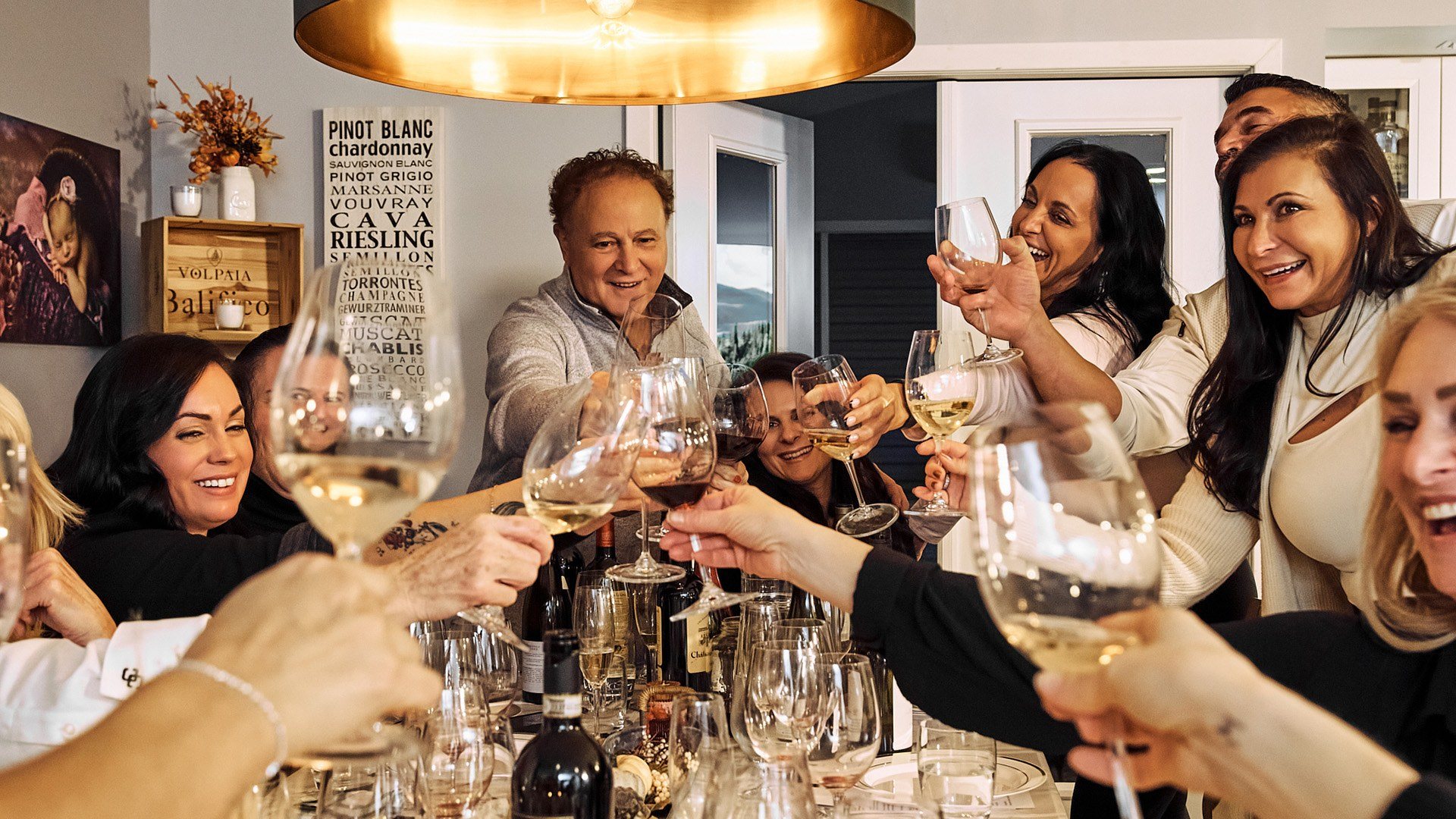
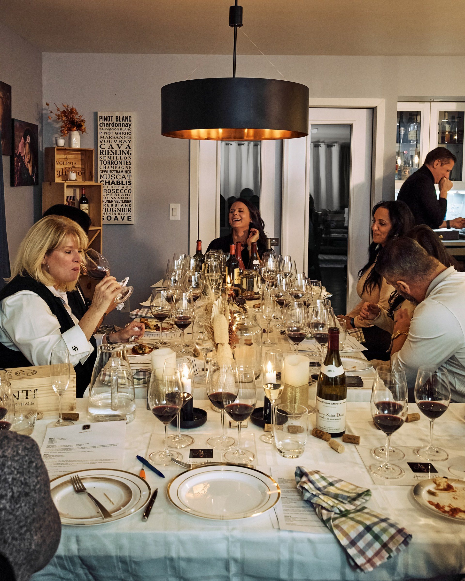
Guests round a long table raise glasses of white and red wine towards each other, laughing, under a copper pendant light.
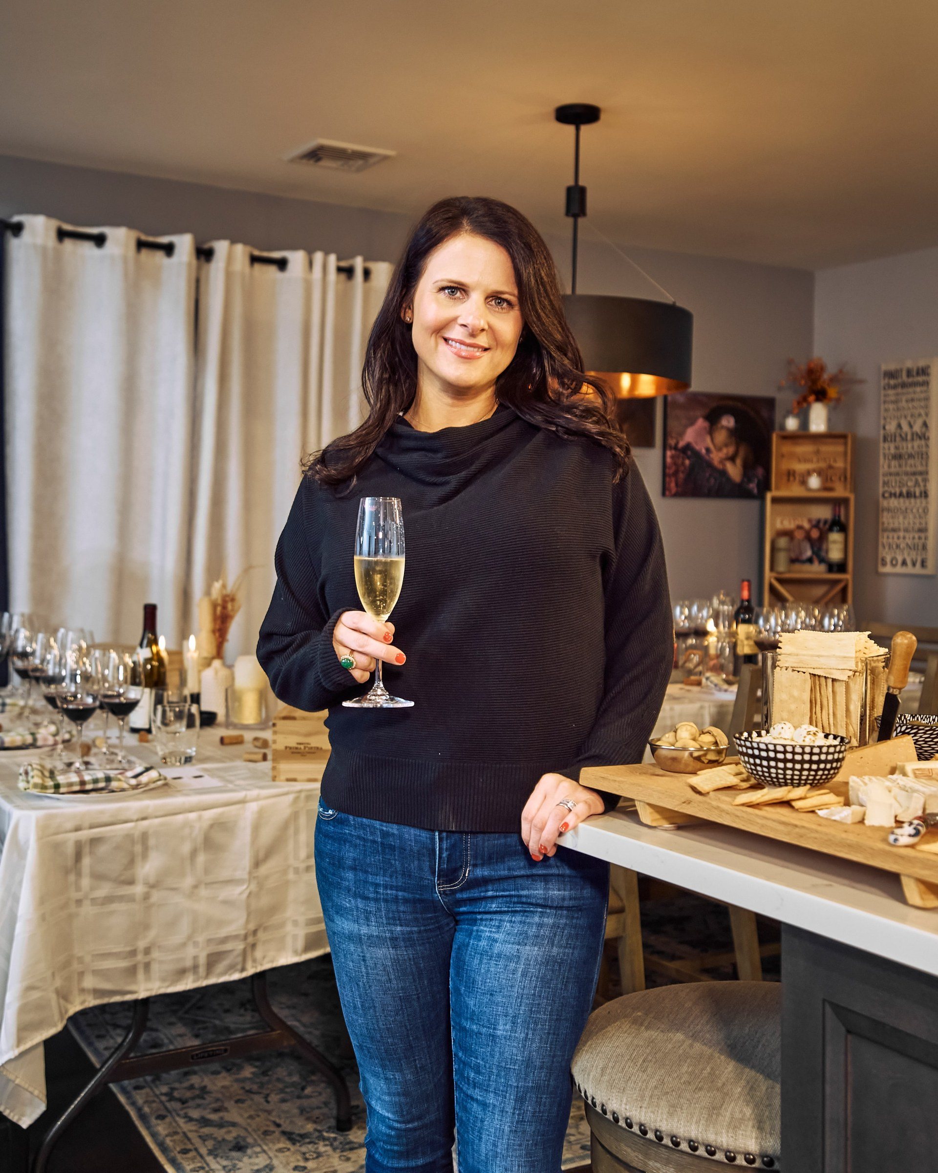
Alicia Abaté in a dark jumper, holding a glass of sparkling wine beside the set table.
Alicia Abaté, founder and sommelier.
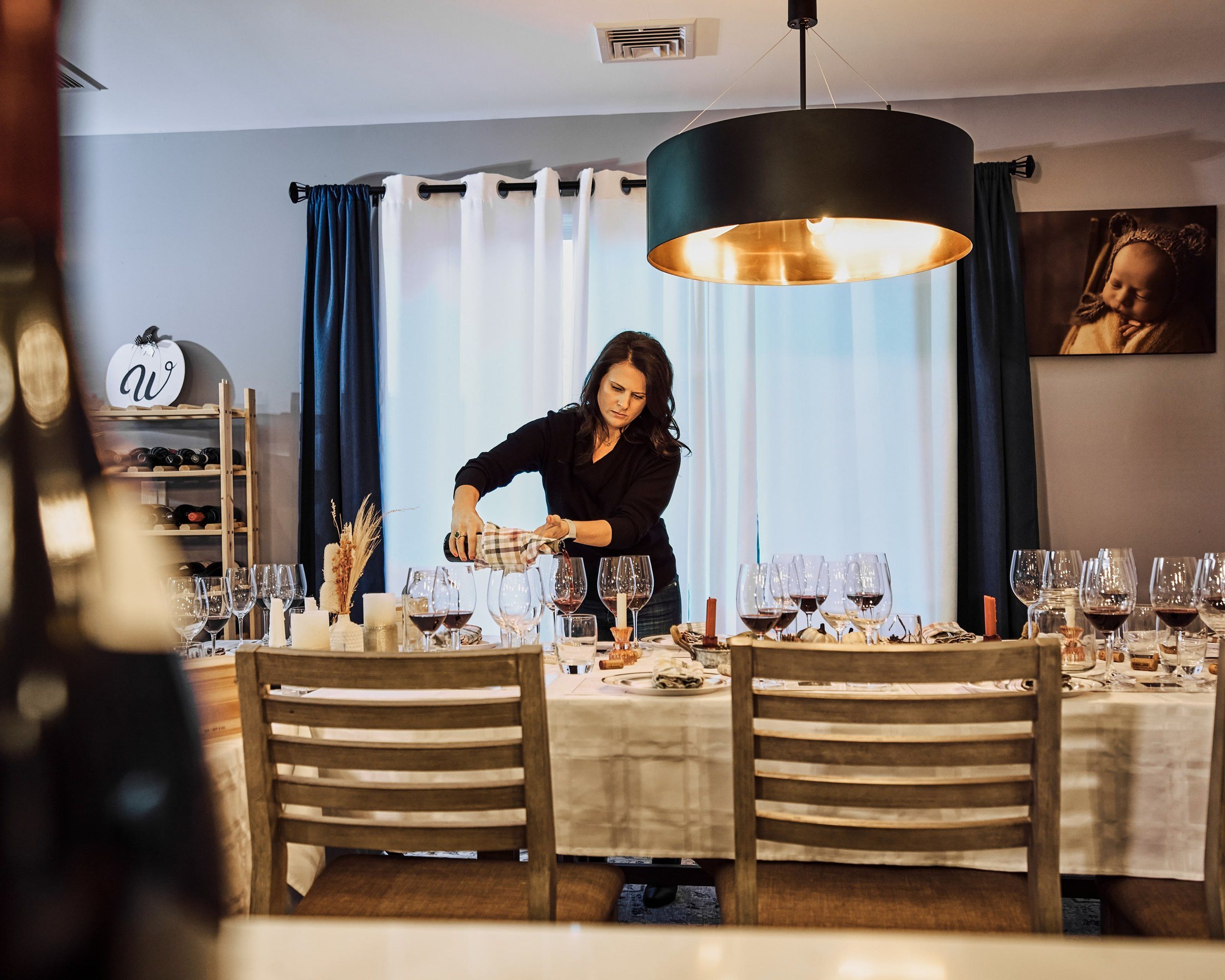
Alicia setting glasses along a long table under a black-and-copper pendant light before guests arrive.
Setting the table.

02

Five rounds, three weeks

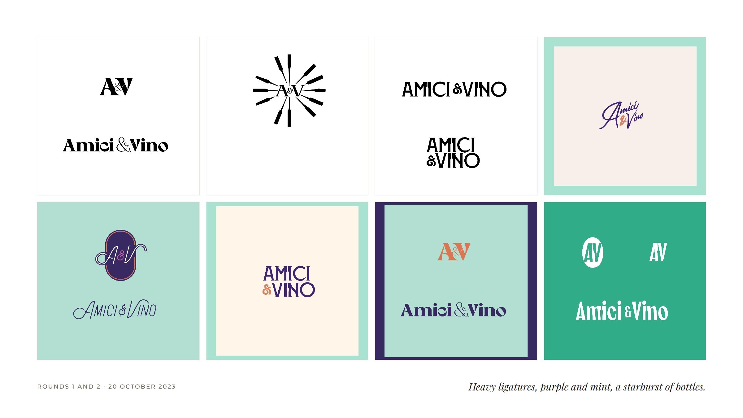
It started as a gesture: an A and a V written in one line, sketched on 18 October 2023. The first two rounds then went the other way, loud and typographic, with heavy ligatures, purple and mint, and a starburst of bottles.

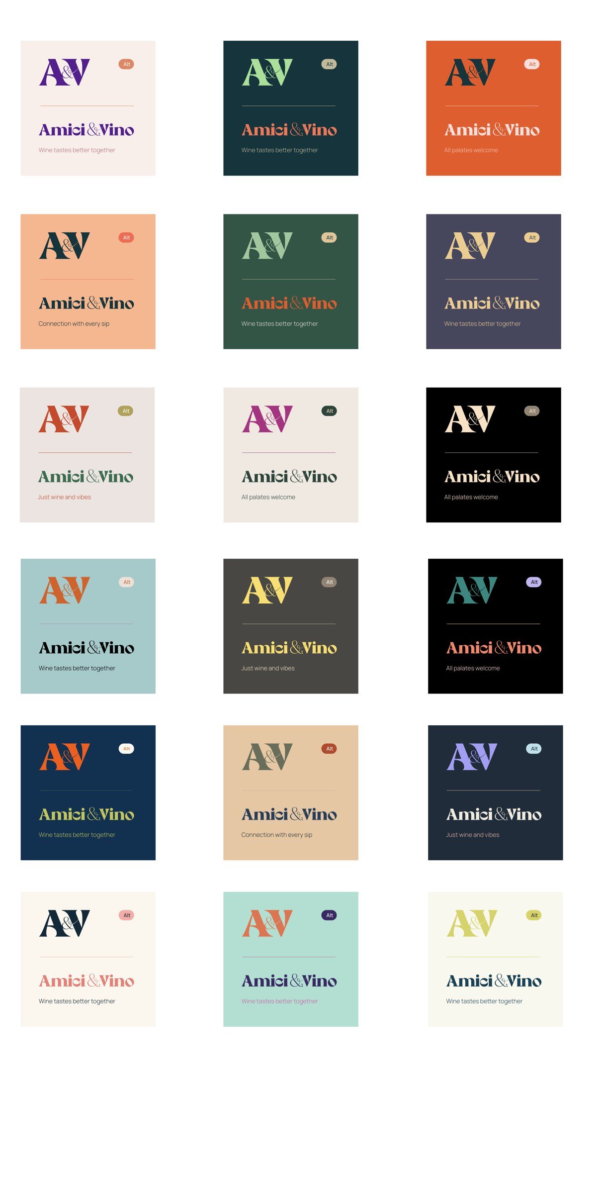
A palette study tried eighteen colourways, each carrying a candidate line. One line stayed: Wine tastes better together.
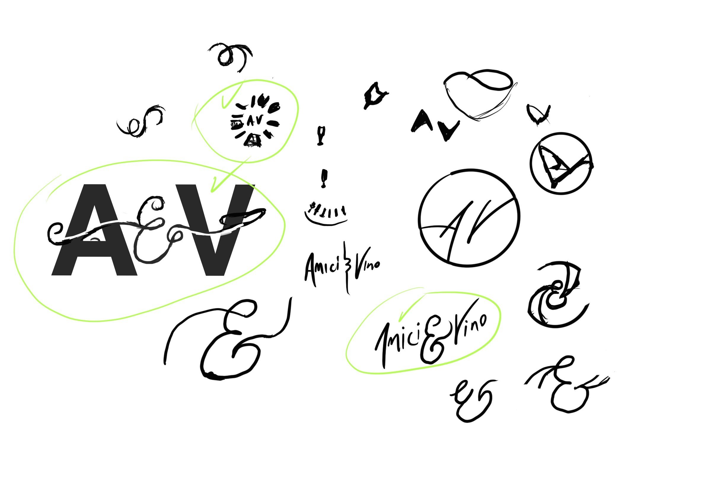
A sketch page: a heavy A and V ligature circled, script ampersands, a wine glass, and an A and V inside a circle.
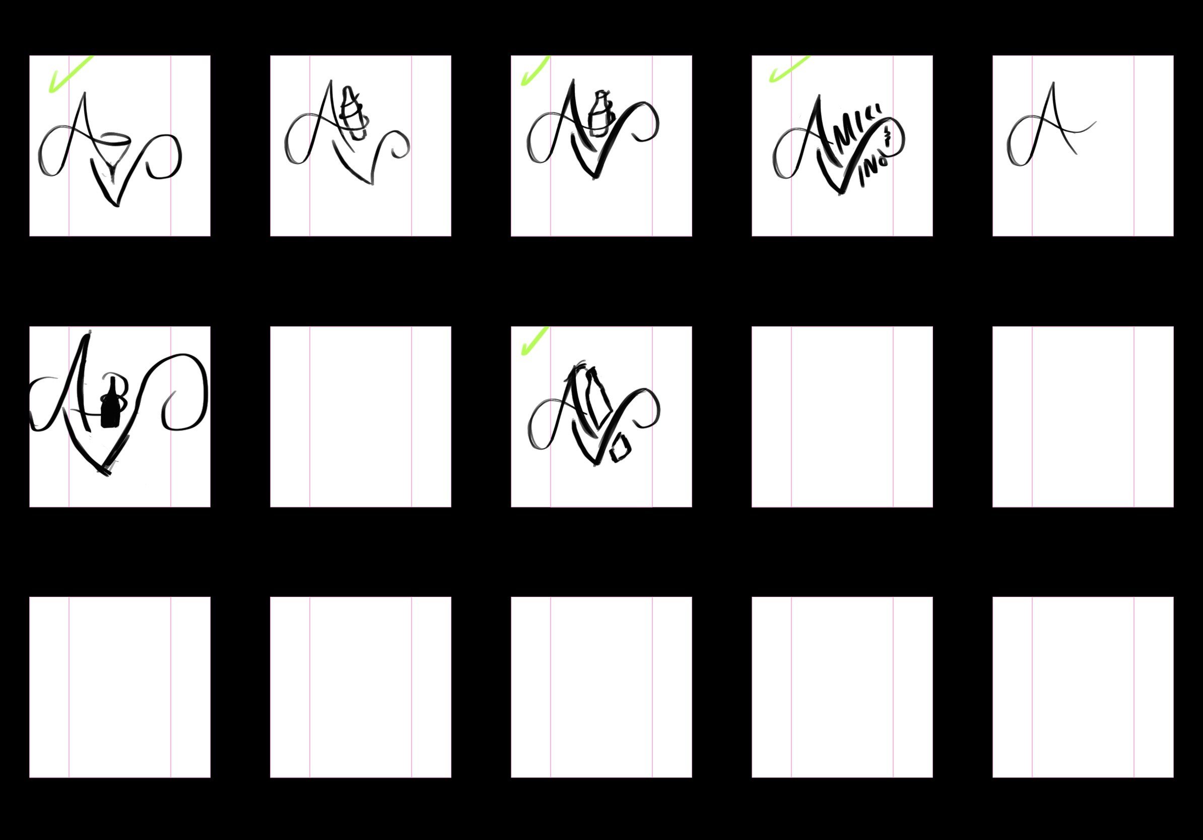
A grid of sketch frames: script A and V gestures, some ticked in green.
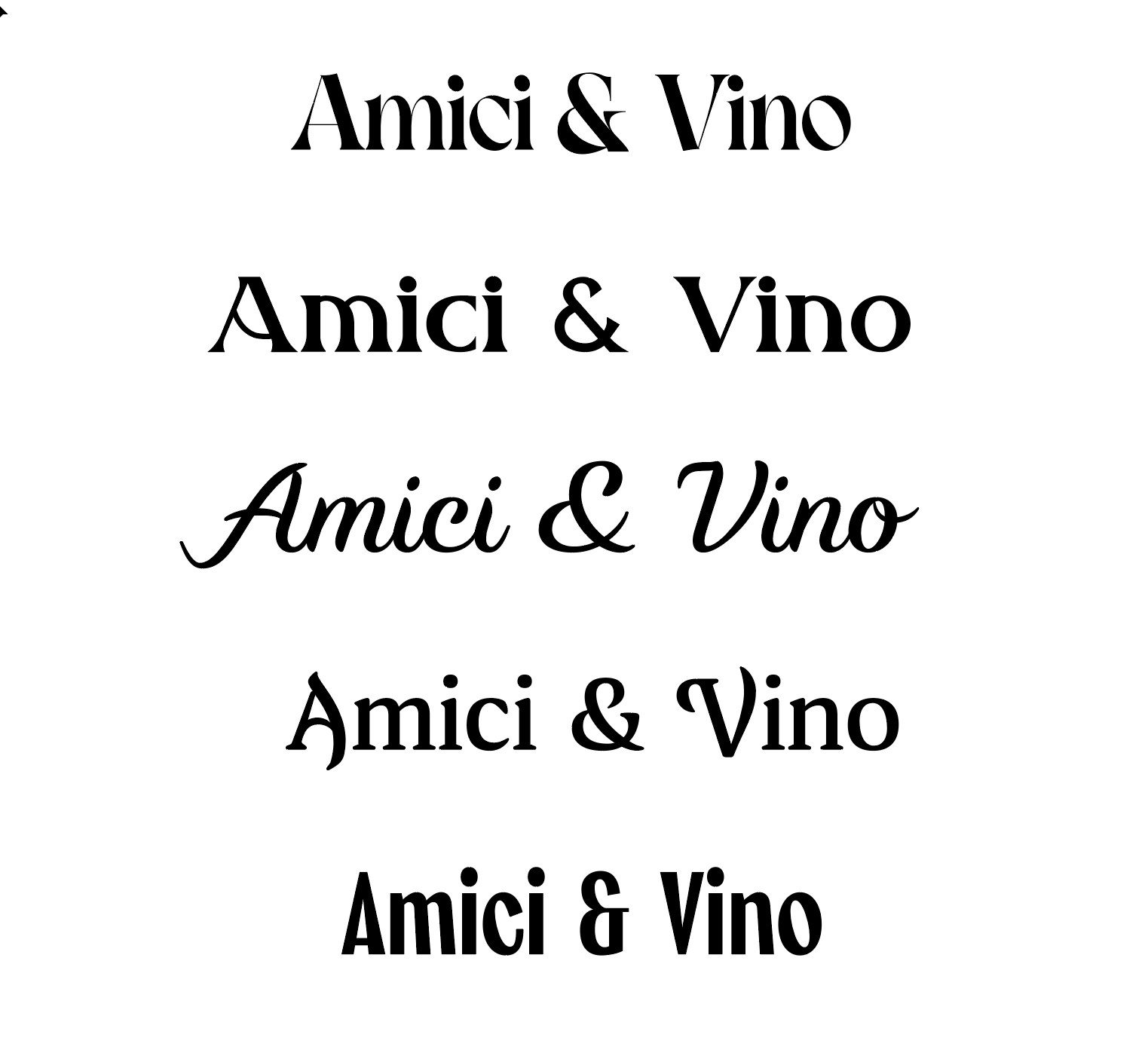
Amici & Vino set in five typefaces, from a heavy serif to a script.
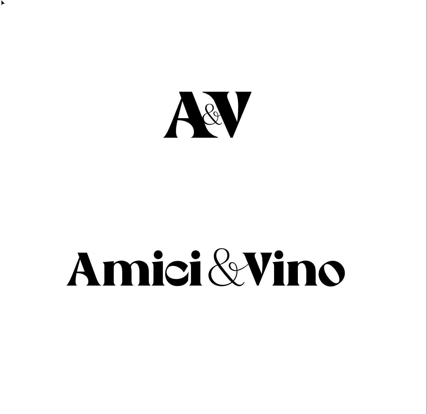
A heavy A and V ligature above the full name in the same heavy serif.
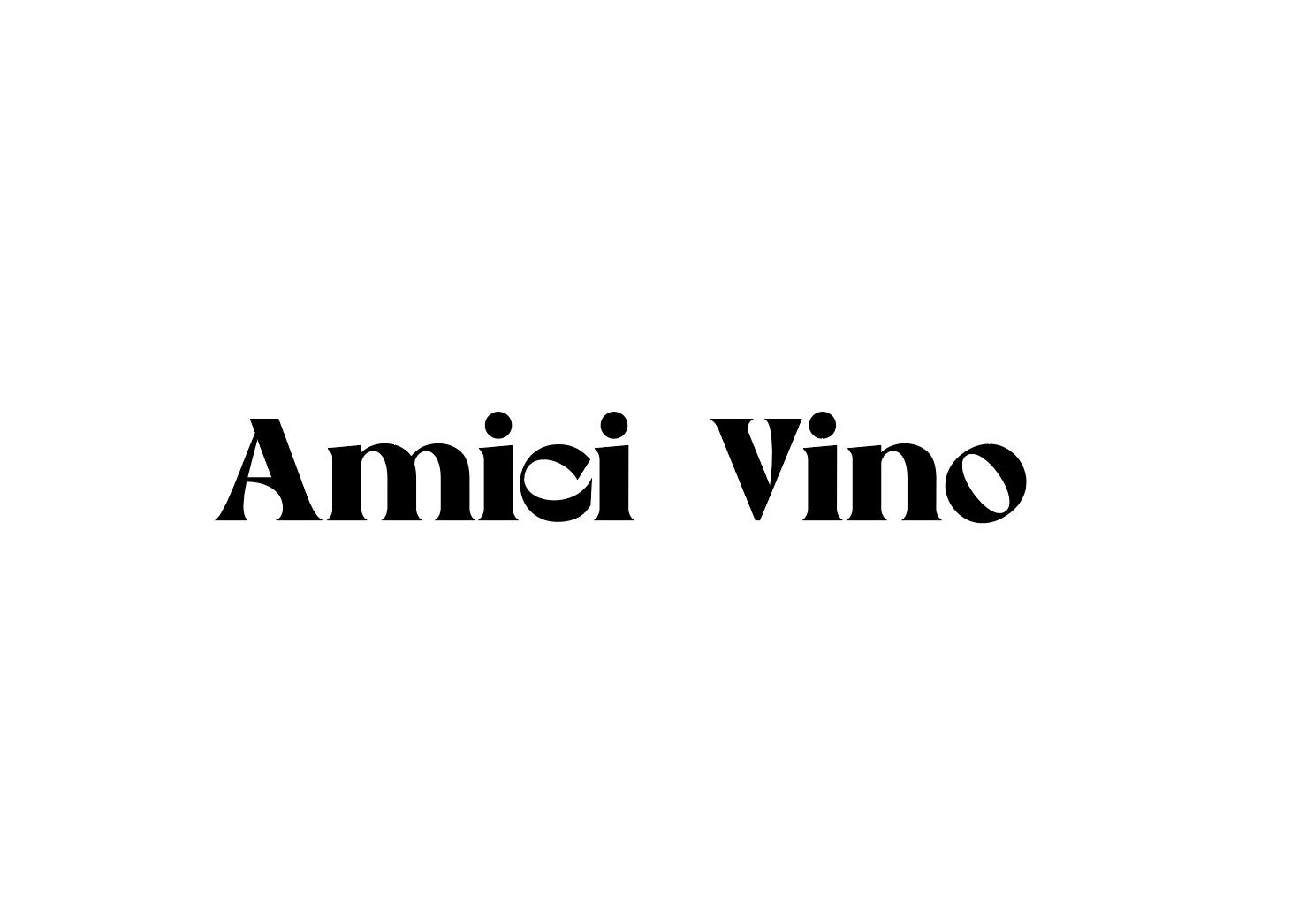
Amici Vino in a heavy display serif.
Type studies, 19 October.
Eight artboards from rounds one and two: heavy A and V ligatures, a starburst of bottles, stacked AMICI & VINO lockups, and script versions on mint, cream, purple and green.
The palette study: the lockup repeated in colourways from blush and orange to deep green, navy and black, each with a short line.
The palette study: eighteen colourways, each with a candidate line.

Then Alicia sent her own references: gold, circles, a bottle drawn in a single stroke. Four days later, round three went copper.
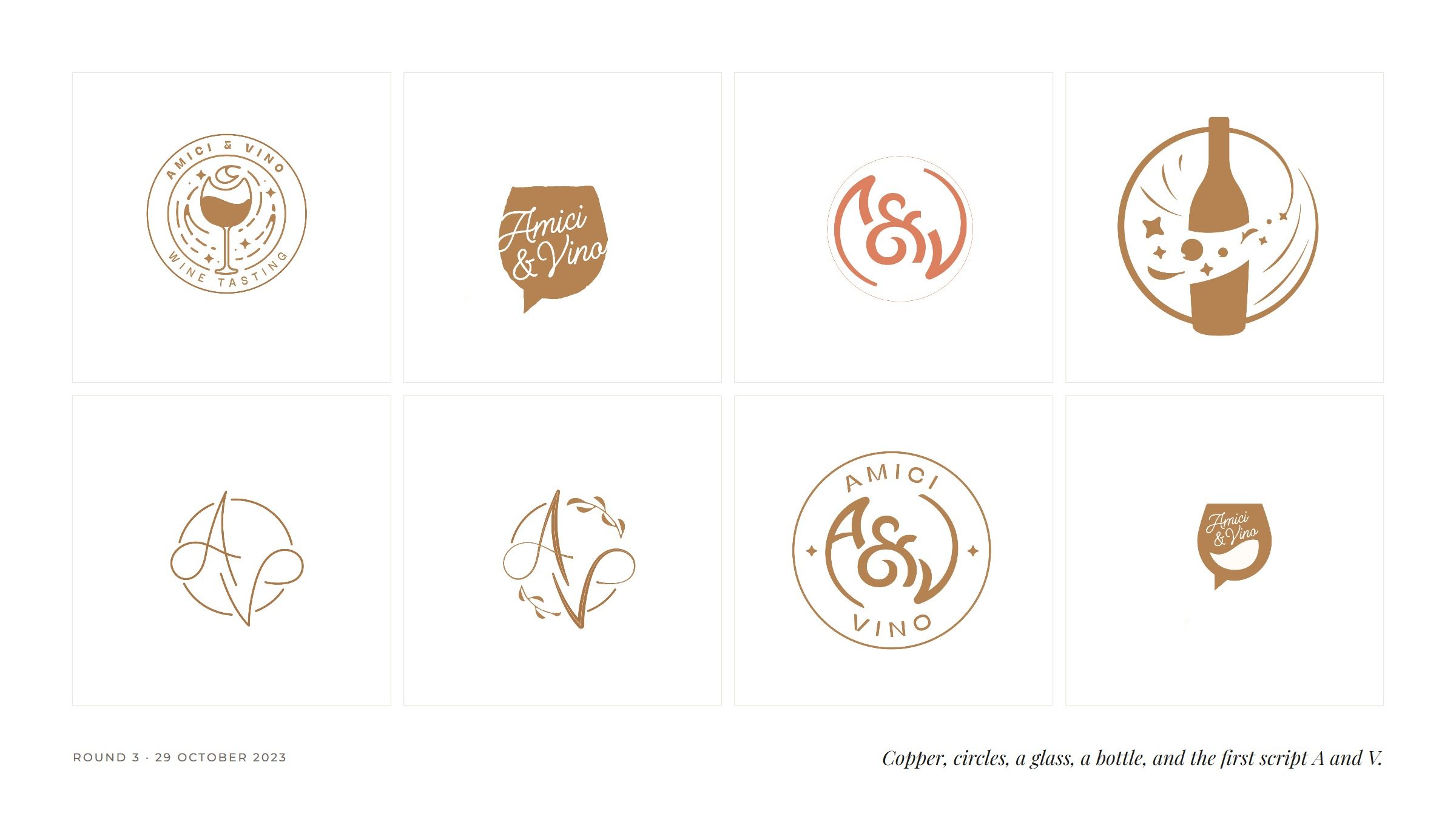
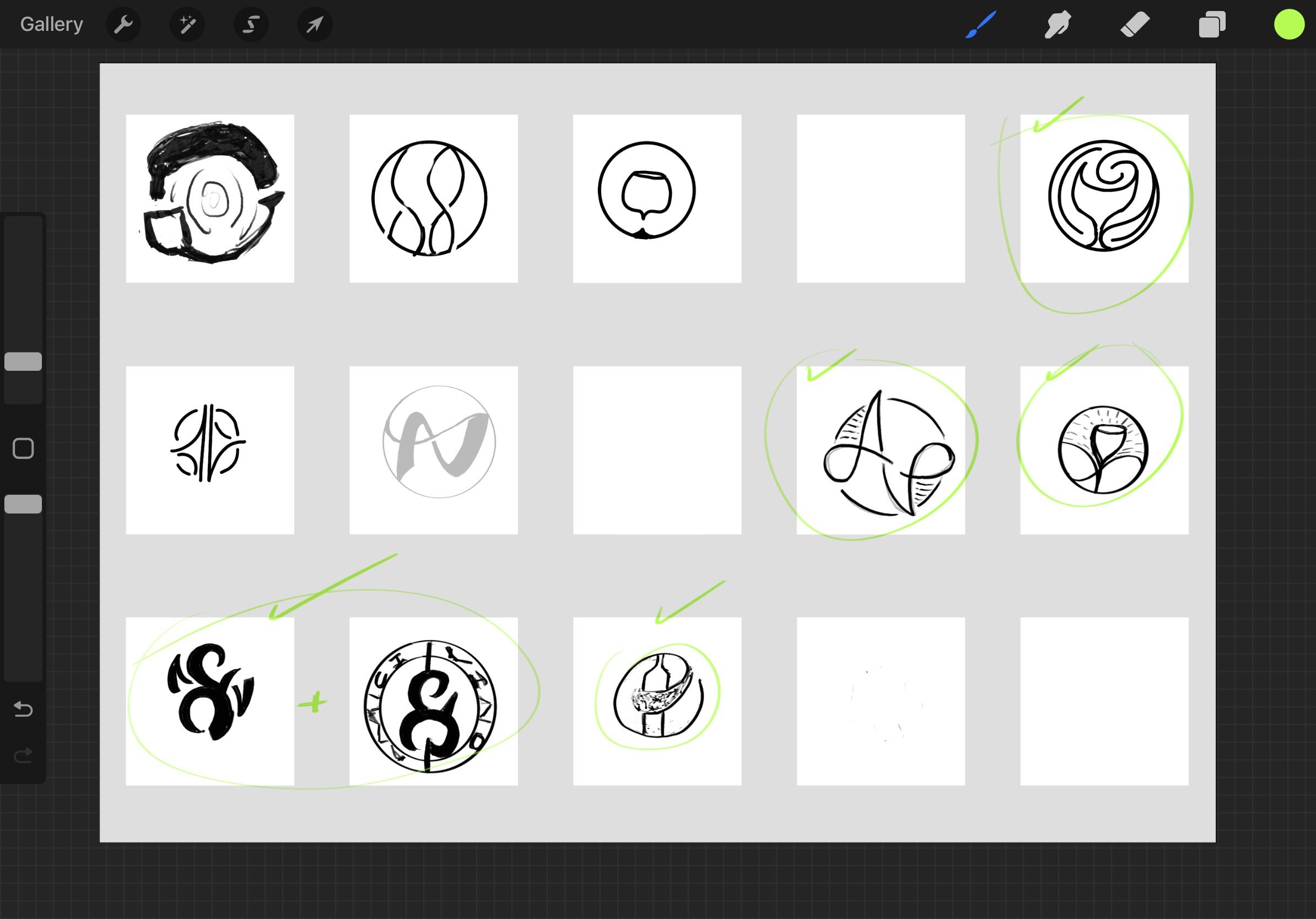
Eight artboards from round three in copper: a wine-tasting seal with a glass, a speech-bubble glass, an ampersand badge, a bottle in a circle, and the first script A and V with vines.
A sketch board of circular marks, several ticked in green: an ampersand, a bottle, the A and V.
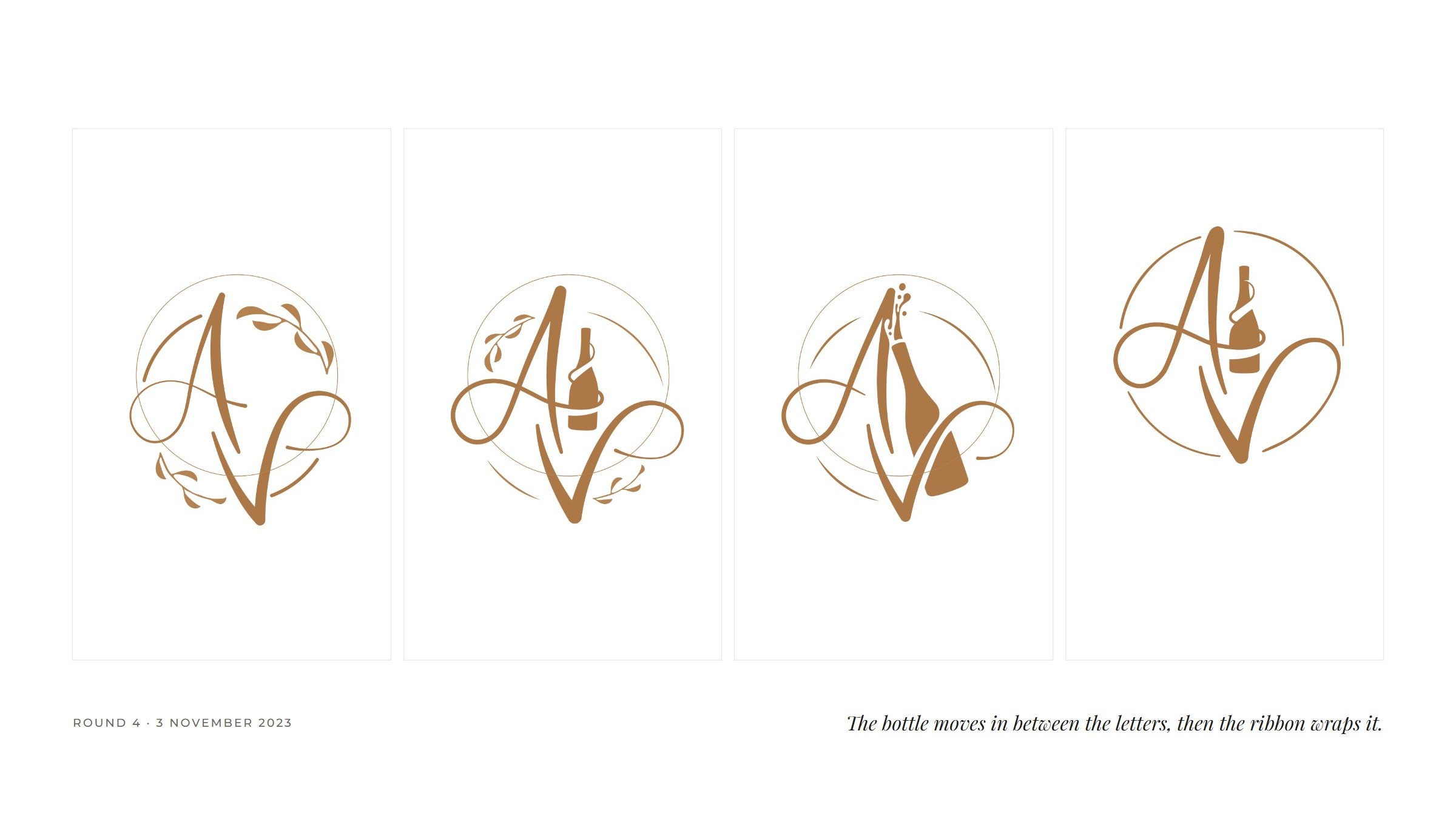
Four artboards from round four: the script A and V with a bottle between the letters, and finally the bottle wrapped by the A's crossbar.

03

The mark

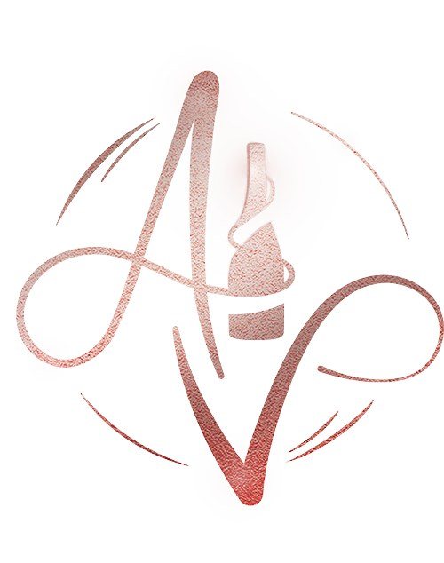
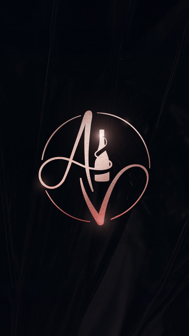
One script gesture. The A, for amici, runs its crossbar on as a ribbon and ties the bottle twice, at the neck and at the waist. The V answers with a sweep out and back. Four arcs hold the two letters, broken wherever a stroke passes, so the circle never quite closes.

The A, the ribbon and the bottle’s shoulder are drawn as one shape.
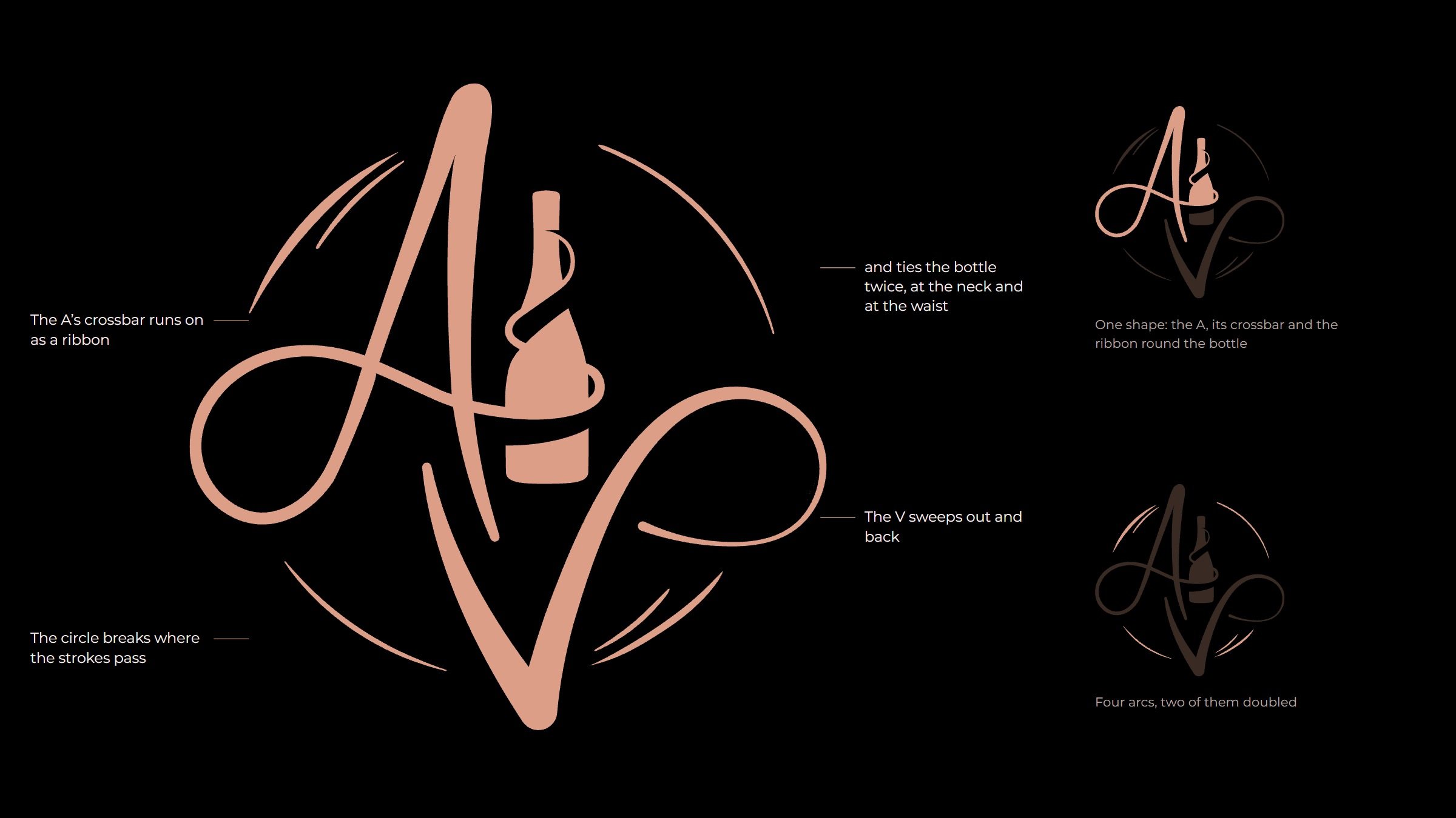
The monogram with four notes: the A's crossbar runs on as a ribbon; it ties the bottle twice; the V sweeps out and back; the circle breaks where the strokes pass. Beside it, two small versions highlight the single A shape and the four arcs.
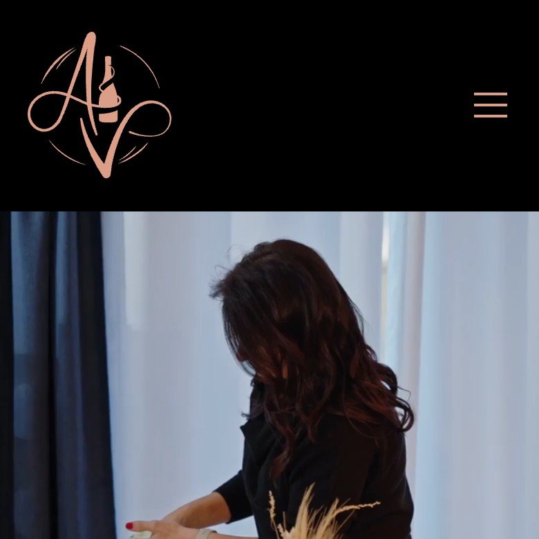
The top of amiciandvino.com on a phone: the rose-copper monogram in the black header, above a photograph of Alicia setting glasses.
In the site’s header.
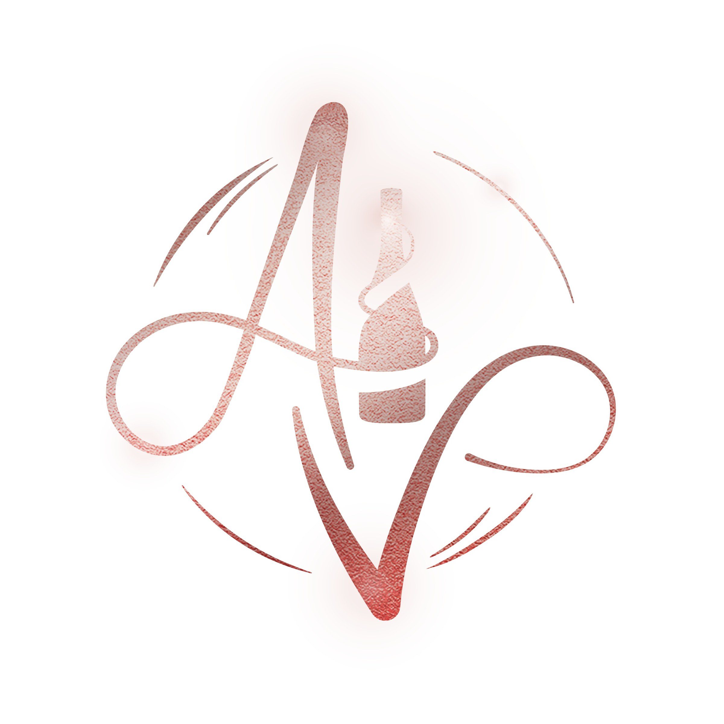
The monogram in rose-copper foil with a soft glow, on white: the Instagram avatar.
As the avatar, in foil.

04

Rose copper

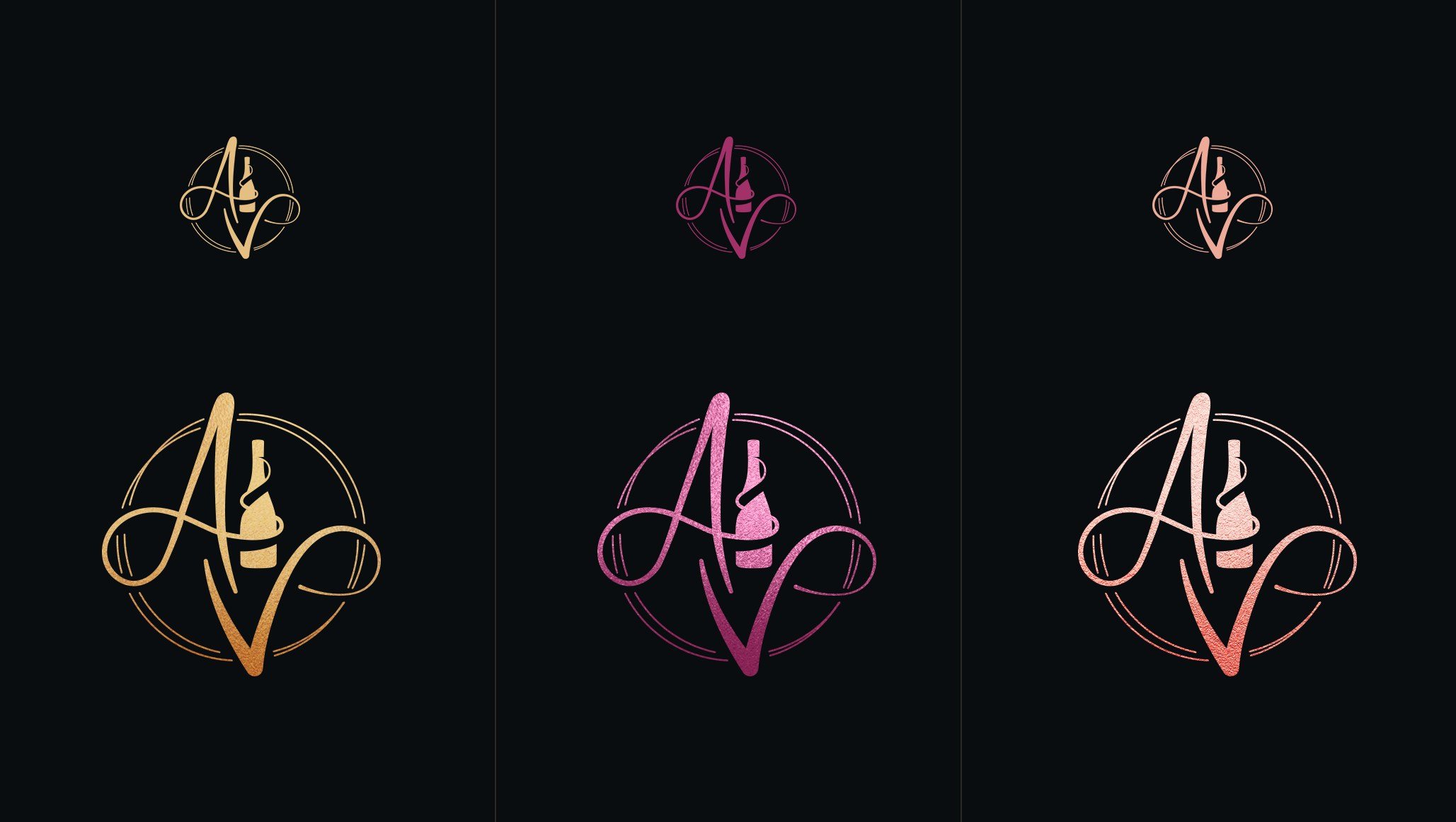
We tested the finish before the colour: the bottle badge and the monogram in gold, magenta and rose foil. Rose copper won, on black. On the site it lives in the black header, and the pages below turn blush.

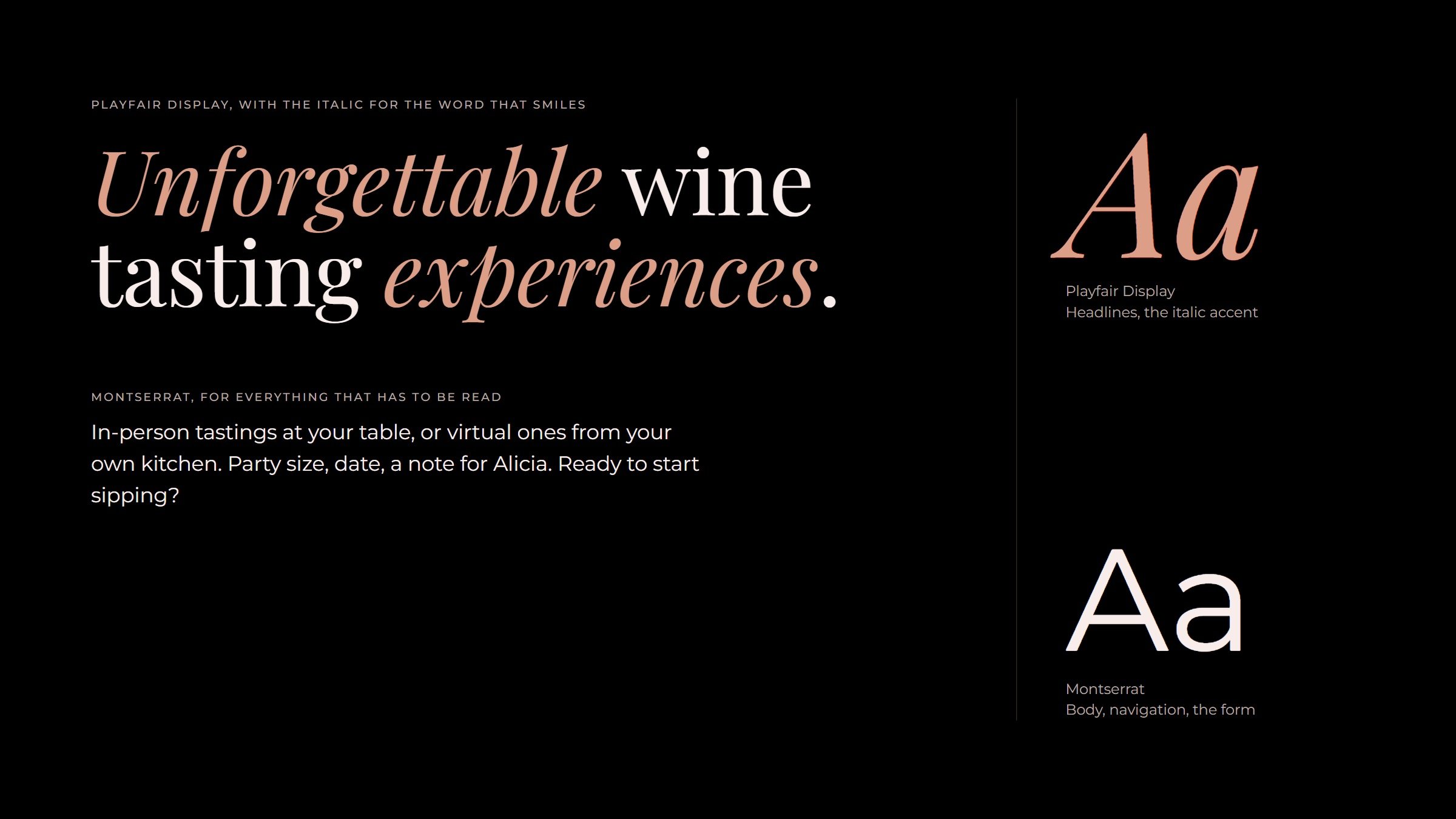
Playfair Display carries the headlines, with the italic kept for the word that smiles. Montserrat does the reading.
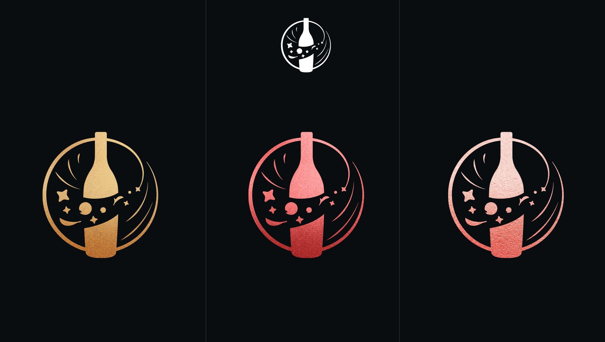
Three bottle badges on black in gold, magenta and rose foil.
The monogram on black in gold, magenta and rose foil, large and small.
The monogram in textured rose-copper foil on white.
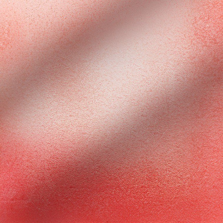
Close-up of the rose-copper foil texture, a band of light across it.
The foil.
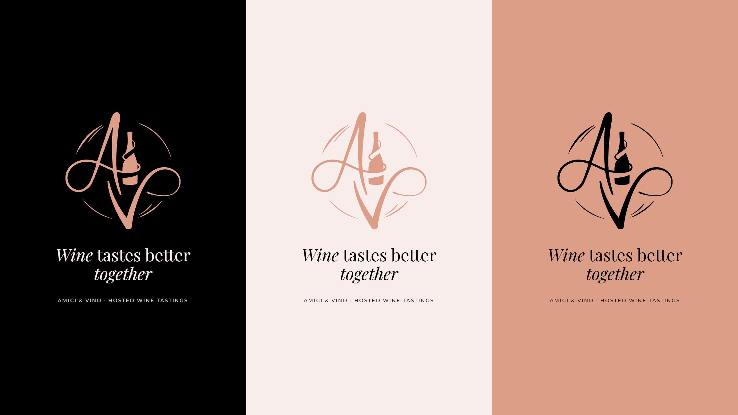
One layout, the monogram above the line Wine tastes better together, on black, on blush and on rose copper.
Colour in use: one layout on the three grounds.
Type in use: Unforgettable wine tasting experiences in Playfair Display, the accent words in rose-copper italic, with Montserrat body text and specimens of both faces.
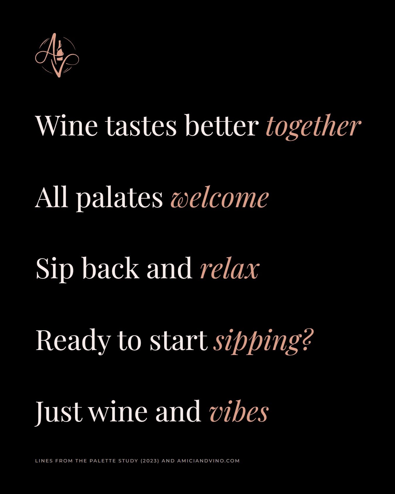
Five lines on black, each ending in a rose-copper italic word: Wine tastes better together. All palates welcome. Sip back and relax. Ready to start sipping? Just wine and vibes.
Lines from the palette study and the site.
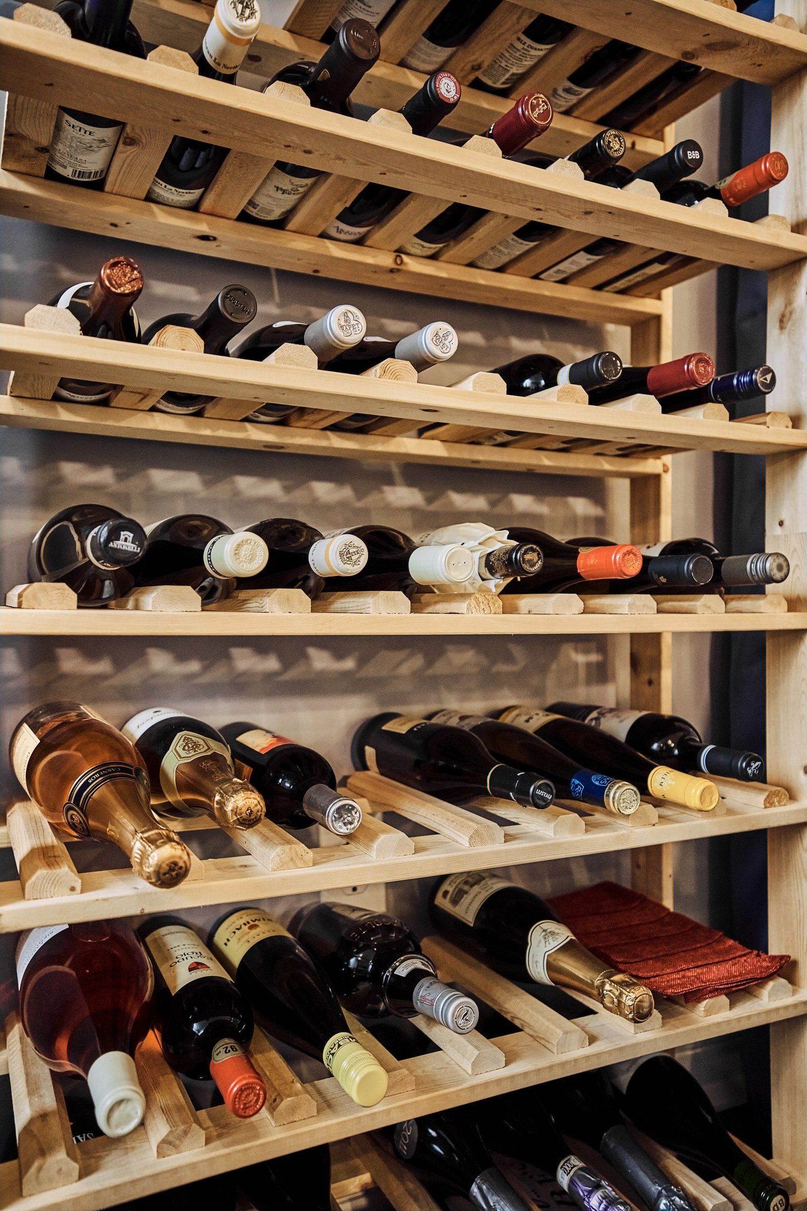
A wooden rack filled with bottles of red, white and rosé wine.

05

At the table

The brand has to hold up by candlelight on a crowded table. The monogram sits on the tasting placemats and the tasting sheets, and the photographs stay with the evening itself: the board, the pour, the toast.
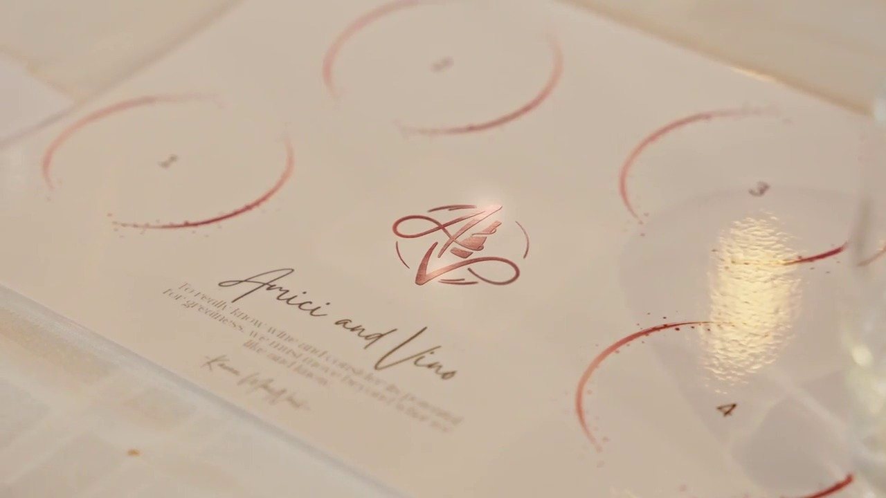
A white tasting placemat with numbered circles for glasses, the rose-copper monogram and Amici and Vino in script.
The tasting placemat, from the opening frame of the site’s film.
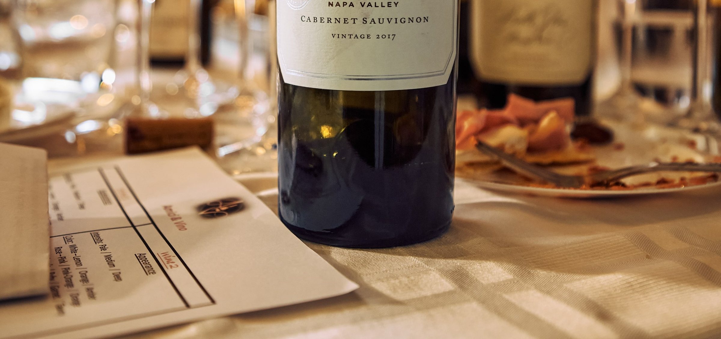
A tasting sheet beside a bottle: the monogram and Amici & Vino in rose copper above a grid for appearance, intensity and colour.
A tasting sheet: appearance, intensity, colour.
Guests round a long candlelit table with glasses of red wine, tasting notes at each place.
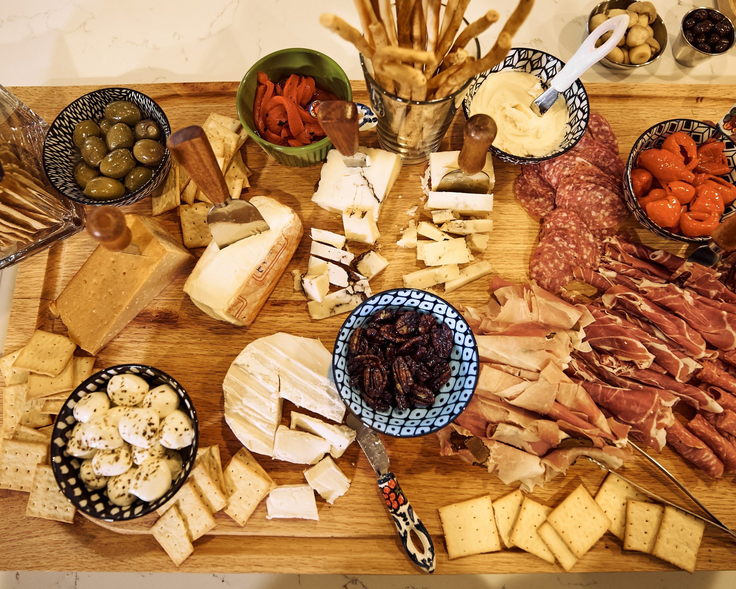
A charcuterie board from above: cheeses, cured meats, olives, peppers and crackers.
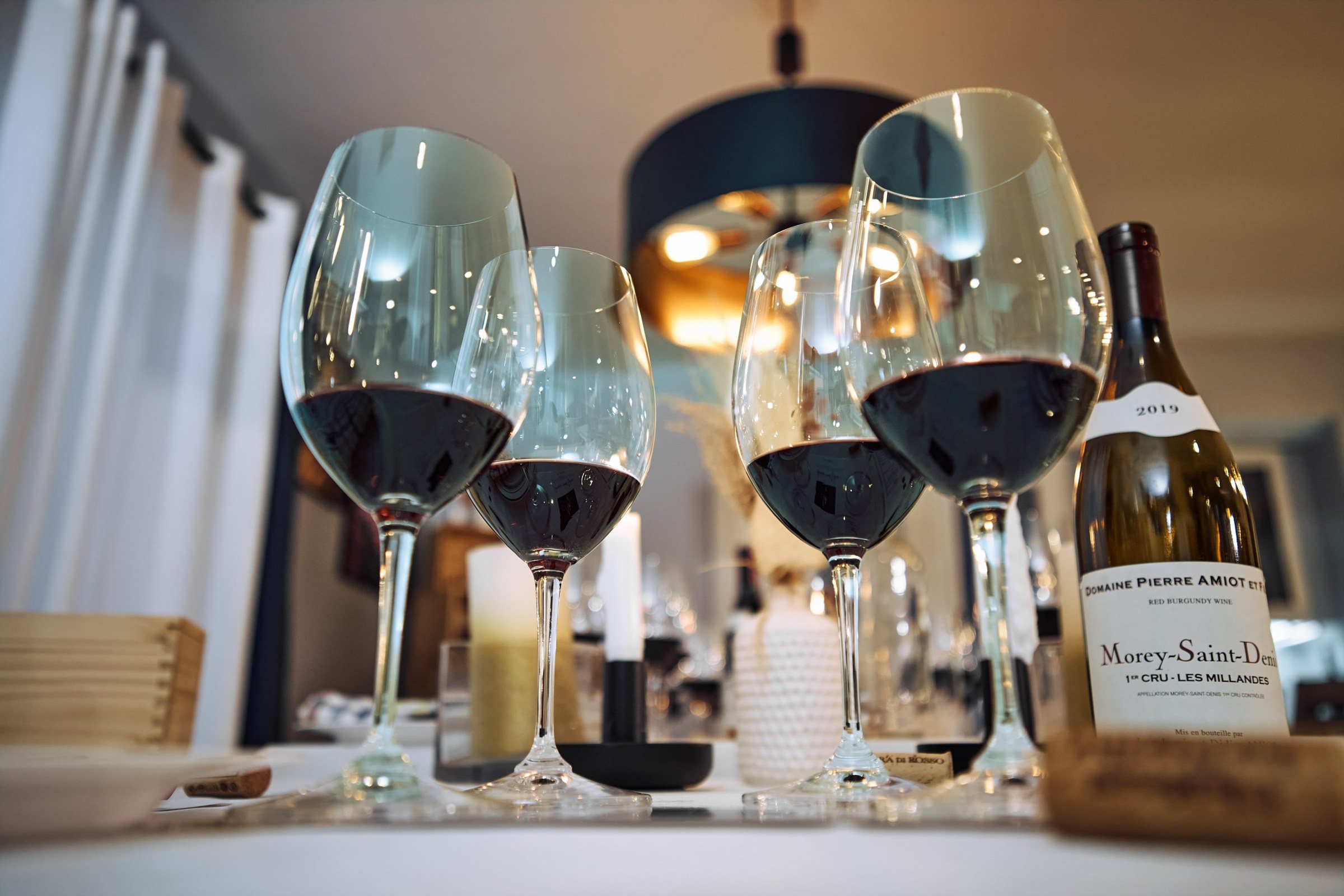
Glasses of red wine and a bottle of burgundy on the table under a copper pendant.

06

The launch

Amici & Vino arrived on Instagram as a foil monogram, rendered in 3D and set over a dim toast, cut for the feed and for stories, with the avatar to match.
The rose-copper foil monogram glowing over a dim photograph of friends raising glasses under string lights.
The intro post, 3D.
Story format: the foil monogram over a dim toast, string lights above.
Story format: the foil monogram on a dark draped background, a highlight on the bottle.

07

The site

We built amiciandvino.com in Webflow: four pages, one coloured button, and a film of a real evening at the top. The black header carries the mark; the blush pages carry the photographs, the two kinds of tasting and the booking form.
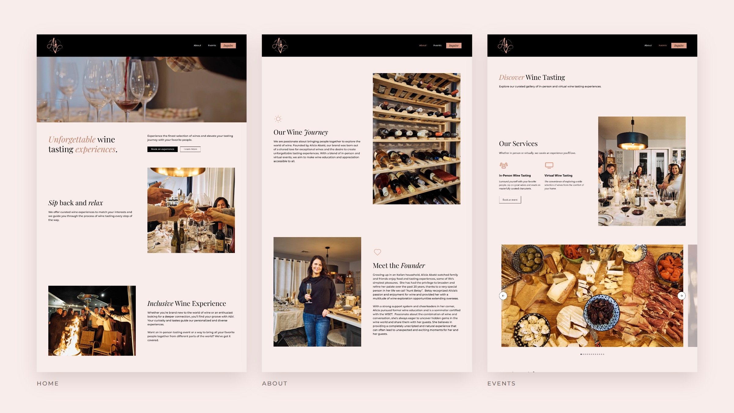
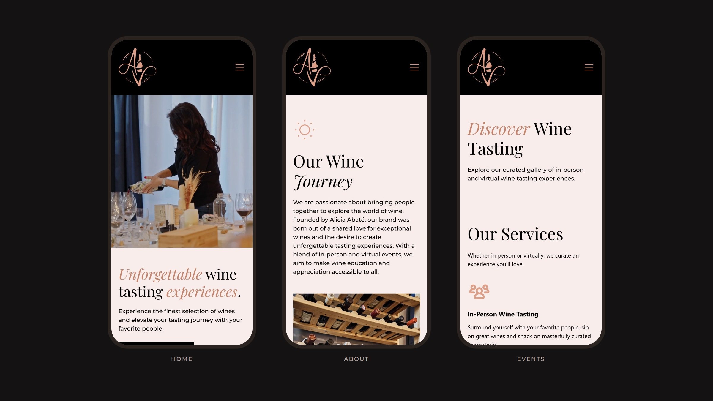
amiciandvino.com, 2023.
The Home, About and Events pages side by side on blush.
Home, About and Events on phones: the black header with the monogram above the blush pages.
At 390 pixels.
“As someone who knows very little about wine, Alicia’s lighthearted approach eased the uneasiness I often feel at wine events.”

Rachel D., Haddam, Connecticut, on amiciandvino.com
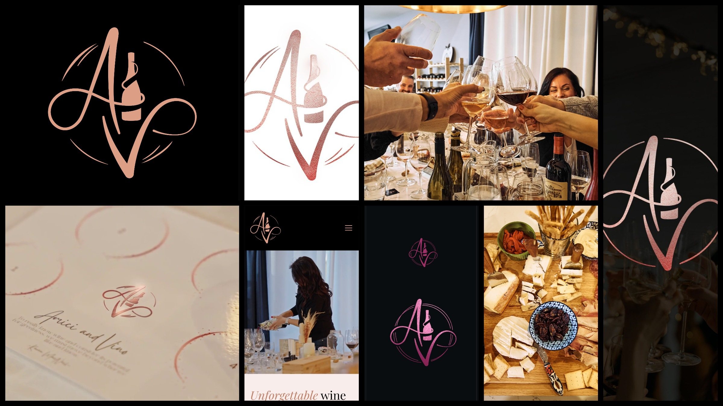
The system at a glance: the monogram on black, the foil monogram, a toast, a story, the tasting placemat, the site on a phone, the foil studies and a charcuterie board.

Wine tastes better together

Made by
Signal Eight: identity, social launch in 3D and motion, website (Webflow)
Type
Playfair Display, Montserrat

Next case study

True Glow

Skincare built on what a glow is: light coming back from inside the skin. The lustre rings, eight hairline layers crowding towards one point, carry the idea across opal-glass packs, a website, print, social and film.
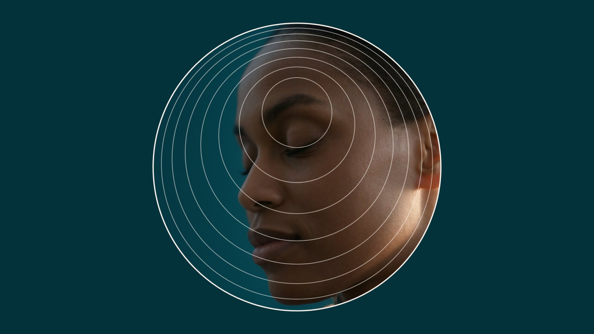
The True Glow rings holding a portrait in back-light: the edge of the ear glows warm inside the layers.

Let’s find your signal.

Tell us about your brand