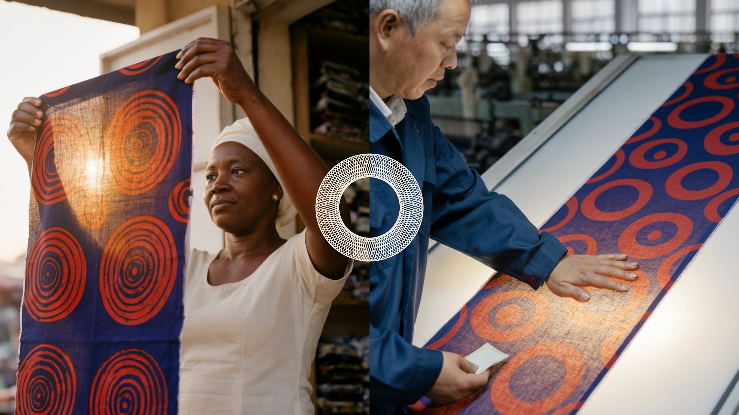
Case study · 2026
Oxide
A colour-cosmetics brand built on one true fact: every skin shade is the same four pigments. A drawn wordmark whose i is the brand's own dropper, and colour always shown across black and white.
- Client
- Oxide
- What we made
- Strategy, Naming, Identity, Voice, Image direction, Website, Packaging, Campaign
Signal Eight created Oxide, a colour-cosmetics brand built on one true fact: every skin shade is the same four pigments in different amounts. The system centres on a drawn wordmark whose i is the brand's own dropper, and on the drawdown, colour shown across black and white, from the website to the carton, the street and the order email.
01 · Situation
A category that sells softness.
We looked at ten complexion brands, from Fenty Beauty and Rare Beauty to Glossier, Ilia and Kosas. They share a language that works: pink, cream and greige grounds, beauty-lit faces with the product held at the cheek, spaced capitals, and heroes that lead with promotions. It is warm and easy to trust.
What none of them shows is the colour itself. Shade names are numbers or poems; the recipe sits in six-point type at the end of the ingredient list. Yet the most common complaints, “it goes orange”, “I’m between shades”, are about exactly that recipe.
How do you make a makeup brand people can check?
02 · The truth
Four pigments make every skin shade.
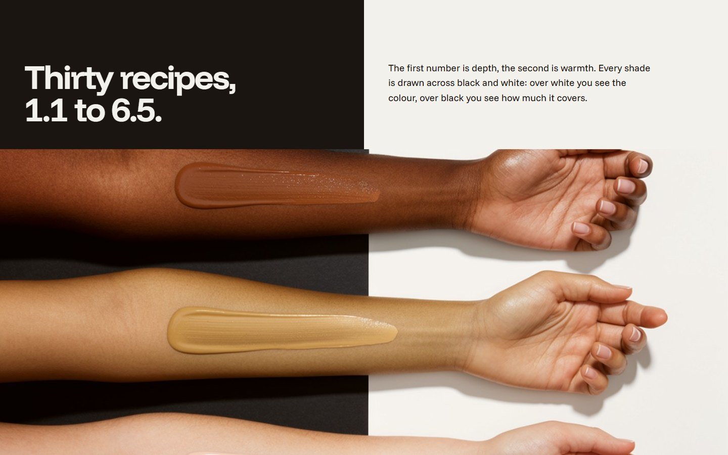
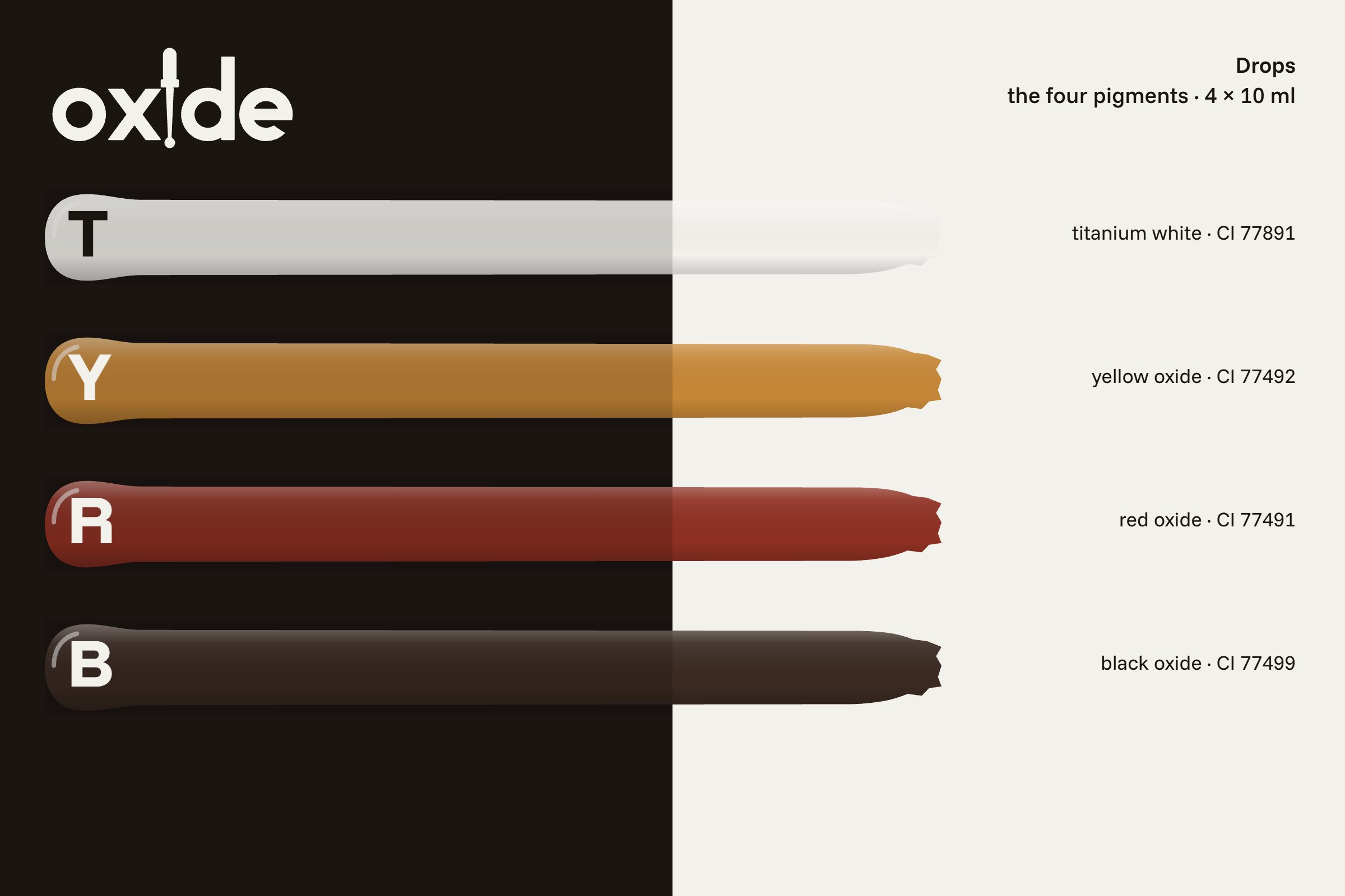
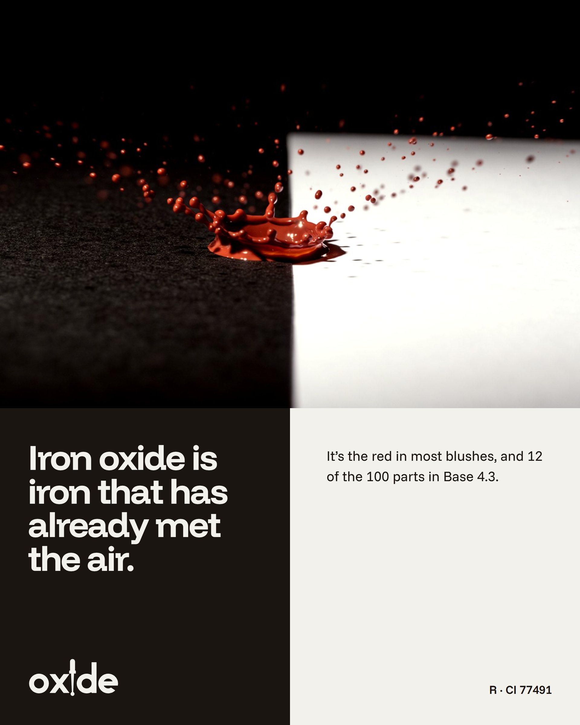
Foundation colour is built from titanium white and yellow, red and black iron oxide (Sensient Beauty; Cosmetics & Toiletries). Every shade on the market is a ratio of the same four. Paint makers have a test for colour like this: they draw it down a card that is half black and half white. Over white you see the colour; over black you see how much it covers.
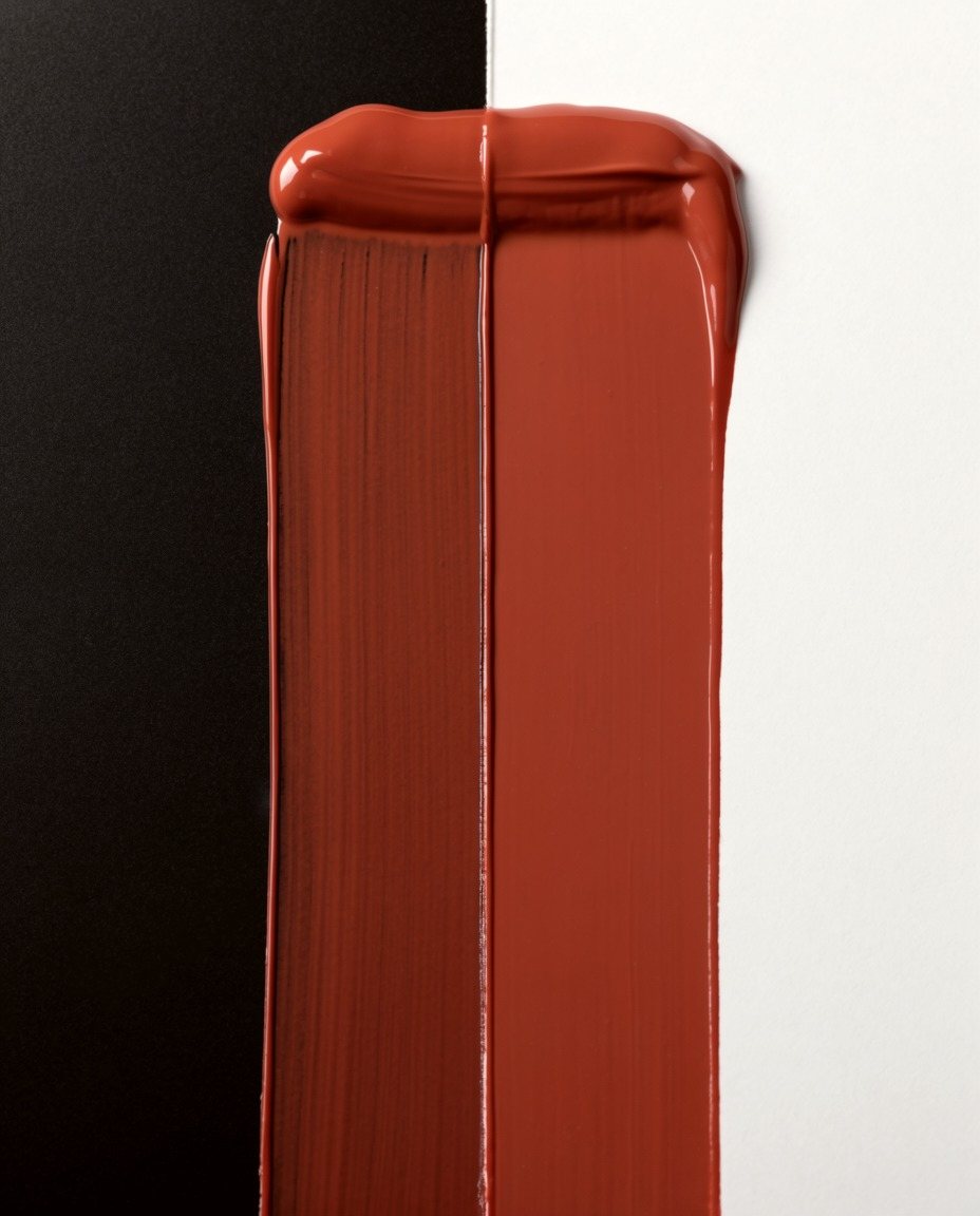
Every colour is a recipe.
Oxide prints each shade’s recipe on the pack, names the shade by it, and sells the four pigments on their own as Drops, so a shade can be adjusted instead of replaced.
The brand has one behavioural rule: colour is always shown crossing light and dark, with its recipe beside it. Every surface is the test card.
03 · Signature
The i is the dropper.
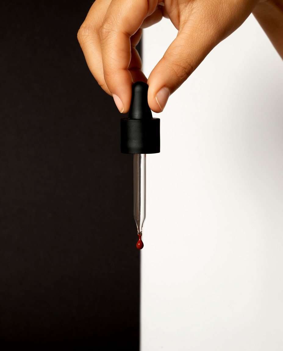
We drew the wordmark from circles and bars, and gave one letter the idea: the i is the Drops dropper, with its rubber bulb as the dot, a moulded cap, a glass pipette for the stem and a drop forming at the tip. It is also the colour picker every screen-literate buyer already knows. A thin cap read as a sword’s hilt, so the cap became a block.

- Stroke
- 104 on a 400 x-height; bowls overshoot 8
- Bulb
- 1.02 × stroke, a third of the letter
- Cap
- 1.36 × 0.62 stroke, a block
- Pipette
- 0.60 tapering to 0.26 stroke
- Drop
- 0.40 stroke, attached, so it never reads as an exclamation mark

04 · Colour
The palette is the pigments.
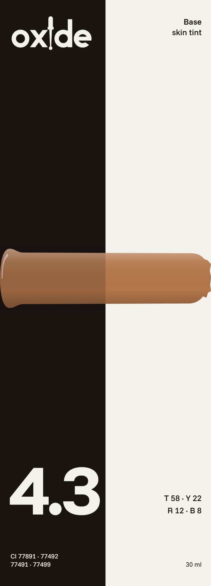
Black oxide and titanium white share the ground half and half, like the test card. Ochre and red oxide appear only as pigment: a drop, a stroke, a label. The one live colour on any surface is the product’s own shade.
05 · Type and voice
Numbers first, then one plain sentence.
Funnel Display and Funnel Sans, one family in two cuts. Shade numbers are set as large as names, because here they are the names. The voice is a colourman’s: quantities first, chemistry said in everyday words, the next step always given.
Funnel Display 800 for shade numbers; Funnel Sans with tabular figures for every recipe. Both OFL.
06 · The motif
Every shade is shown as a drawdown.
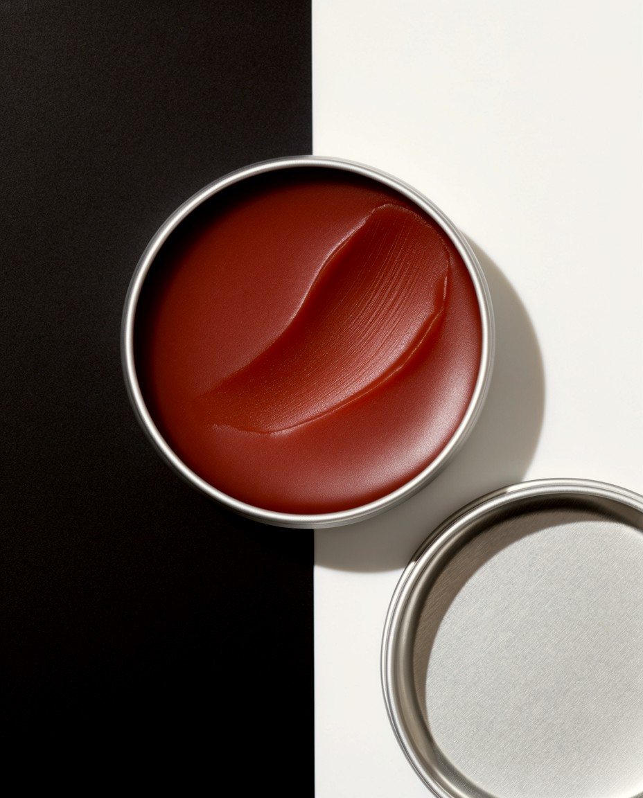
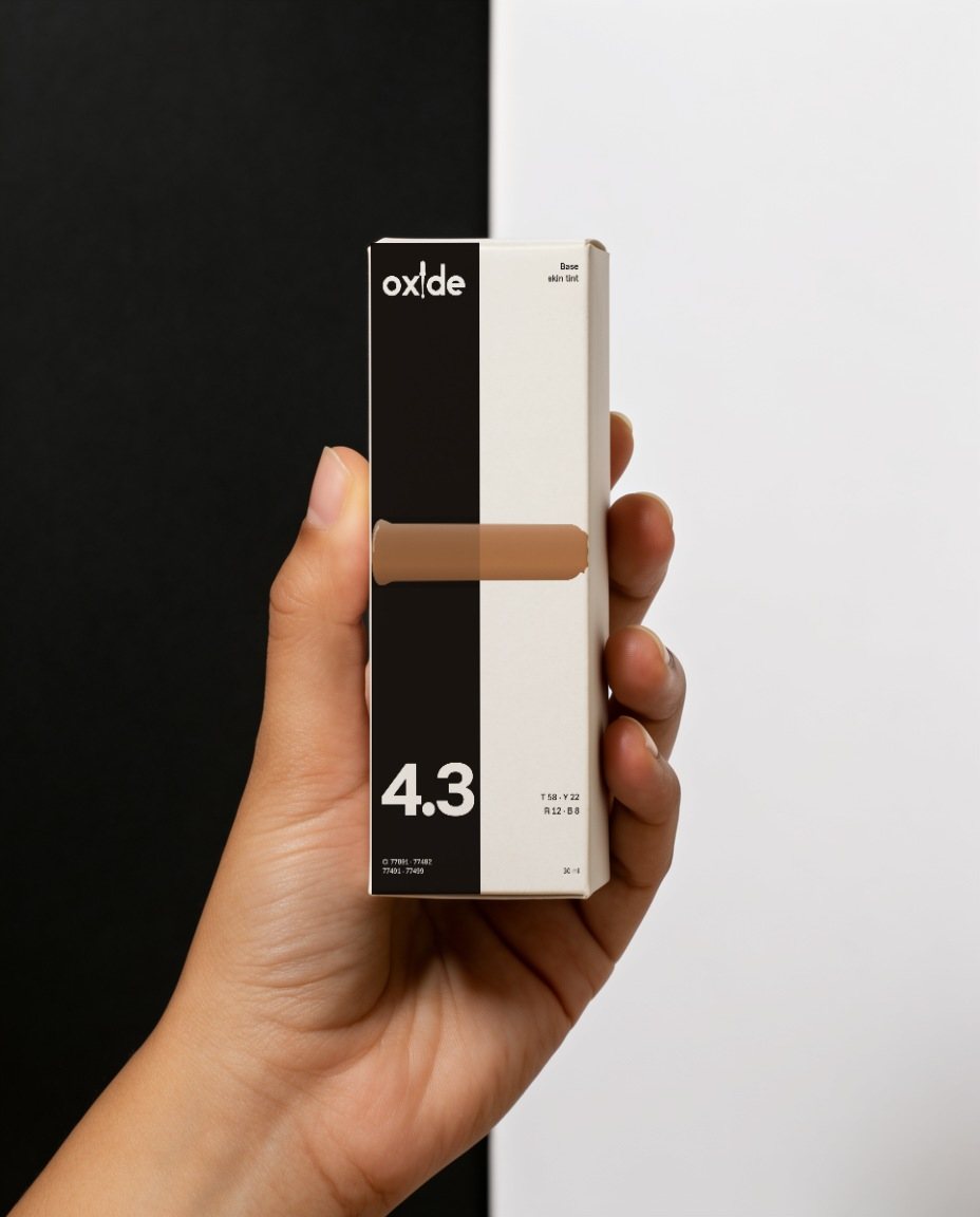
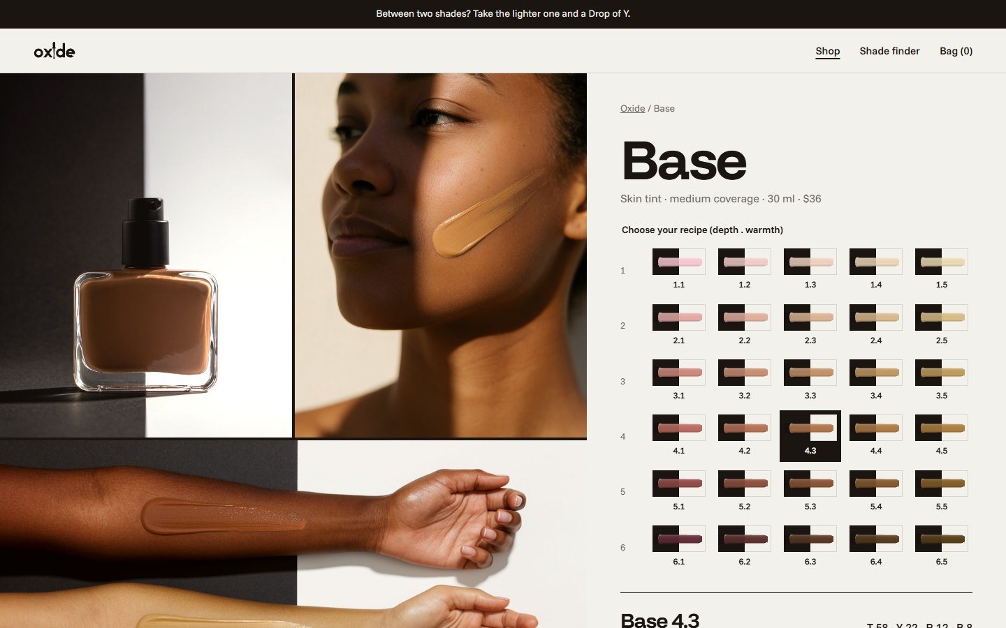
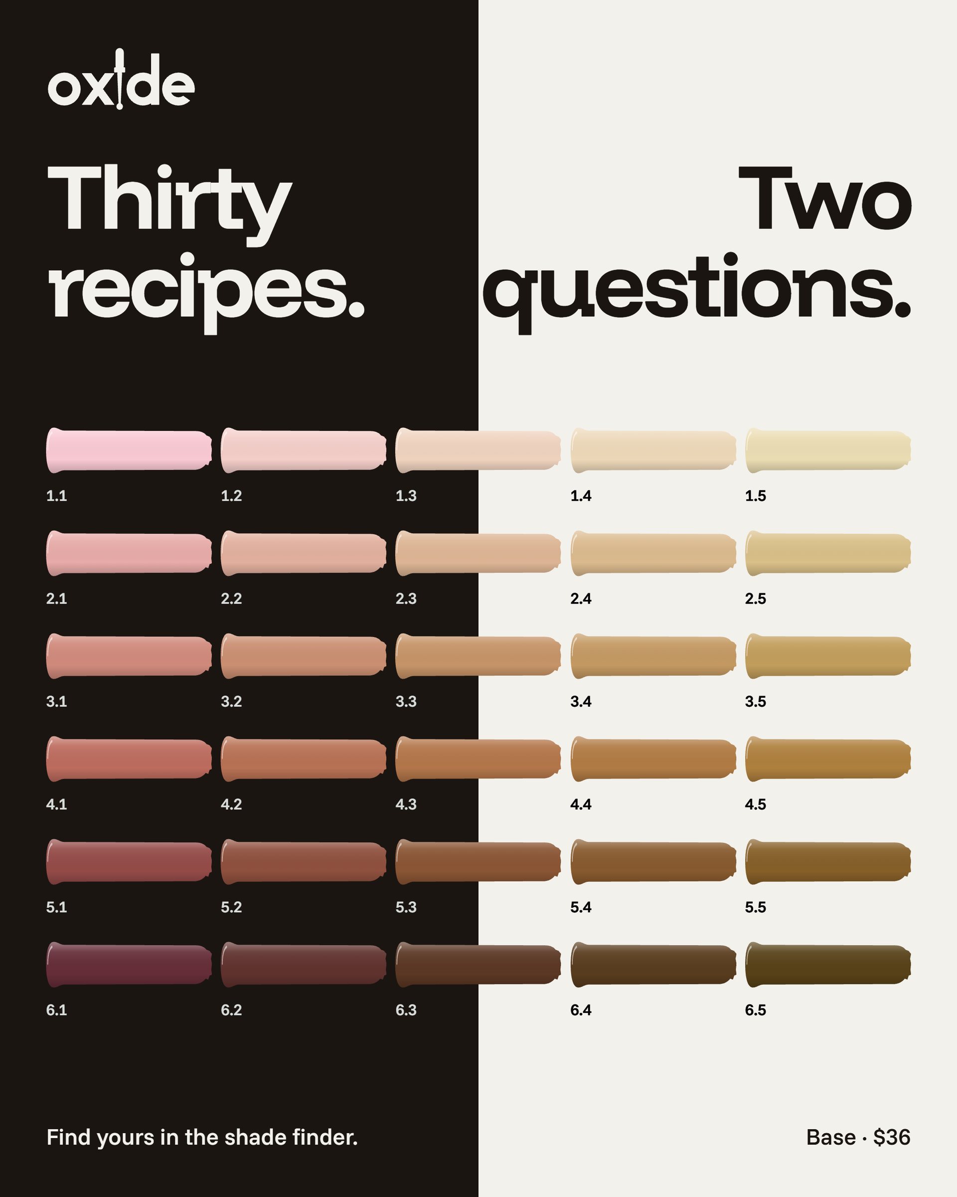
A shade is never a flat swatch. It is a stroke with a wet bead where it starts, drawn across a black and a white half; over black it reads a touch deeper, which is its coverage. All thirty Base recipes come from one rule: depth sets the white and the black, warmth splits the rest between yellow and red.
07 · Photography
Sun chart.
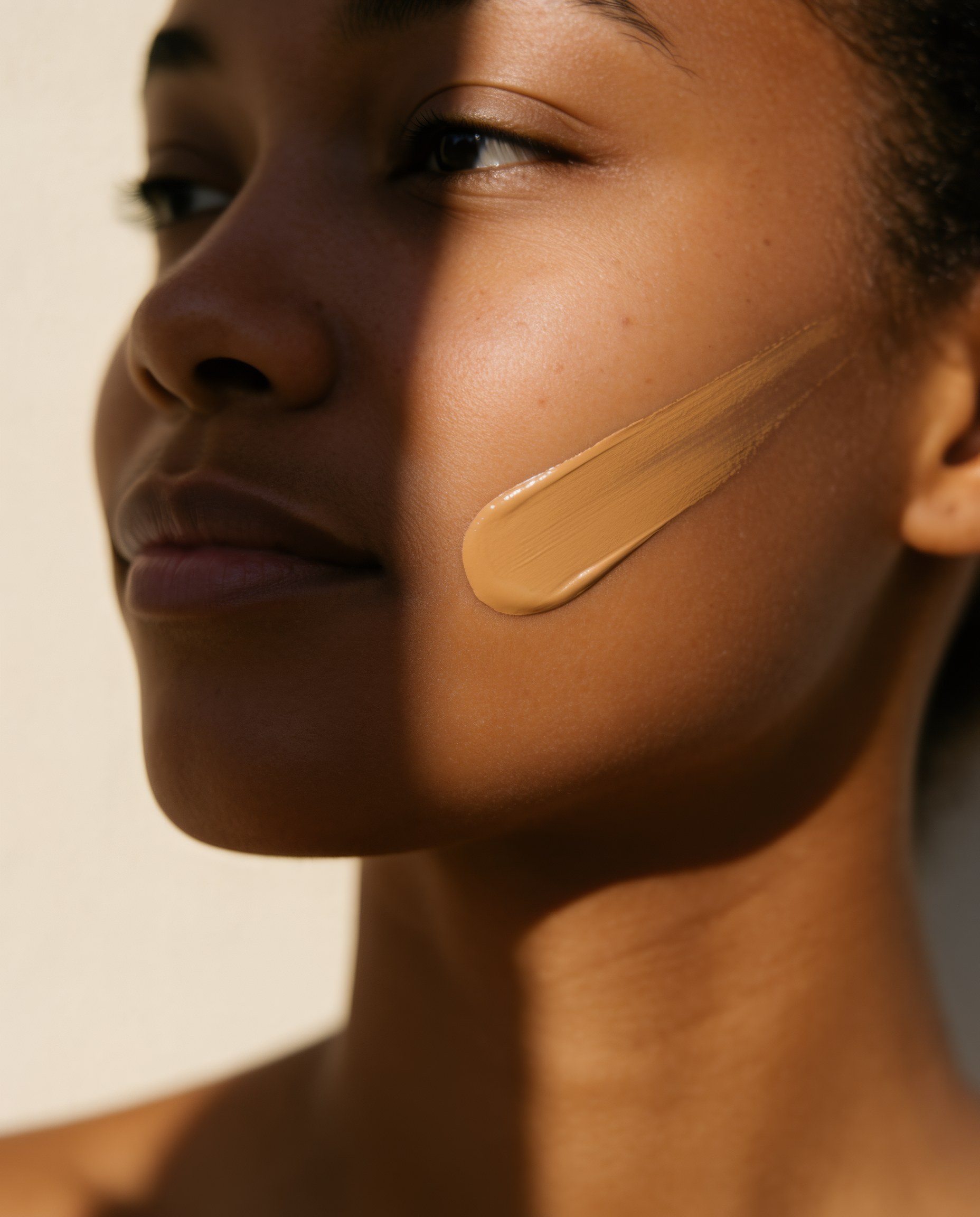
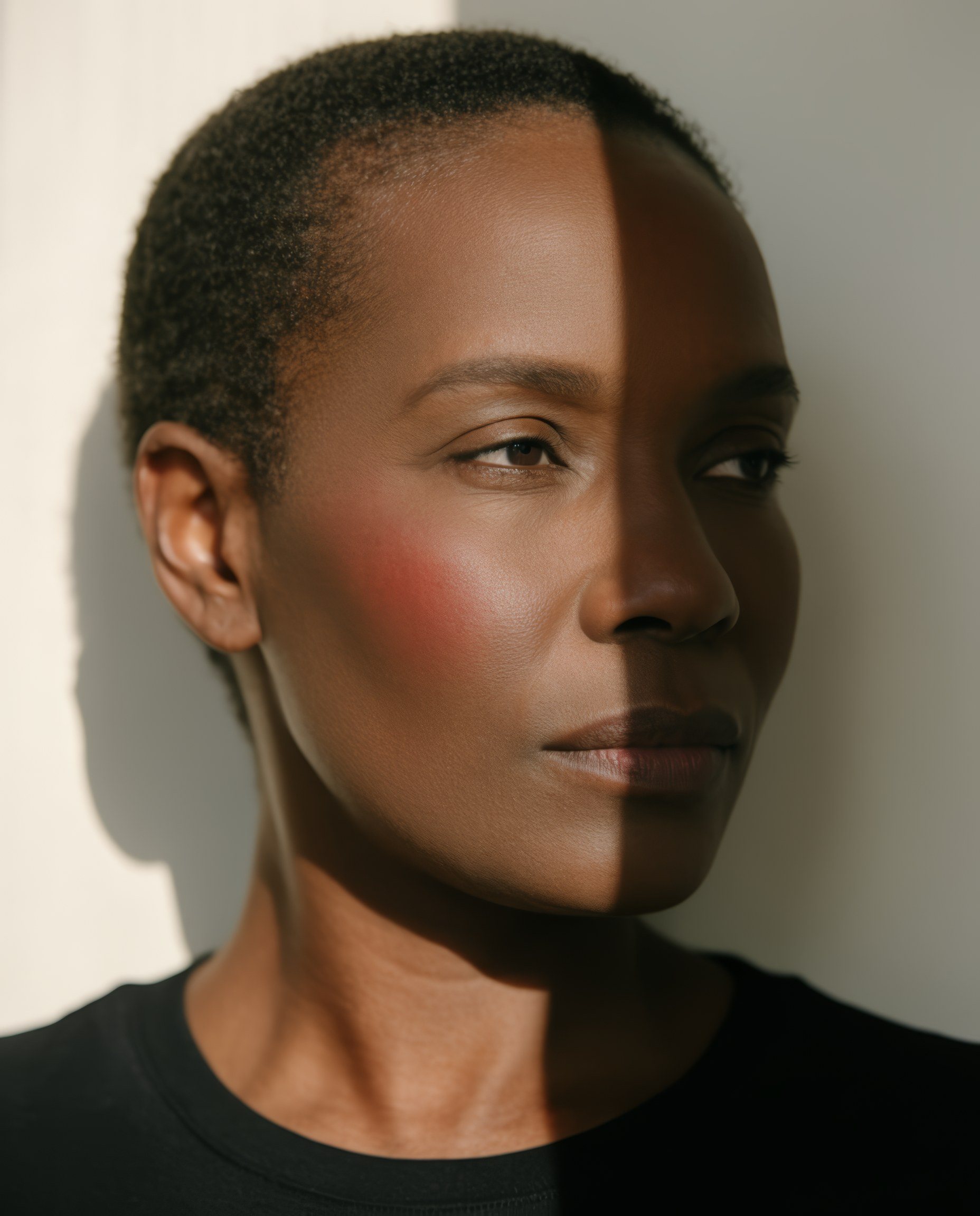
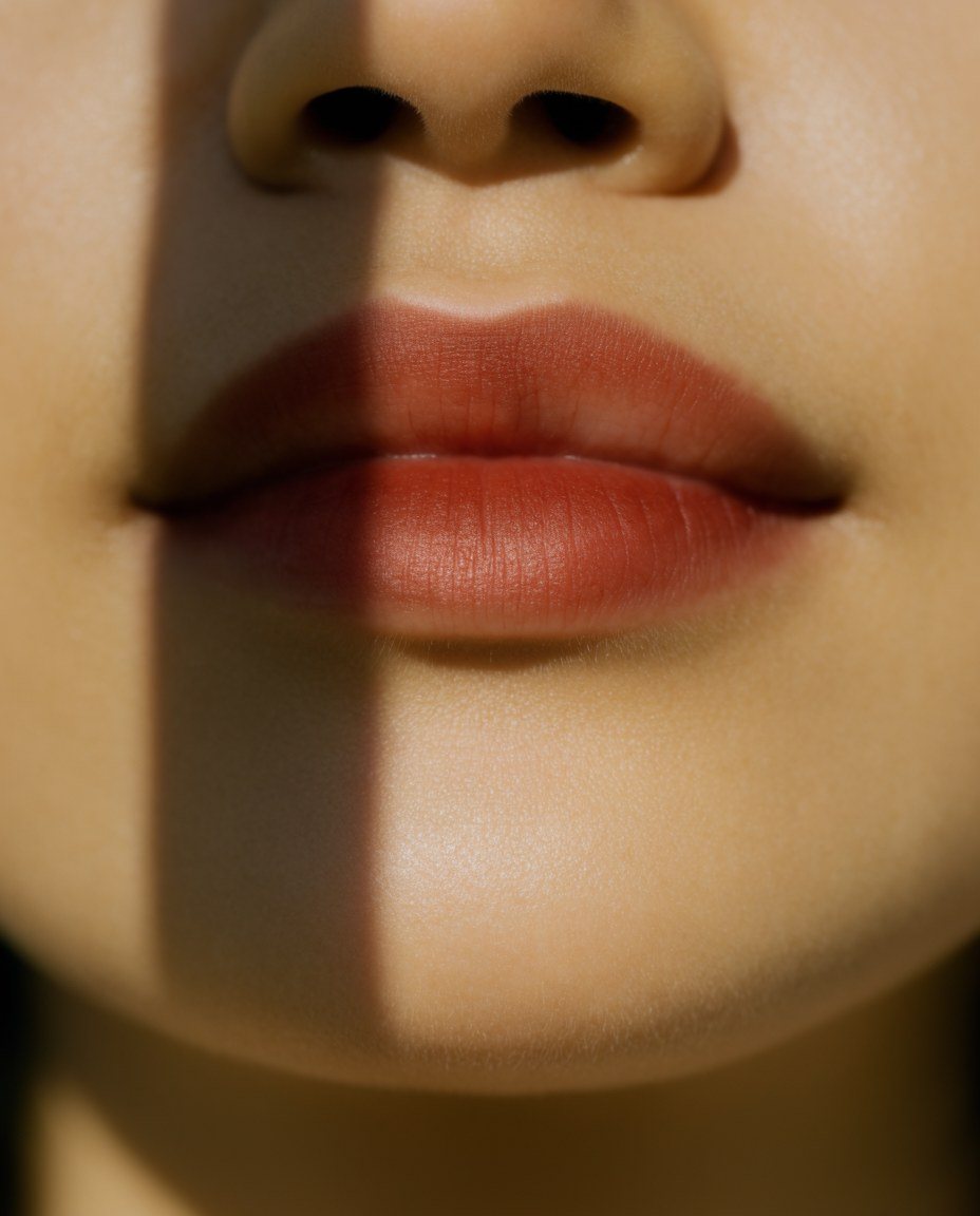
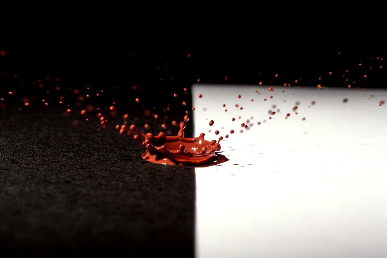
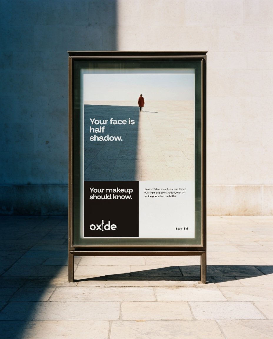
One hard, narrow light makes one straight edge between light and shadow, on a face, a plaza or a floor, or the set itself is split black and white. The product, or a stroke of it, crosses the edge. We named every product colour against the skin it sits on: left alone, the image model drew pale foundation on deep skin twice.
08 · Packaging
Every pack is the card.
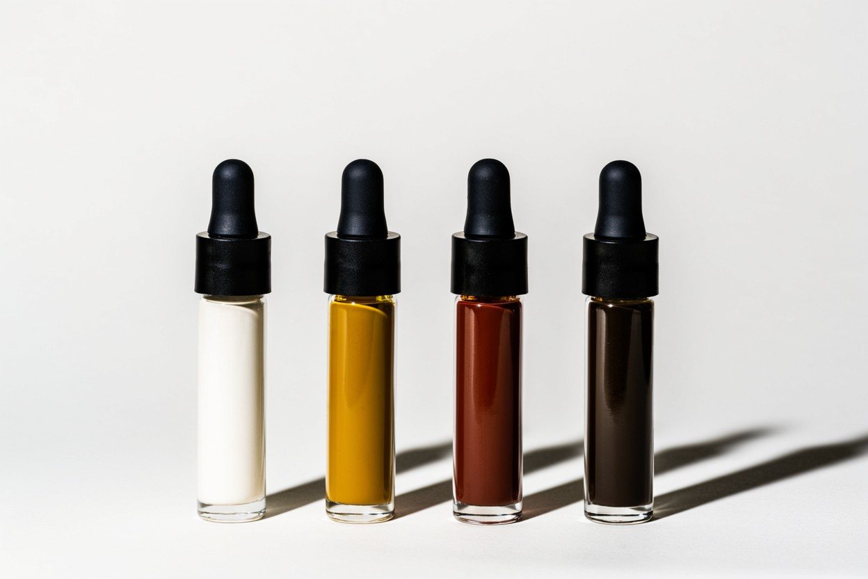
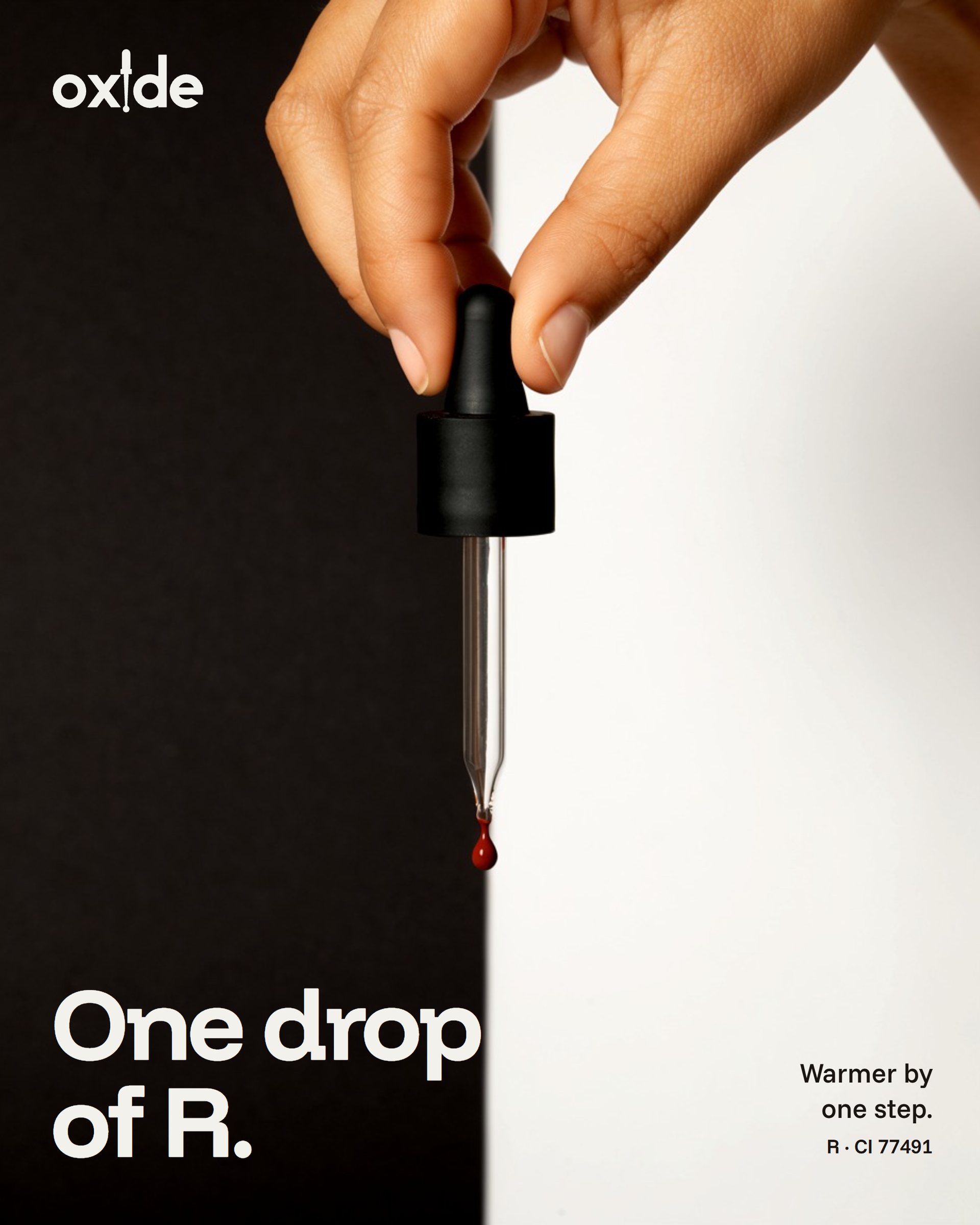
The carton is split black and white, with its own shade drawn across and its recipe printed where a name would be. The Drops lid lines up the four pigments over both halves: titanium disappears on white, black oxide on black, which is the whole idea in one lid.
09 · Flagship
A shop that shows its working.
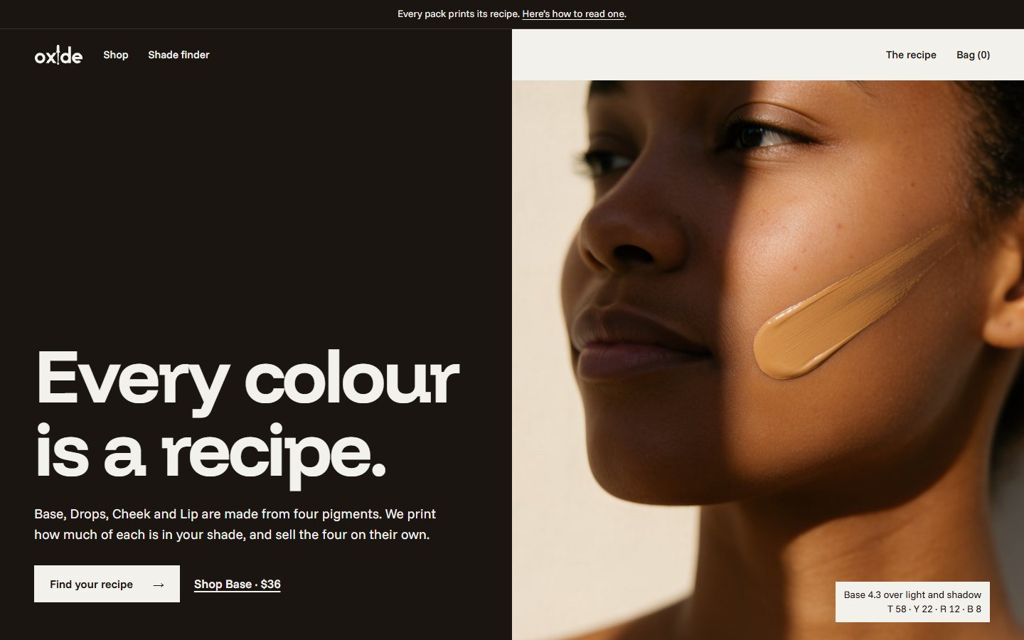
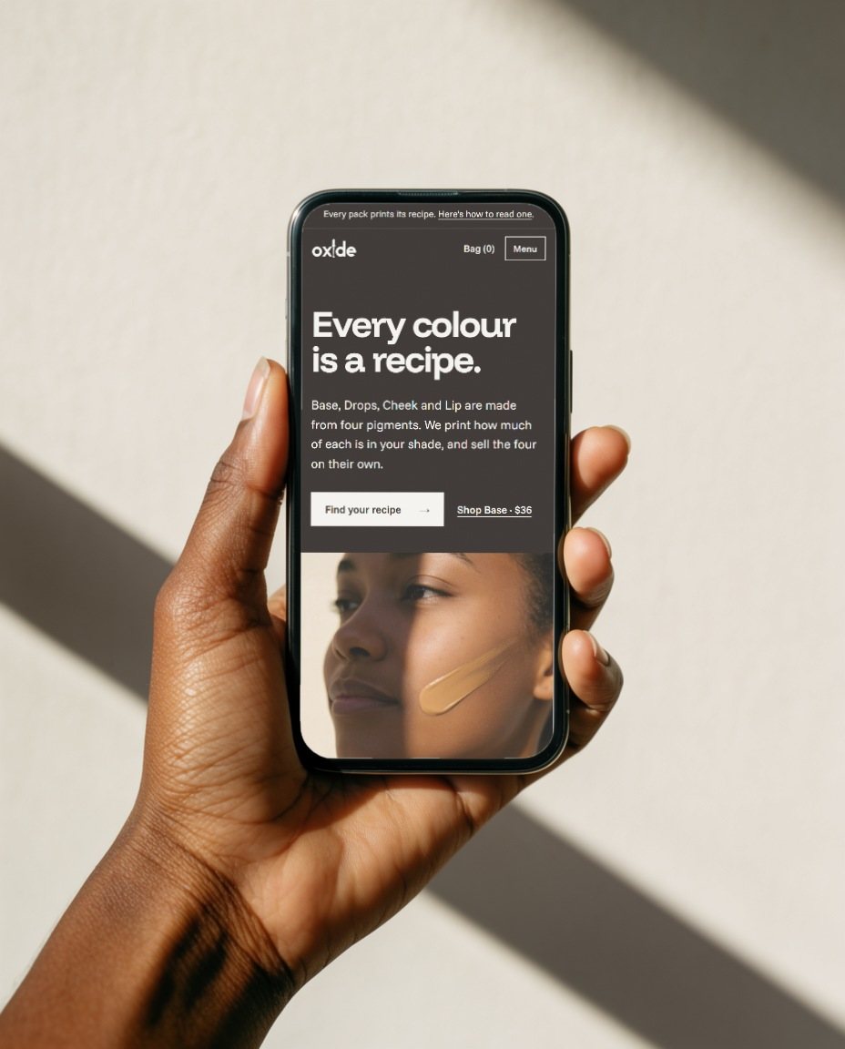
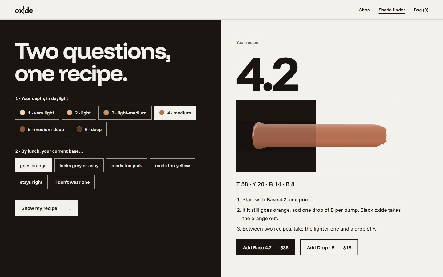
The website puts the recipe in the hero, a two-question shade finder in the nav, and the adjust table on the homepage. Every state is written in the voice, from the empty bag to the finder’s error.
10 · Everyday
Quiet, and still the card.
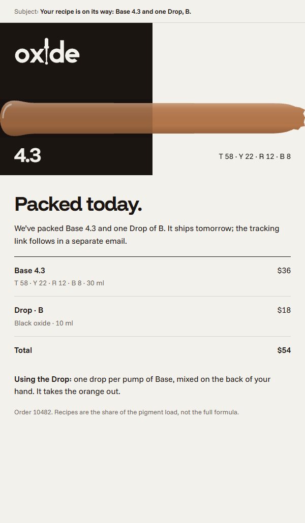
Social posts carry one pigment or one recipe each. The order email names the product and the recipe in the subject line.
- Concept
- A self-initiated concept by Signal Eight, made to show our capabilities.
- Made by
- Signal Eight
- Photography direction
- Signal Eight
- Type
- Funnel Display and Funnel Sans (OFL)
Next case study
nota
Digital dollars for businesses that pay suppliers across borders. The o of the wordmark is a see-through register: two printed halves, the sender's and the receiver's, that complete only when the money lands.