Case study · 2026
AMP
An identity for a portable speaker whose feature is range. The speaker's face became the a, its light line the counter, and the counter fills with orange to show how far the sound reaches.
- Client
- AMP
- What we made
- Strategy, Identity, Photography, Art direction

AMP is a portable speaker for 18 to 24 year olds that keeps playing up to 150 m from your phone. We built the brand around one idea: distance is the unit. The mark is drawn from the product itself, and it measures.
01 · The brief
A speaker whose feature is distance.
Portable speakers sell loudness, bass and toughness, usually in the same orange-and-black. AMP's difference is range: it keeps playing when the phone is 150 m away, and many AMPs can play as one.
The audience is 18 to 24. They carry the speaker like a bag, not like gear.
02 · The idea
Distance is the unit.
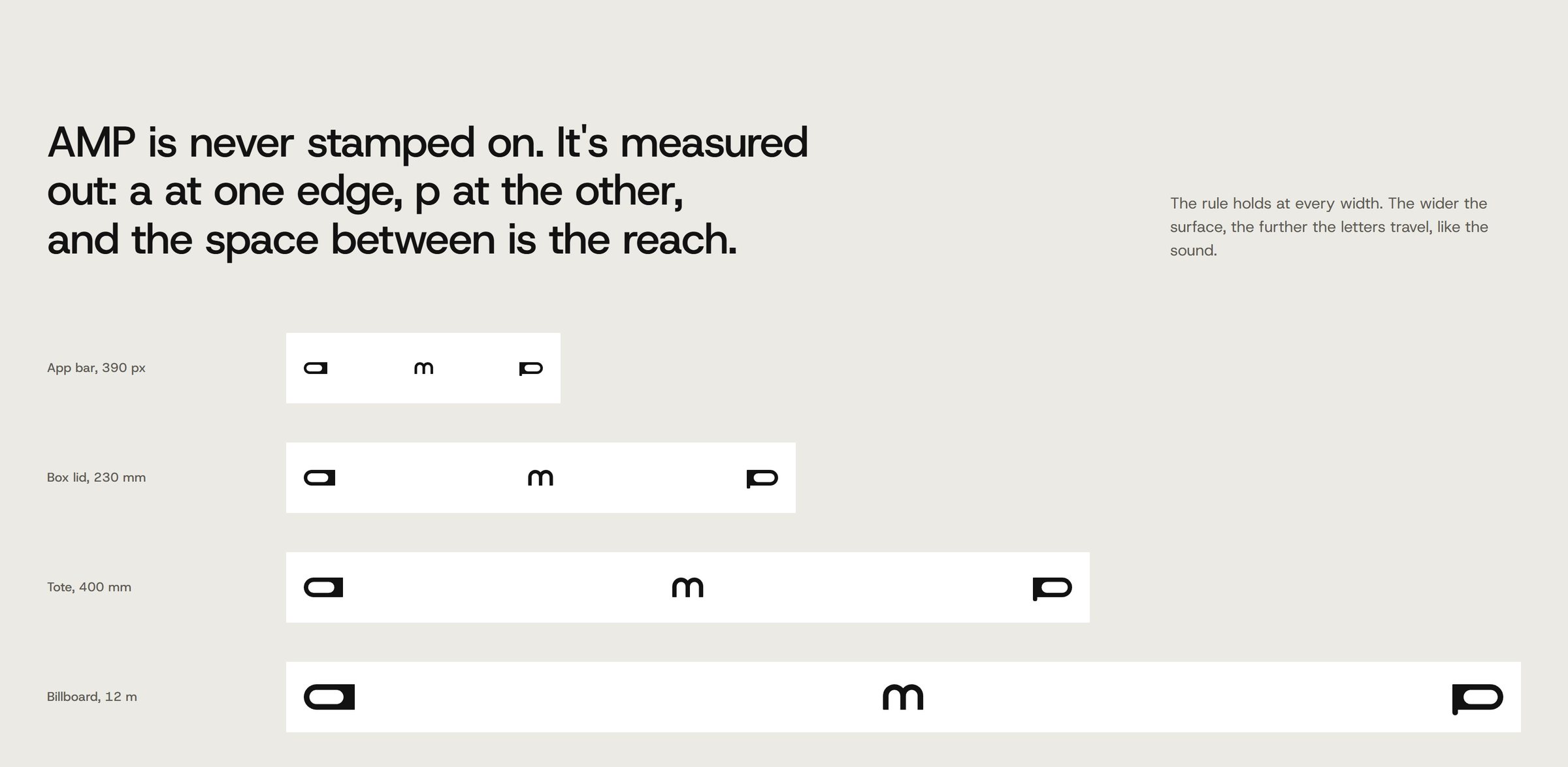
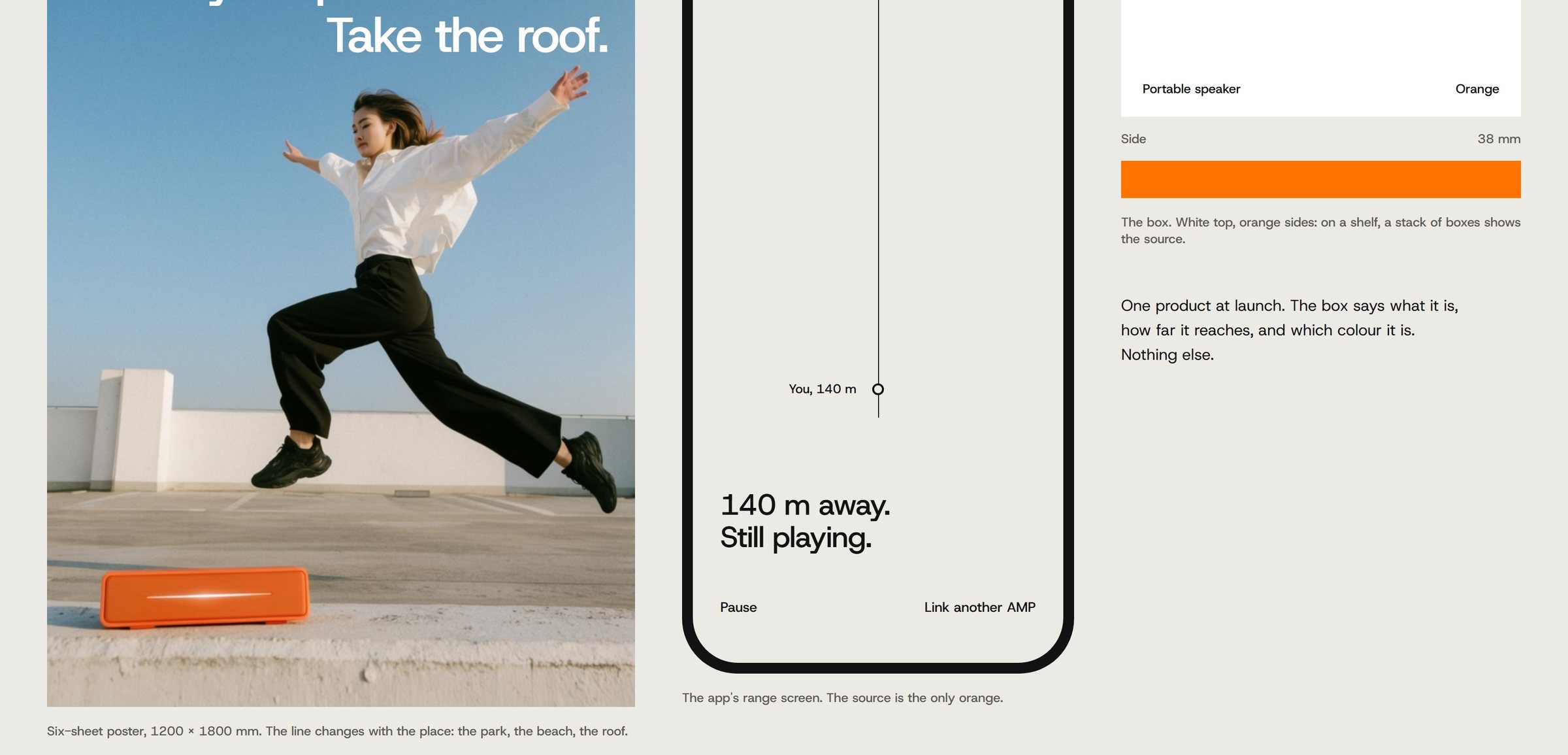
Every decision measures. Frames are wide and quiet, with people far from the speaker. The name is spread across a surface: a at one edge, p at the other, the space between as the reach.
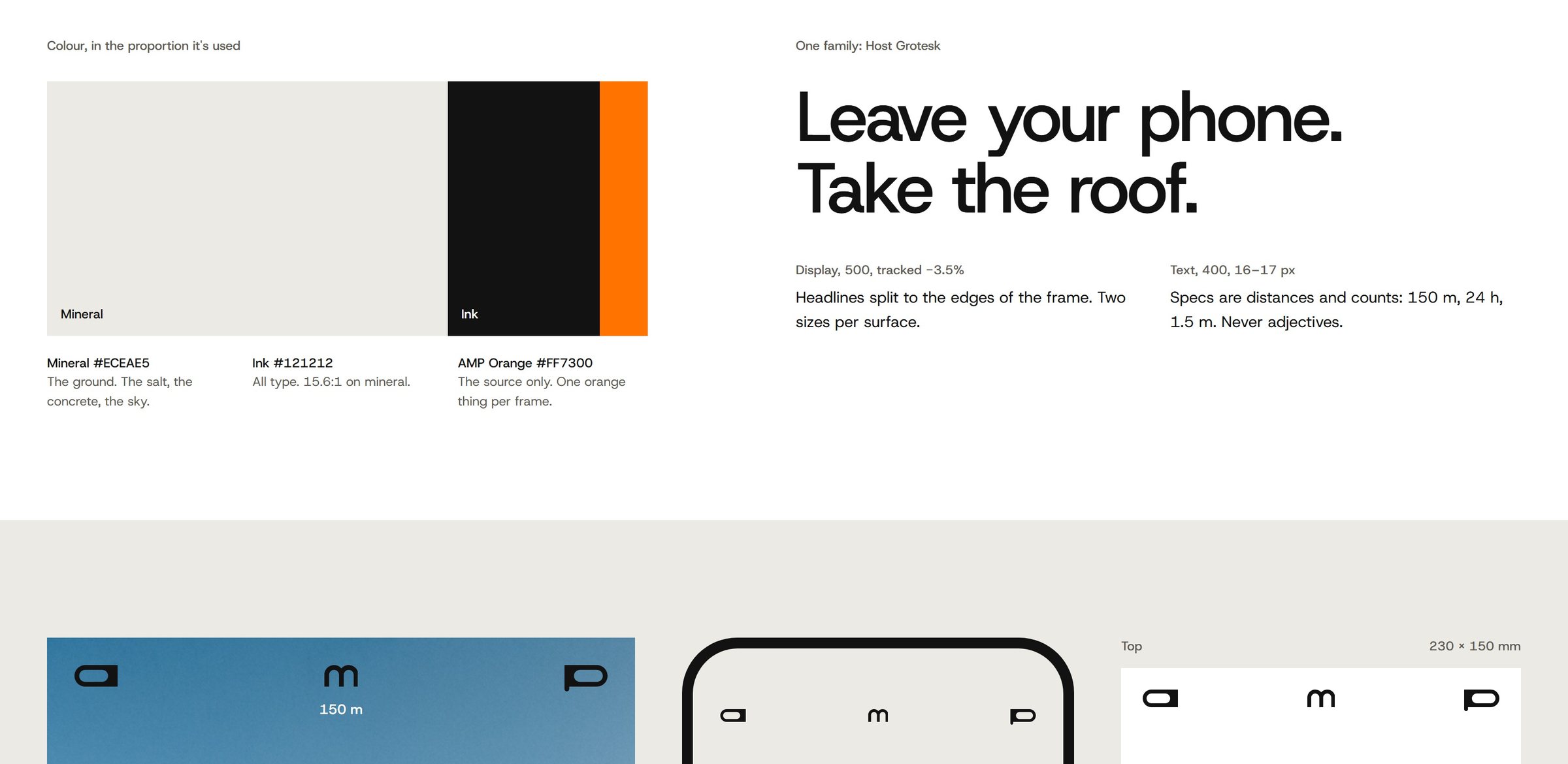
Orange marks the source and nothing else. One orange thing per frame.

03 · The signature
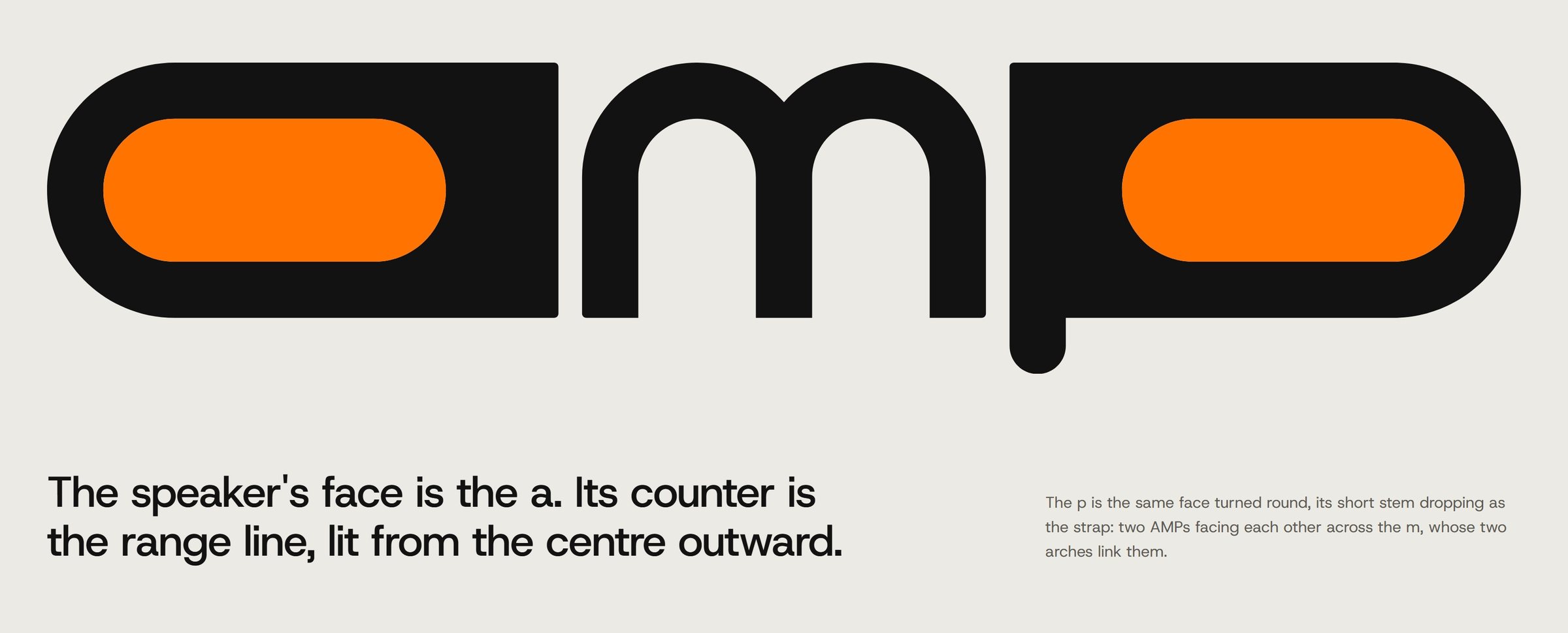
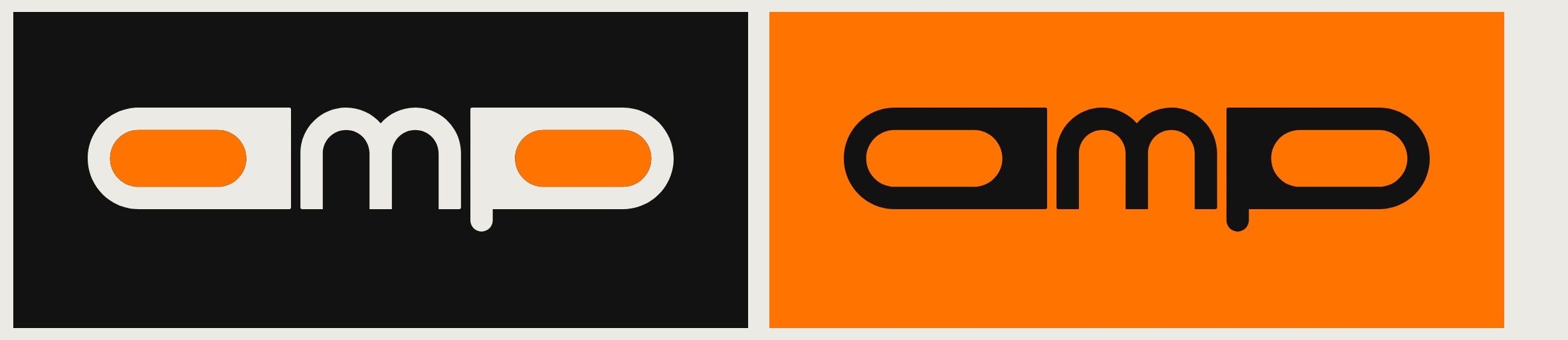
The speaker's face is the a.
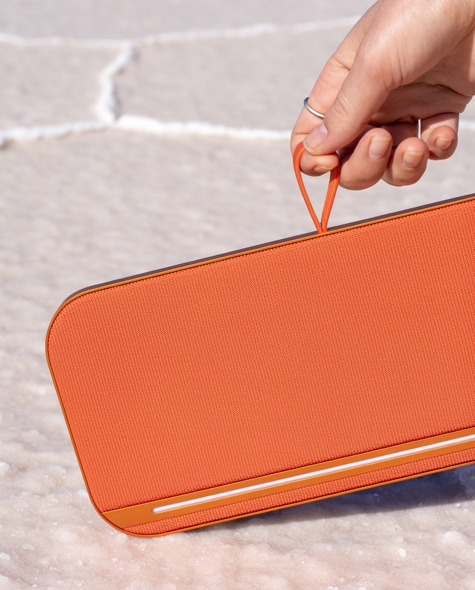
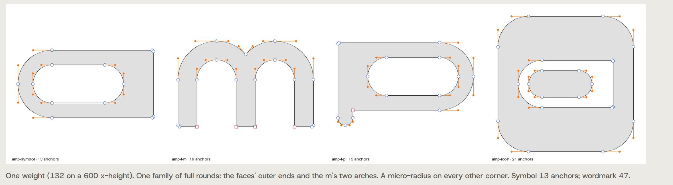
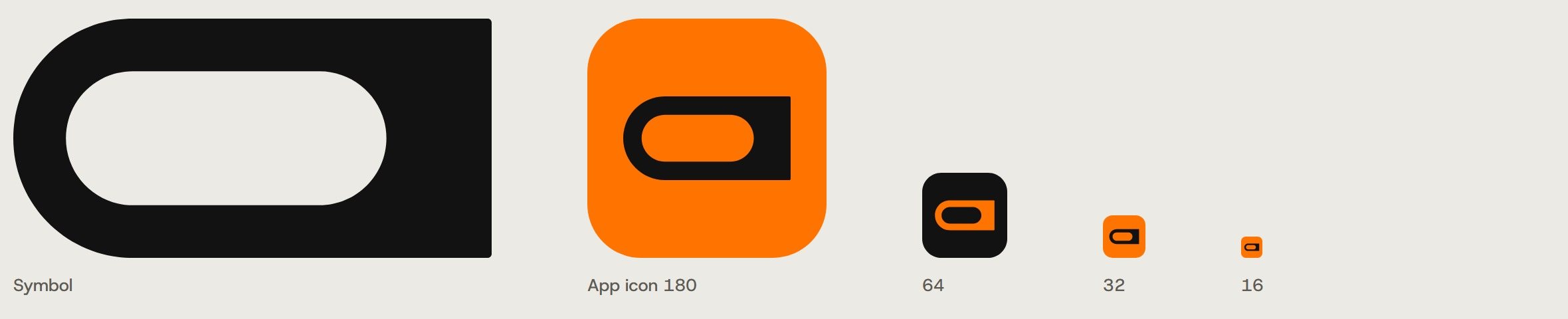
The product is a slim slab with one thin light line along its edge. Drawn as a letter, its face is the a: a full round at one end, the stem at the other, and the light line as the counter.
The p is the same face turned round, its short stem dropping as the strap. The m's two arches link the faces, so the whole name reads as one long speaker.
04 · The gauge
The mark shows how far.
On the product, the light line fills from one end to show how far away the phone is. The mark does the same: orange sweeps each counter from the centre outward and comes to rest full.
Full orange is the mark at rest, and plain ink its one-colour version. The sweep plays wherever the mark can move: the app, the site, the launch film.

05 · The world
Measured out, never stamped on.
Posters carry the span and a distance. The app's range screen is a single line from you to the speaker. The box says what it is, how far it reaches and which colour it is. Nothing else.
- Concept
- A self-initiated concept by Signal Eight, made to show our capabilities.
- Made by
- Signal Eight: strategy, identity, art direction
- Images
- Art-directed to one rule: people far from the speaker, one orange thing per frame
- Type
- Host Grotesk (Element Type, SIL Open Font License)
Next case study
Paddock
A brand for Paddock, a private car storage club in New York and Miami: a hexagonal P, a quiet editorial voice and cars lit like sculpture, carried through film, events, the website and the app, and revised in 2026.