Case study · 2026
Bonny
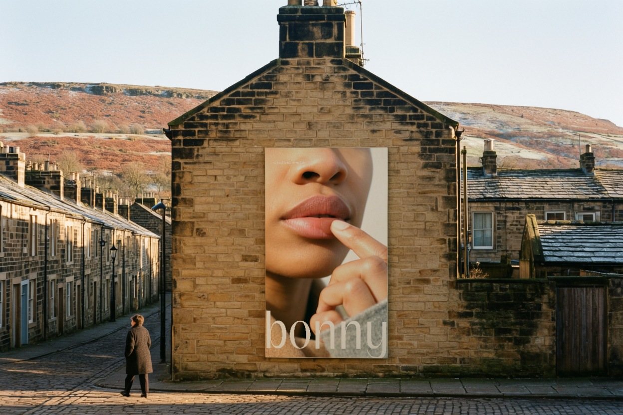
Colour cosmetics for looking well rather than made up. Sheer balms put colour where cold air does, and the brand's one device is a real fingertip press of the product, shown in every shade.
- Client
- Bonny
- What we made
- Strategy, Naming, Identity, Art direction, Packaging, Web
Signal Eight created Bonny, colour cosmetics for people who would rather look as if they'd been out than made up. The system centres on a monogram drawn from the name's own typeface and a real fingertip press of the balm, carried across cartons, posters, photography and the website.
01 · The category
Makeup sells a finished face.
We looked at forty-one beauty brands, from the prestige houses to the design-led independents. Most of the category speaks in pink, nude and greige, shot on a studio sweep with dewy skin up close. The finish is the promise.
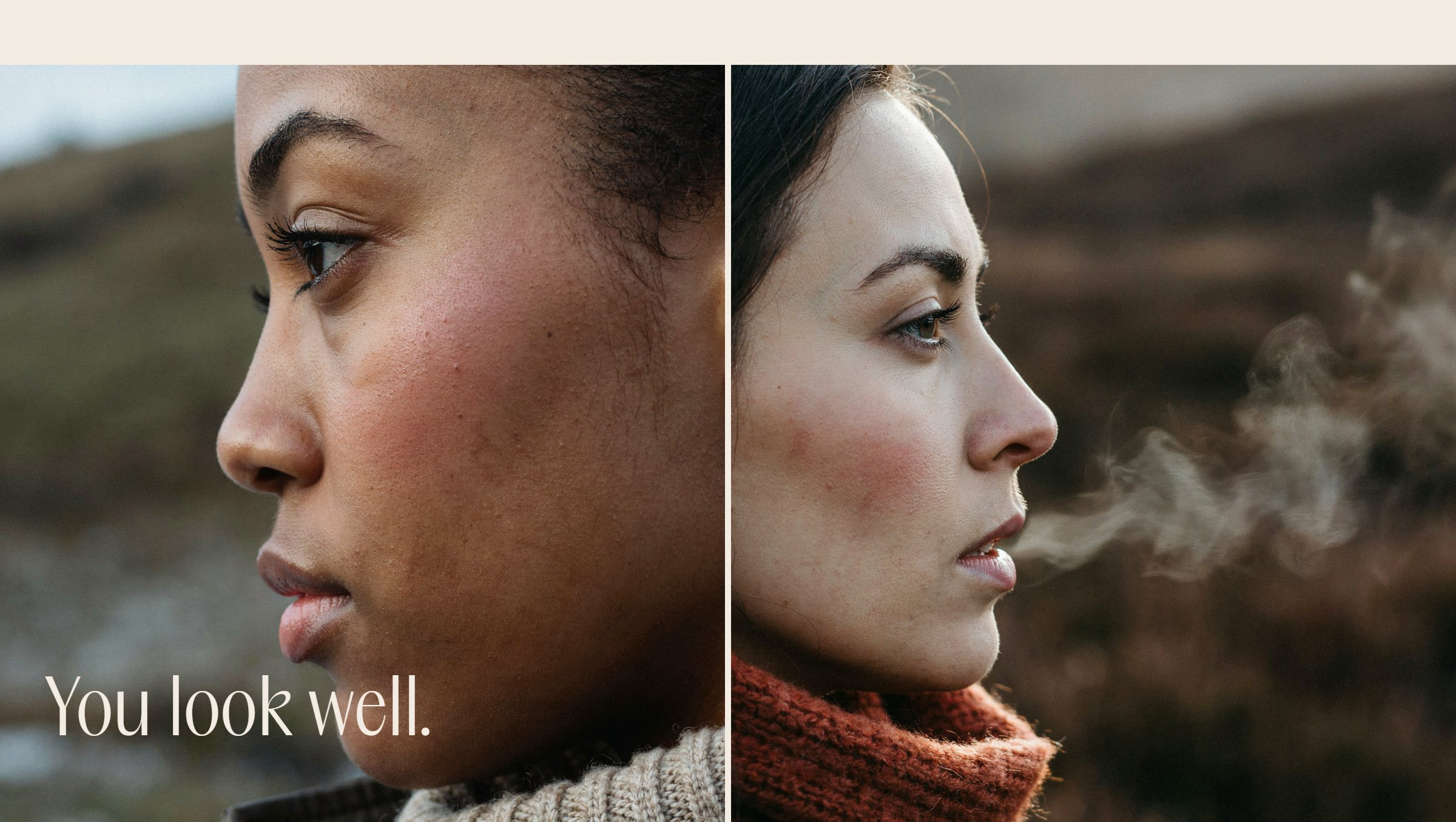
Plenty of people want the opposite: colour that reads as their own good health, the look of someone who has just come in from a cold walk.


02 · The idea
Colour like you've been out.
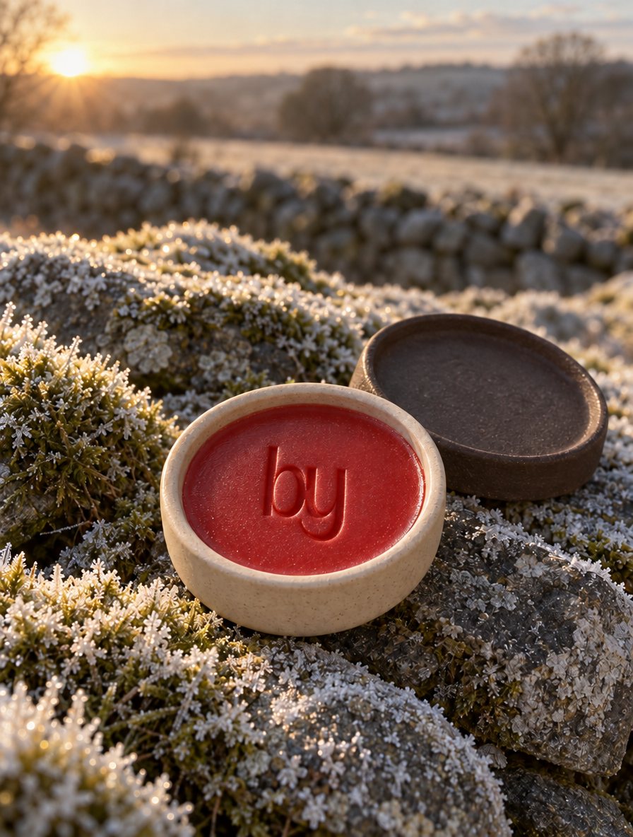
Bonny is an old word from Scotland and the North of England for pretty in a healthy, rosy-cheeked way. The brand takes it at its word. Its balms put colour where weather puts it: the tops of the cheeks, the bridge of the nose, the tops of the ears and the lips, a touch more on one side.
That one idea sets every decision. The colours come from heather, bracken and frost, every photograph is taken outdoors in cold light, and the voice pays the compliment people give a face with colour in it.

03 · The mark
One hand.
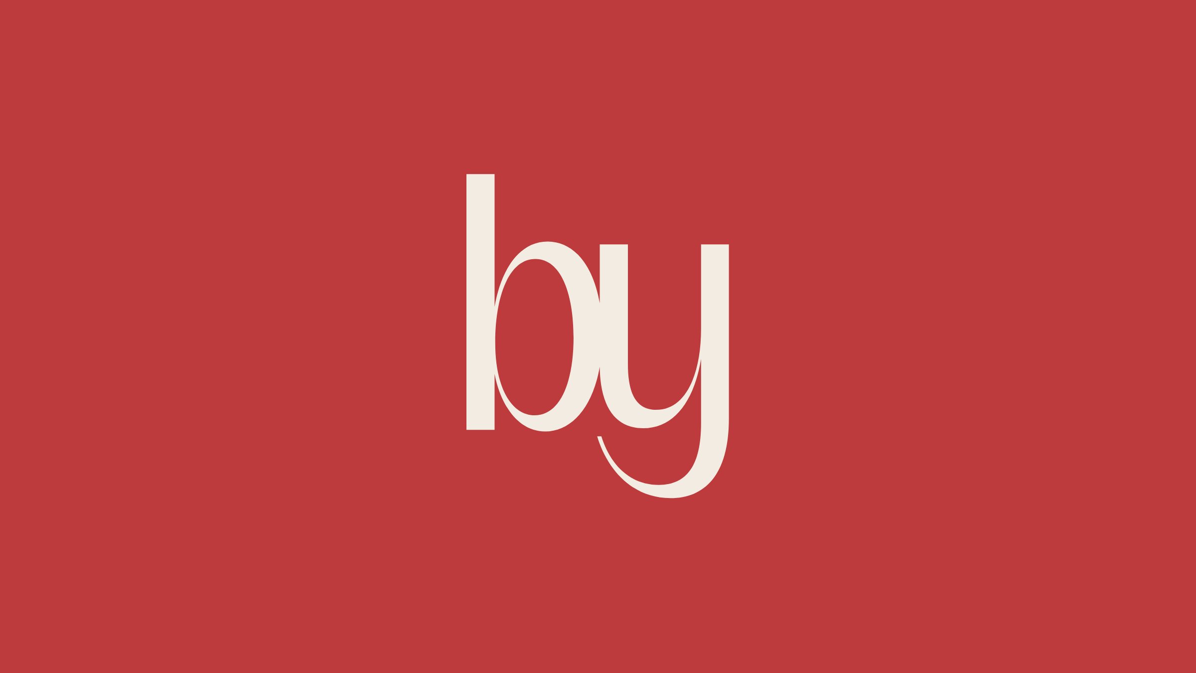
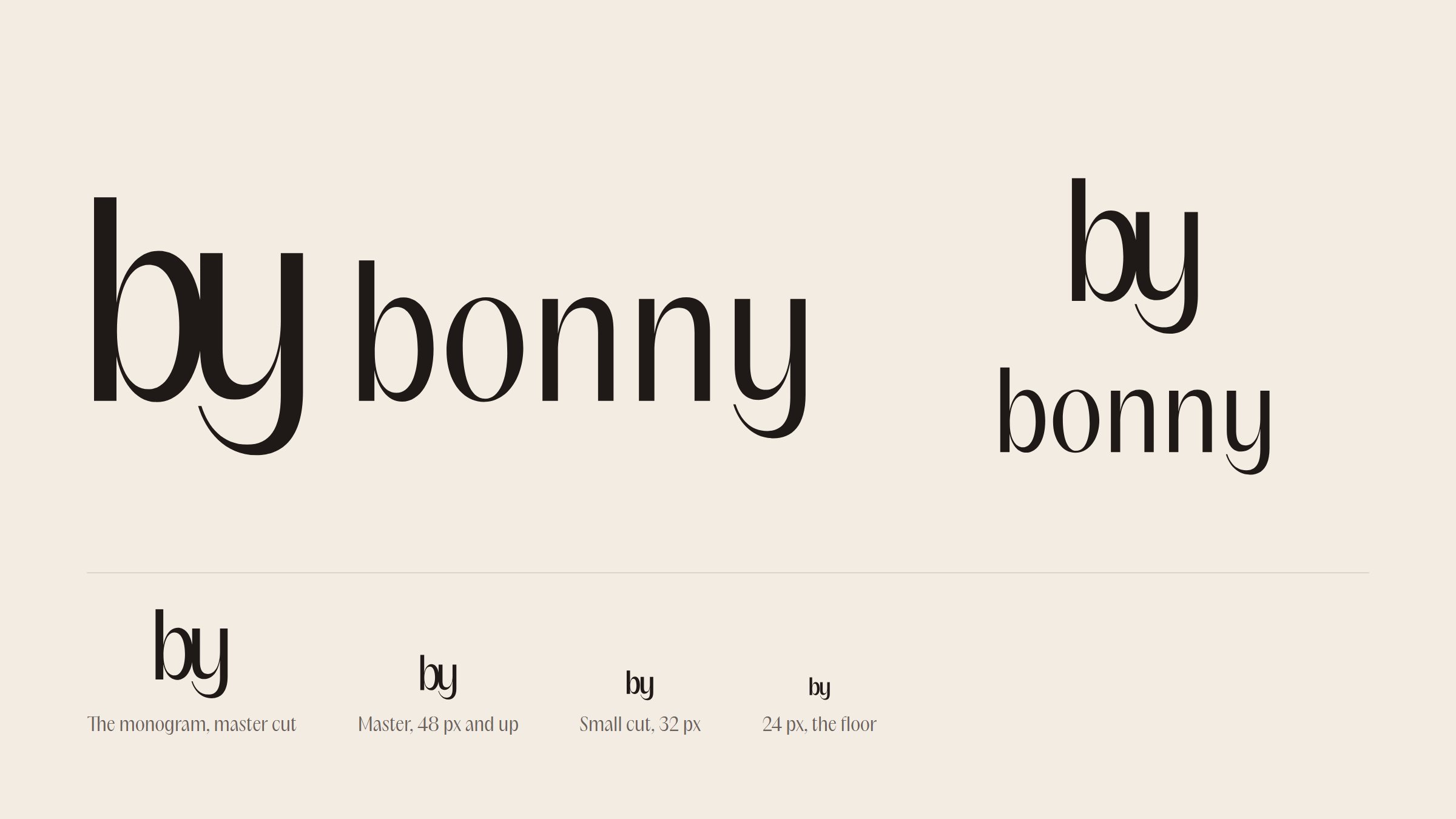
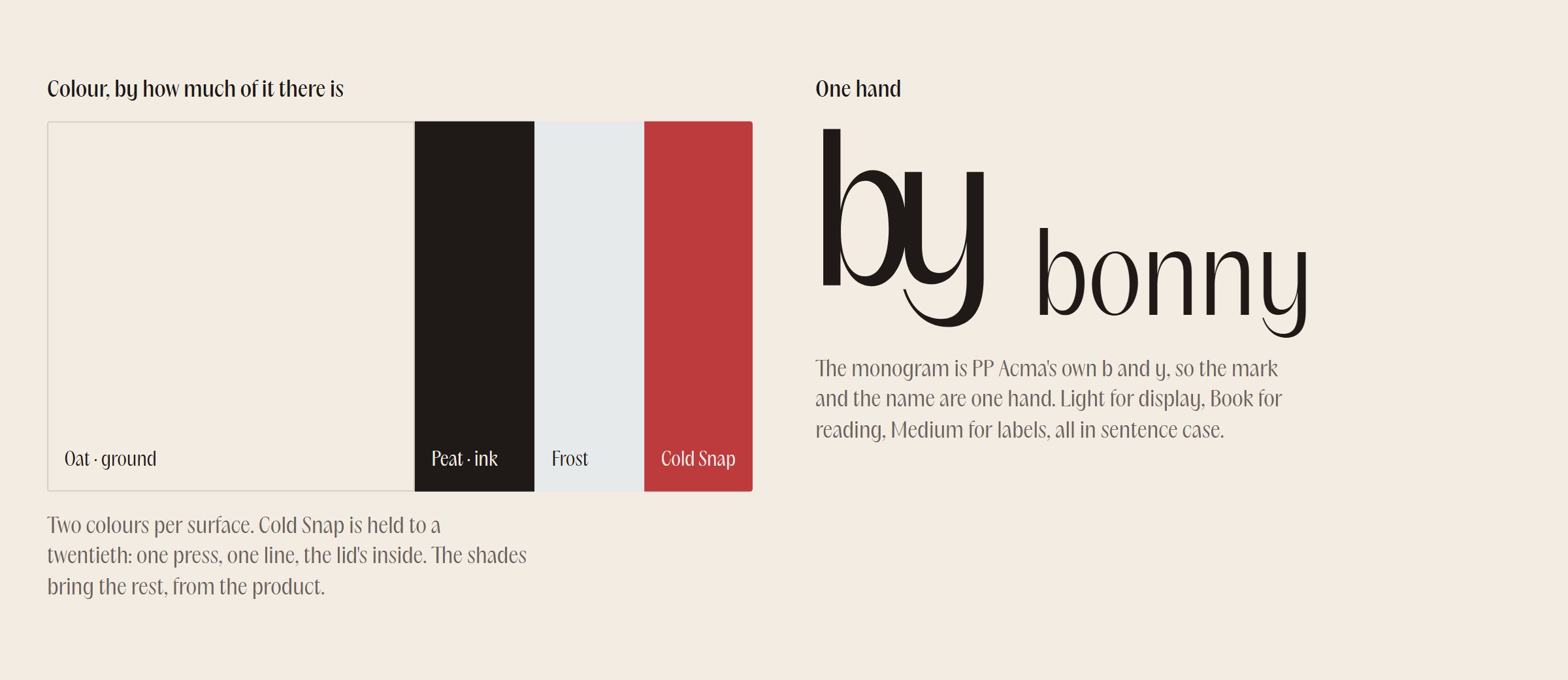
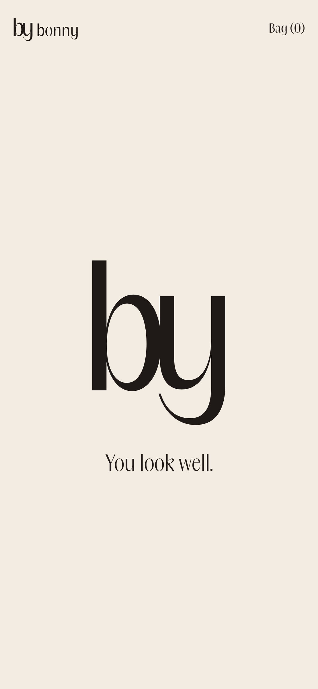
The name is set in PP Acma Book, a warm serif with a soft swell in its curves. The monogram is Acma's own b and y, set until they touch, the y's tail tucked under the bowl of the b. The mark and the name are one hand, and the monogram reads as a signature: by Bonny.
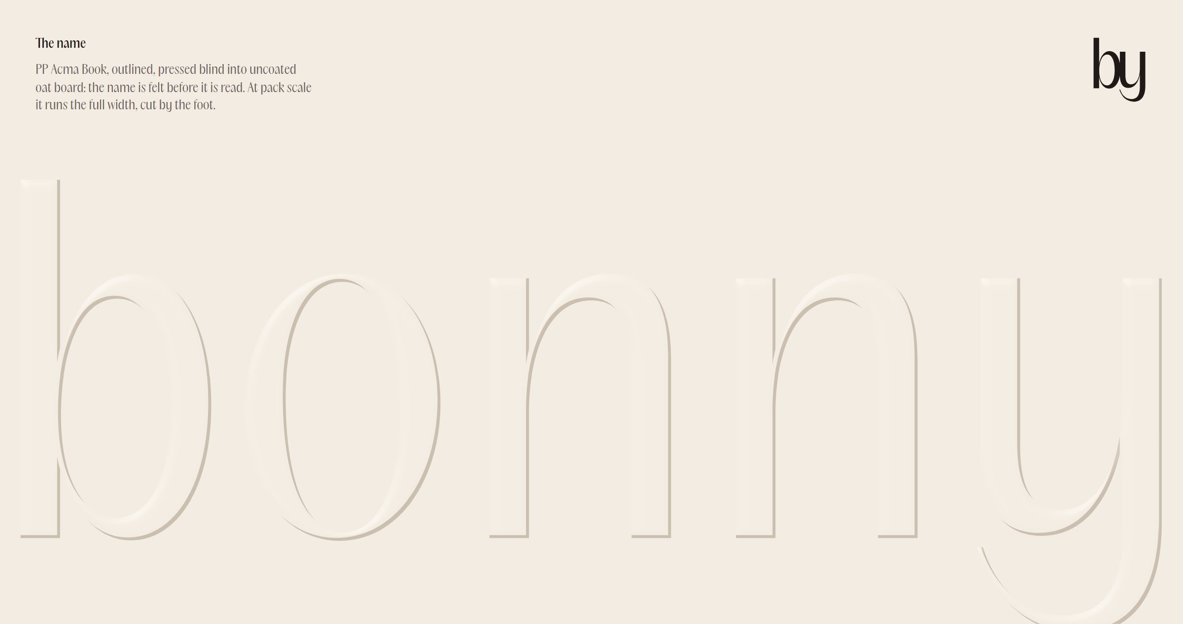
On card the name is pressed blind into uncoated oat board, so it is felt before it is read.
04 · The device
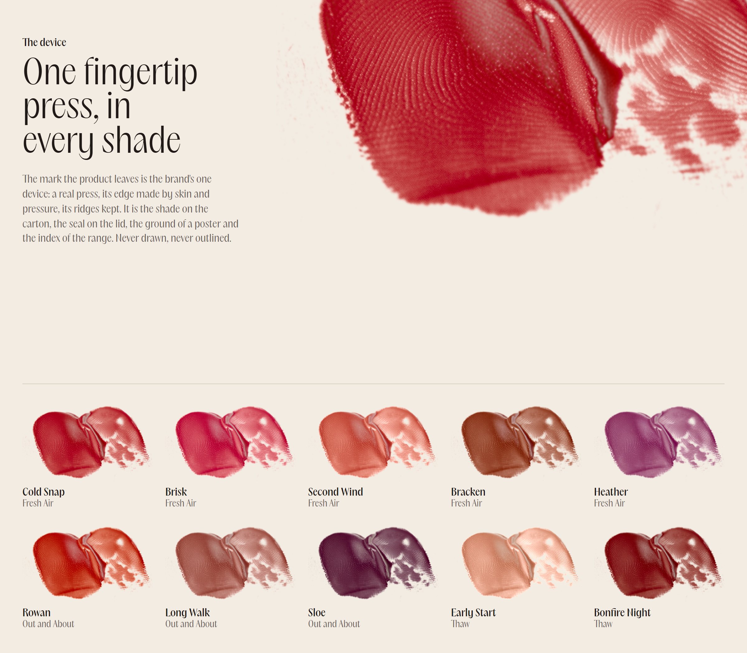
One fingertip press, in every shade.
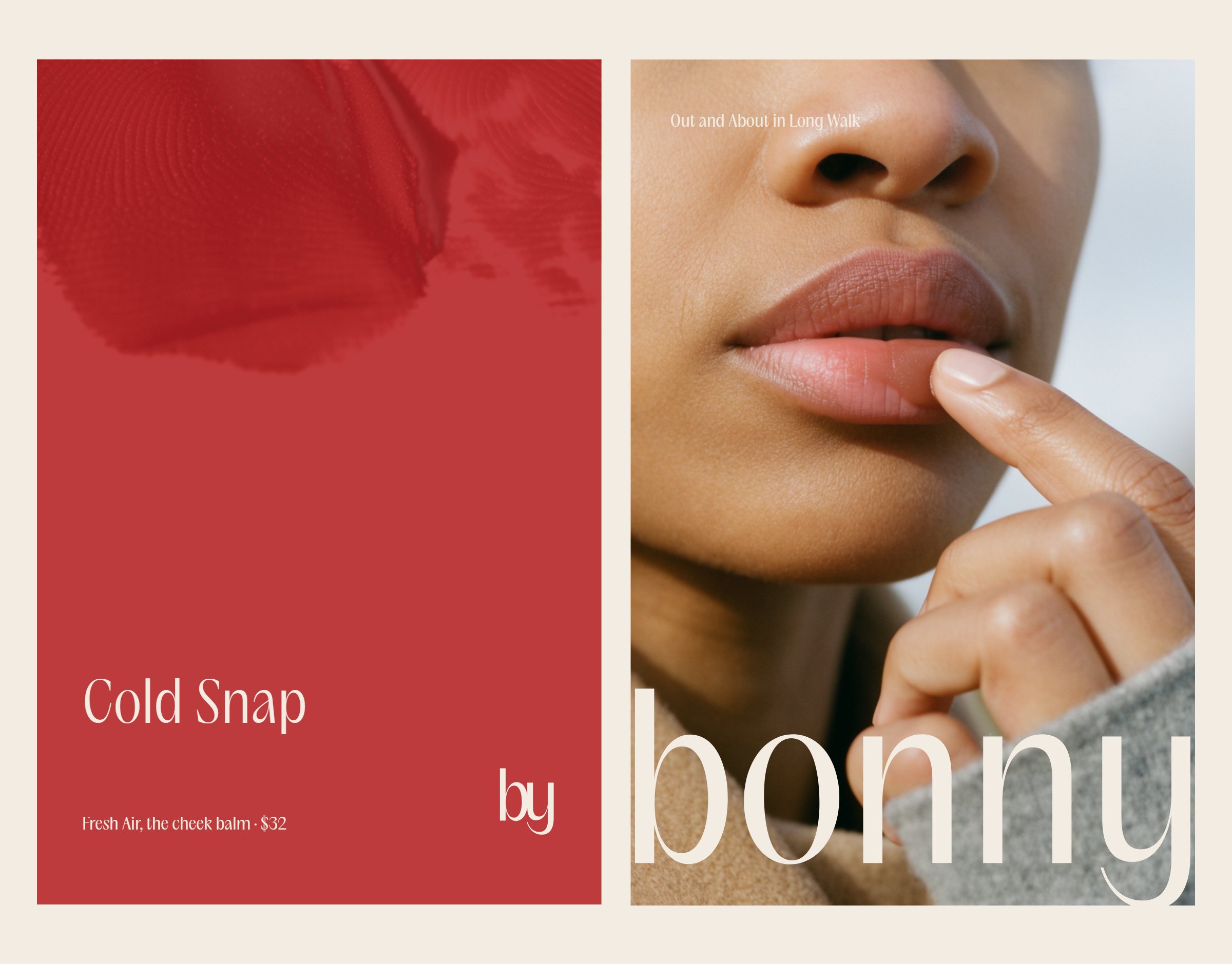
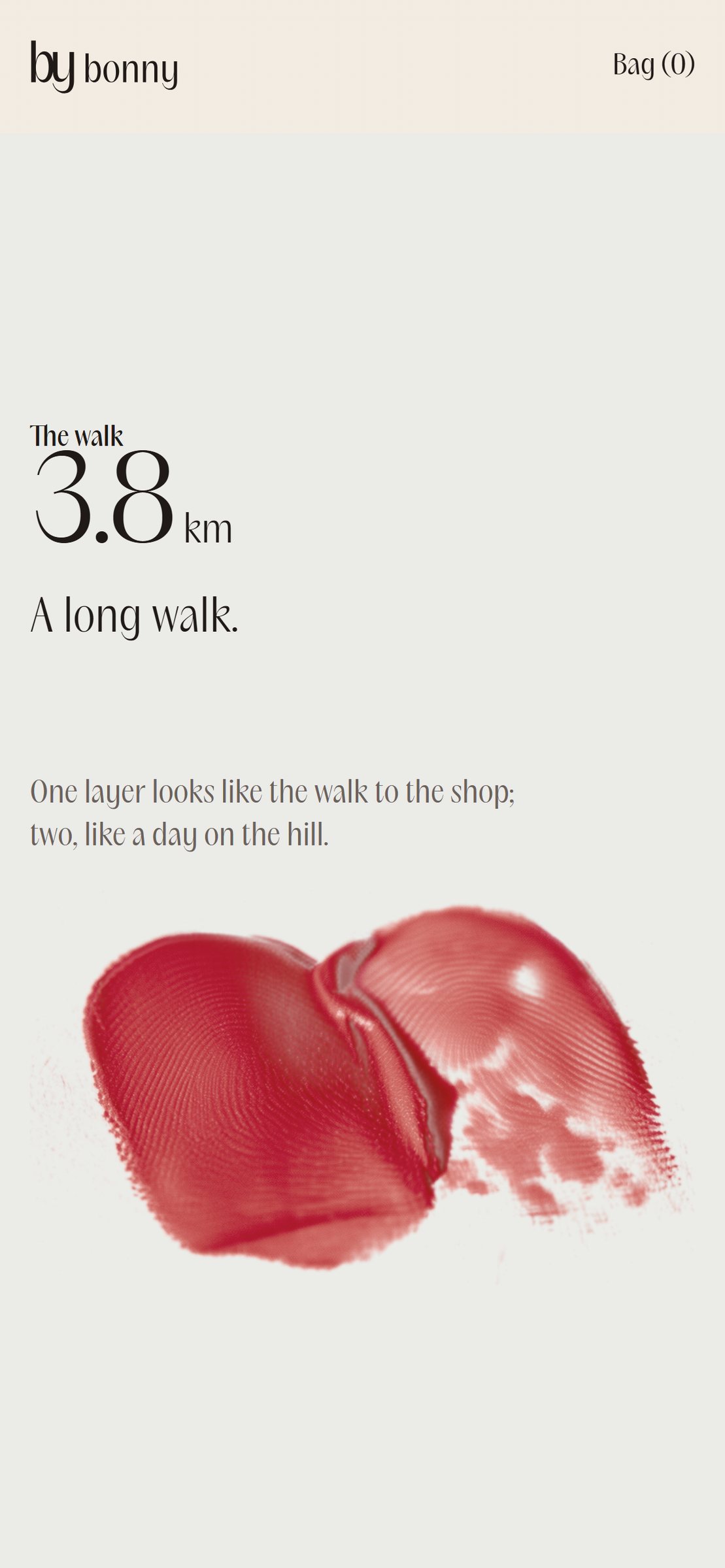
The mark the product leaves is the brand's one device: a single real press of the balm, its edge made by skin and pressure, its ridges kept. It is recoloured into all ten shades with its light and shadow intact.
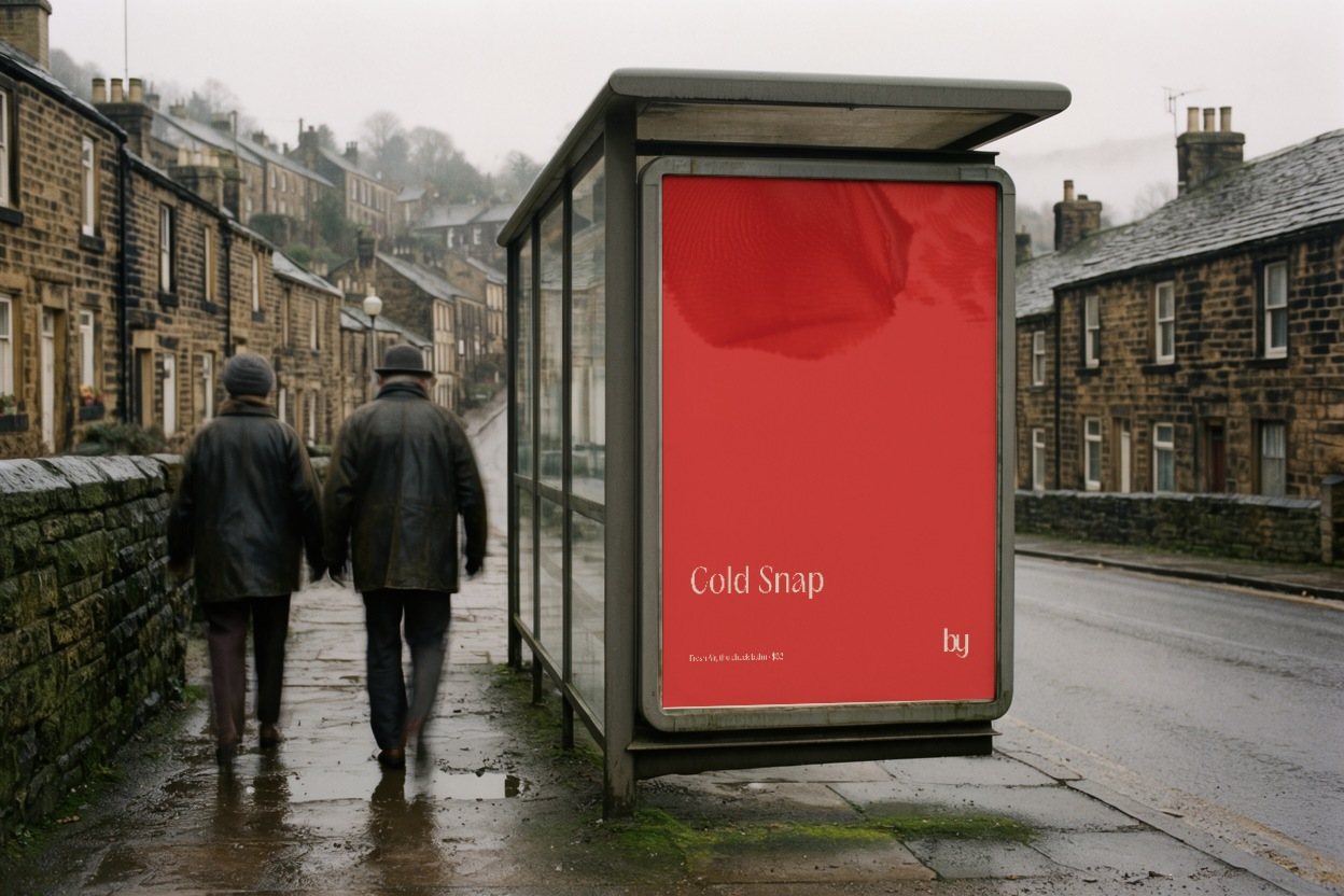
It does every job a pattern would. It is the shade on the carton, the ground of a poster and the index of the range.
05 · The pack
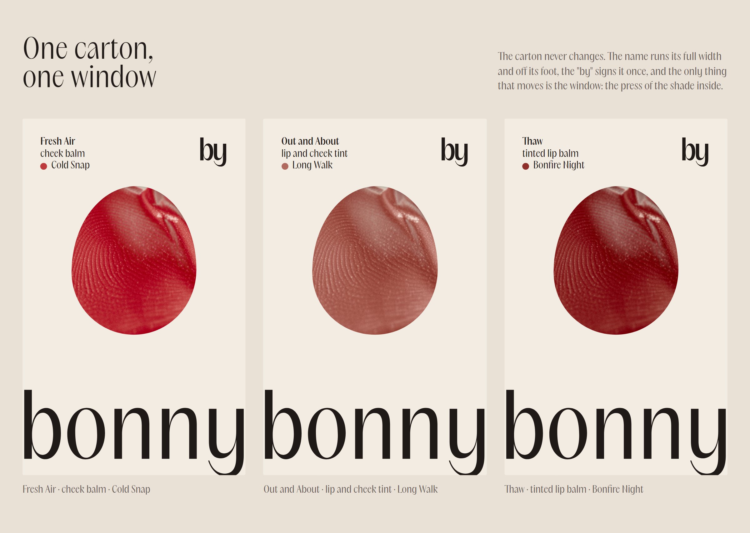
One carton, one window.
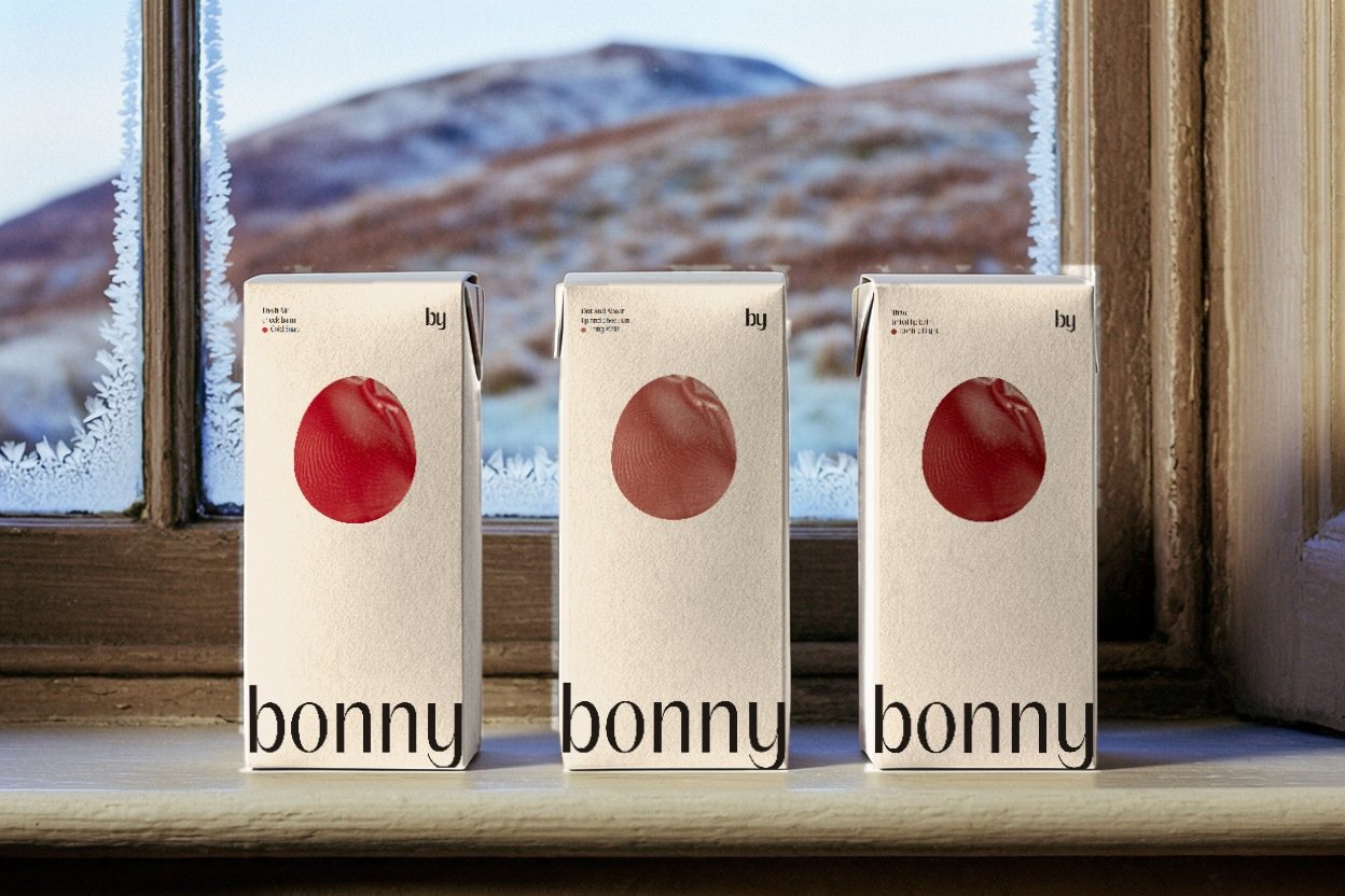
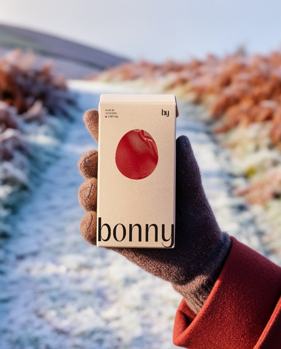
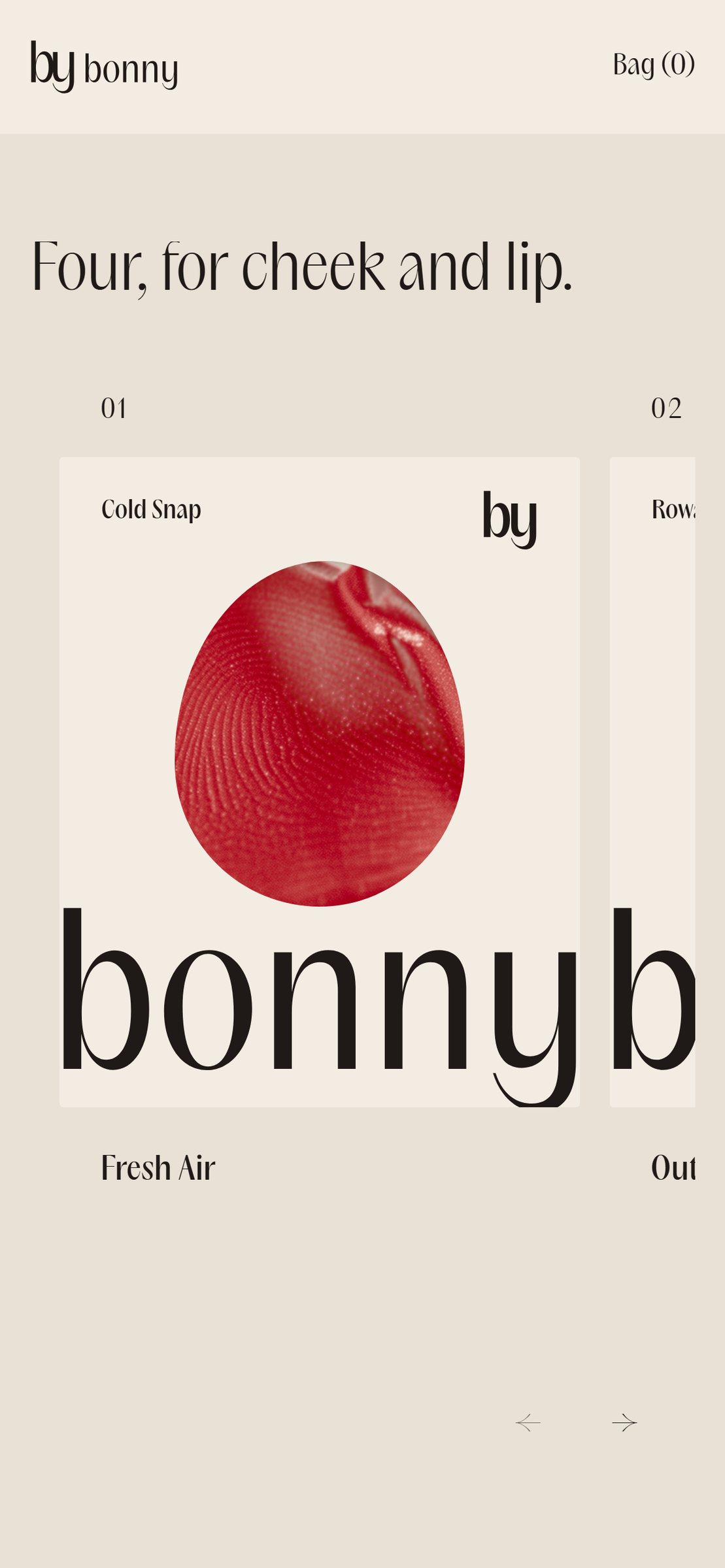
The carton never changes. Product, type and shade sit top left, the monogram signs it once, and the name runs the full width and off the foot. The only thing that moves is a fingertip-shaped window showing the press of the shade inside.
On the balm itself the monogram is pressed into the surface, so it wears away with use.
06 · Colour and type
Oat, peat and one flush.
The grounds come from the northern landscape: oat for paper, peat for ink, frost for winter. Cold Snap, the clear red of a cold cheek, is the brand's own colour and is held to about a twentieth of any surface. The ten shades bring the rest, from the product.
One family of type in three weights, light for display, book for reading and medium for labels, all in sentence case.
07 · Voice
Said the way a neighbour would.
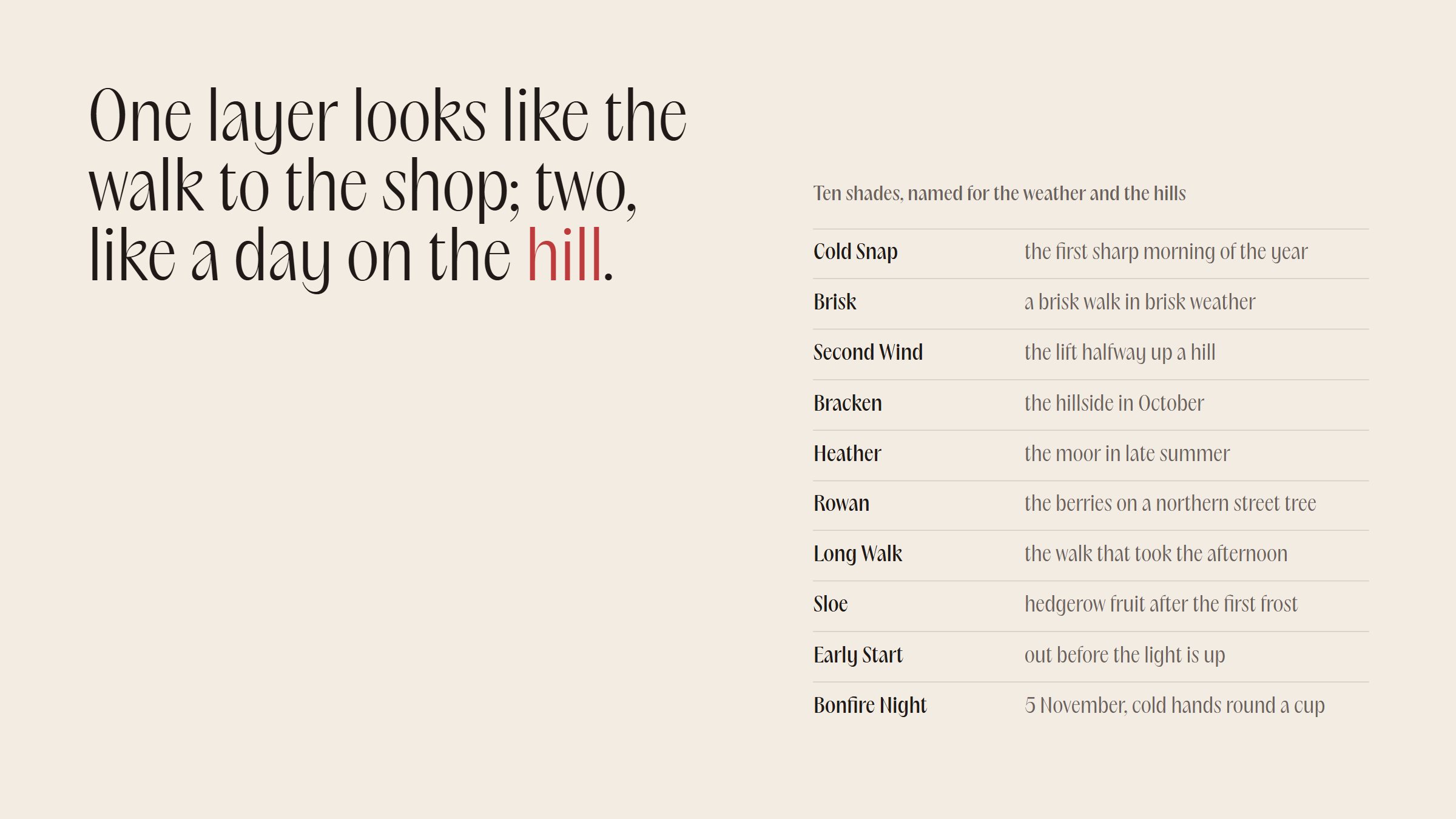
Bonny talks like someone at the gate on a cold morning: plain, warm and a little wry about the weather. Shades are named for days outside, from Cold Snap to Bonfire Night, and instructions name places on the face.
Every page, pack and film ends on the same line: You look well.
08 · The website
Out for a walk.
The homepage opens on the monogram writing itself, then follows a walk. A counter climbs to six kilometres while the press builds in three layers and the ground cools from oat to frost.
The range sits in a sideways row of cartons, and a one-question shade finder asks what colour you go after a cold walk.
09 · The film
Every ridge is a contour.
The brand film is one unbroken shot. The camera dives into a single press of Fresh Air, then climbs: its ridges emboss the oat board, the board is cut and folded into the carton, and the same lines carry on as frost on a pane, a wall on the fell and the fell itself, which turns out to be the fingertip.
It ends on the frame it began with, so it never stops.
- Concept
- A self-initiated concept by Signal Eight, made to show our capabilities.
- Made by
- Signal Eight
- Type
- PP Acma (Pangram Pangram)
Next case study
nota
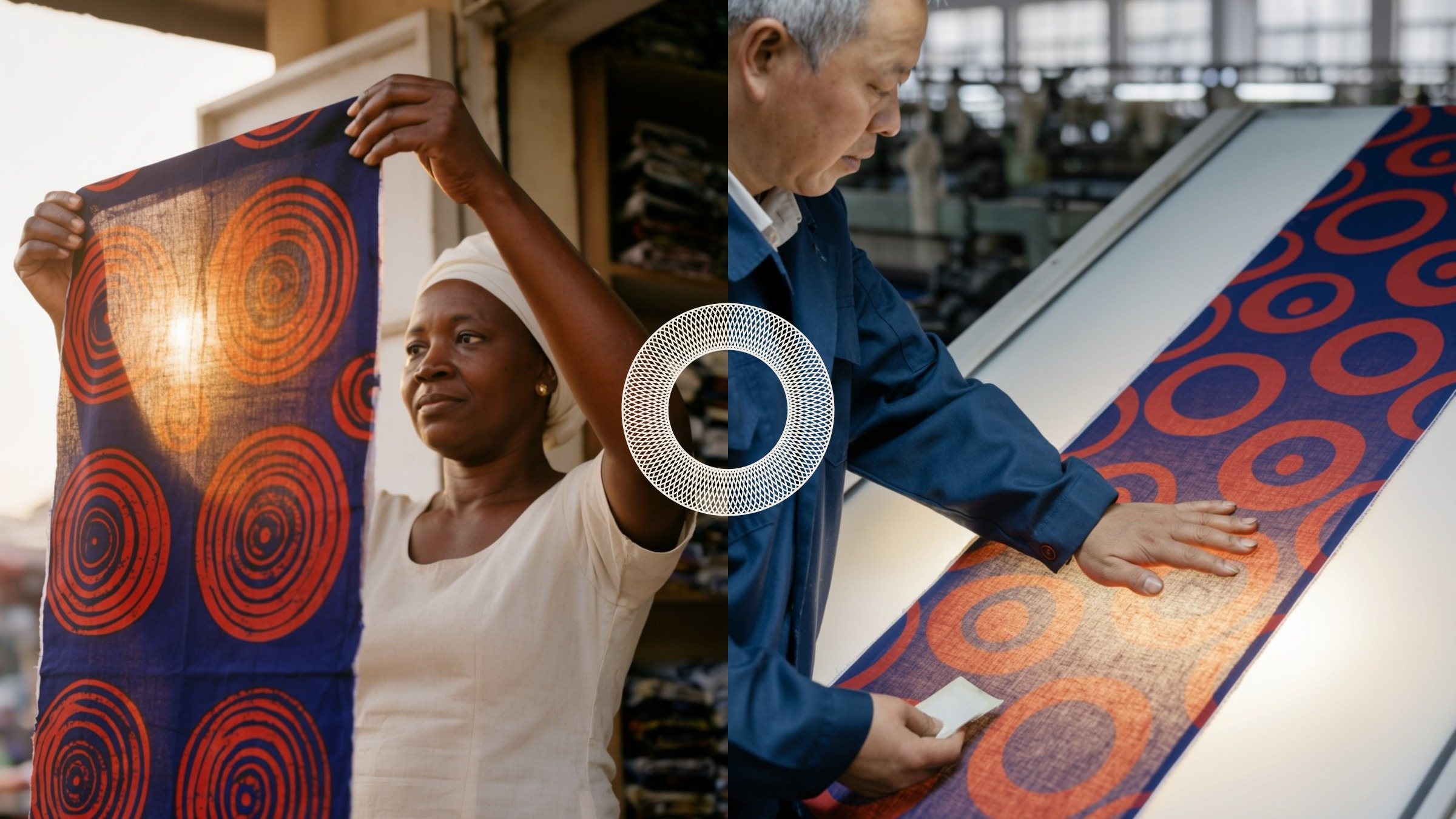
Digital dollars for businesses that pay suppliers across borders. The o of the wordmark is a see-through register: two printed halves, the sender's and the receiver's, that complete only when the money lands.
Open to new clients until 30 November
Your first project, 30% off.
See what it is like to have one studio behind your brand. Your first project with us is 30% off until 30 November.
- Tell us about your brand.
- Get your free Signal Audit.
- Start your first project at 30% off.
New clients only. Applies to the fee for your first project with Signal Eight. Reach out by 30 November to lock it in.