Case study · 2023

Good Vibes Cantina

A rebrand for Good Vibes Cantina, a Latin and American restaurant and bar in Canton, Baltimore: a wordmark with tortilla chips for counters, a palm with a smiling island, and a system that works lunch on cream and late nights in neon.

Client
Good Vibes Cantina
What we made
Research, Identity, Print, Signage, Motion, Film, Website, Social, Interior visualisation

Good Vibes was a sports bar on O’Donnell Street in Canton, Baltimore. In 2023 its owners reopened it as Good Vibes Cantina, with Latin and American food and a room that stays up late. We kept the name everyone already used and built the rest around it: a wordmark and a palm, menus, signs, bar screens, a film, the website and a plan for the room.

01

A name the neighbourhood already used

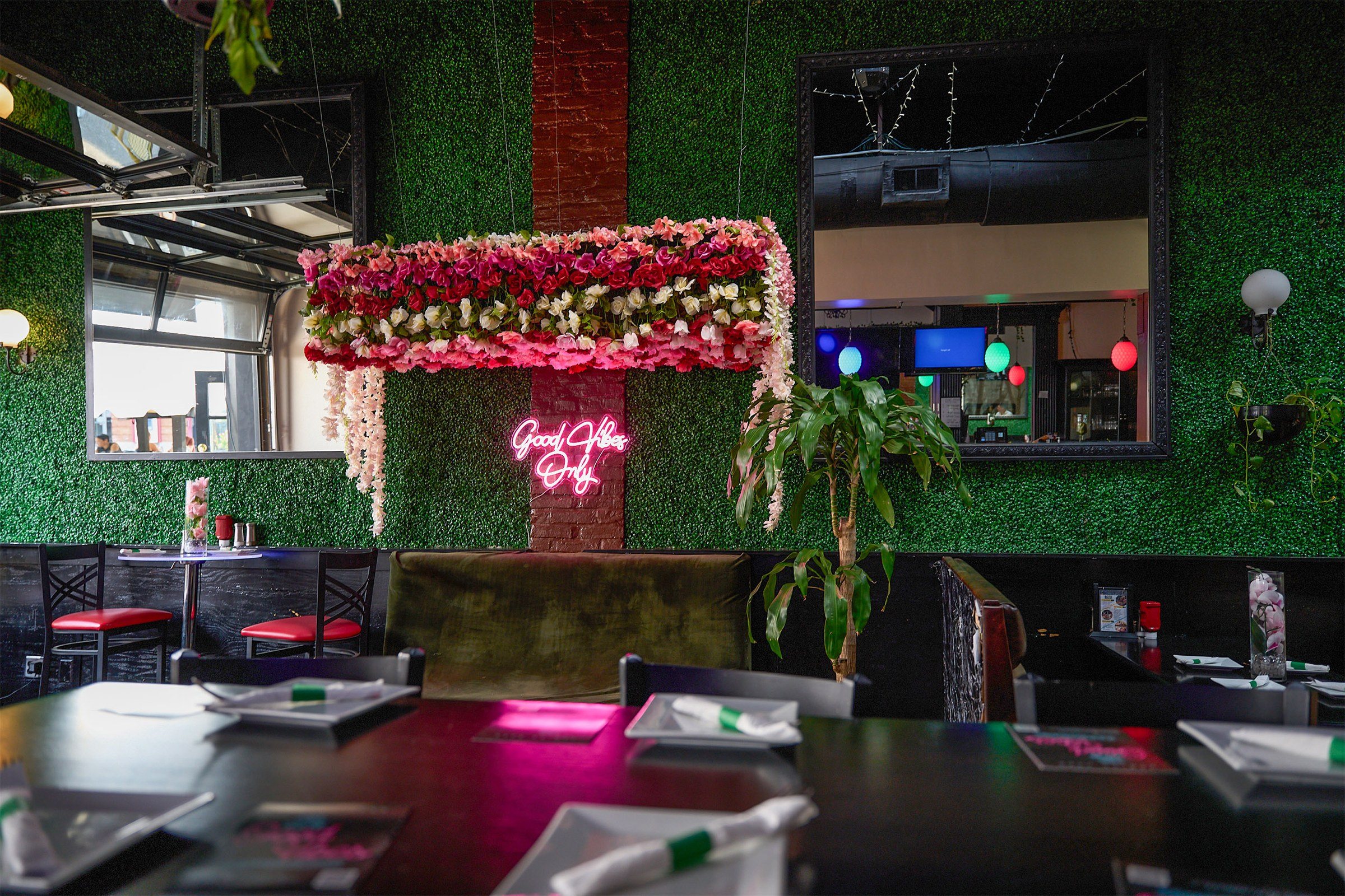
Good Vibes had been a sports bar and restaurant at 2903 O’Donnell Street: a red script sign with a palm tree over the door, a pink flower wall with a neon inside, the game on every screen.

In 2023 the owners reopened it as a cantina, with Latin and American plates, cocktails, music, and doors open until 2 AM at the weekend.

How do you reopen a neighbourhood bar and keep the name everyone already says?
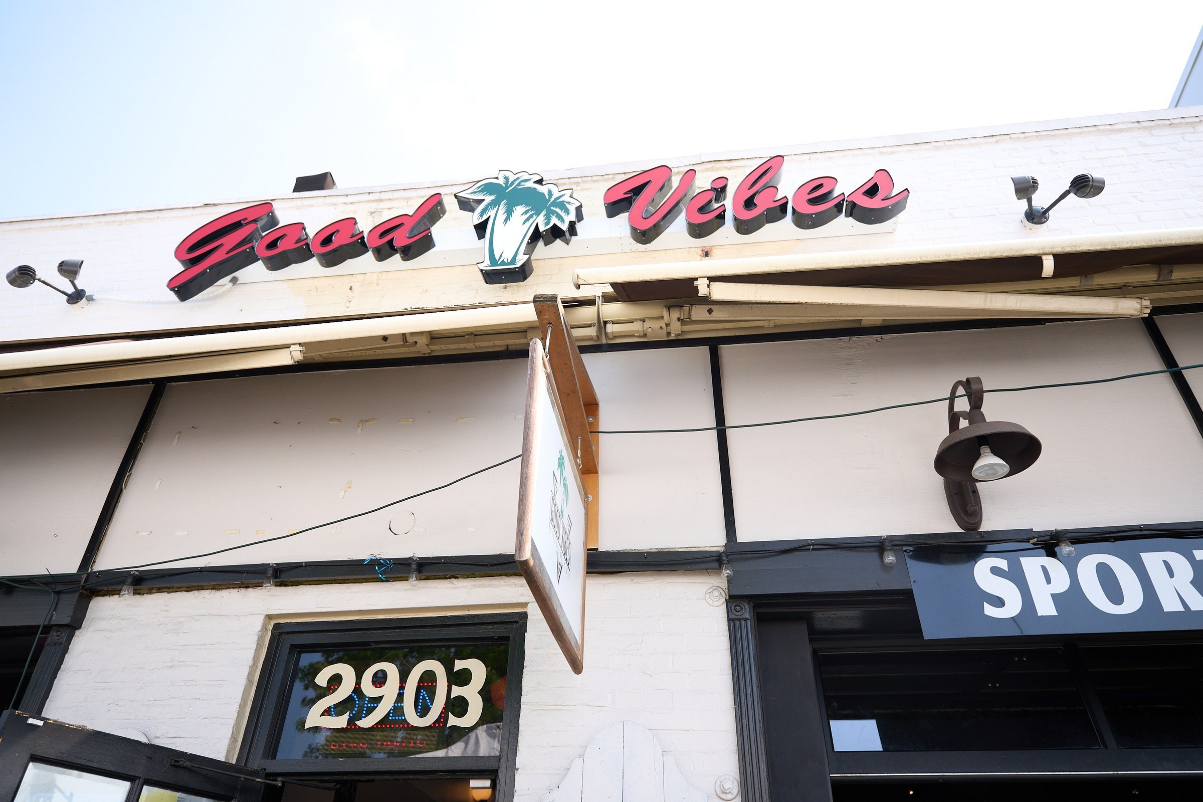
The front of the old Good Vibes: a red script Good Vibes sign with a teal palm tree between the words, above a door numbered 2903.
The awning, July 2023.
Inside the old Good Vibes: a wall of green hedge with a canopy of pink flowers and a pink Good Vibes Only neon, booths and tables in front.
The flower wall and its neon.

02

Ask the room first

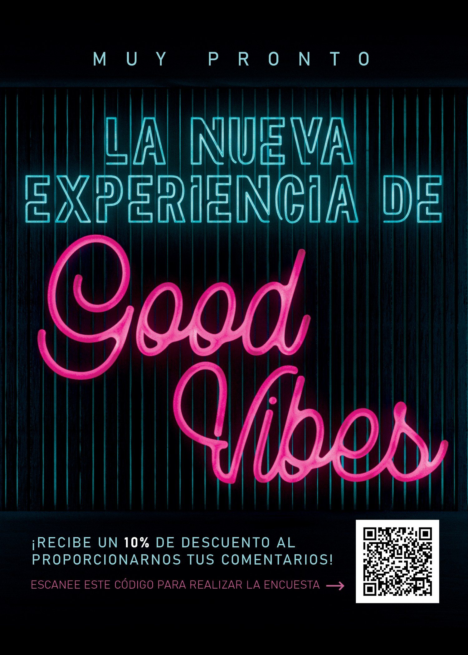
Before we drew anything, we asked the guests. A table card in English and Spanish announced the new Good Vibes experience and offered 10 % off for a few minutes of feedback.
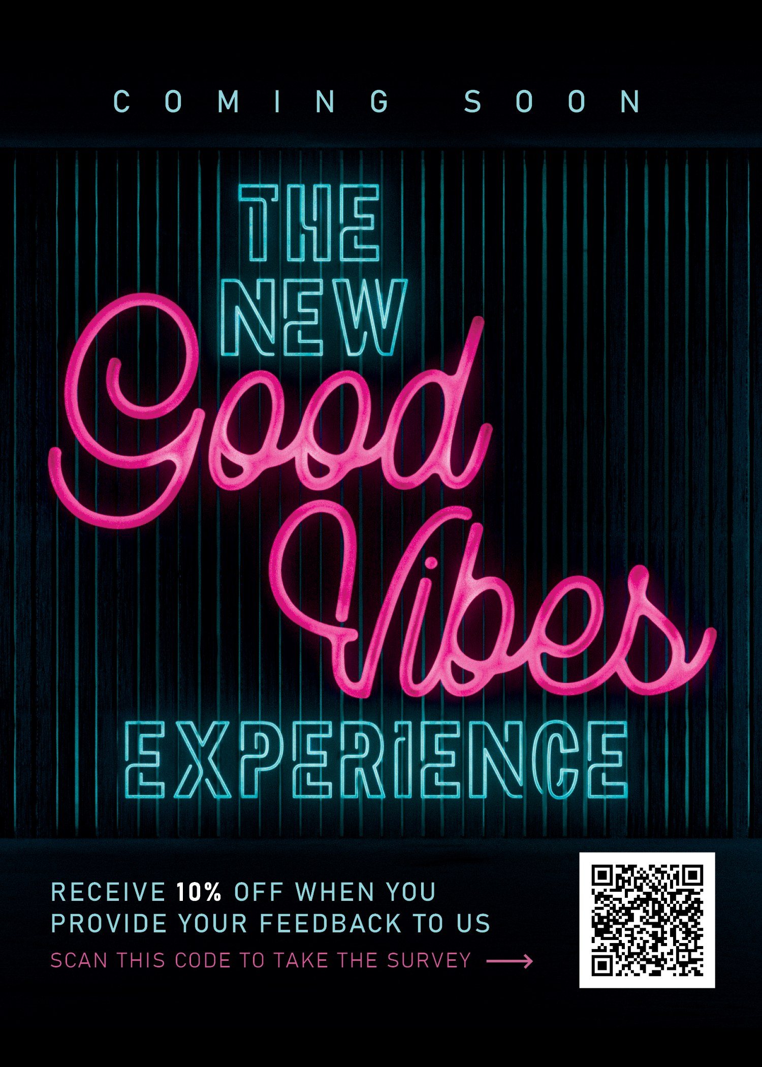
A dark table card: Coming soon, The new Good Vibes Experience, with Good Vibes in pink neon script, and a QR code offering 10 percent off for feedback.
English.
The same card in Spanish: Muy pronto, La nueva experiencia de Good Vibes, with the QR code and the 10 percent offer.
Español.

03

Round one, then green

Round one, on 25 May, tried a bit of everything: heavy black type, sticker lockups, a hand-drawn GooD, a page of Spanish sayings, a confetti of little cut circles.

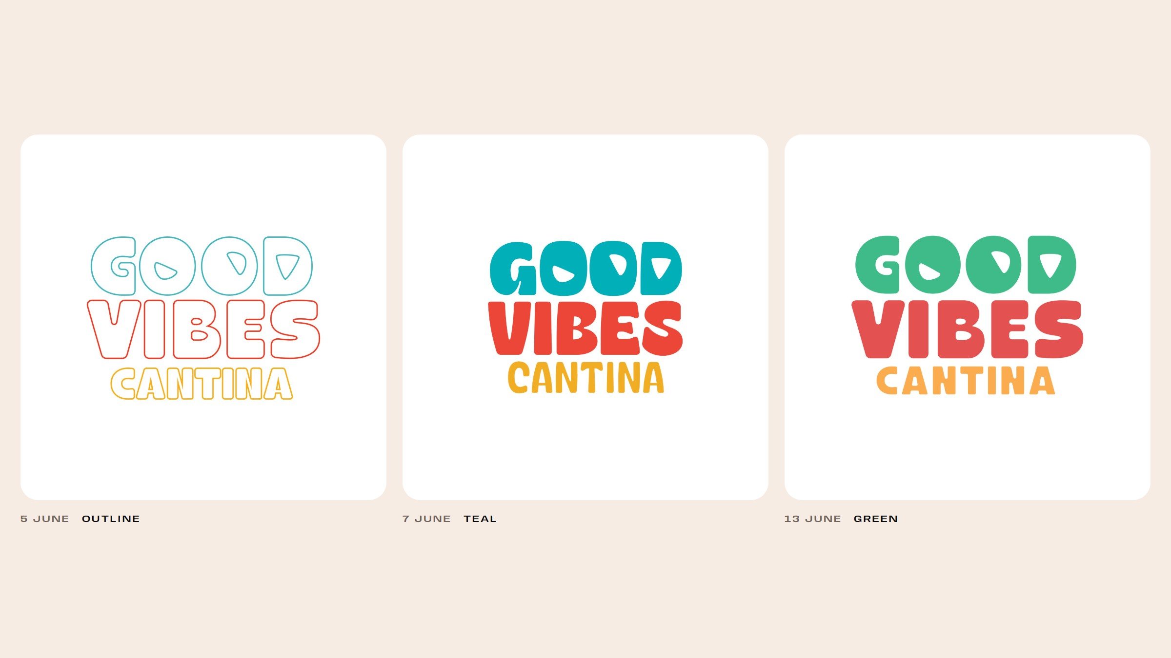
The same week we inflated the wordmark in 3D to see how soft it could get. By June the stack had settled into GOOD, VIBES and CANTINA in three colours, and on 13 June the teal turned green.
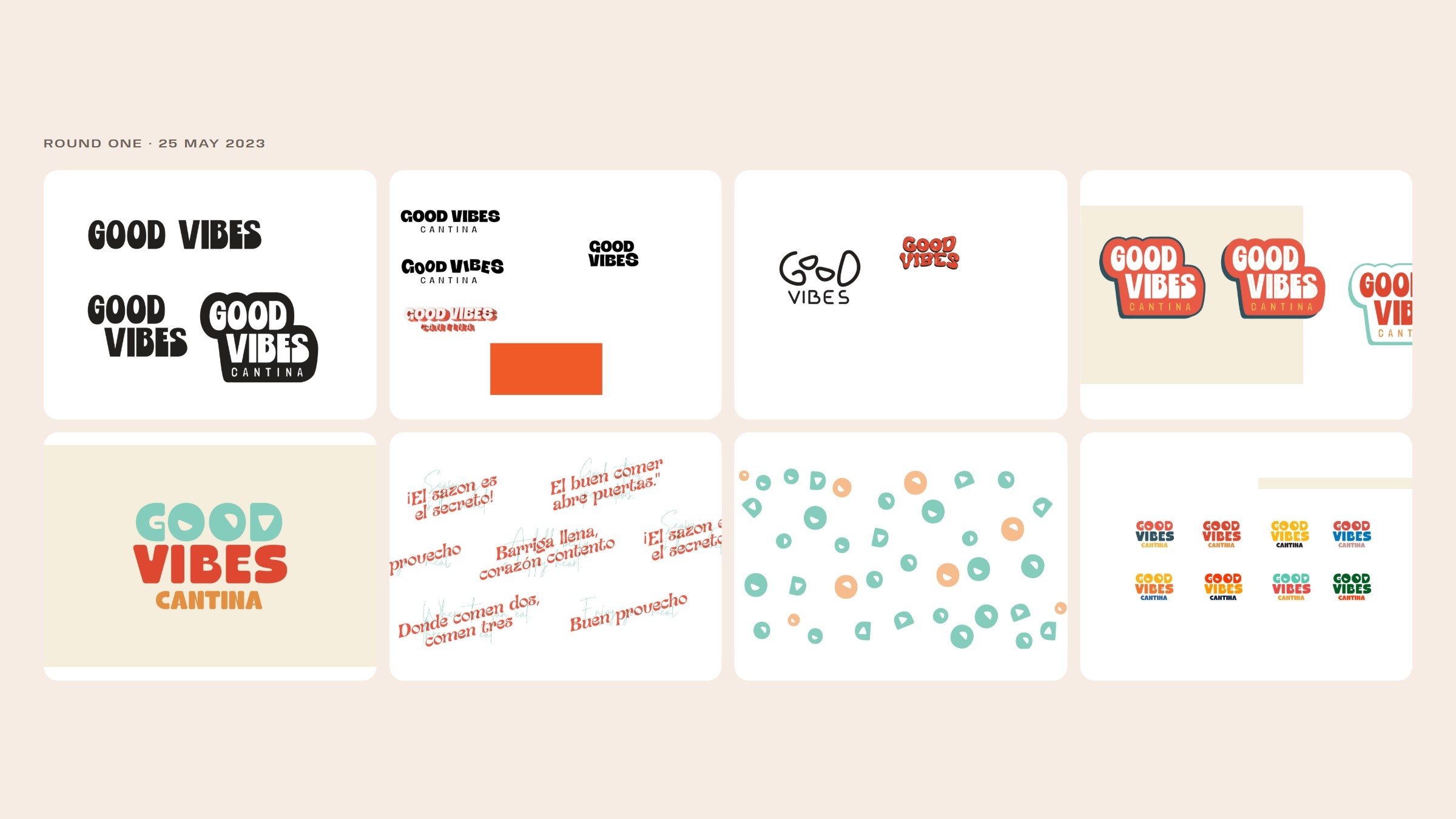
Eight artboards from round one: heavy black Good Vibes lockups, small wordmarks and an orange block, a hand-drawn GooD Vibes, red sticker lockups, the stack in teal, red and amber on cream, Spanish sayings in red script, a confetti of teal and peach circles with wedges cut out, and eight colourways.
The 3D test, the same week.
Three versions of the stacked wordmark: in outline on 5 June, in teal, red and amber on 7 June, and in green, red and amber on 13 June.
Outline, teal, green: 5 to 13 June.

04

Three counters, three chips

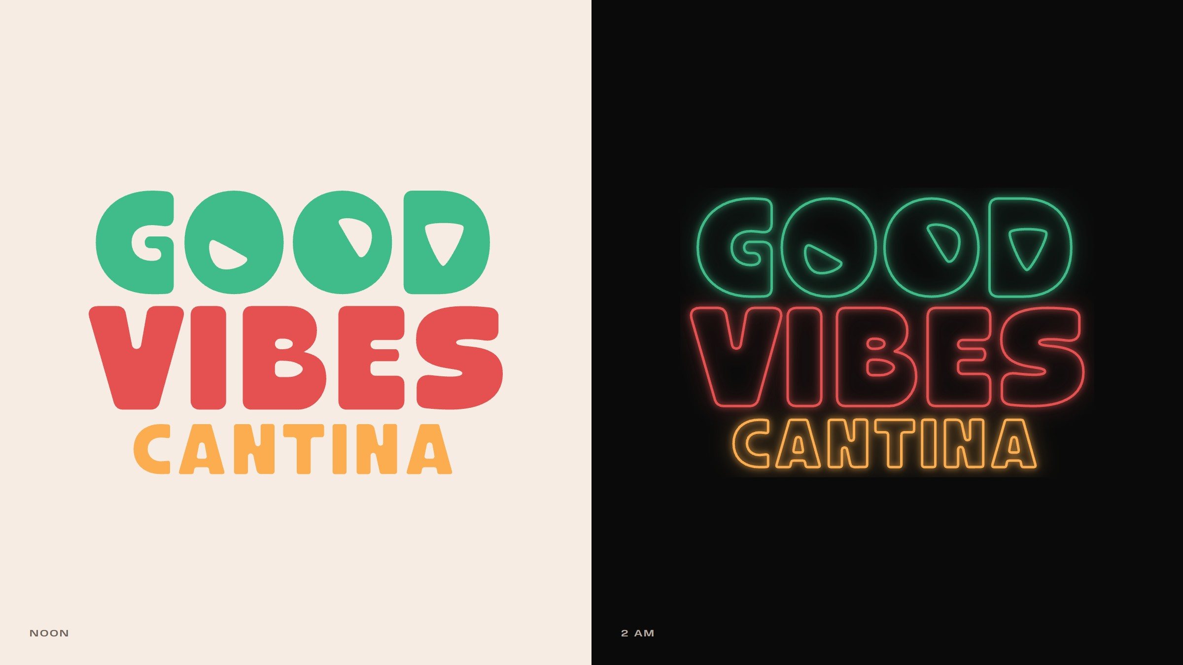
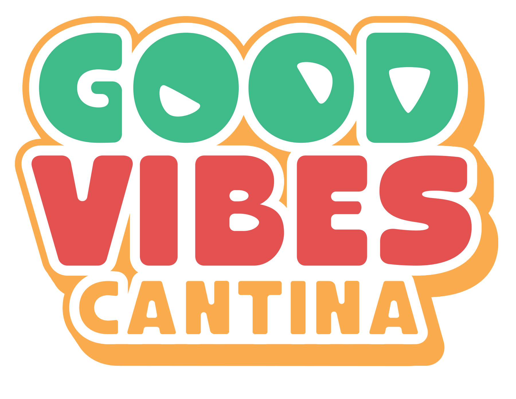
The letters are heavy, round-cornered and stacked tight. The counters of GOOD are cut as tortilla chips, each at its own angle, and the chips go on to turn up everywhere: on the stickers, round the neon, on the screens over the bar.

The palm came from the old awning. We redrew it inside a rounded square and gave it an island shaped like a smile.


The old awning: red script Good and Vibes with a teal palm tree between them.
The awning, July 2023.
The icon, 13 June 2023, in its colours.
The wordmark twice: in solid green, red and amber on cream, labelled Noon, and as glowing neon tubes on black, labelled 2 AM.
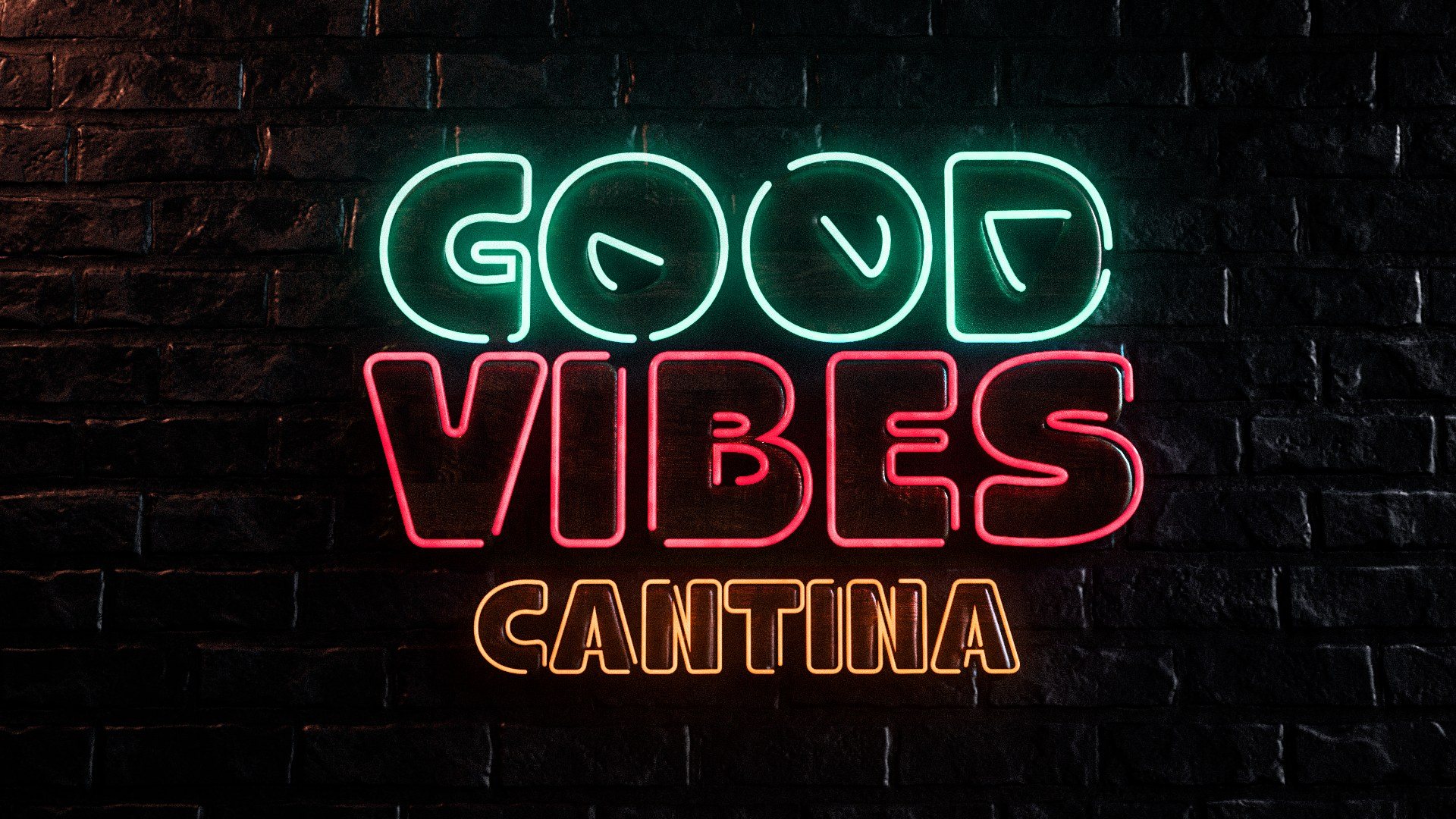
The wordmark as neon tubes in green, red and amber on a dark brick wall.
The wordmark in neon, May 2023.
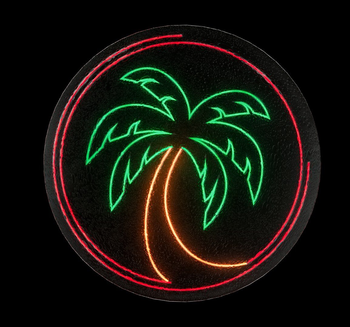
The palm as a neon sign: a green palm with an orange trunk inside a red neon ring, on a dark wall.
The palm in neon, July 2023.

06

Said with a full belly

The brand talks the way the room does: in two languages, with a grin. Old Spanish sayings got an English line underneath.

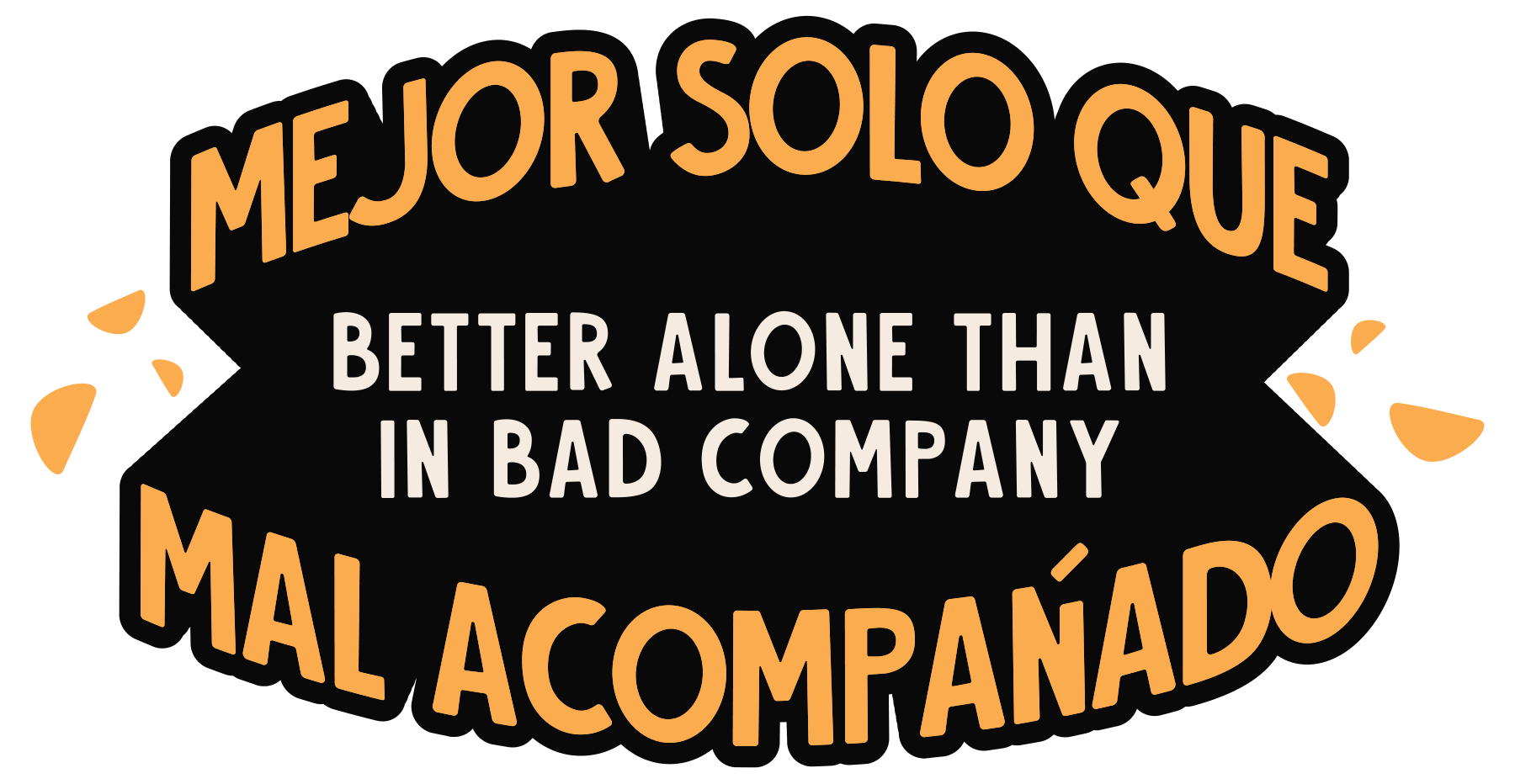
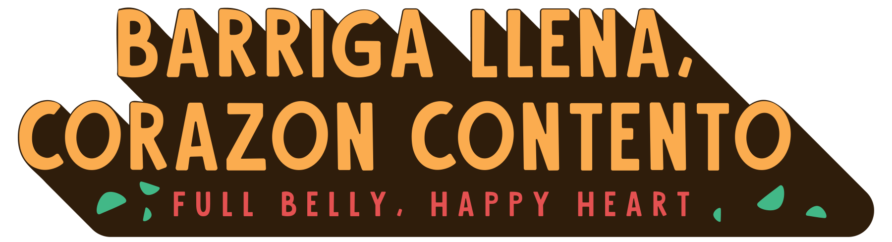
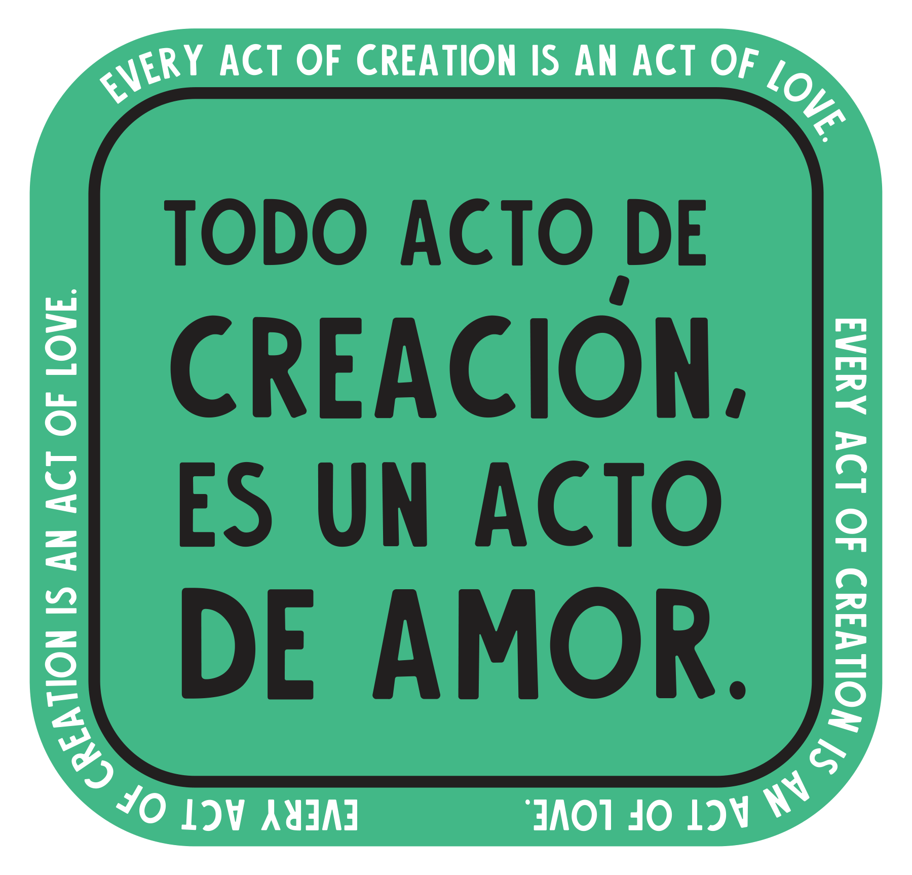
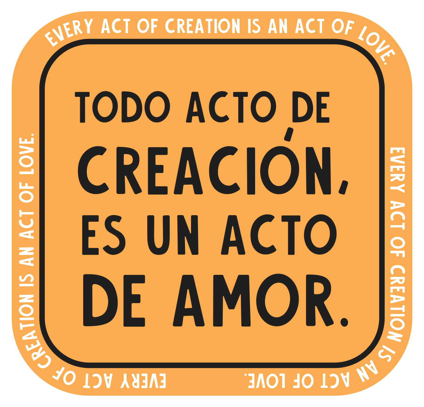
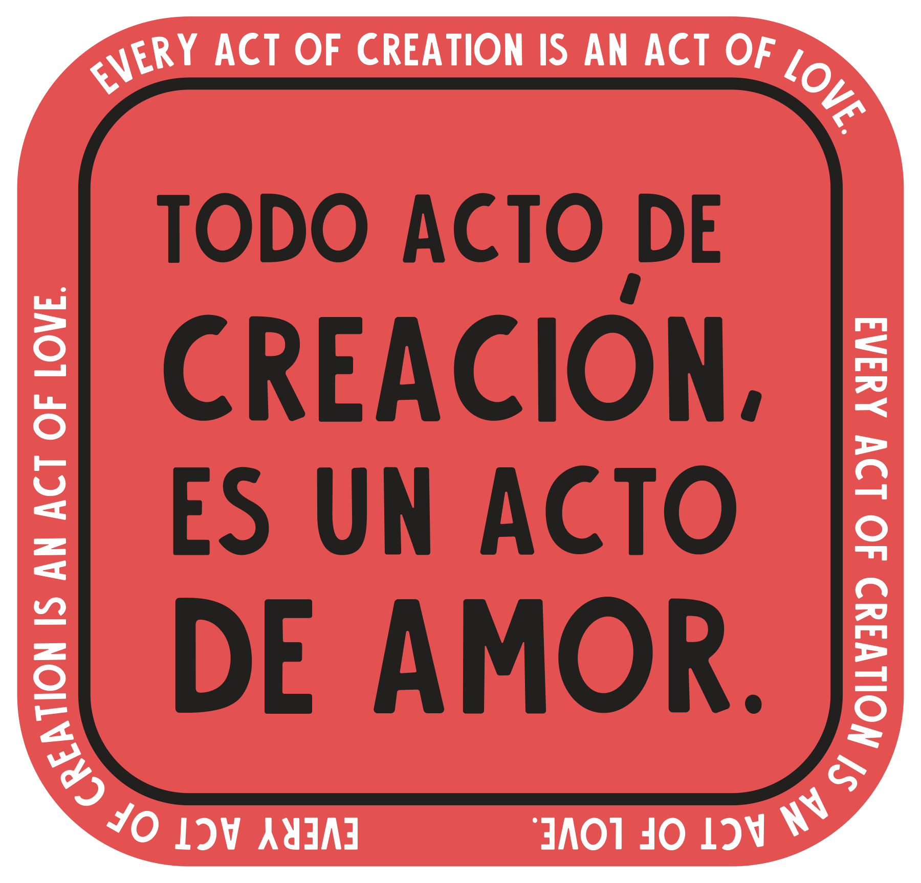
Barriga llena, corazón contento: full belly, happy heart. Mejor solo que mal acompañado: better alone than in bad company. And Taco Tuesdays kept going, and Wednesdays, and Thursdays, all the way round to Monday.
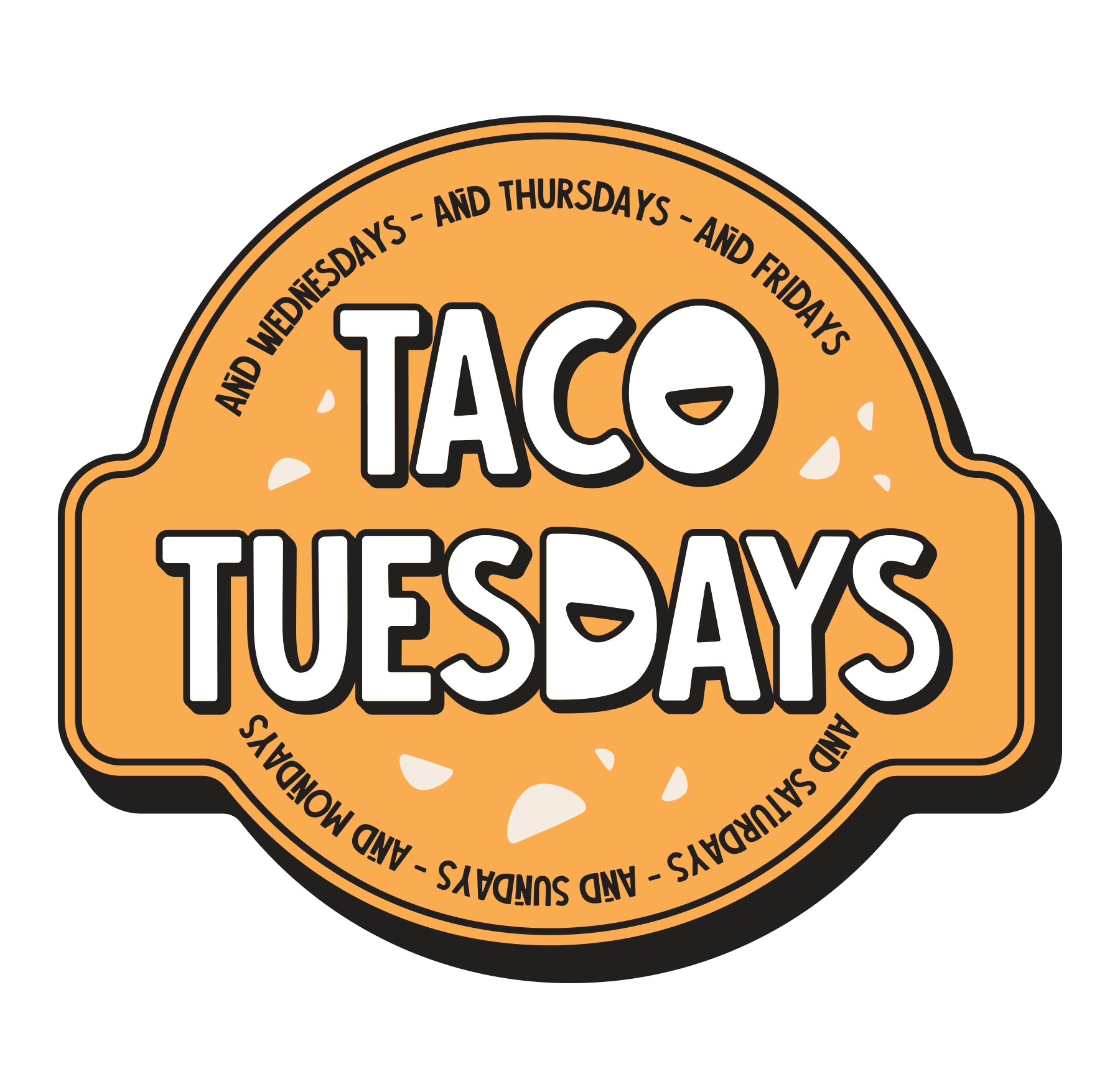
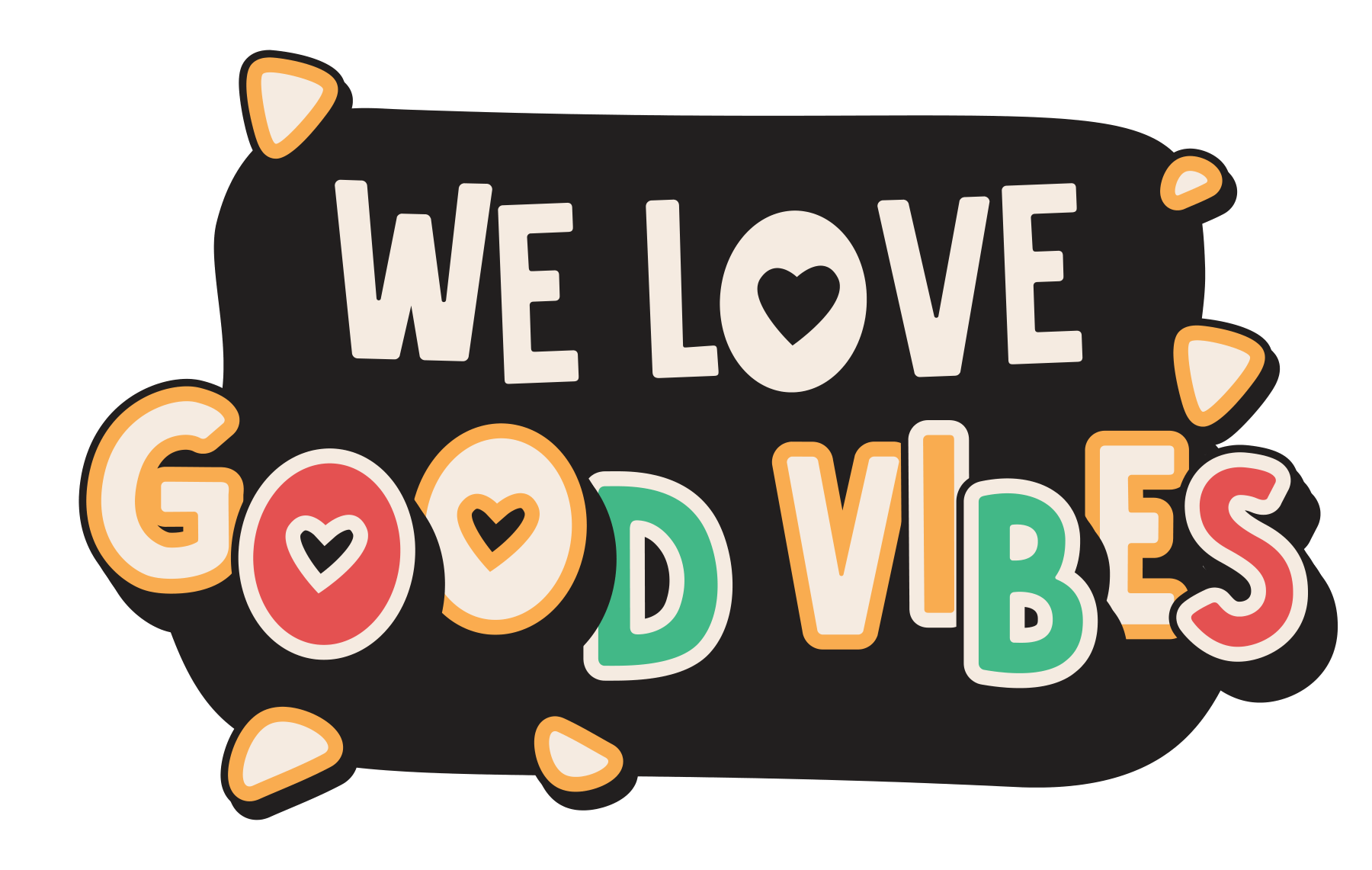
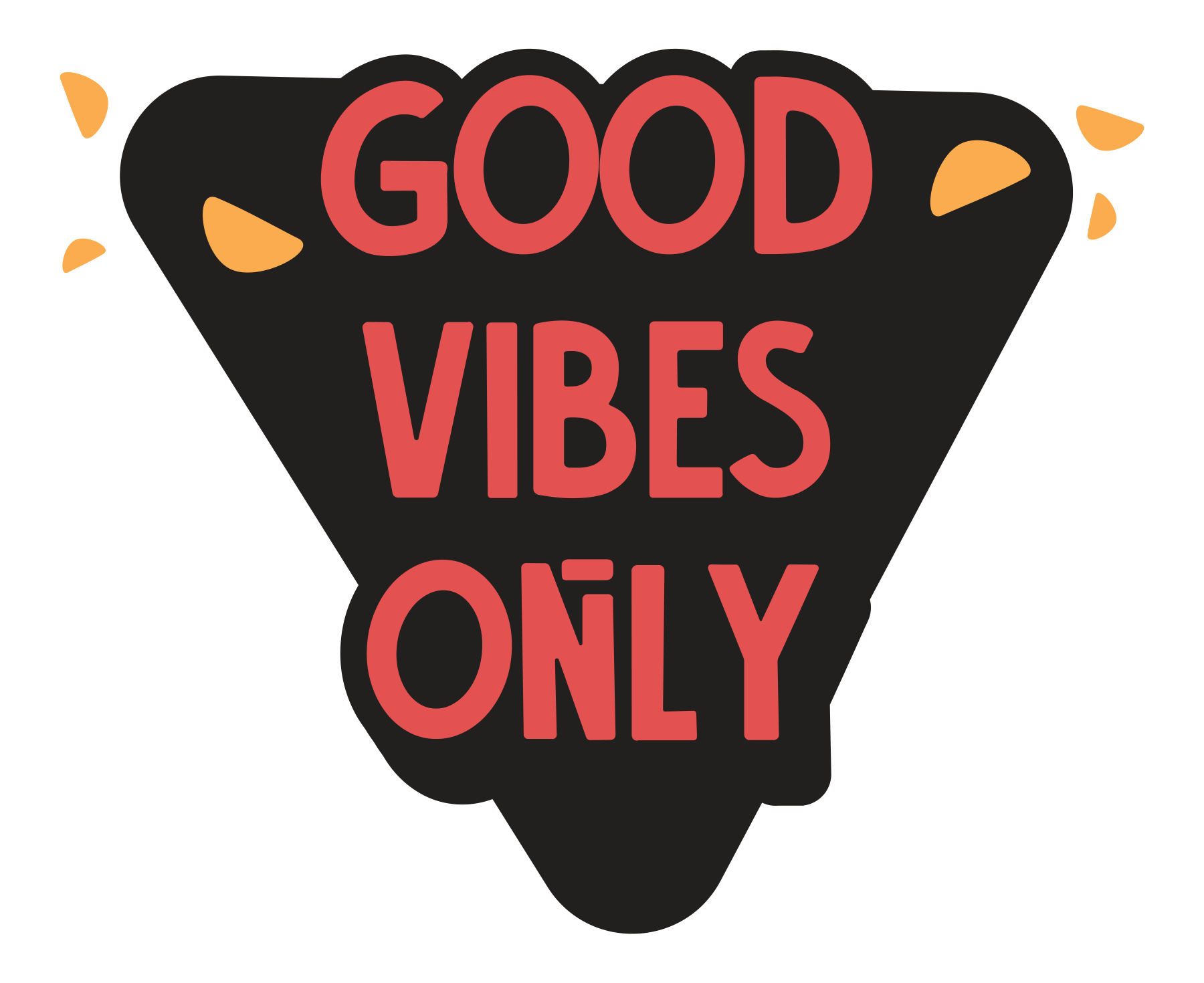
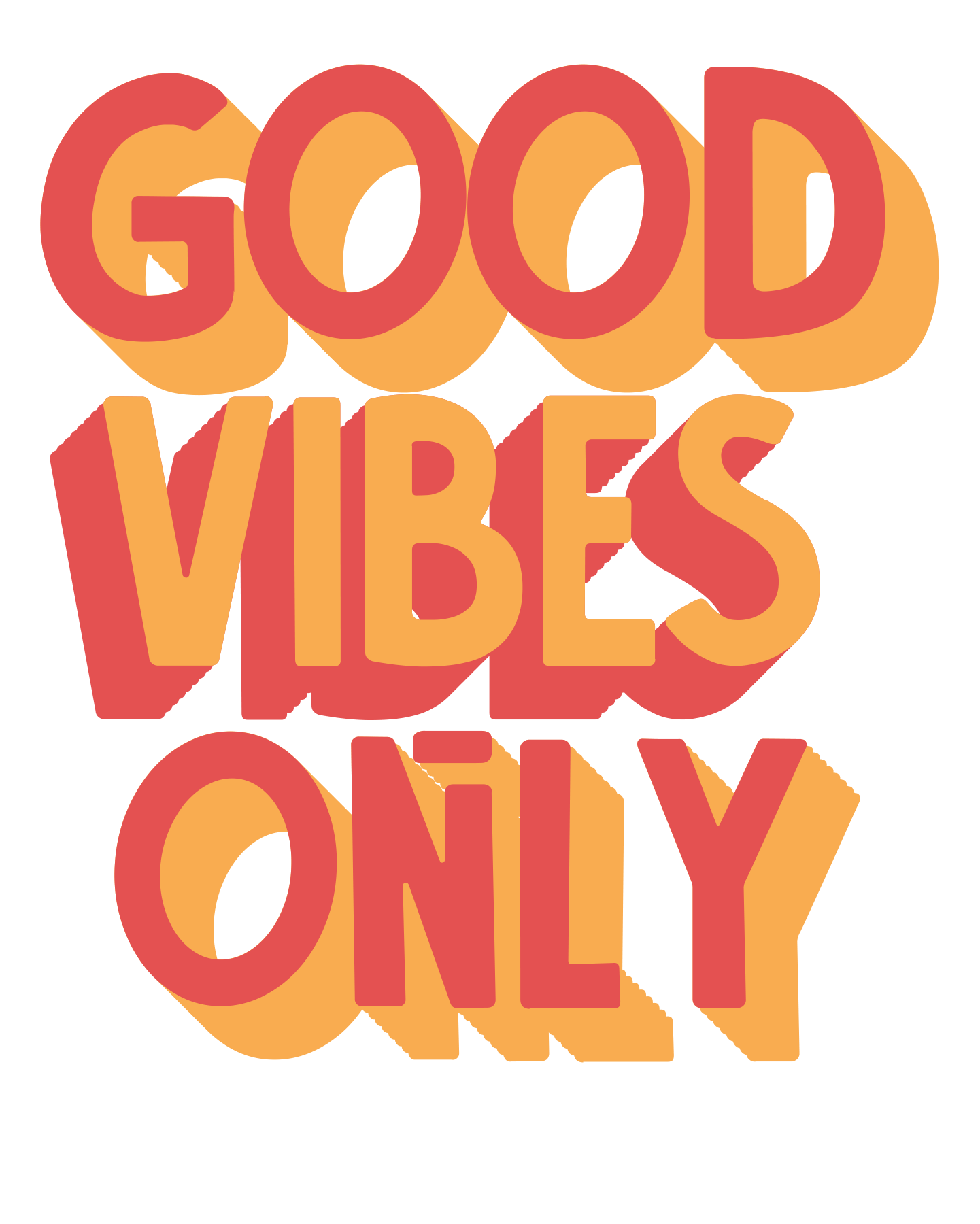
The stickers, July 2023.
One saying, three colours.

07

At the table

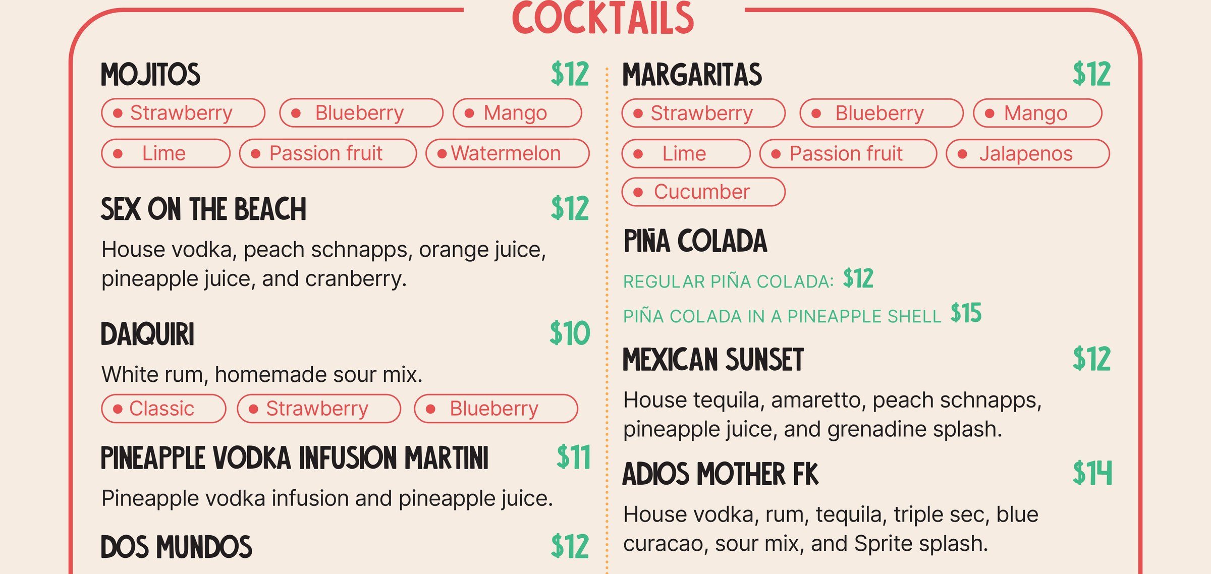
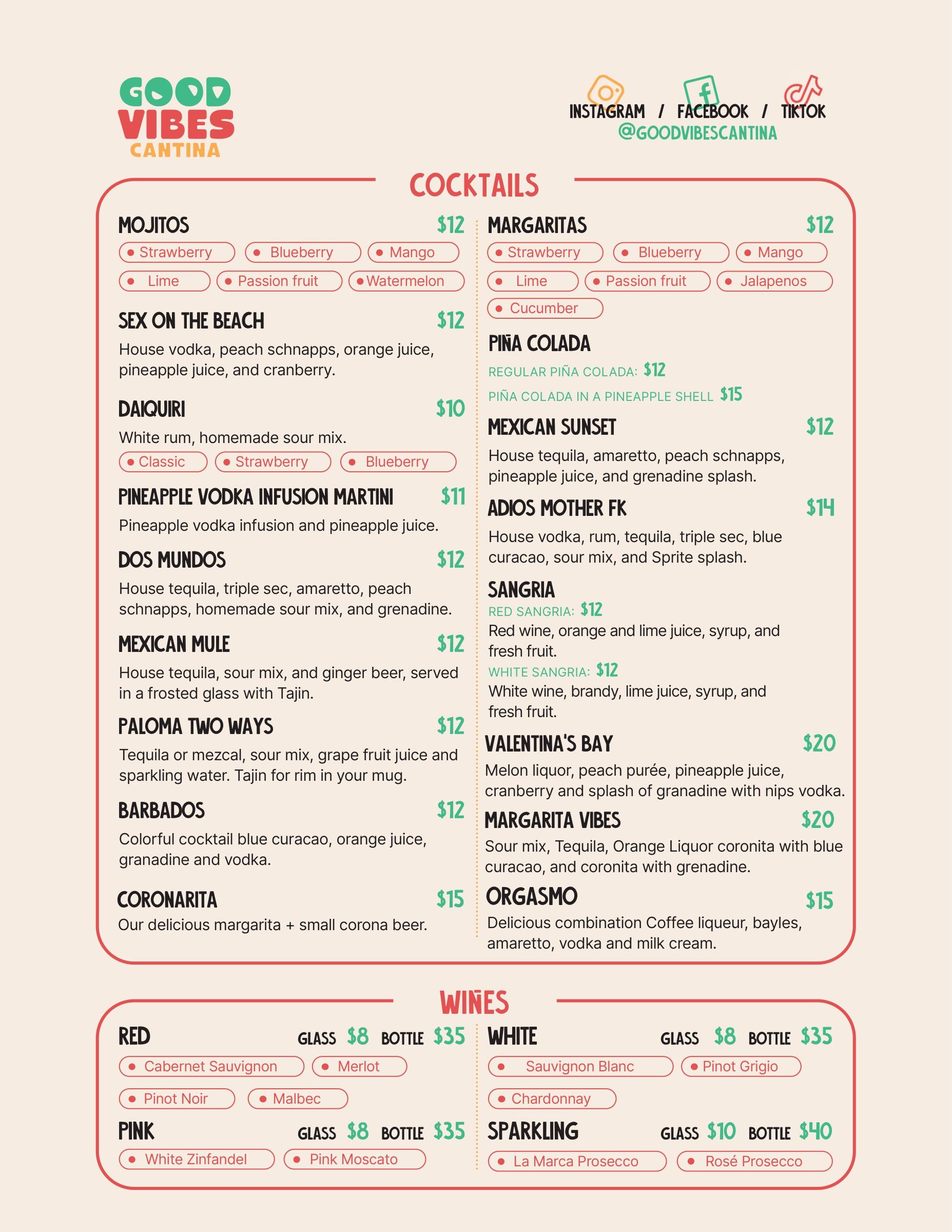
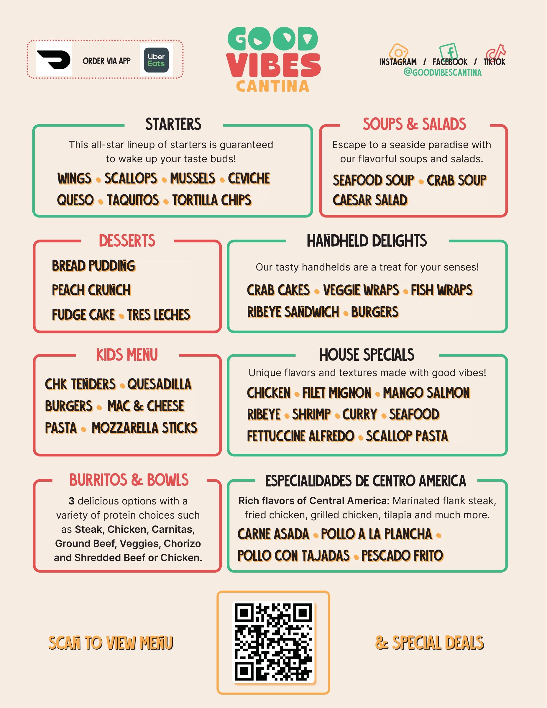
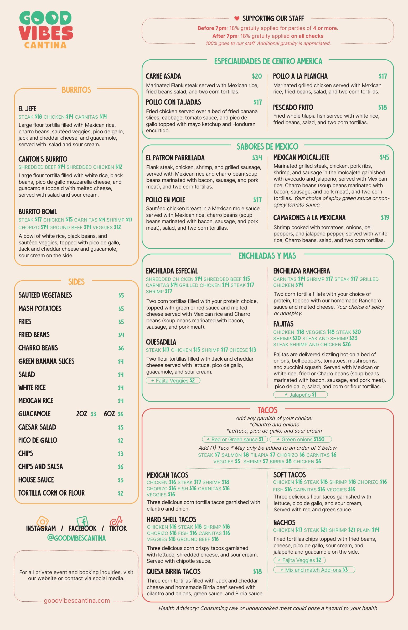
The menus are cream, with each section in a rounded frame in one of the three colours. Flavours, proteins and add-ons sit in small pills, so the six mojito flavours read at a glance.

The same system runs through the drinks list, the menu board outside and the to-go sheet with its QR code.
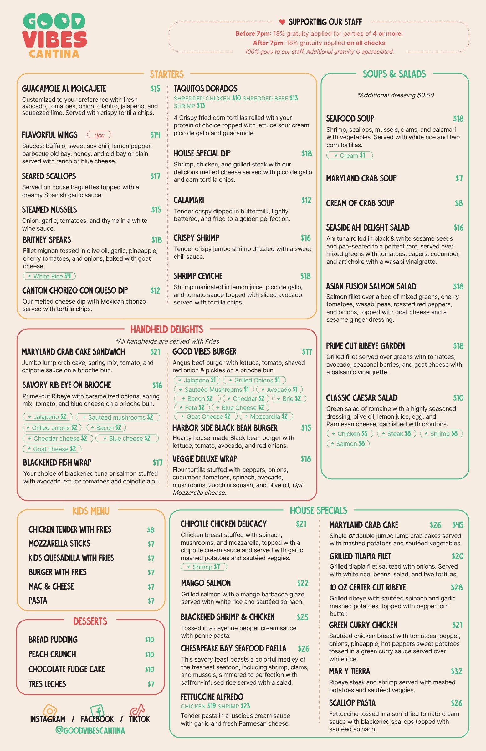
The main menu, front: starters, soups and salads, handheld delights, the kids menu, desserts and house specials in red, green and amber rounded frames on cream.
The main menu, back: burritos, sides, Central American specialities, flavours of Mexico, enchiladas and tacos, with prices and choices in small pills.
The main menu, 11 × 17 in, both sides.
Detail of the drinks list: mojitos and margaritas at 12 dollars, each with its flavours in small outlined pills, strawberry, blueberry, mango, lime, passion fruit and watermelon; below, Sex on the Beach, Daiquiri, Piña Colada and more.
Flavours and add-ons as pills.
The drinks list: cocktails in a red frame, wines below, the wordmark and social handles at the top.
The drinks list.
The to-go menu: the categories in coloured frames, delivery app badges at the top and a QR code to scan for the full menu and special deals.
The to-go menu, December 2023.

08

Out front, and over the bar

Two banners out front, 36 by 24 inches, put the plates and the drinks in slanted frames over a wall of dish names.

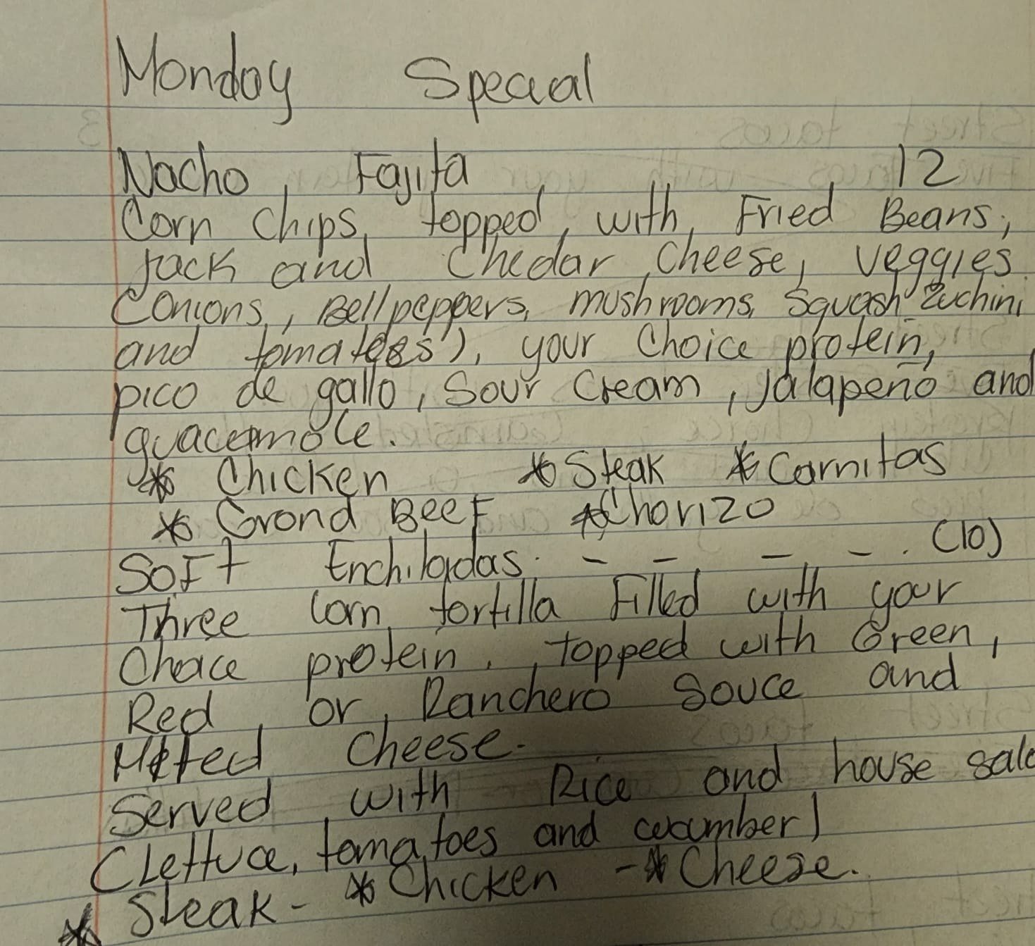
Inside, the screens over the bar run short neon loops: Taco Tuesday, a birthday, a nudge to follow @goodvibescantina, and the daily specials, which start life as the owner’s handwritten notes.
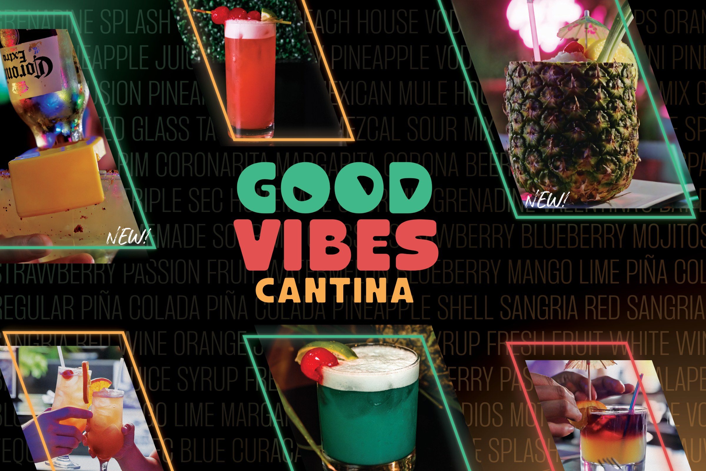
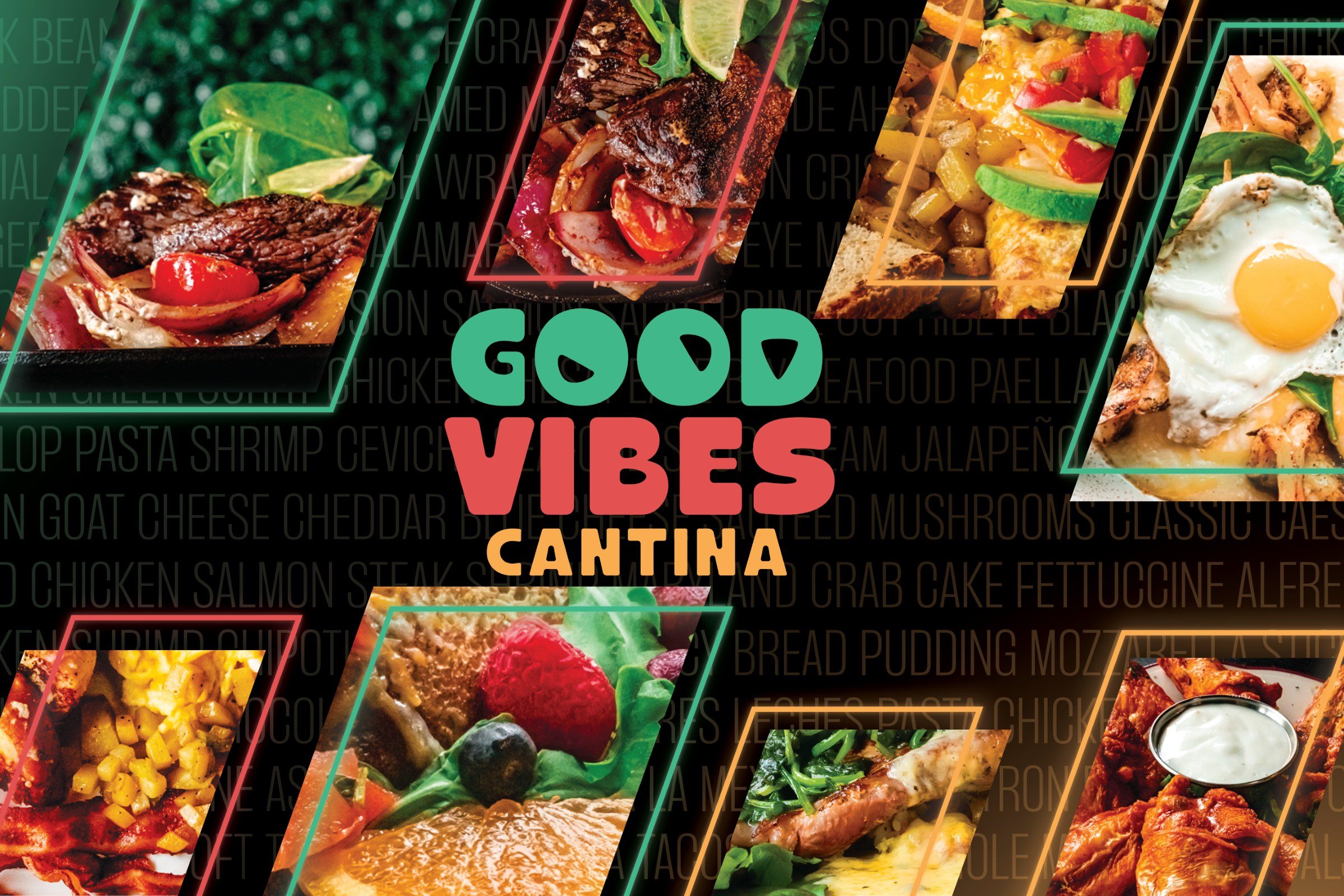
The drinks banner: the wordmark on black, surrounded by photographs of cocktails in slanted green, red and amber frames, over a wall of drink names in grey capitals.
Drinks.
The food banner: the wordmark on black, surrounded by photographs of steak, salads, fries, an egg on a plate and wings in slanted frames, over a wall of dish names.
Food. Both 36 × 24 in.
A handwritten note on lined paper: Monday special, nacho fajita 12, soft enchiladas 10, with the fillings listed.
Monday, as written.
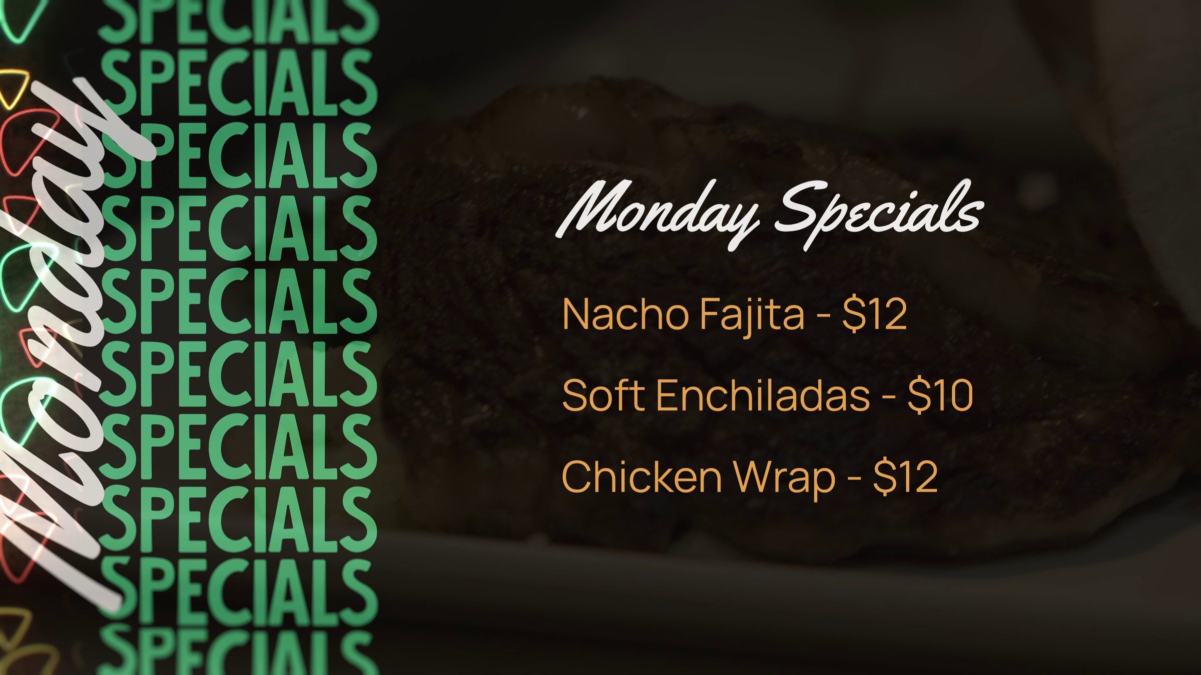
The Monday screen: Monday in white script over a column of SPECIALS in green, and Nacho Fajita 12 dollars, Soft Enchiladas 10 dollars, Chicken Wrap 12 dollars on a dark photograph of food.
Monday, on the screen.
Taco Tuesday, November 2023.
Check us out, November 2023.
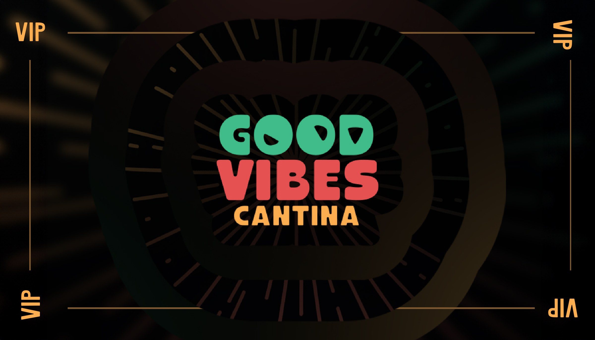
The VIP card: the wordmark on black with a burst of faint rays, VIP in amber in each corner.
The VIP card, 3.5 × 2 in.

09

The site and the film

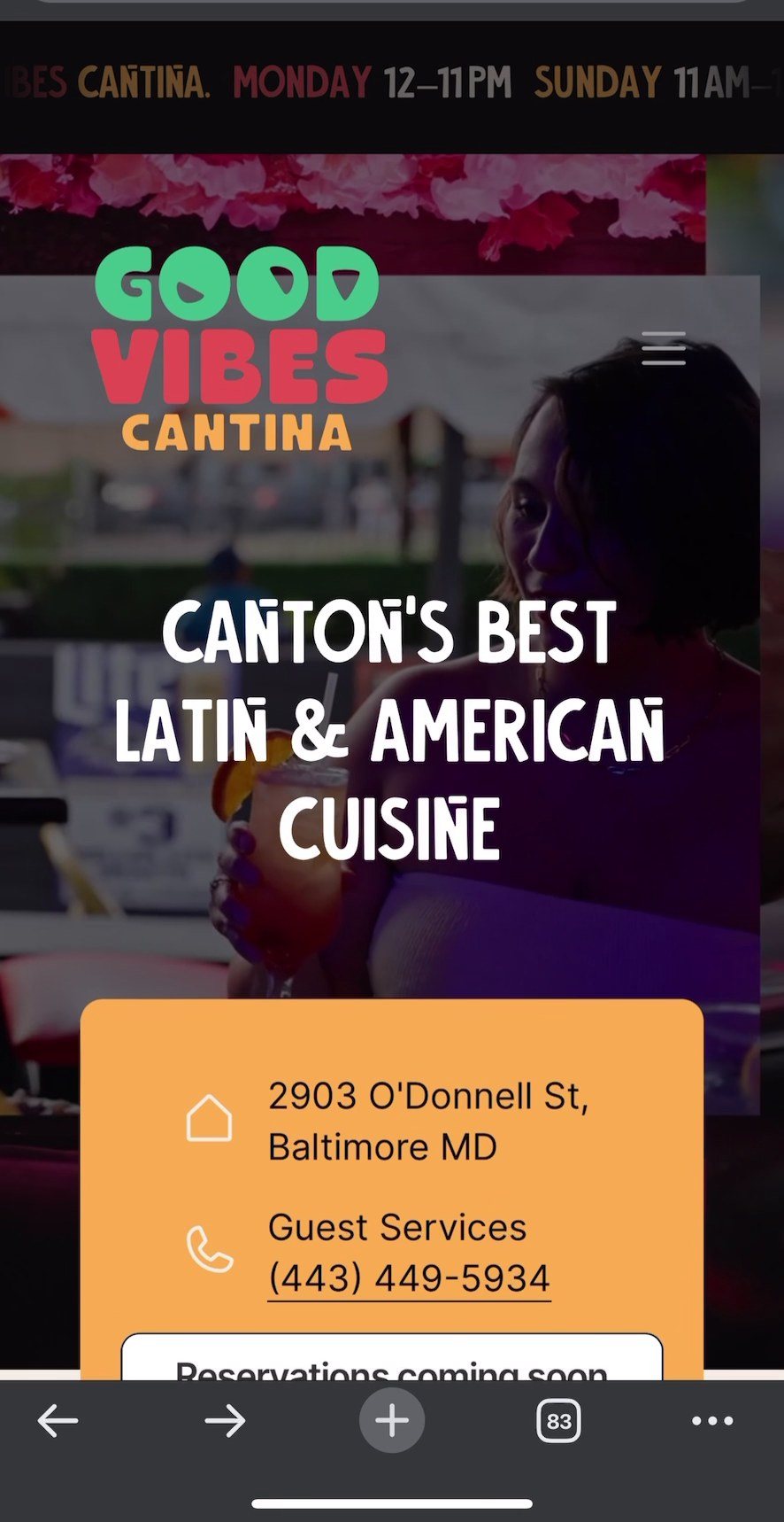
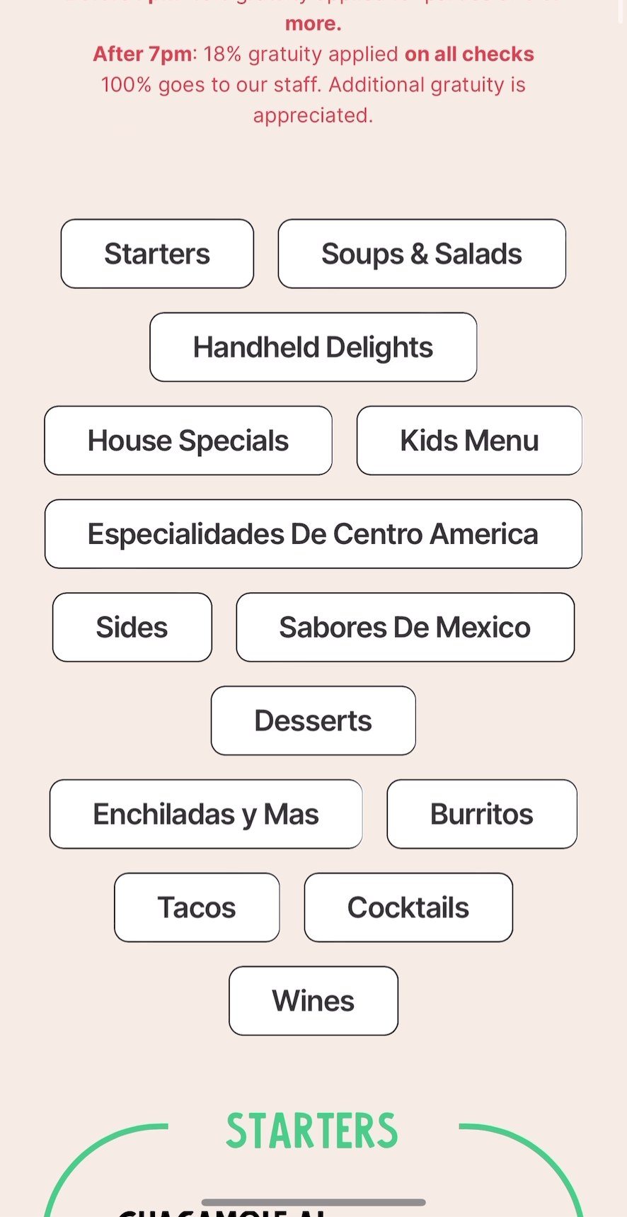
We built goodvibescantina.com in Framer. On a phone it opens with the address and the number to call, then the menu sorted into pills, then the ways in: delivery, events and the newsletter.

For its front page we cut a half-minute film of the room, from the first margarita to the last toast. It opens this page.
The launch post, October 2023.
The site on a phone: the wordmark over a dim photograph of the room, Canton’s best Latin and American cuisine, and an amber card with the address and phone number.
The menu page: the menu categories as outlined pills on cream, from Starters to Wines, above the Starters frame in green.
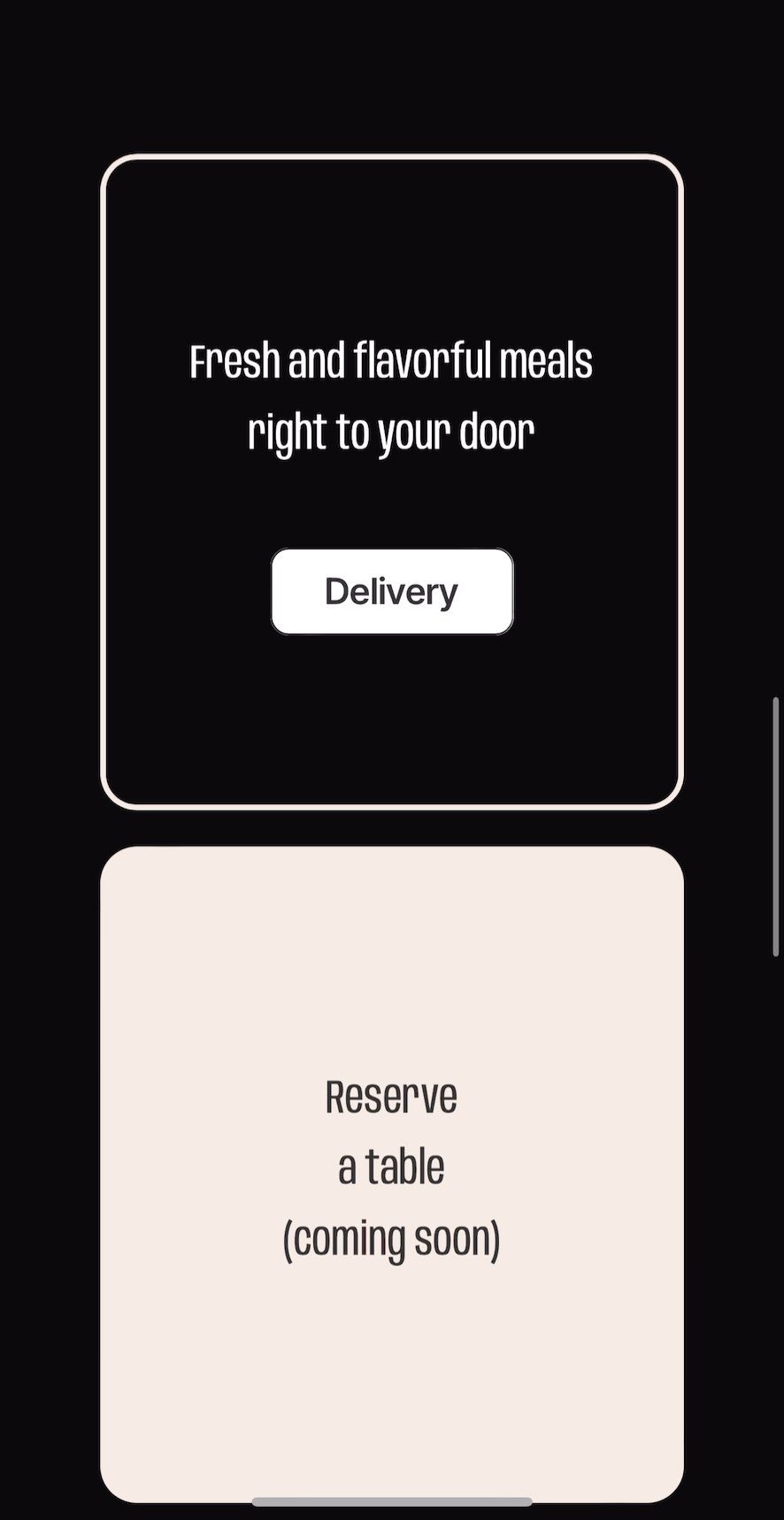
Two cards on the site: Fresh and flavorful meals right to your door, with a Delivery button, on black, and Reserve a table, coming soon, on cream.
goodvibescantina.com, October 2023.

10

The room, drawn

We drew the room too. A plan zoned the floor into the flower wall, main and shared dining, a lounge, a VIP corner, the DJ and the bar.

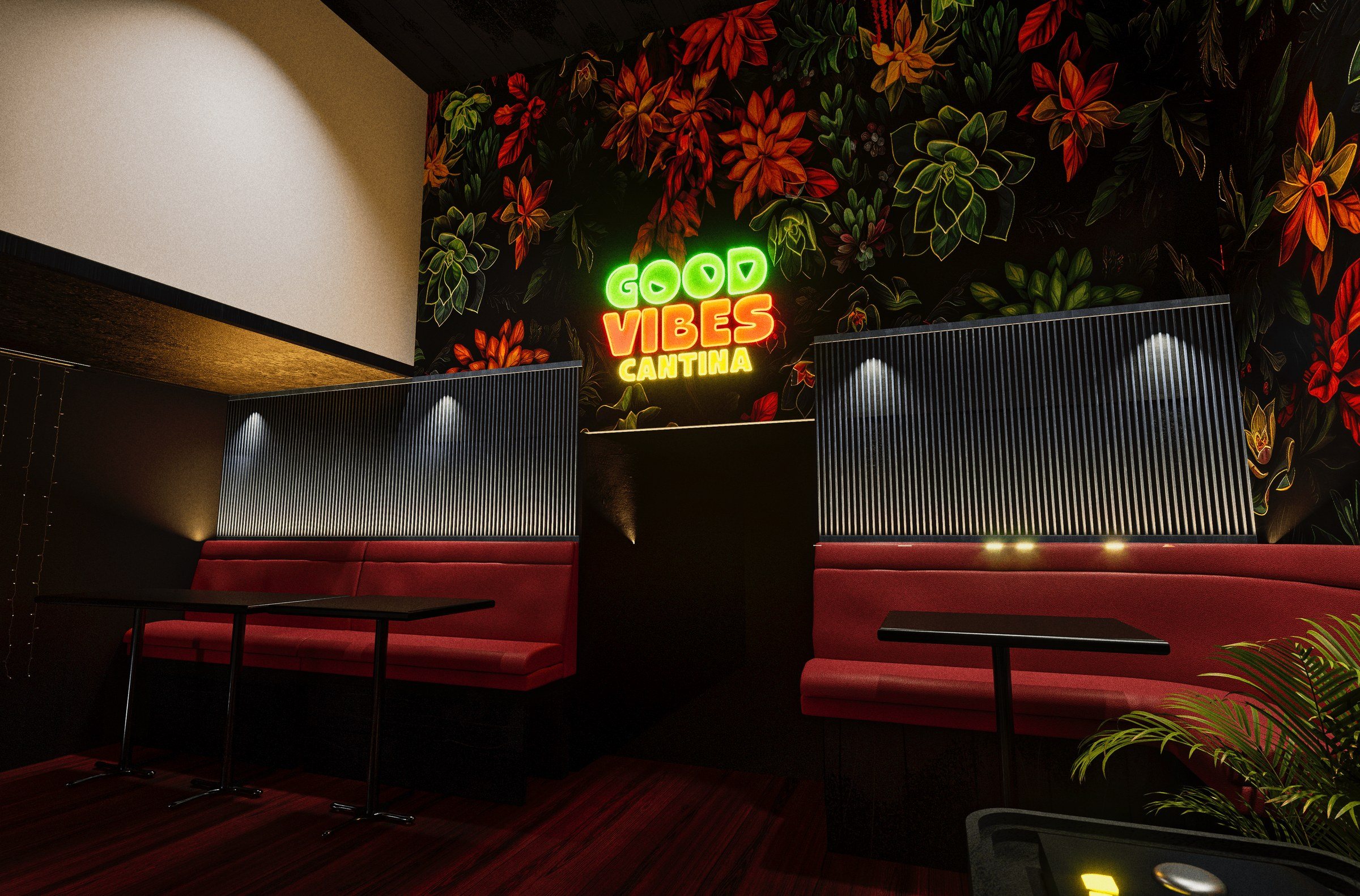
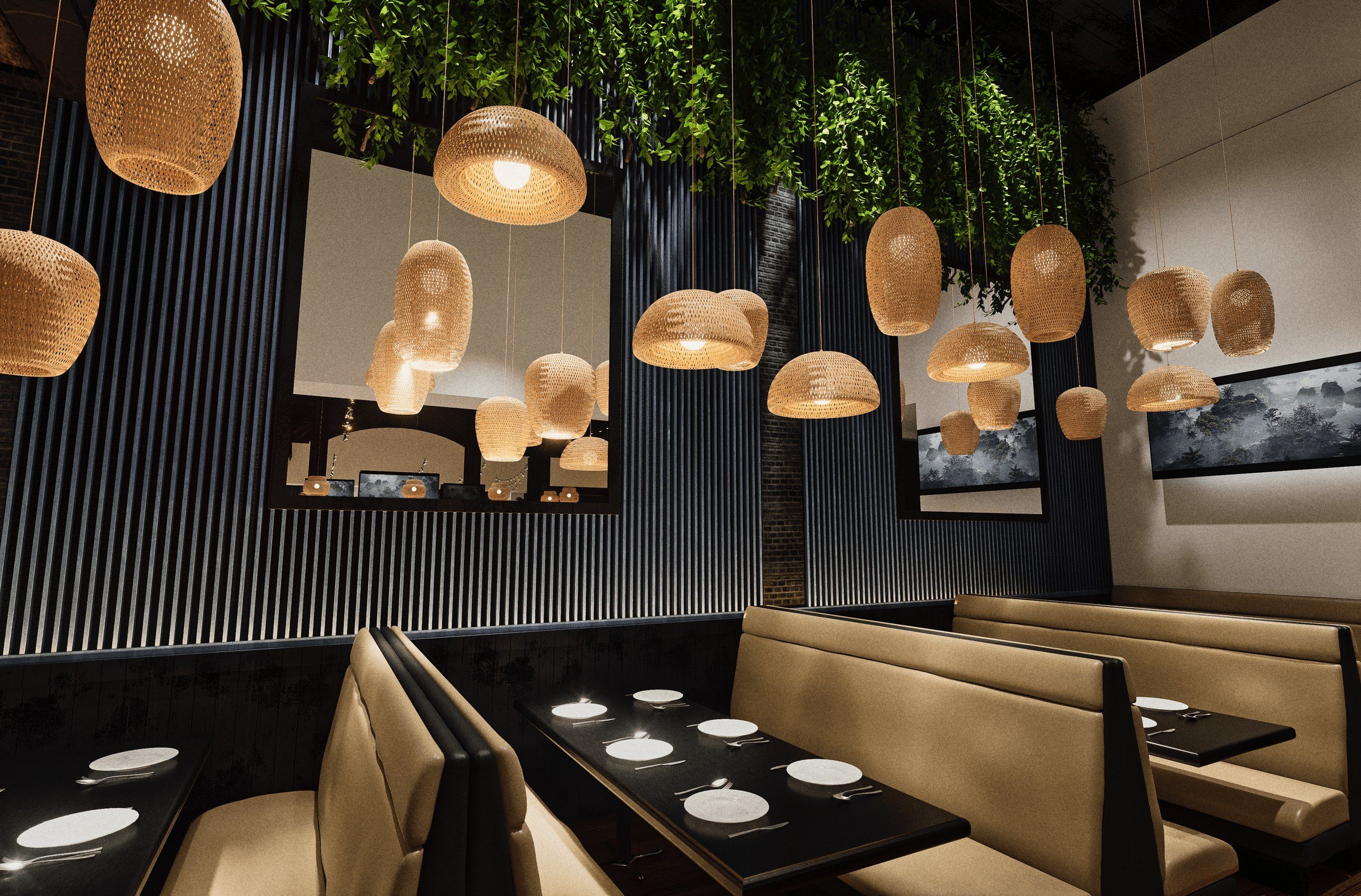
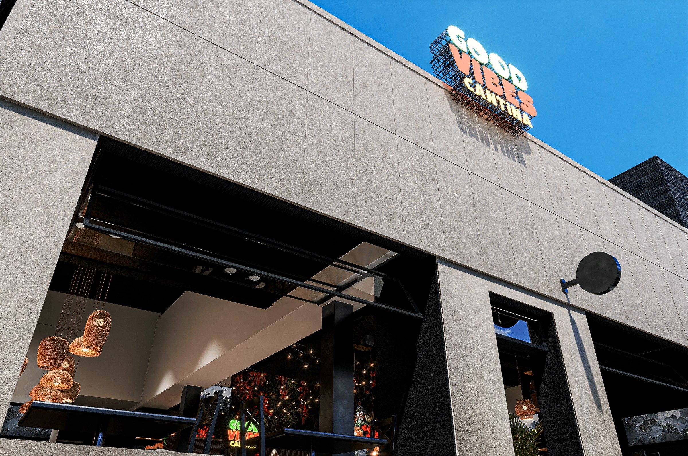
Then a rendered walk-through let the owners stroll it end to end: rattan pendants, a mural of tropical flowers, the wordmark in neon over red banquettes, and the sign on the roof.
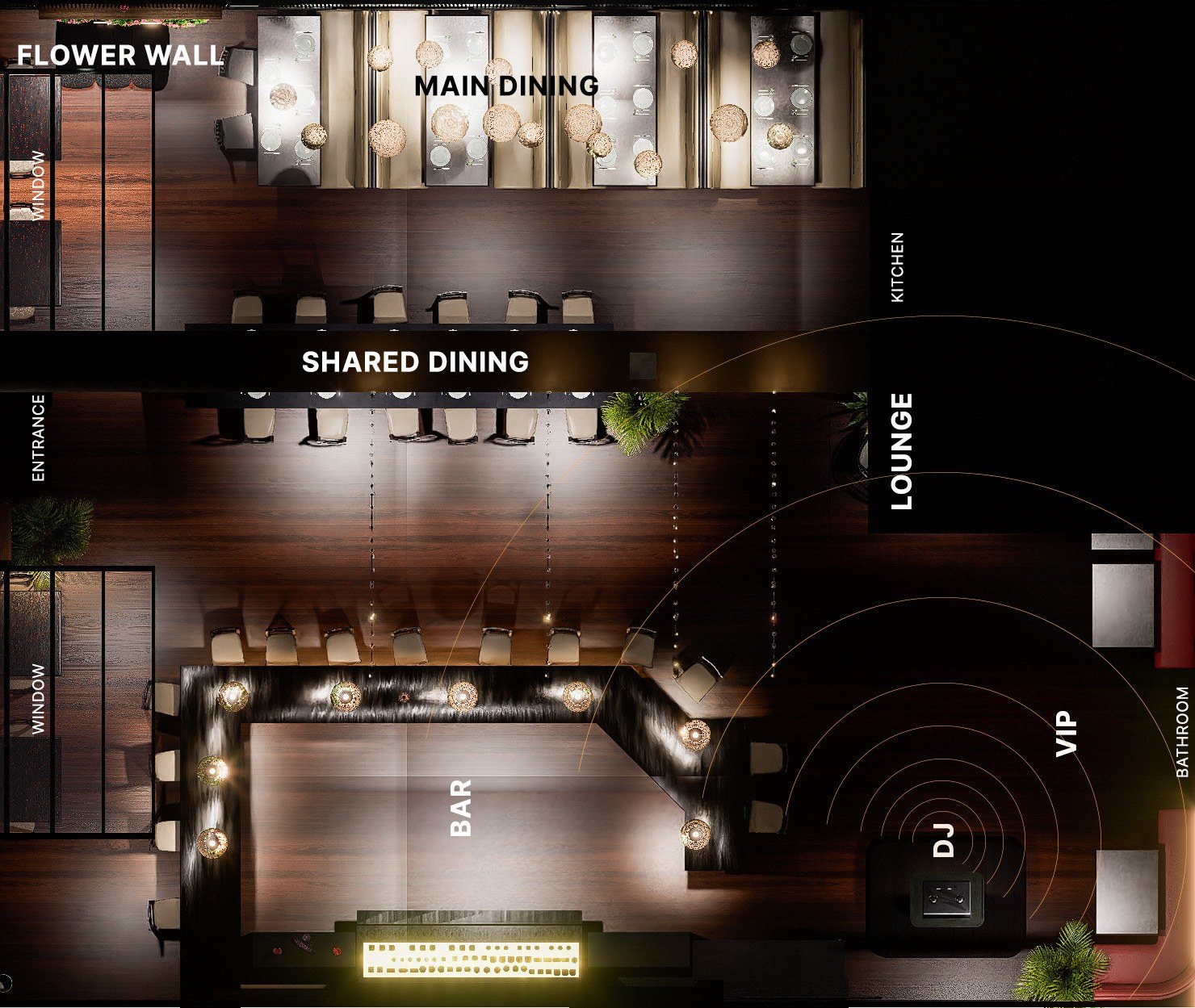
A rendered plan of the room from above, labelled flower wall, main dining, shared dining, lounge, VIP, DJ, bar and entrance.
The plan.
A rendering of the front: a pale concrete façade, open windows with rattan pendants inside, and the wordmark as a sign on the roof against a blue sky.
The front, rendered.
A rendering of the dining room: red banquettes under a mural of red and orange tropical flowers, the wordmark glowing in neon at its centre.
A rendering of the booths: cream banquettes and dark tables under clusters of rattan pendants, a flower wall with a Good Vibes Only neon behind.
Interior visualisation, August 2023.
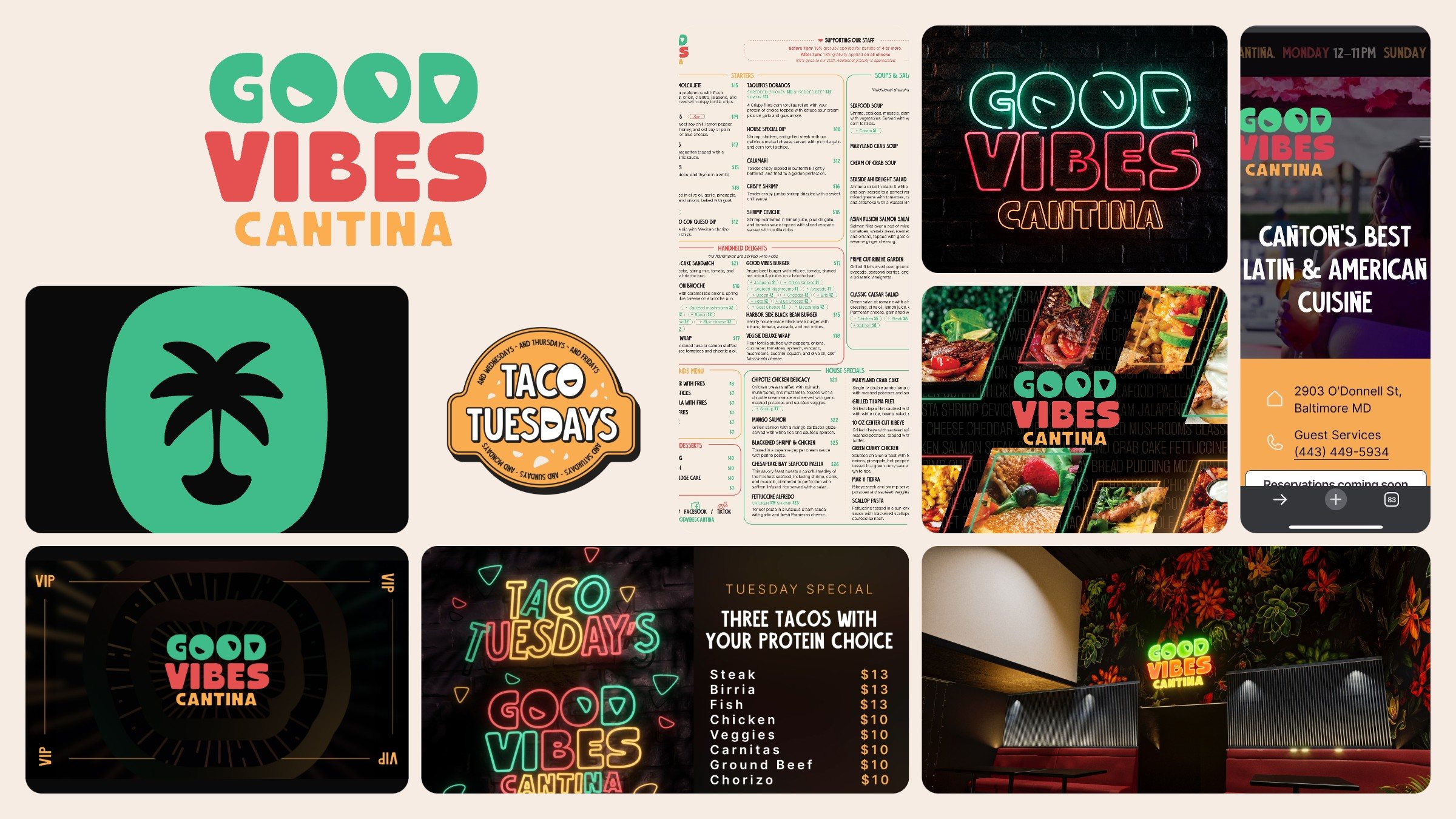
The system at a glance: the wordmark on cream, the main menu, the neon wordmark on brick, the site on a phone, the palm icon, the Taco Tuesdays sticker, the food banner, the VIP card, the Taco Tuesday screen and the rendered dining room.

Good vibes only

Made by
Signal Eight: guest research, identity, menus and print, signage and bar screens, film edit, website (Framer), social, interior visualisation
Type
The wordmark is drawn; text in Anybody
Photographs
The food photographs on the banners and the site are the restaurant’s own.

Next case study

Regular Hours

An identity for an essentials label built on the reorder: the order book's ditto, written across a carbon-blue ledger, receipts, posters and a shop that remembers your size.
Four canary posters on a grey hoarding: the first reads Tee 01, black, M., the other three only the ditto

Let’s find your signal.

Tell us about your brand