Case study · 2026
Regular Hours
An identity for an essentials label built on the reorder: the order book's ditto, written across a carbon-blue ledger, receipts, posters and a shop that remembers your size.
- Client
- Regular Hours
- What we made
- Strategy, Identity, Voice, Photography, Website, Campaign
Regular Hours is a mid-premium US essentials label whose pieces are made the same way every season. The system centres on the ditto, the order book's mark for "same as above".
01 · The category
Everyone sells permanence. The first thing they say is a coupon.
We mapped ten US essentials brands. The same codes repeat: warm, film-graded lifestyle photography; beige and olive palettes; small, widely spaced sans wordmarks; "permanent", "timeless" and "responsibly" on every page. "Permanent collection" is already claimed, word for word.
And the first message most homepages send is a discount pop-up.
How do you make the same tee feel like yours for years?
02 · The order book
The answer was already on the counter.
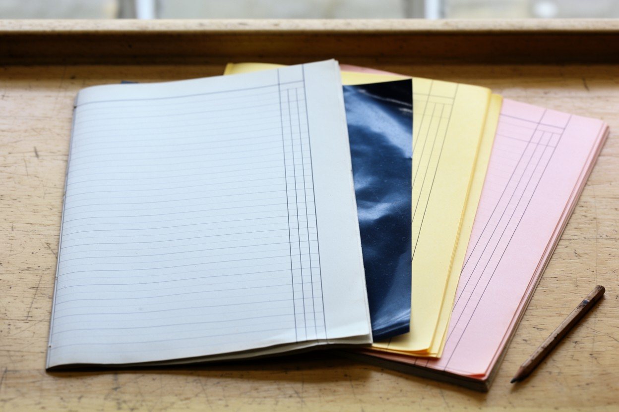
A regular never says their order twice. Shop counters have always written it down: the duplicate order book, three sheets and a carbon, where anything repeated is marked with two short strokes.
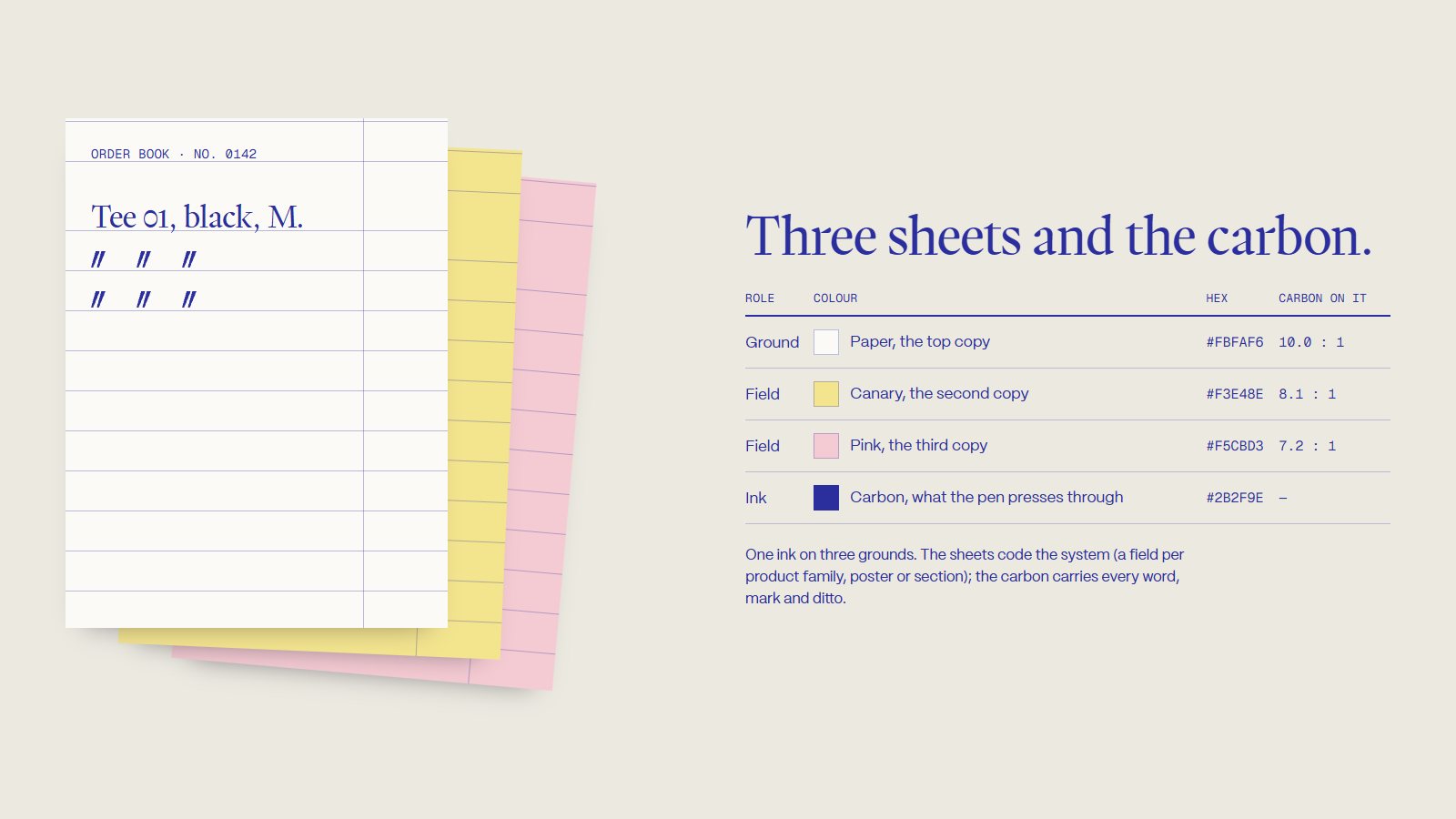
We took the whole identity from that book: the colours of its copies, the carbon-blue ink the pen presses through, and the ditto.
03 · The rule
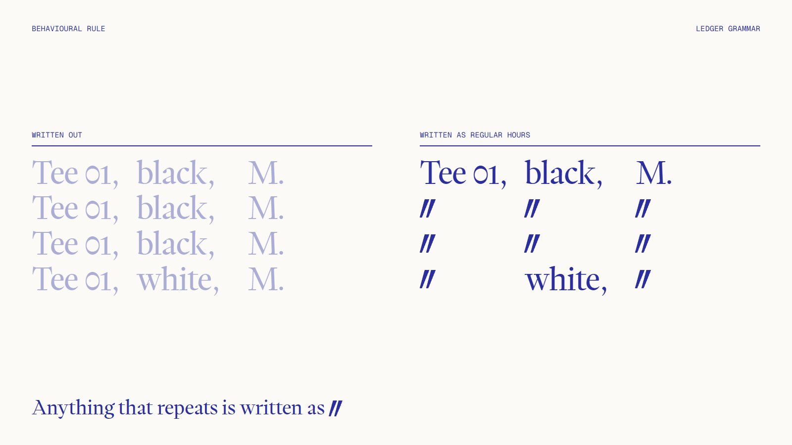
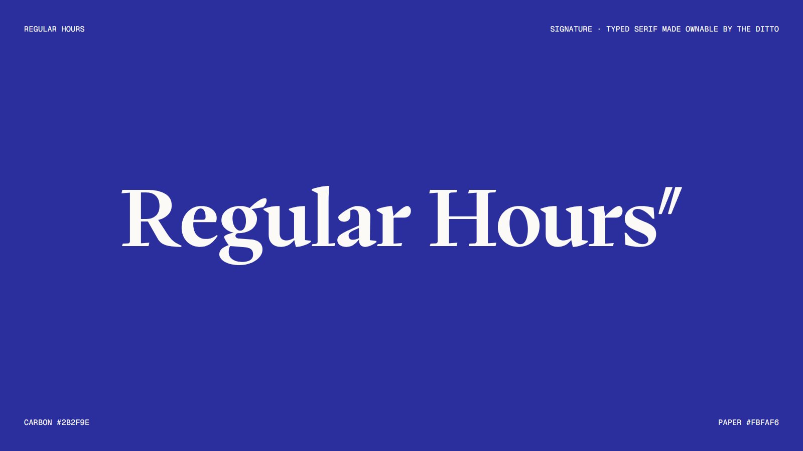
Anything that repeats is written as
The ditto works like a letter the brand writes. On a receipt, in a ledger, down a run of posters, the second line is always the mark.
The product never changes, so the list shows it. The name is set in Writer, and the ditto finishes it.
04 · Type
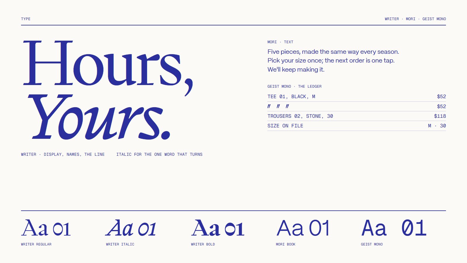
A serif for the name, a ledger for the rest.
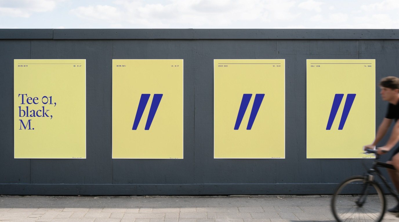
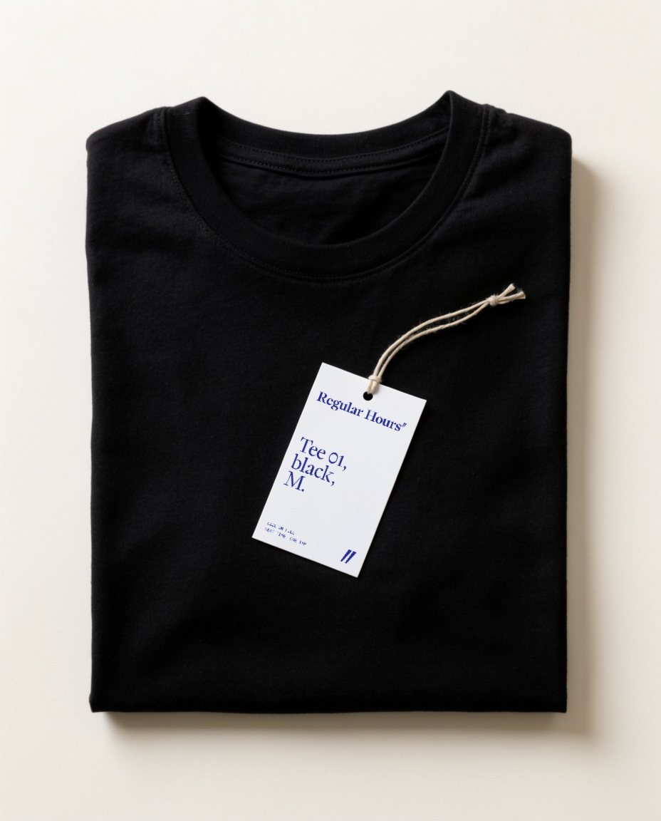
Writer sets the name and the lines, with italic kept for the one word that turns. Mori carries the text. Geist Mono writes the ledger, the receipts and every label, so a product reads the same on a tag as in the bag: Tee 01, black, M.
05 · Her usual
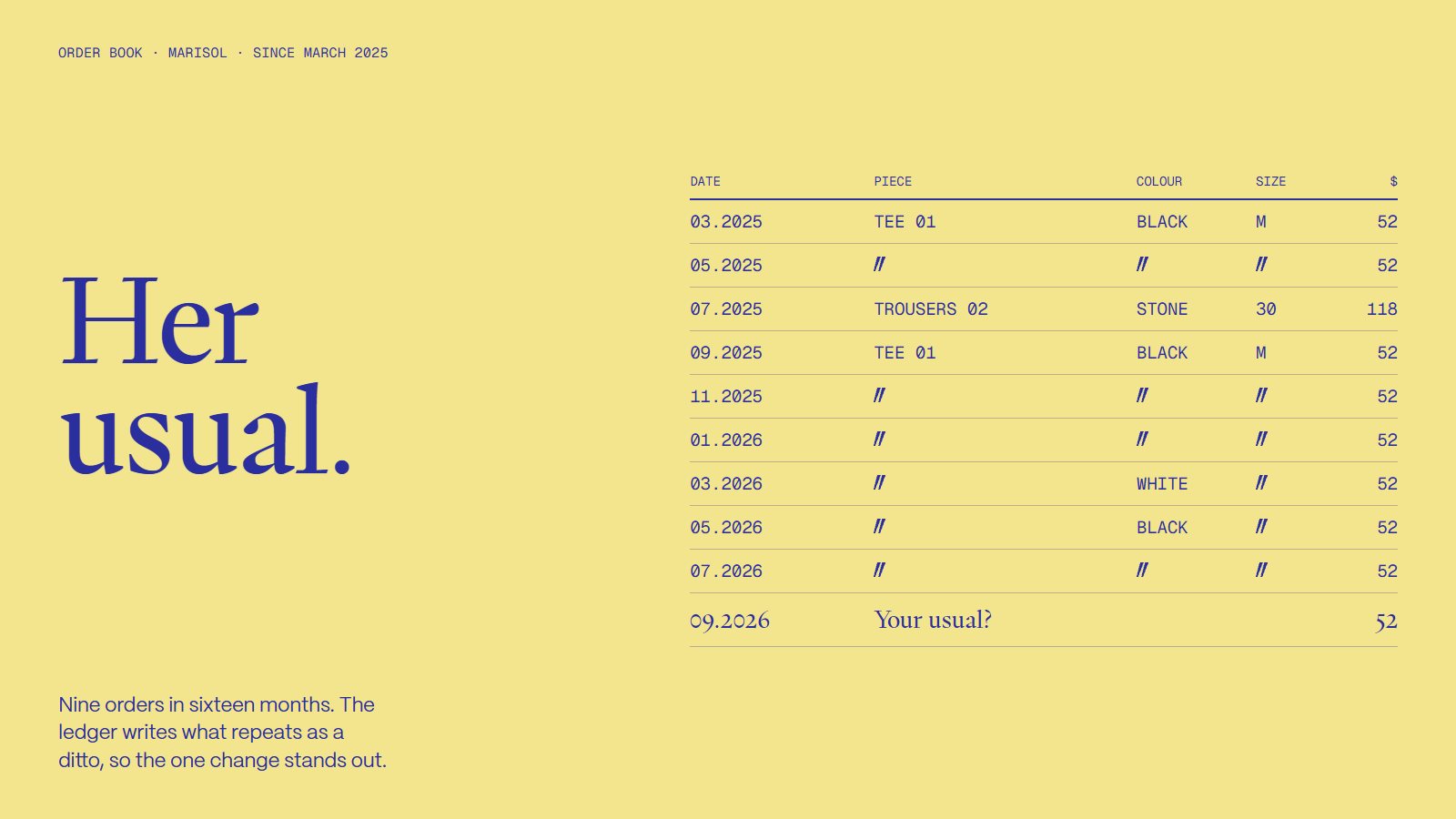
Nine orders, one change.
Written as a ledger, a customer's history becomes the brand's clearest picture. Marisol, one of the cast regulars, orders the same tee every other month. The ditto shows the habit, so the single change stands out.
06 · Photography
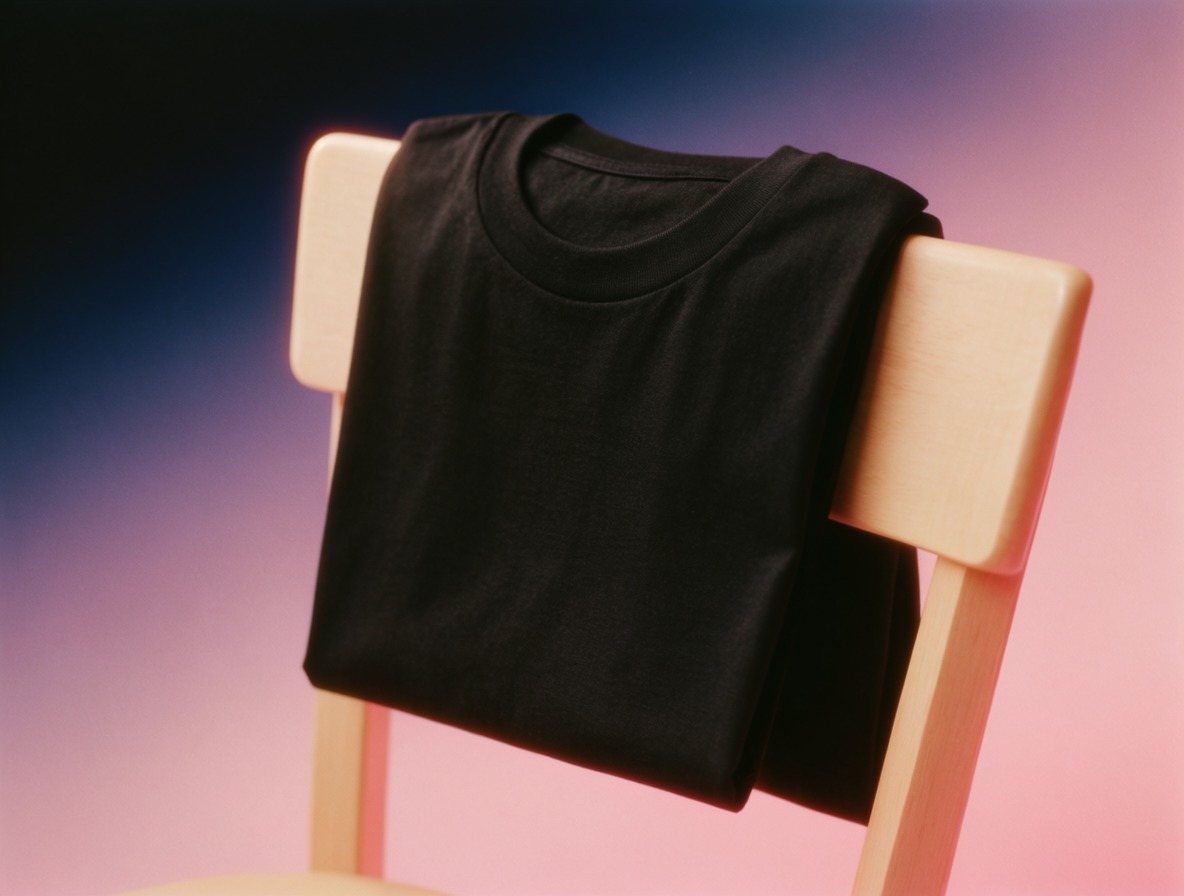
The same person, a year apart.
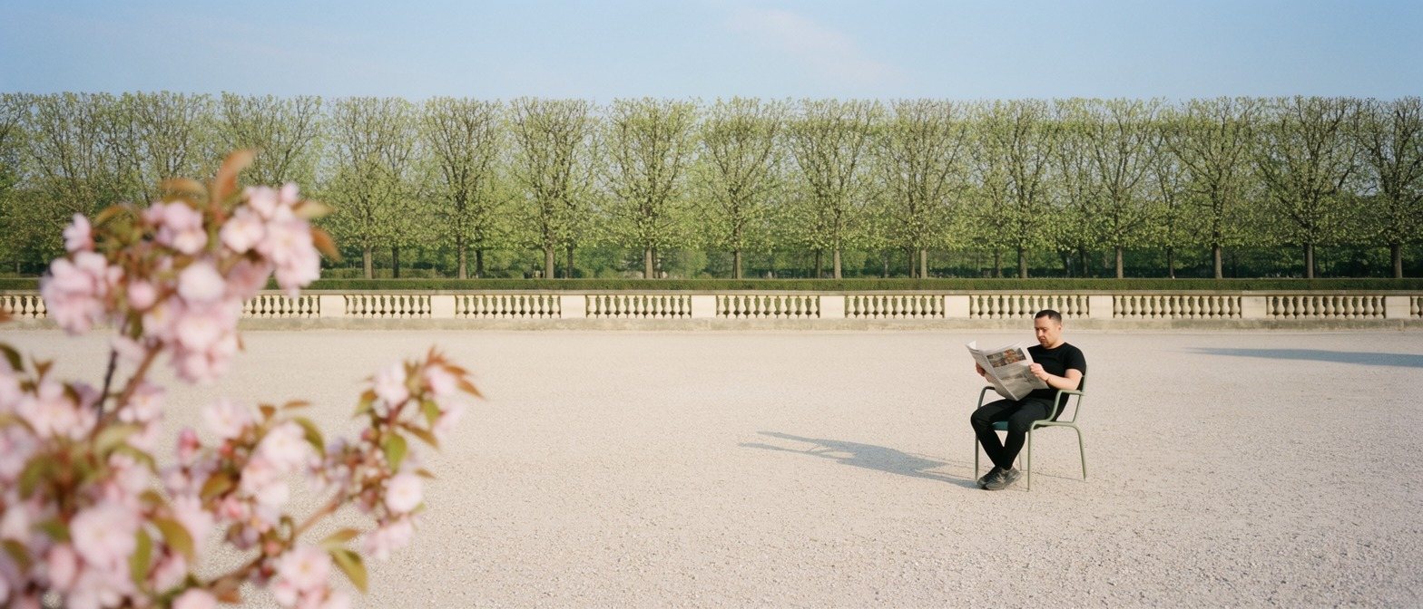
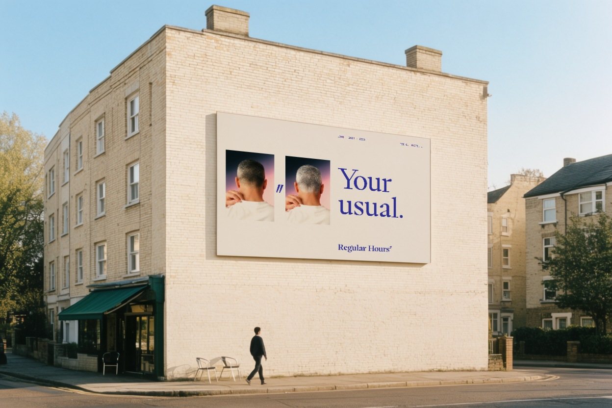
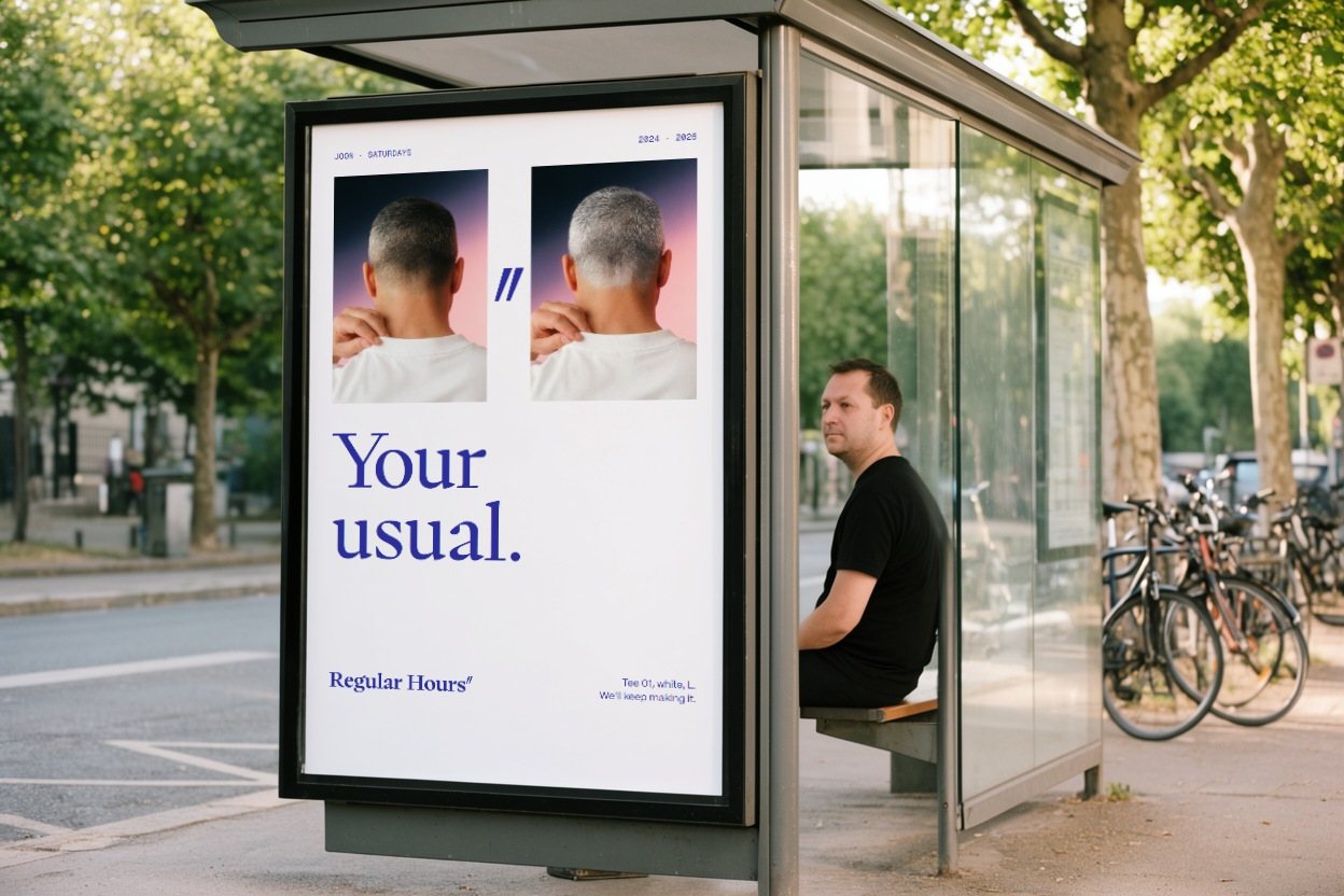
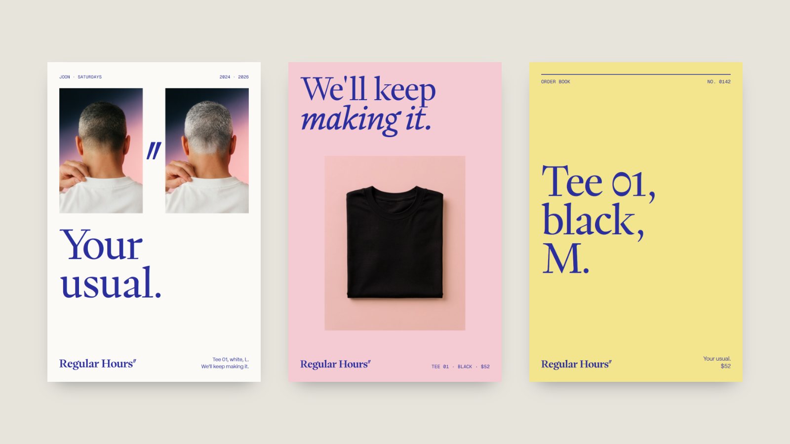
The photography keeps the habit too: the same regular, the same gesture, twelve months later. In the studio, a soft glow in the brand's own gradient. Outside, a strobe over daylight and a long lens, so the place melts and the person stays sharp.






07 · In the street
At city scale, the rule becomes the joke.
Posters run in sets on the three copy colours. On a hoarding, the first poster says it and the rest are the ditto: same as above, all the way down the street.
08 · In the hand
The receipt is the thing a regular keeps.
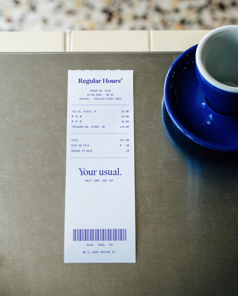
Every printed piece uses the ledger: the receipt on her café counter, the hang tag with the size on file, and the tote on the hook by the door, next to the keys.

09 · The shop
The shop remembers your size.
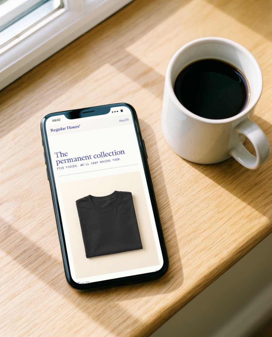
The website sells five pieces and one idea. You pick your size once; after that, the header asks one question and the next order is one tap. There is no coupon pop-up. The only prompt is "Your usual?"
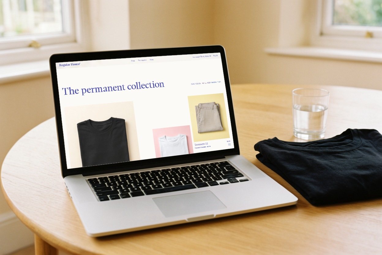
The only promptYour usual?
How a product is writtenTee 01, black, M.
The promiseWe'll keep making it.
Same as above.
- Concept
- A self-initiated concept by Signal Eight, made to show our capabilities.
- Made by
- Signal Eight: strategy, identity, voice, art direction, website and campaign
- Images
- Photography art-directed by Signal Eight to the brand's two styles
- Type
- PP Writer and PP Mori (Pangram Pangram), Geist Mono
Next case study
Amici & Vino
An identity, social launch and website for Amici & Vino, hosted wine tastings in Connecticut and New York: a script monogram whose A ties itself round a bottle, in rose copper on black.