Case study · 2026
Three Lodgers
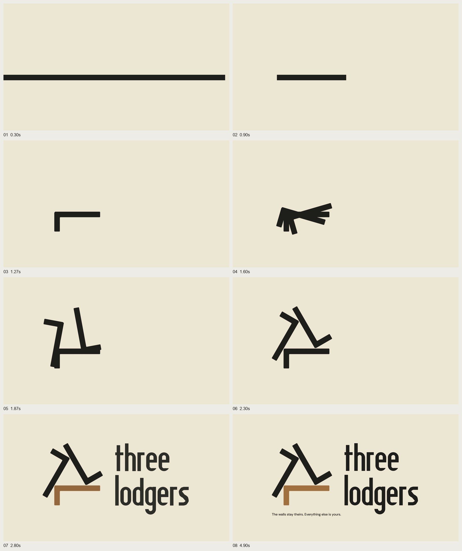
A home-goods brand for people who rent: shelves, lamps and hooks that press between floor and ceiling, so the walls stay as you found them. Its mark is one L turned three times round the room the lodgers share.
- Client
- Three Lodgers
- What we made
- Strategy, Naming, Identity, Voice, Image direction, Website, Packaging, Campaign
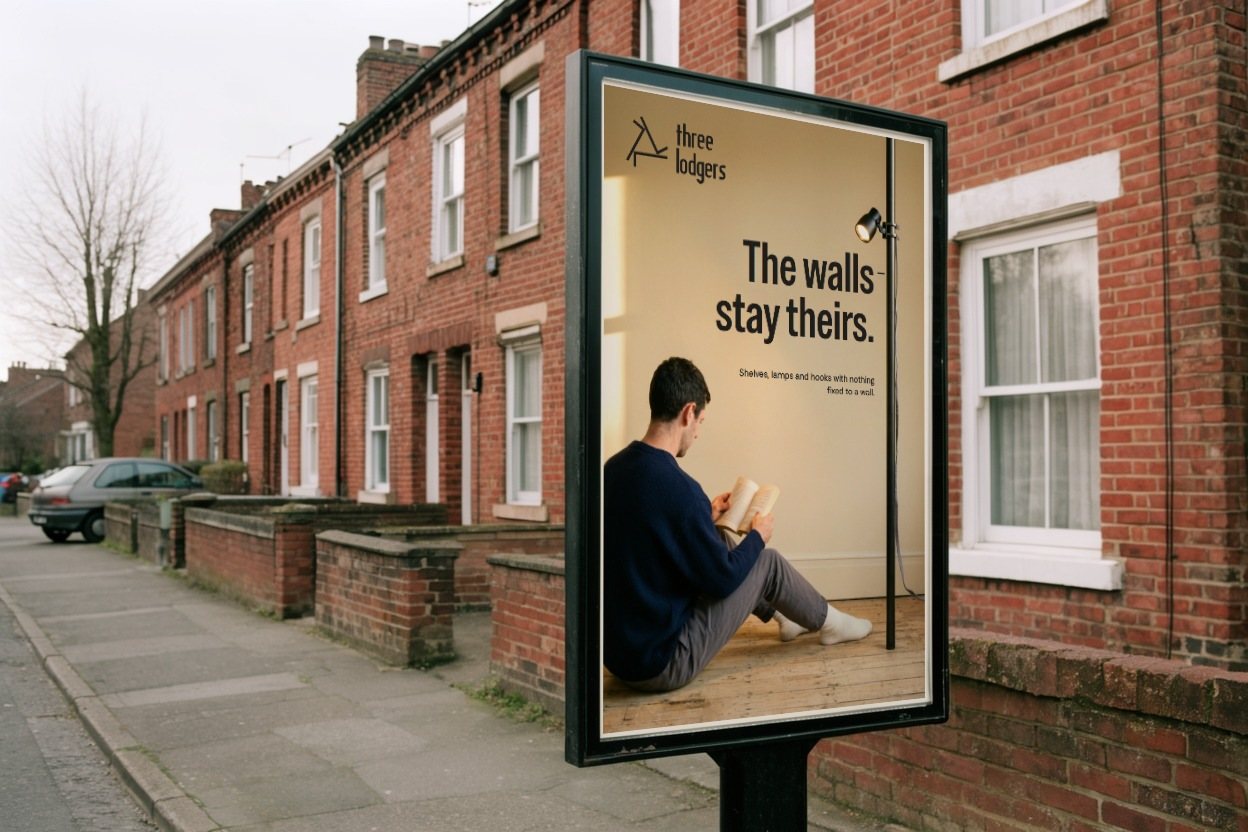
Signal Eight created Three Lodgers, a home-goods brand whose shelves, lamps and hooks press between floor and ceiling or lean, so the walls stay just as you found them. The system hangs from one vertical line, the Pole, and its mark is one L turned three times round a small room: three lodgers, each with a wall of their own, and the space they share.
01 · Situation
A home for as long as you stay.
4.7 million households in England rent privately, and since May 2026 their tenancies no longer end on a set date. They stay for years, and they want those years to feel like home. Most tenancies ask for walls without fixings, so the answer had to come from somewhere else: the floor and the ceiling.
Home brands design for the owned room. Renters' products sit in keyword listings. There was room for a brand made for renting, and proud of it.
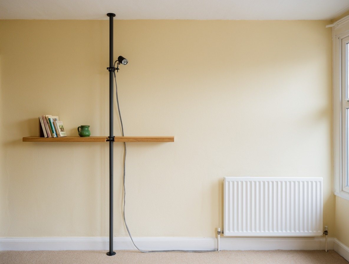
How do you finish a home and leave the walls just as you found them?
02 · The truth and the idea
Floor and ceiling are fair game.
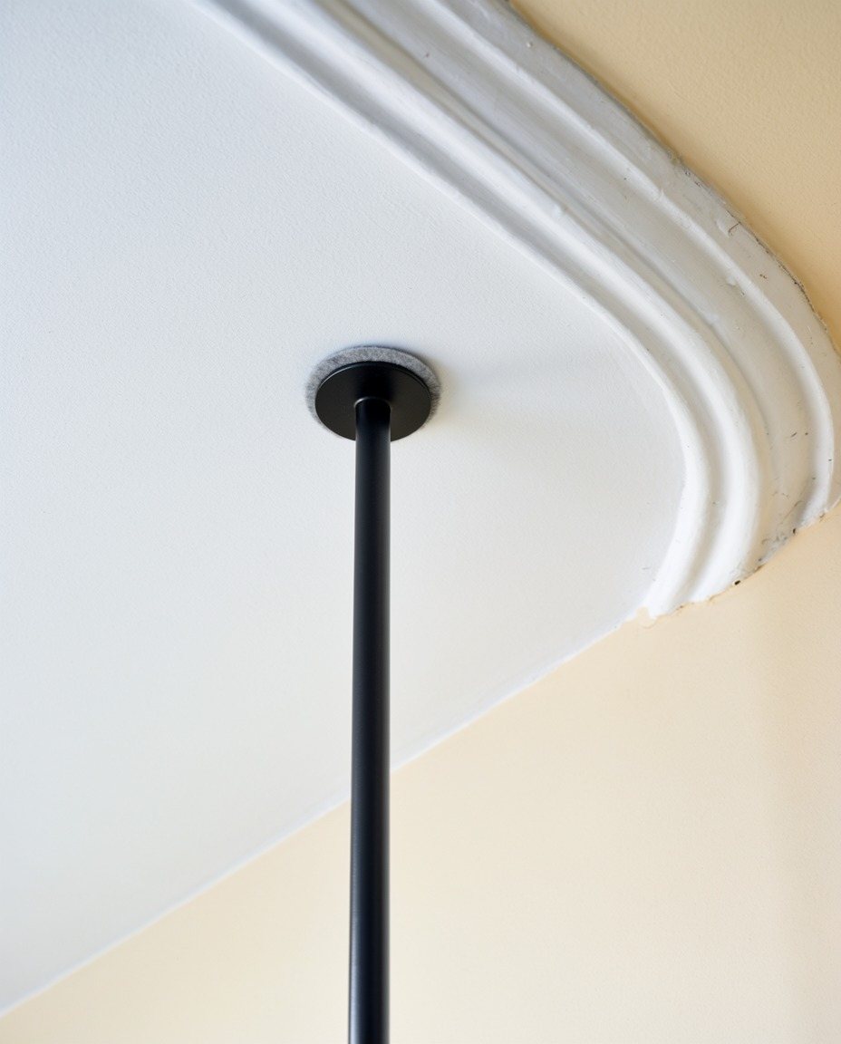
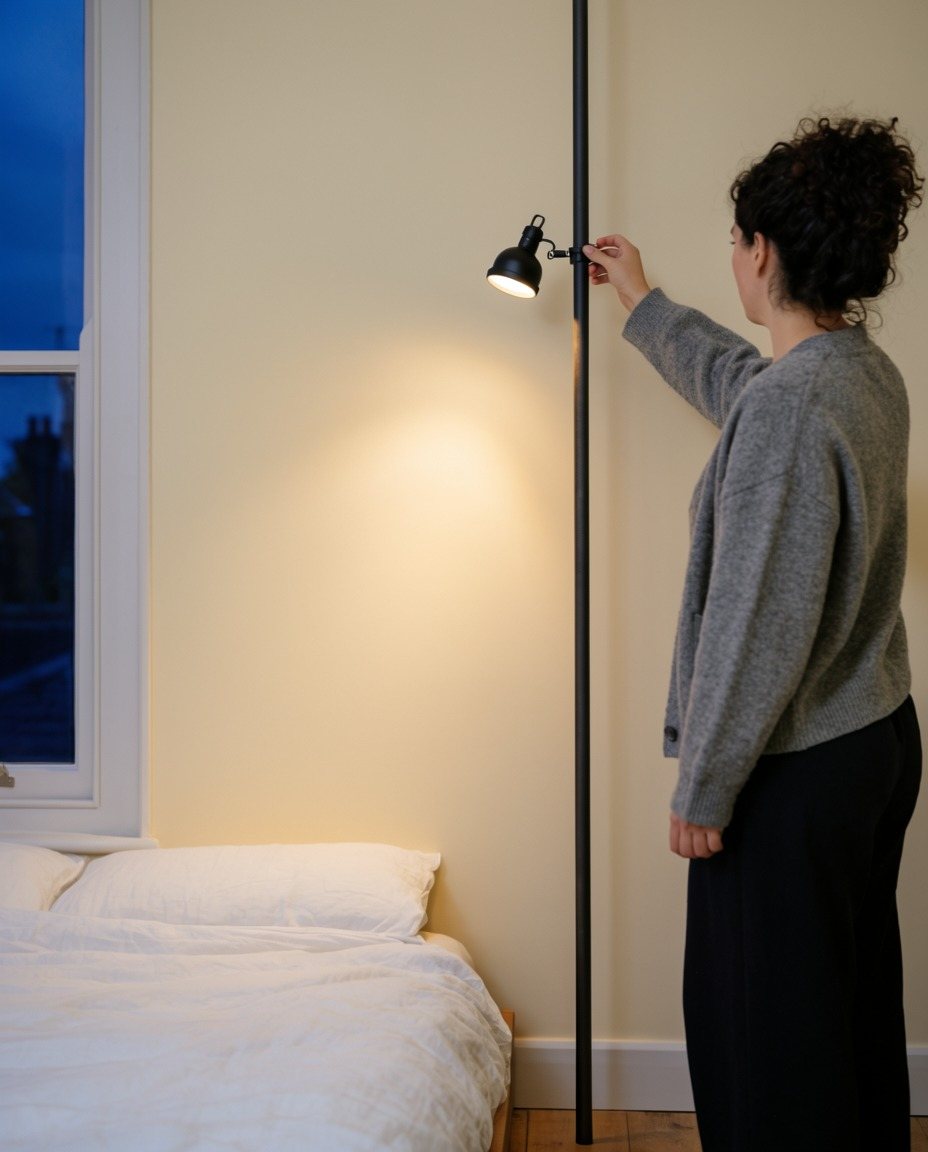
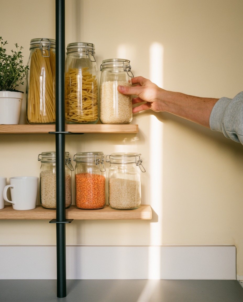
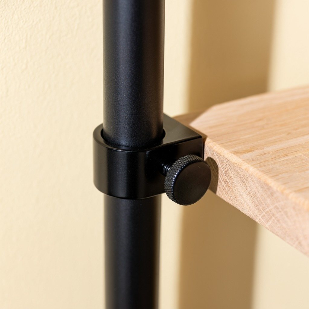
A tension pole is a steel tube with a spring foot: twist it and it presses between floor and ceiling, fixed to nothing. Everything else can clamp to it. That gave us the offer, the range (press, clamp, hang, lean) and the idea:
The walls
stay theirs.
Everything
else is yours.
03 · Signature
One L, turned three times.
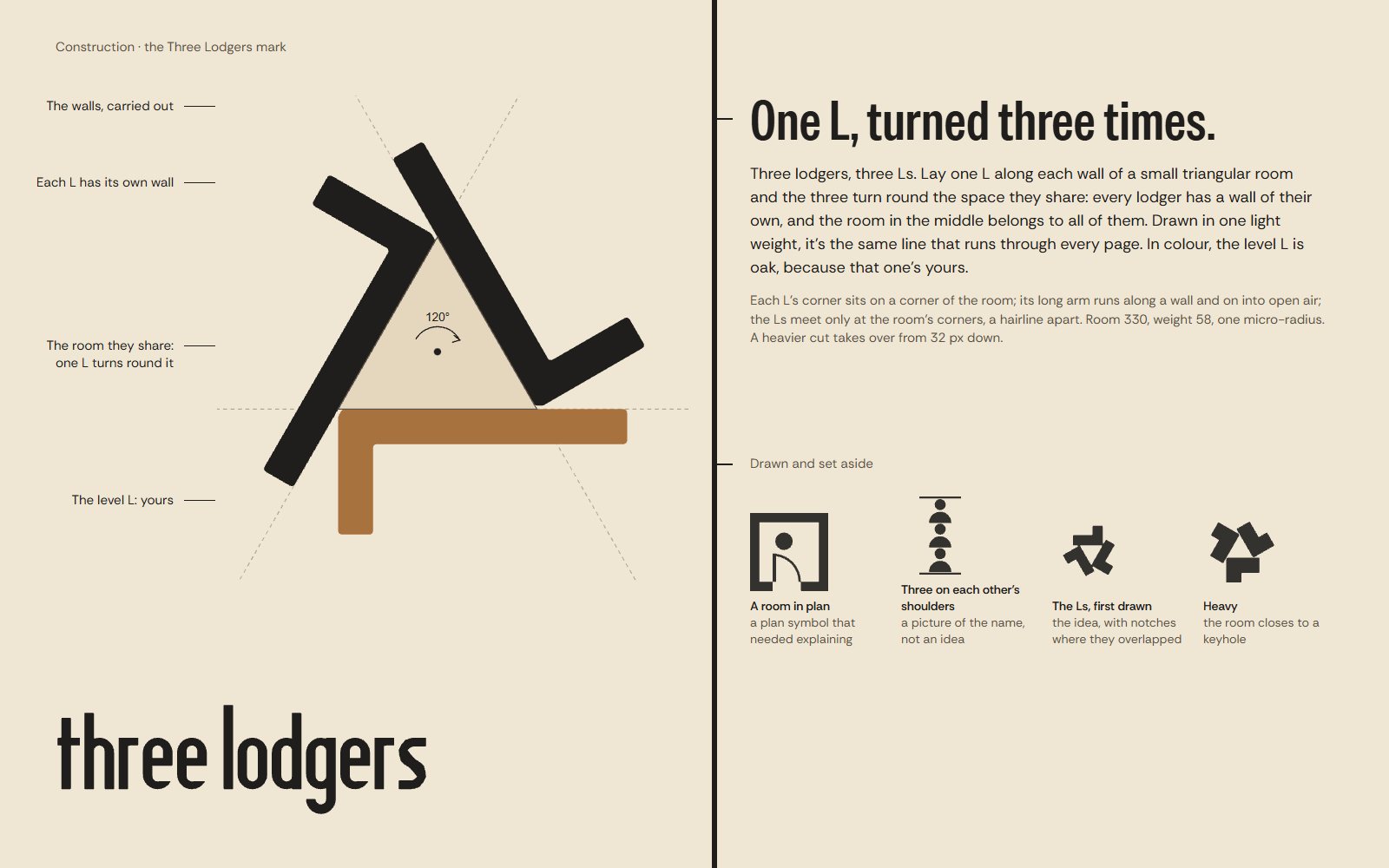
Three lodgers, three Ls. We laid one L along each wall of a small triangular room, so the three turn round the space they share: each lodger has a wall of their own, and the room in the middle belongs to all of them. Each L meets the next only at a corner of the room, and the whole mark is drawn in one light weight, the same line that runs through every page. In colour the level L is oak, because that one's yours. The name is drawn condensed, tall like the Pole.
On the way we drew a room in plan with a lodger at the door, then three lodgers standing on each other's shoulders. Both were pictures of the name. The letters held the better idea: the name gives you three Ls, and three Ls turned round a point leave a room between them.
04 · The line
Everything clamps to one line.
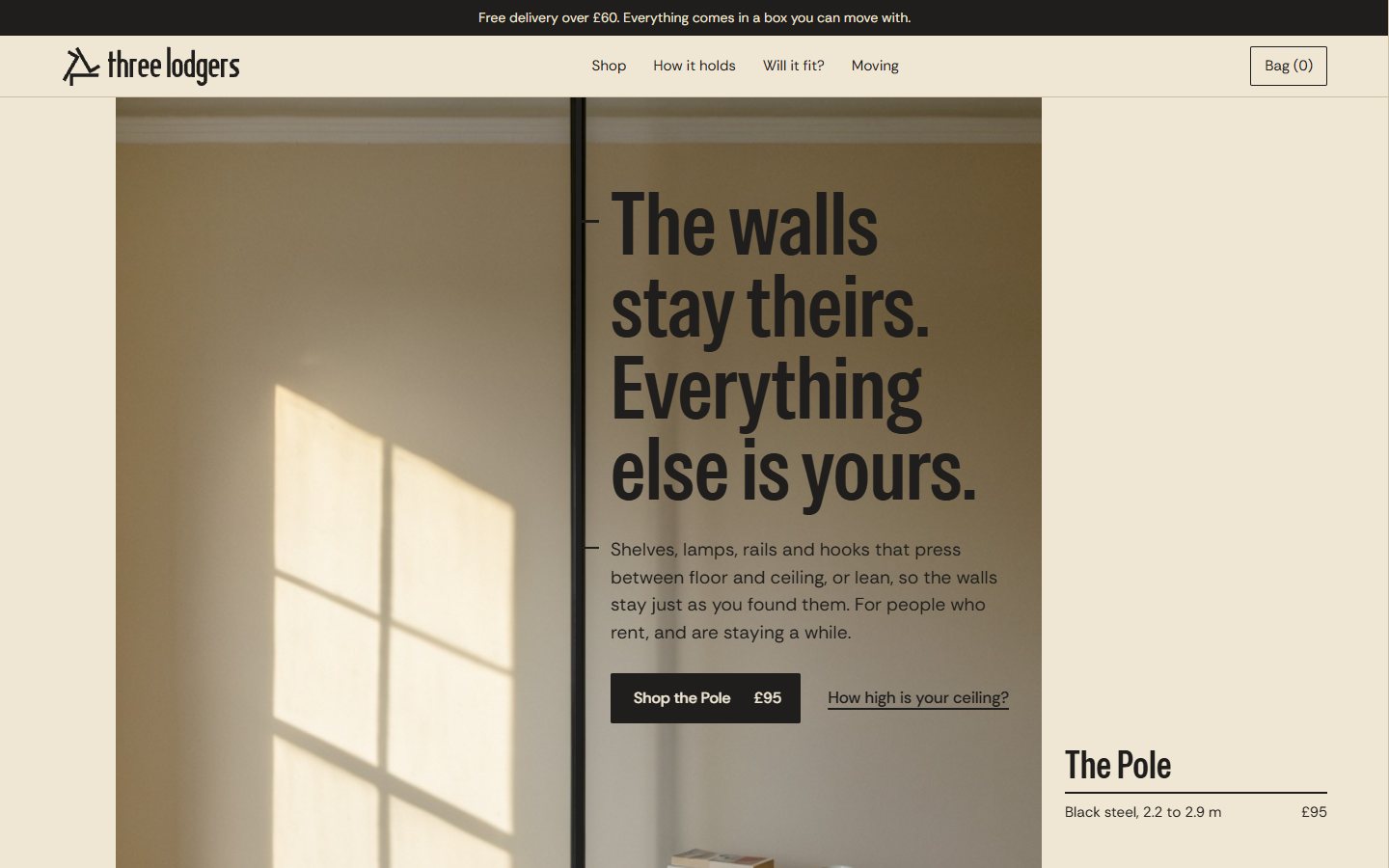
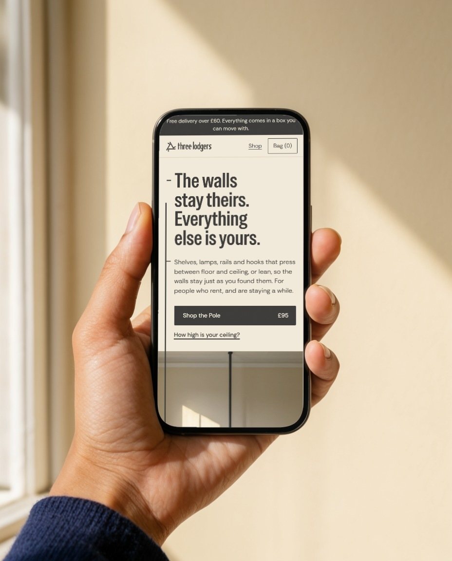
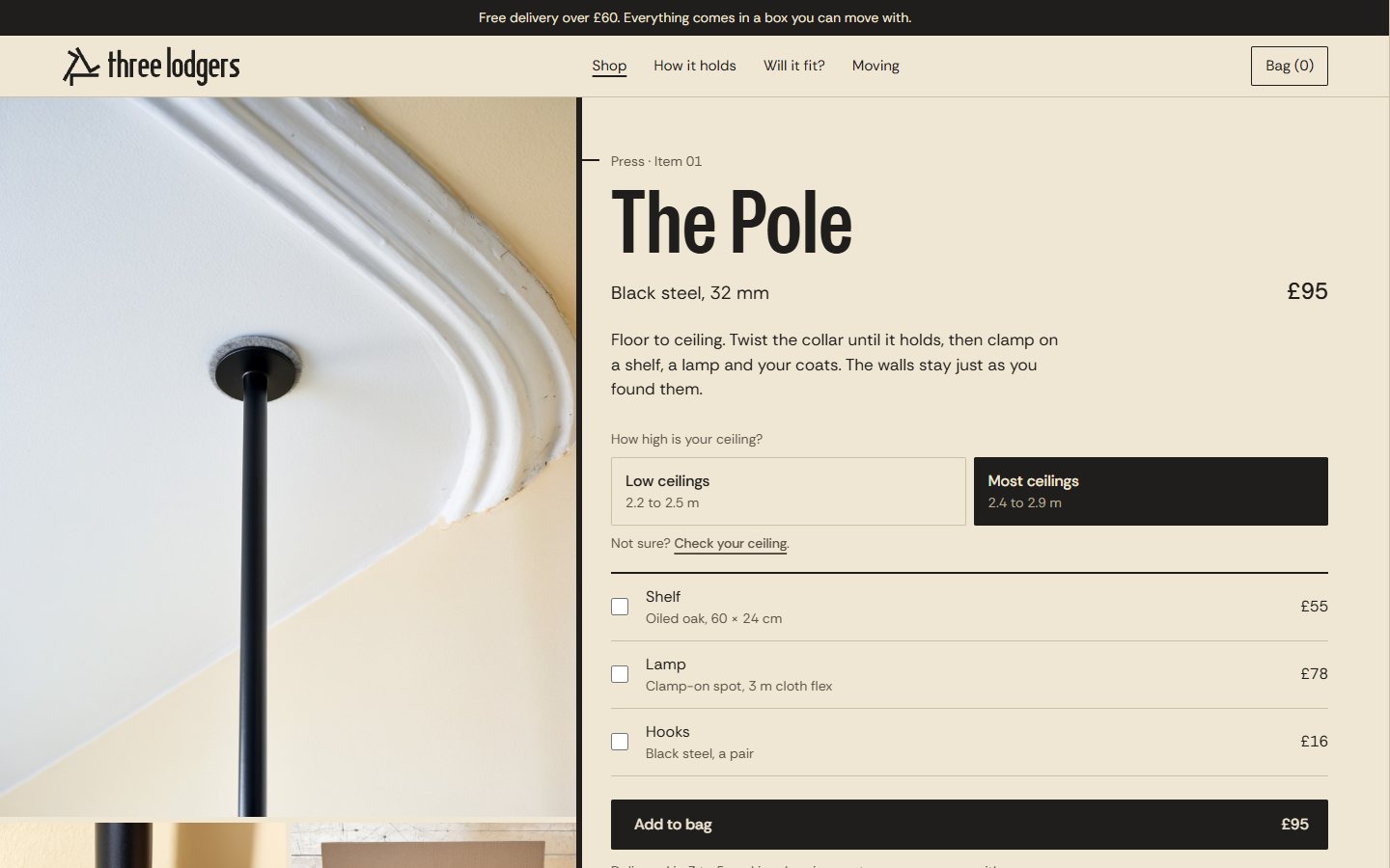
On every surface one line presses from edge to edge, like the Pole, and everything is attached to it with a short tick: headlines at eye level, products at shelf height, prices near the floor. The margins, the surface's walls, stay empty. On the website the photograph's own pole and the page's line are the same line.
05 · Colour
The landlord's paint, and one colour that's yours.
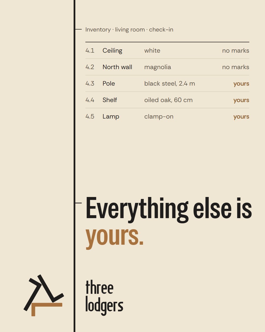
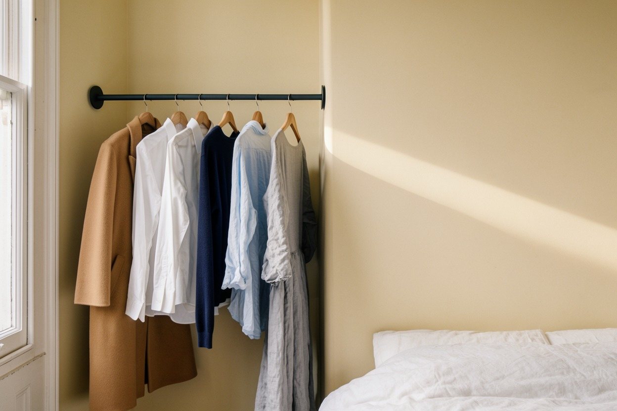
The ground is magnolia, the paint of a thousand rented walls, taken from our photographs in sun and in shade. The ink is the Pole's black steel. The only other colour is oak, from the Shelf, and it only ever marks what belongs to the renter.
06 · Type and voice
The tenancy's own words, said plainly.
Special Gothic Condensed for headlines, tall like the Pole; Rethink Sans for everything read. The voice borrows the paperwork every renter knows (the inventory, "no marks") and turns it good-humoured: it leads with what you can do, adds one warm clause where the reader needs it, and speaks well of the landlord.
ProductThe Pole. Black steel, fits ceilings 2.2 to 2.9 m. Twist the collar until it holds. £95. Empty bagYour bag is ready when you are. Start with the Pole: everything else clamps to it. Ceiling too highFor a ceiling that high, the Rail is the one. It fits between two walls up to 190 cm apart. Out of stockThe Pole has sold out. The next batch arrives on 14 October; leave your email and we'll tell you that day.
Chosen from twelve moments written at three positions, dry, centre and warm (test set).
07 · Photography
Afternoon wall.
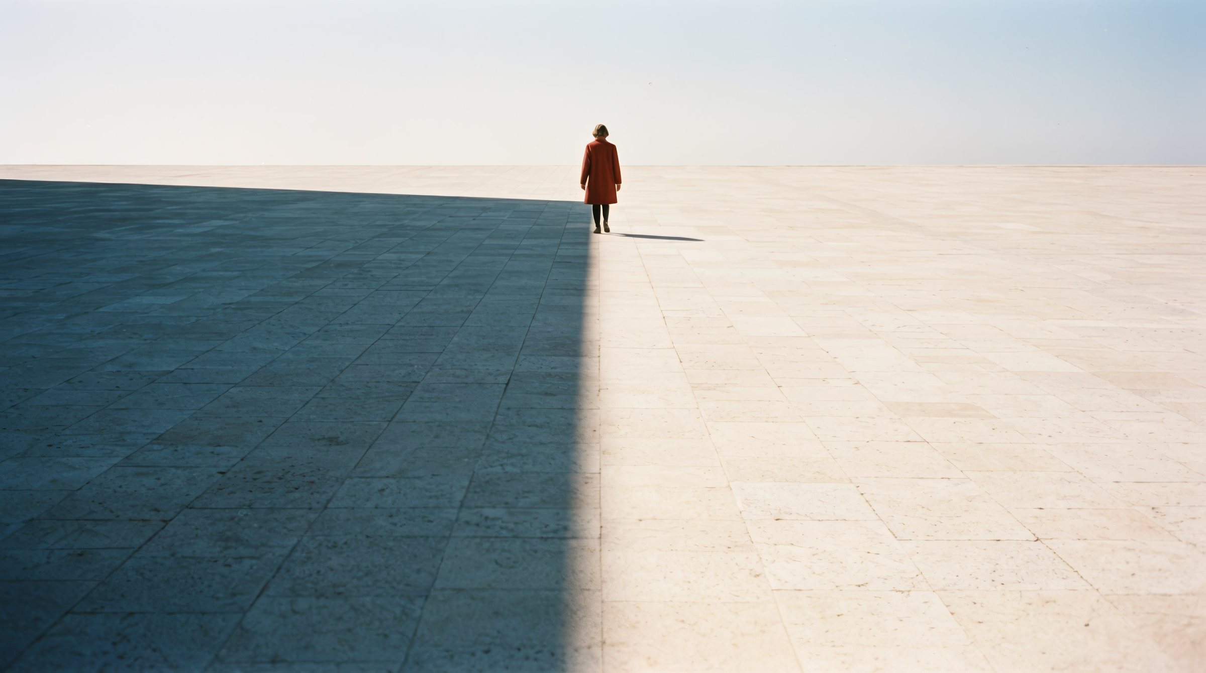
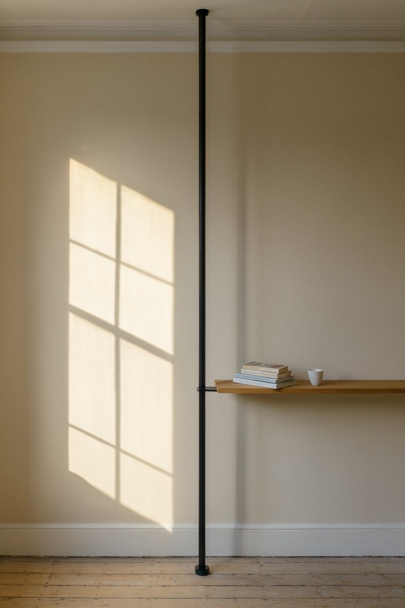
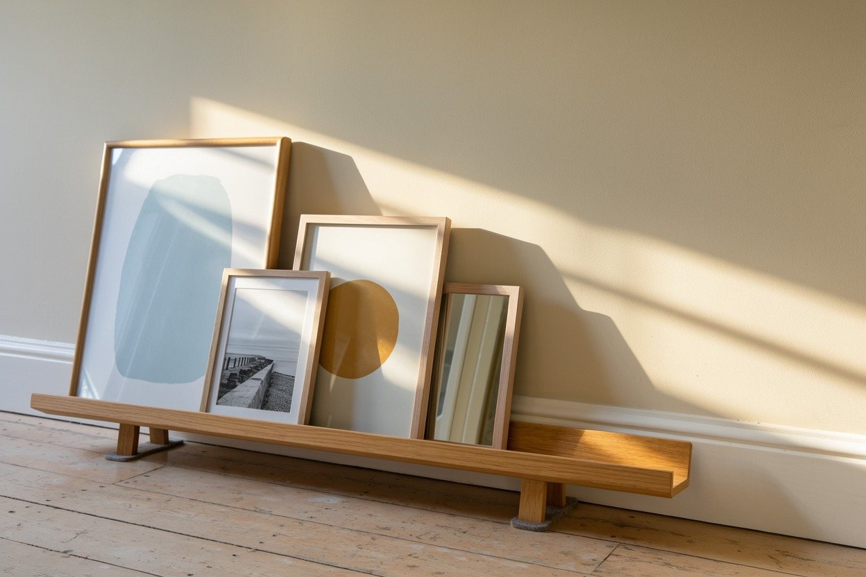
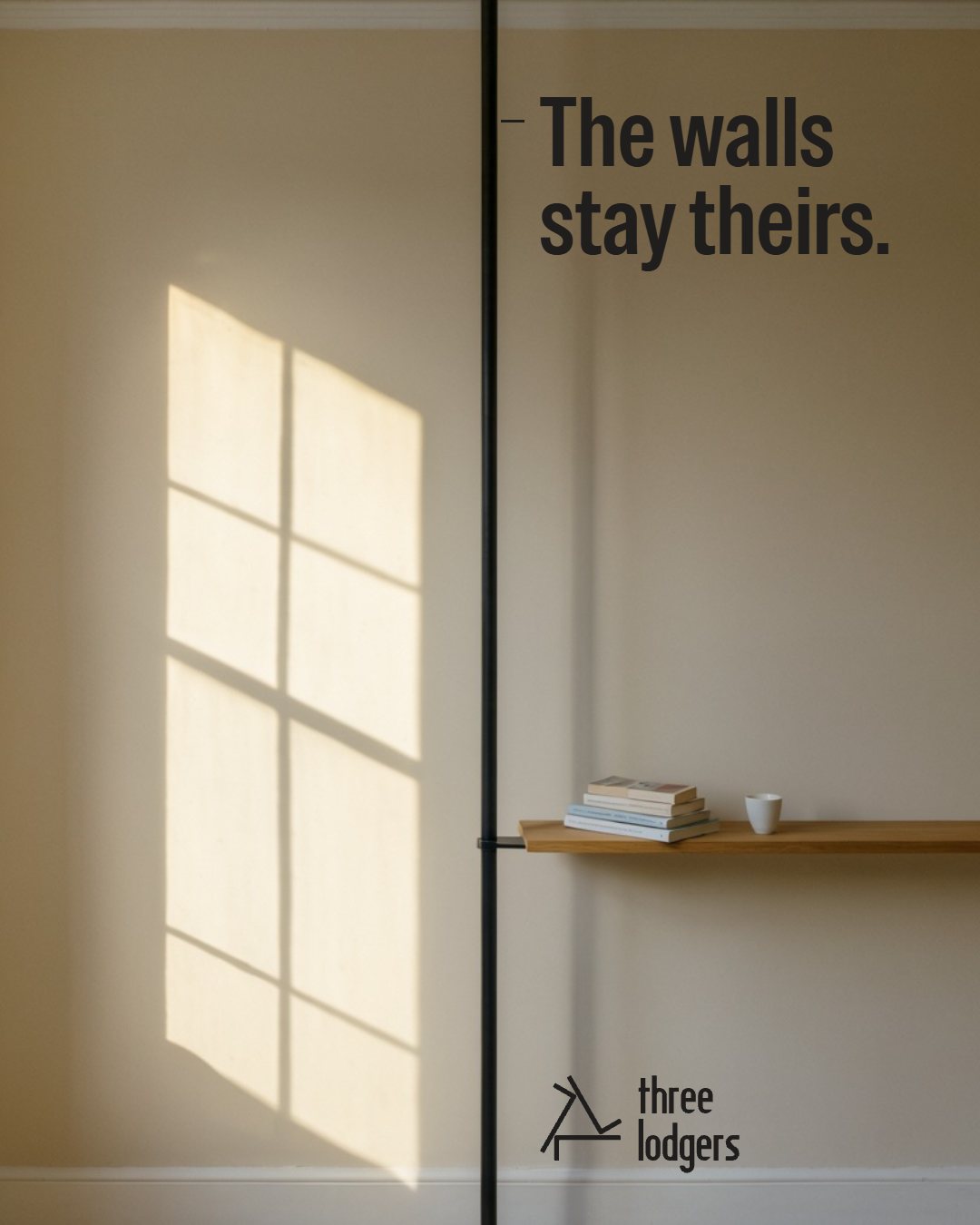
The rented room as it is, made beautiful by light rather than styling: a bare magnolia wall, one hard patch of sun or one pool of lamplight, and the product standing in front of it. The camera stays level and square. At most one person, face turned away. Pictures lean; nothing hangs.
08 · Packaging
The box is how it moves.
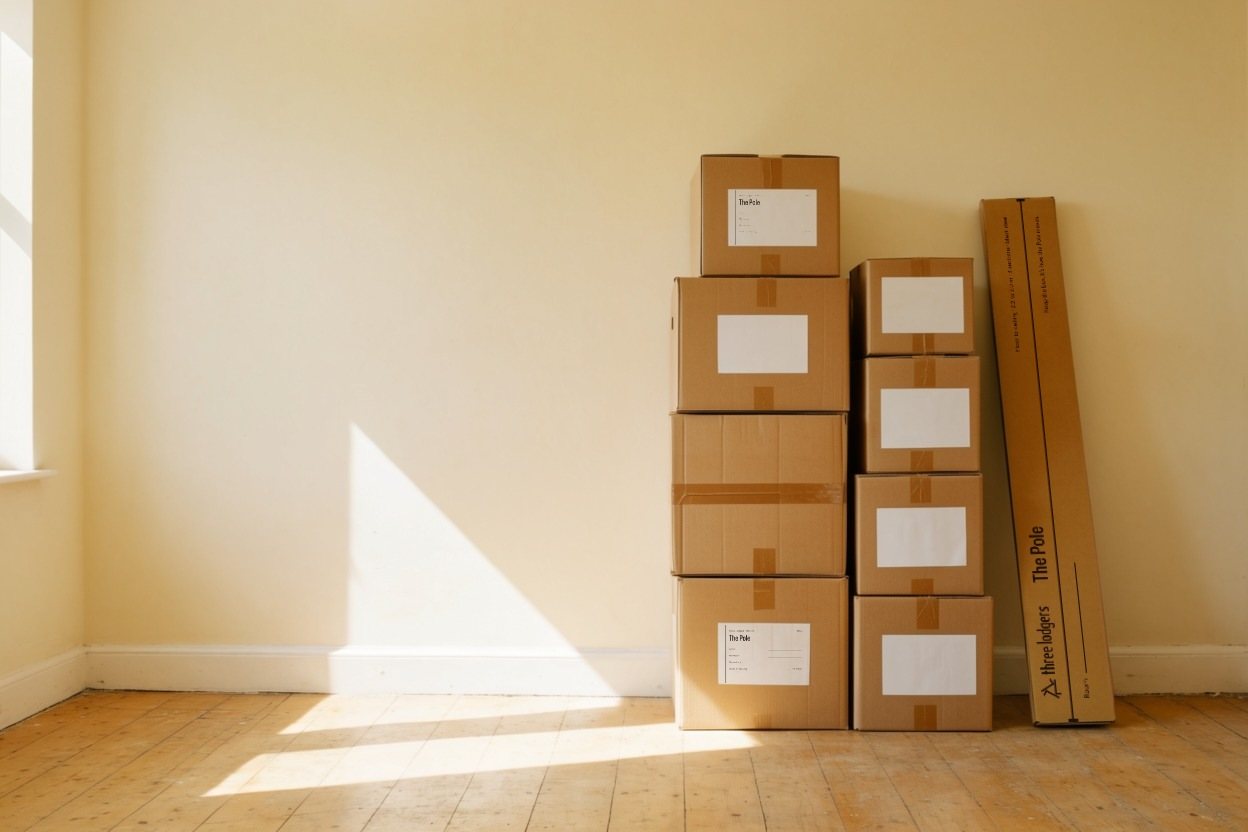
The Pole ships in a long kraft carton printed in one ink, with the Pole lying along it pad to pad and a Room line to fill in on moving day. A paper label borrows the inventory: moved in, moved out, walls on leaving.
09 · Flagship
A shop built on the line.
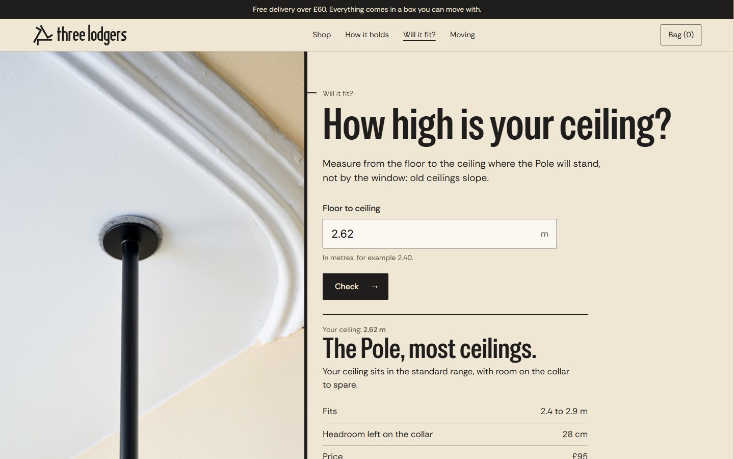
Three pages: home, the Pole and "Will it fit?", a ceiling-height check that answers in the voice and points lower or higher ceilings to the Rail. Every state is written, from the empty bag to the error. On phones the line runs down the left edge and everything clamps to it.
10 · Everyday
Quiet, and still on the line.
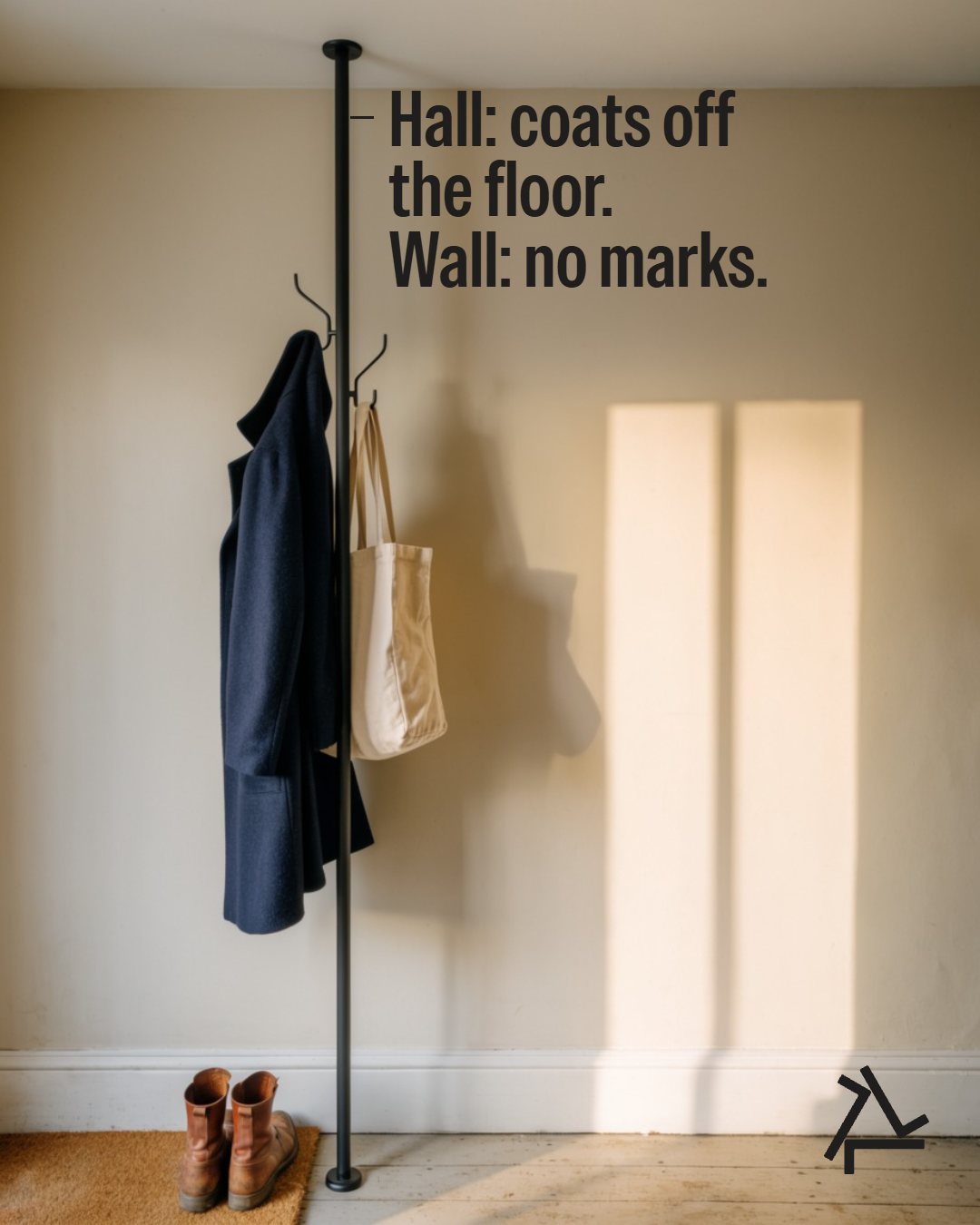
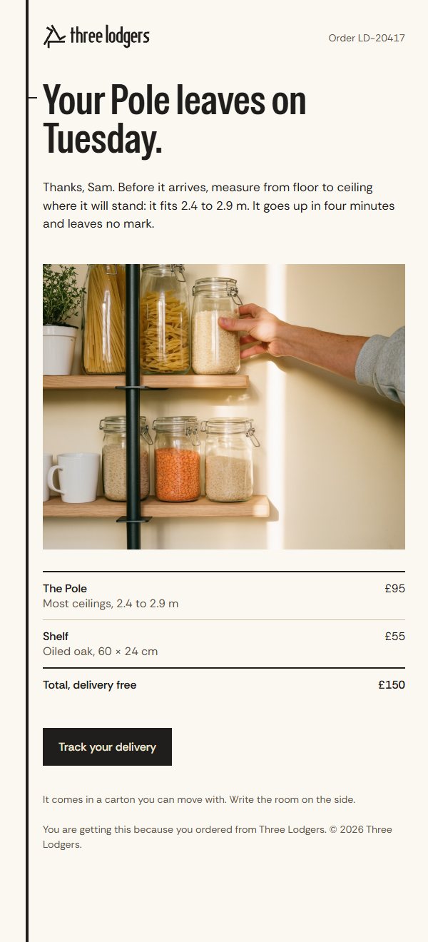
The order email leads with the news and asks you to measure your ceiling. Social posts are rooms, with the words hanging from the pole in the picture.
- Concept
- A self-initiated concept by Signal Eight, made to show our capabilities.
- Made by
- Signal Eight
- Type
- Special Gothic Condensed One and Rethink Sans (OFL)
- Art direction
- Signal Eight
Next case study
Oxide
A colour-cosmetics brand built on one true fact: every skin shade is the same four pigments. A drawn wordmark whose i is the brand's own dropper, and colour always shown across black and white.