Case study · 2026
True Glow
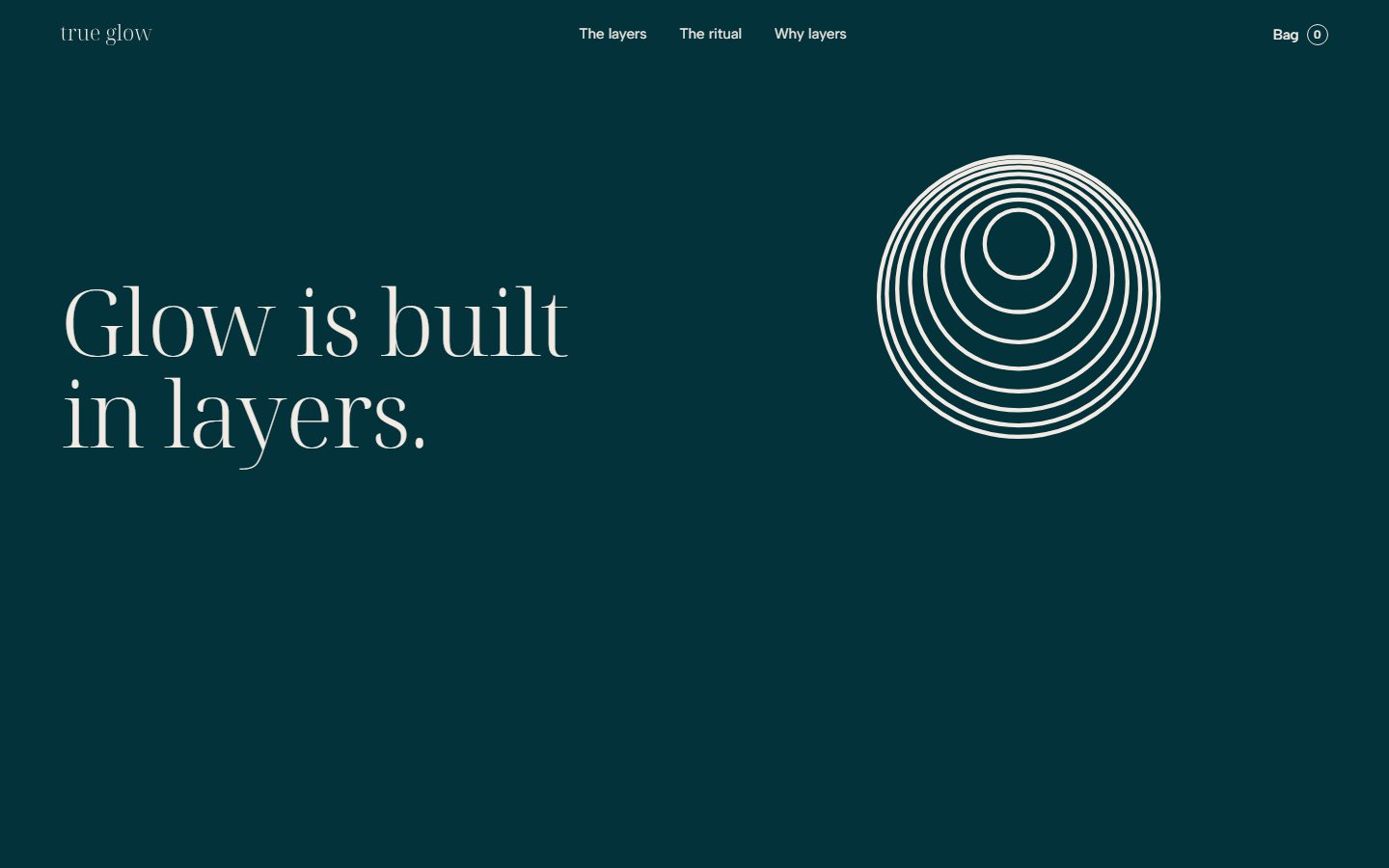
Skincare built on what a glow is: light coming back from inside the skin. The lustre rings, eight hairline layers crowding towards one point, carry the idea across opal-glass packs, a website, print, social and film.
- Client
- True Glow
- What we made
- Strategy, Identity, Voice, Image direction, Packaging, Website, Motion
We created True Glow, skincare for people who want skin that looks alive in daylight. The system centres on the lustre rings: eight hairline layers crowding towards one point, drawn from how a pearl’s lustre and a real glow both come from light returning through thin layers. It runs across opal-glass packs, a website, print, social and film.
01
The category sells the word.
Skincare sells glow everywhere. Across the ten category homepages we mapped, the word turned up as a brand name, a product name, a loyalty club and a headline claim, set on blush, nude and clinical white, with glossy close-ups as proof.
The category gets a lot right: ingredient lists people actually read, and rituals people keep. But nobody said what a glow is, so the word had become a sticker.
02
How do you make “glow” mean something again?
03
Glow comes from inside.
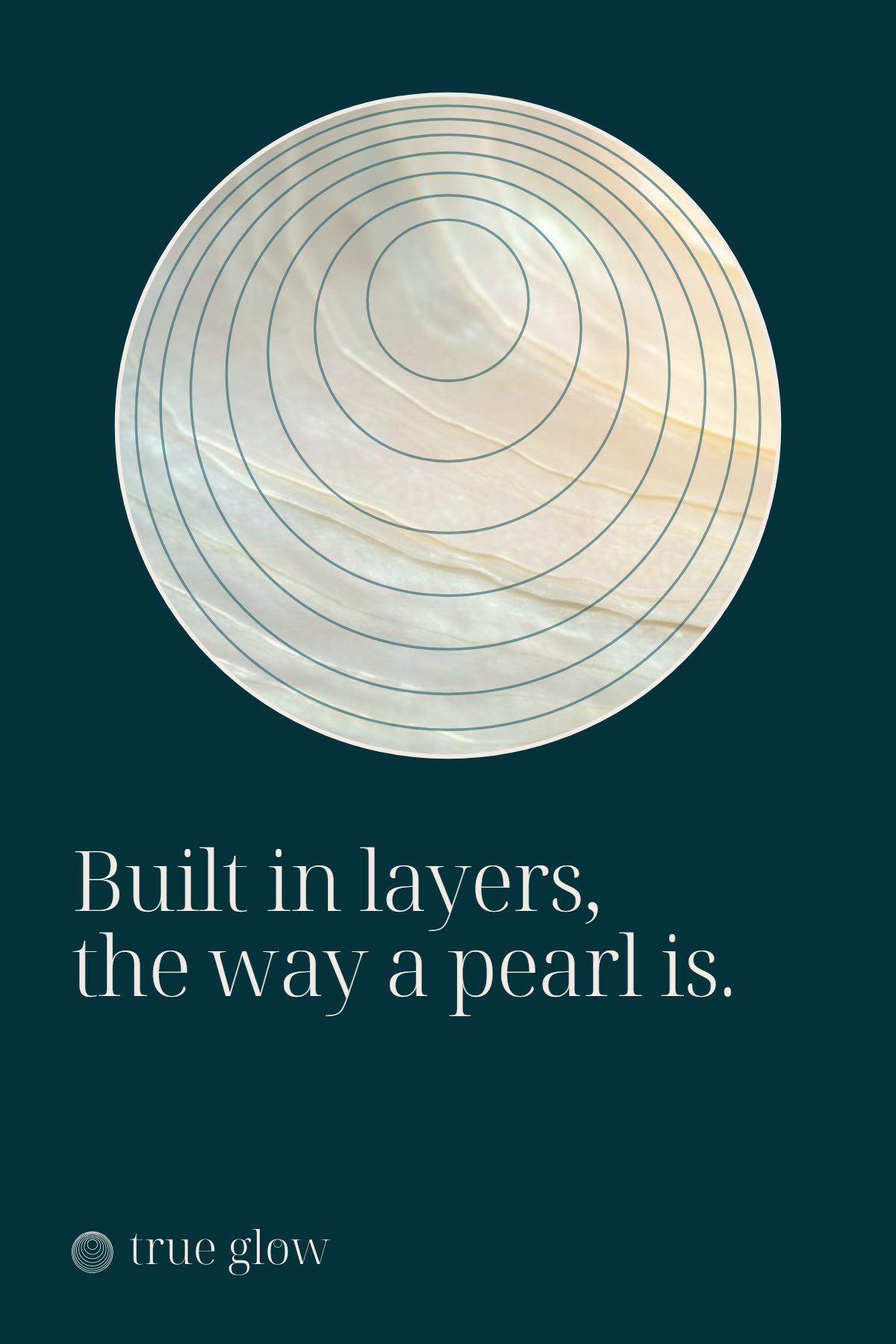
Dermatology research describes radiance as light scattered back from beneath the skin’s surface; shine is light bouncing off the top. A pearl’s lustre works the same way, through many thin layers of nacre. And thin layers, pressed in one after another, are how the products are used.
So the idea was the definition itself.

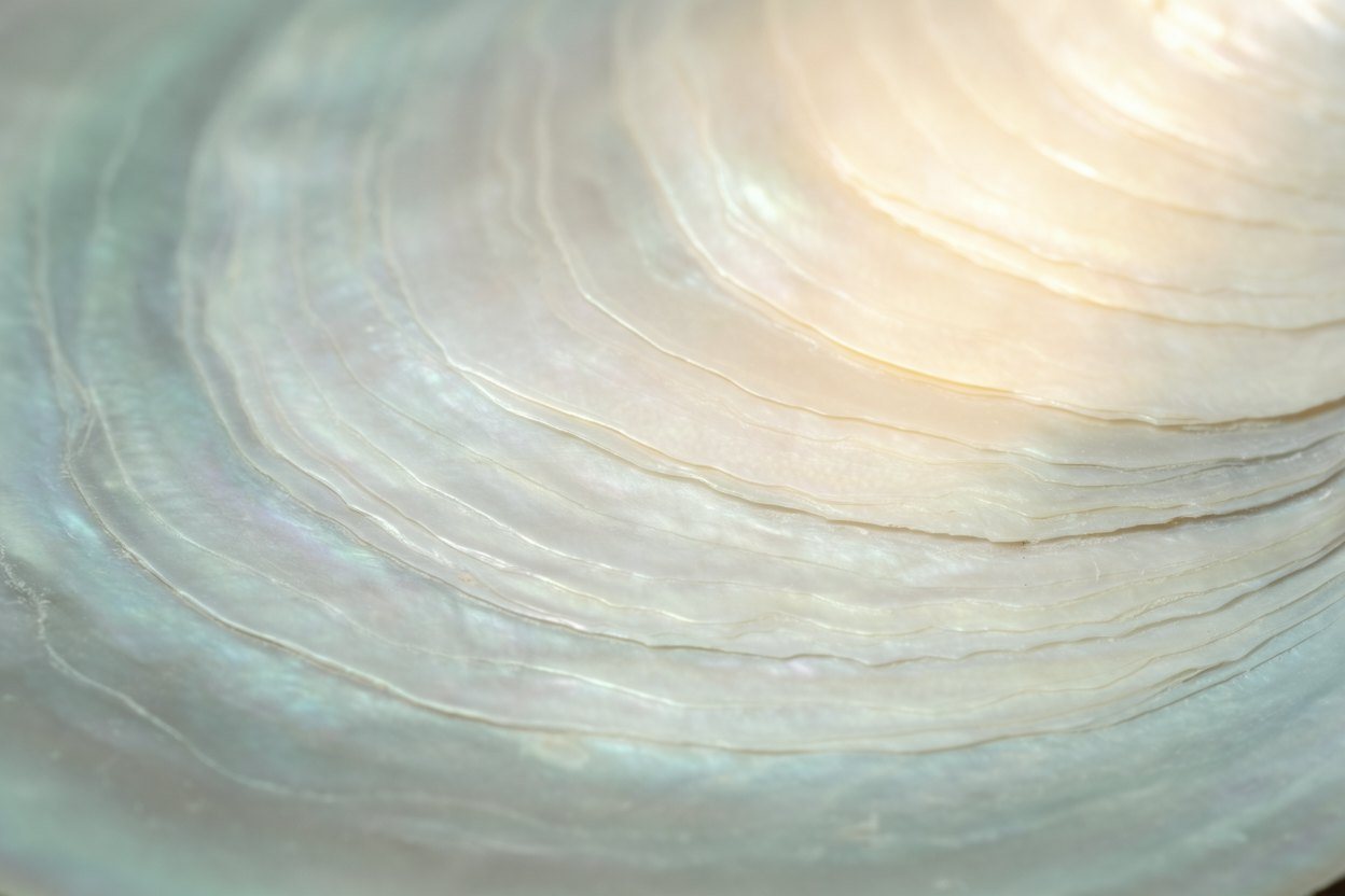
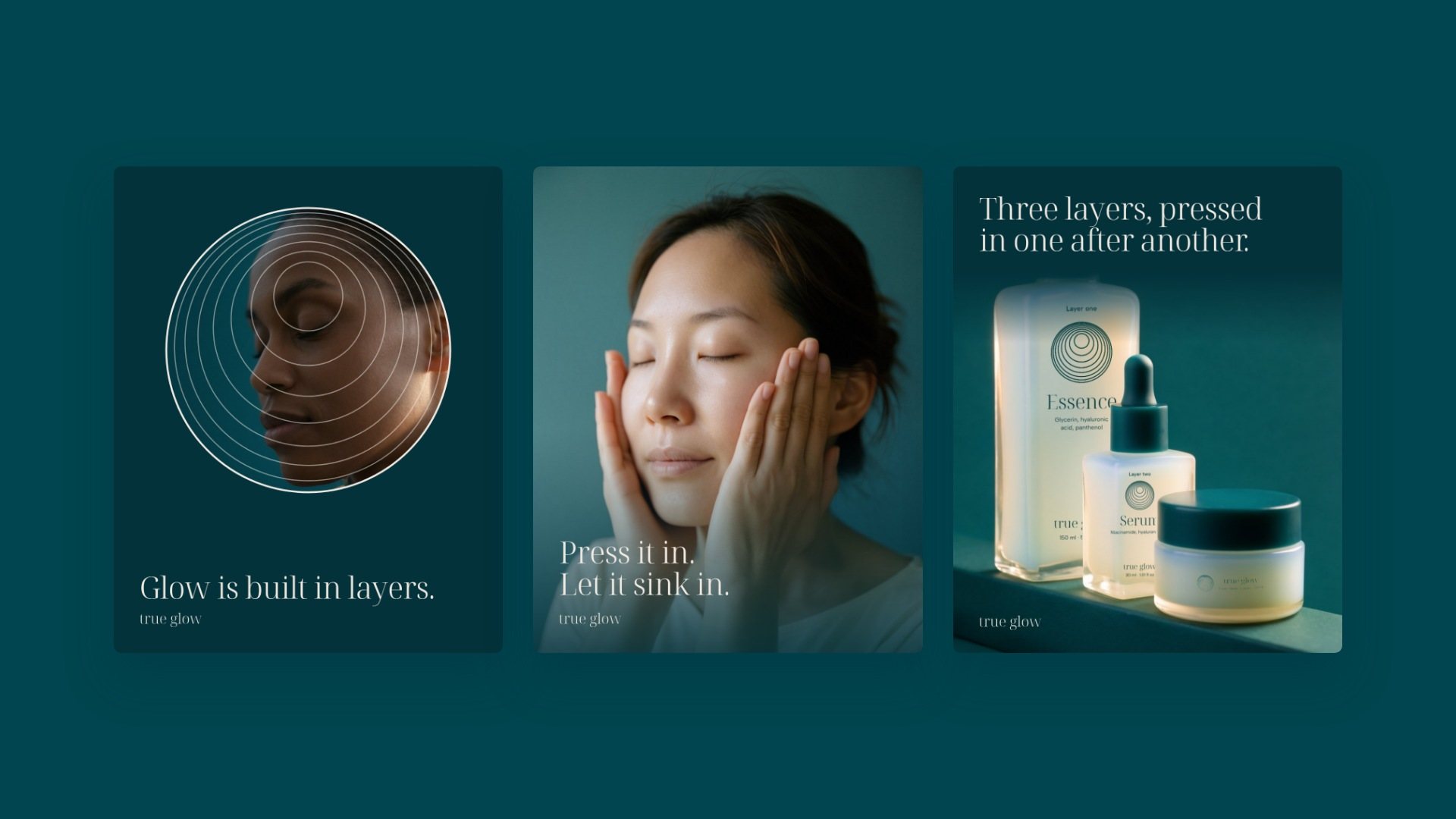
Glow is built in layers.
04
Eight layers, crowding at the top.
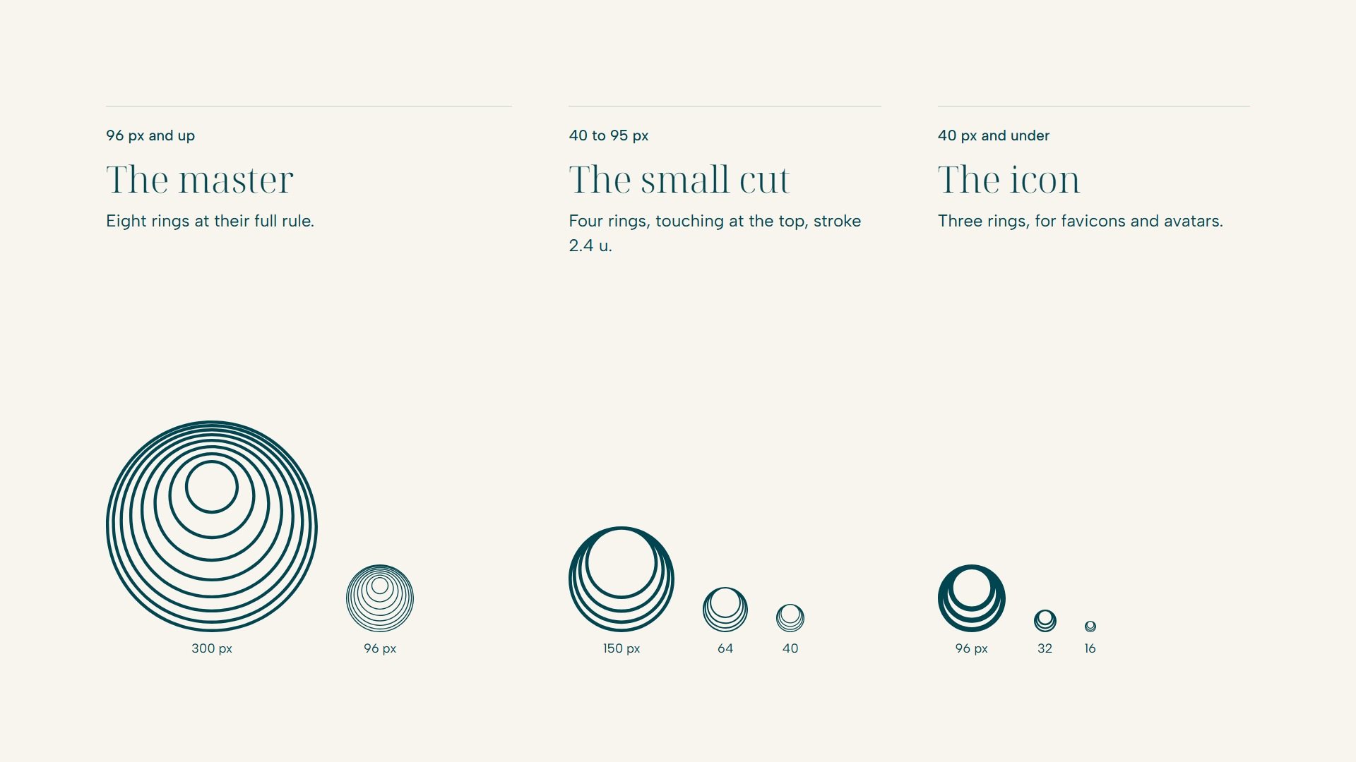
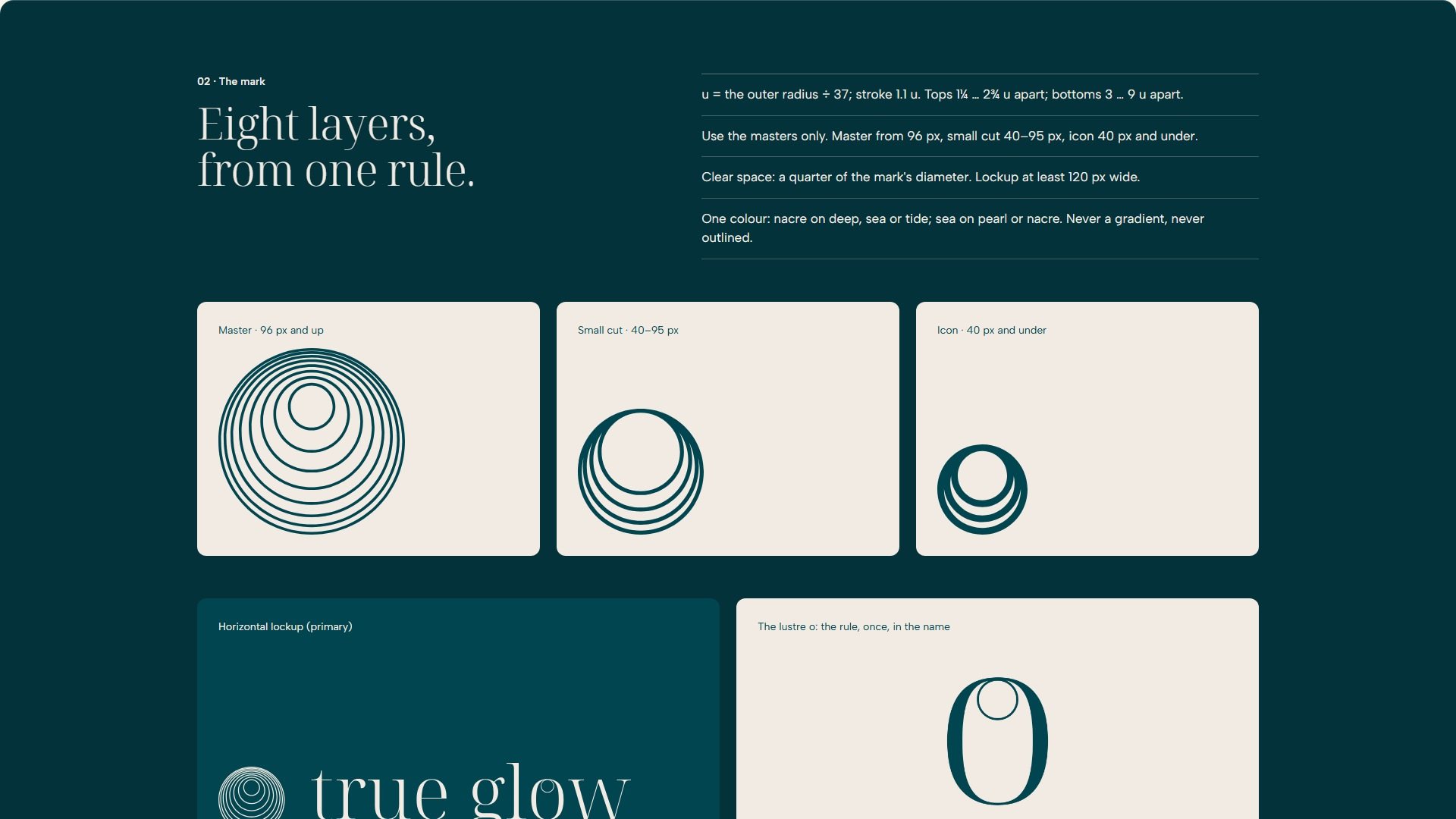
The lustre rings are eight hairline rings. Their tops crowd towards one meeting point while their bottoms open outwards, so each layer is three times thicker at the bottom than at the top. We drew them as a rule, which gave a master, a four-ring cut from 40 px and a three-ring icon.
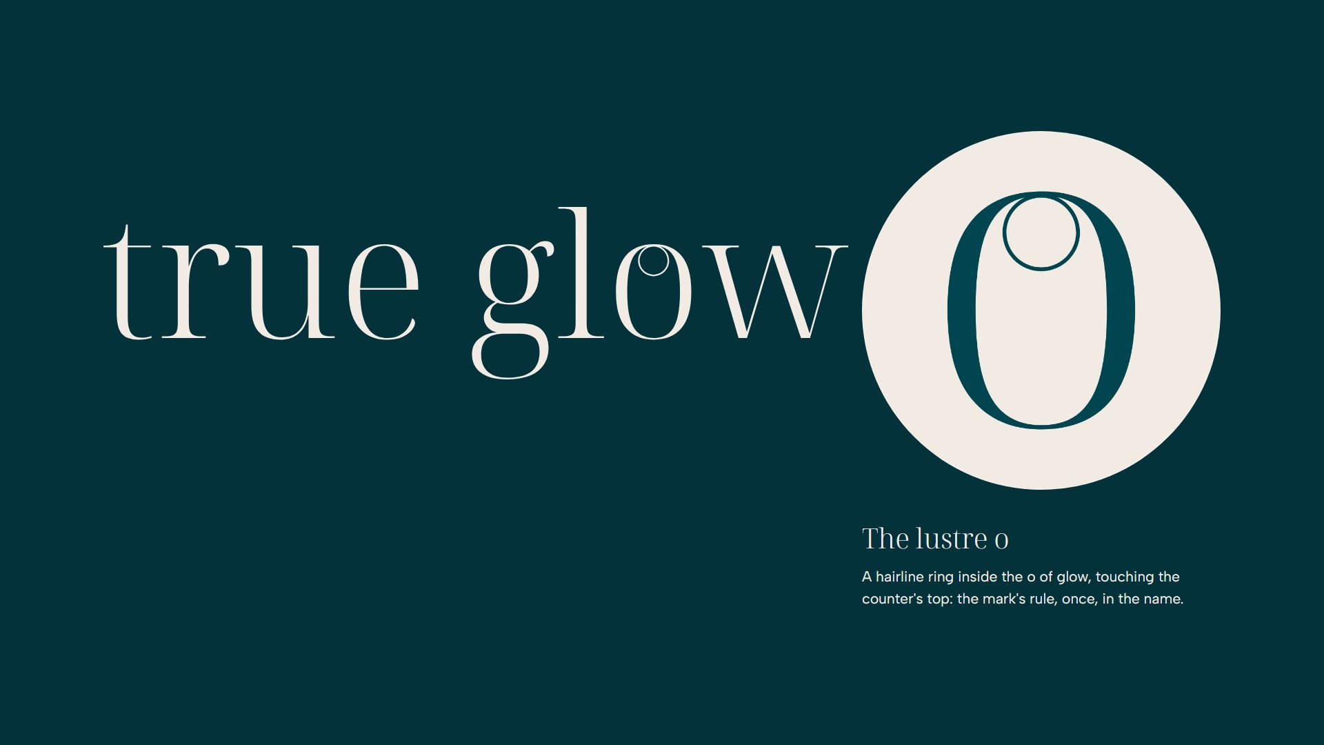
In the name, a hairline ring sits inside the o of glow, for the few who look closely.
05
One hue, one light, one rule.
Colour. One deep-sea hue, from Deep to Nacre, the water a pearl grows in, with a single warm accent that stands for the light itself. On a shelf of blush and white, the deep ground is the brand’s own.
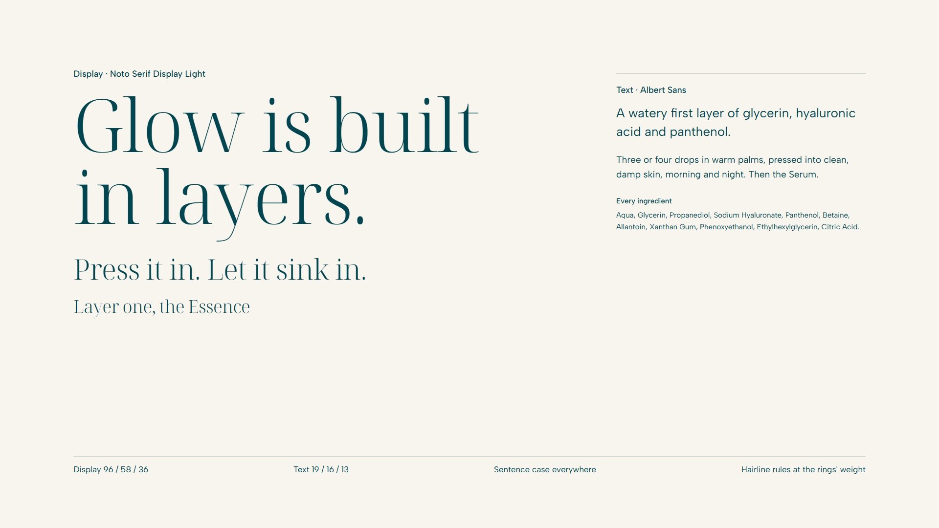
Type. Noto Serif Display Light carries the name and the headlines; its hairlines rhyme with the rings. Albert Sans does the reading: ingredients, prices, instructions.
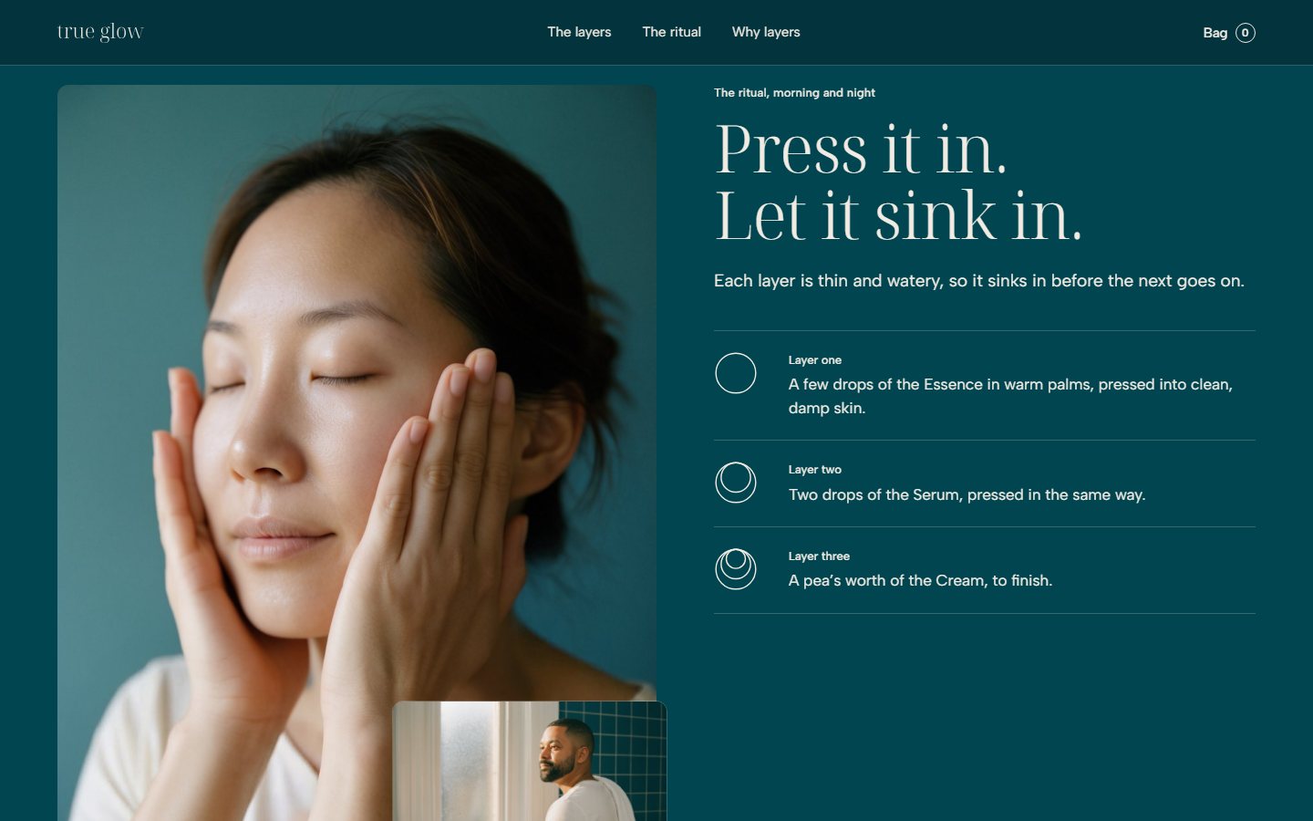
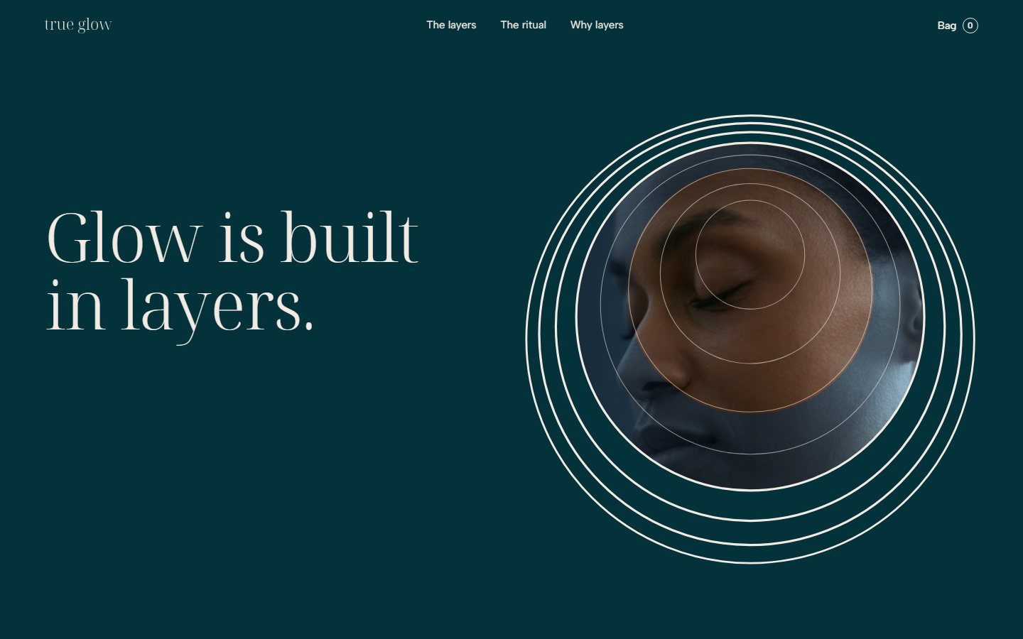
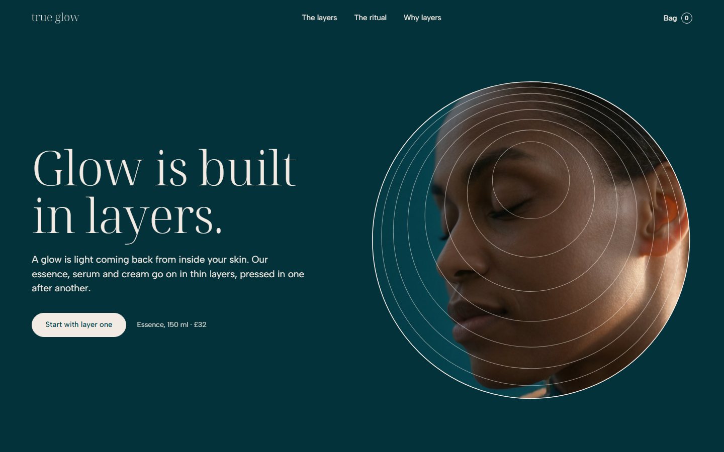
Motif. Light gathers where the layers crowd. Sections arrive over one another, product panels stack with their tops crowding, the routine is counted in rings, and photographs sit inside the outer ring.
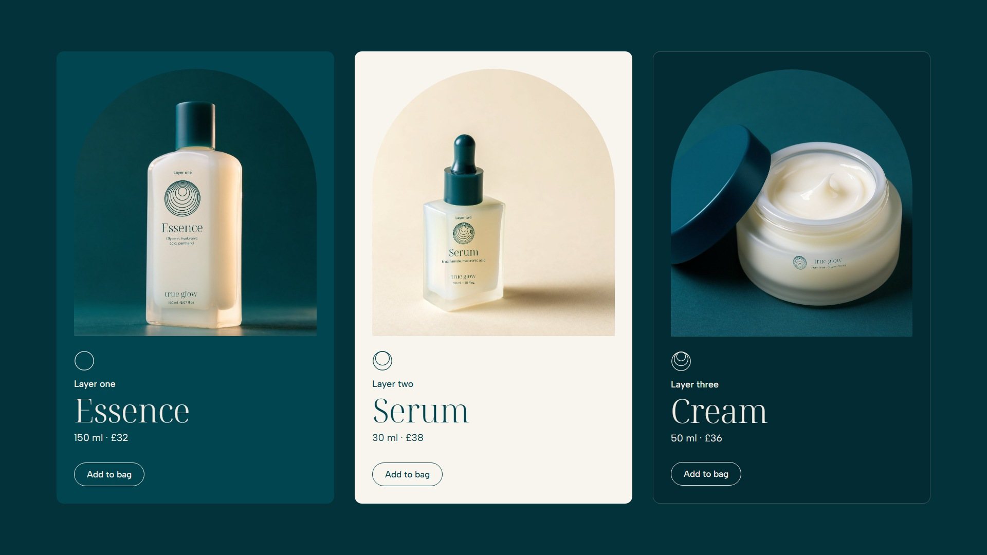
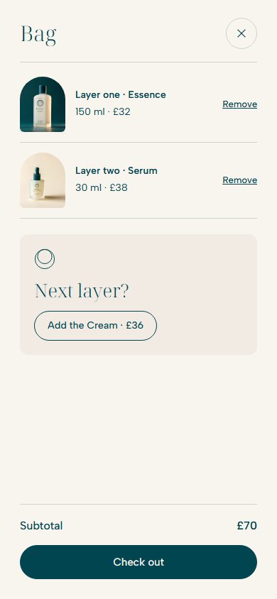
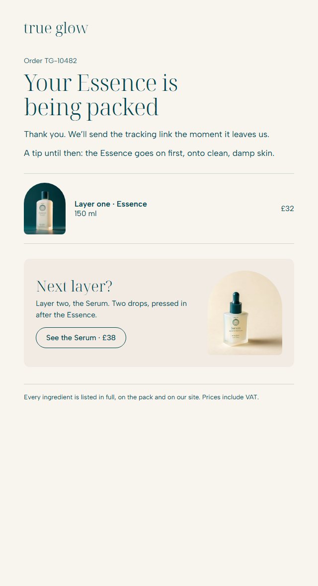
Voice. Understated, warm and exact. The brand explains glow once, then talks about touch and light. Products are counted as layers (layer one, the Essence), and its own prompt is a question: Next layer?
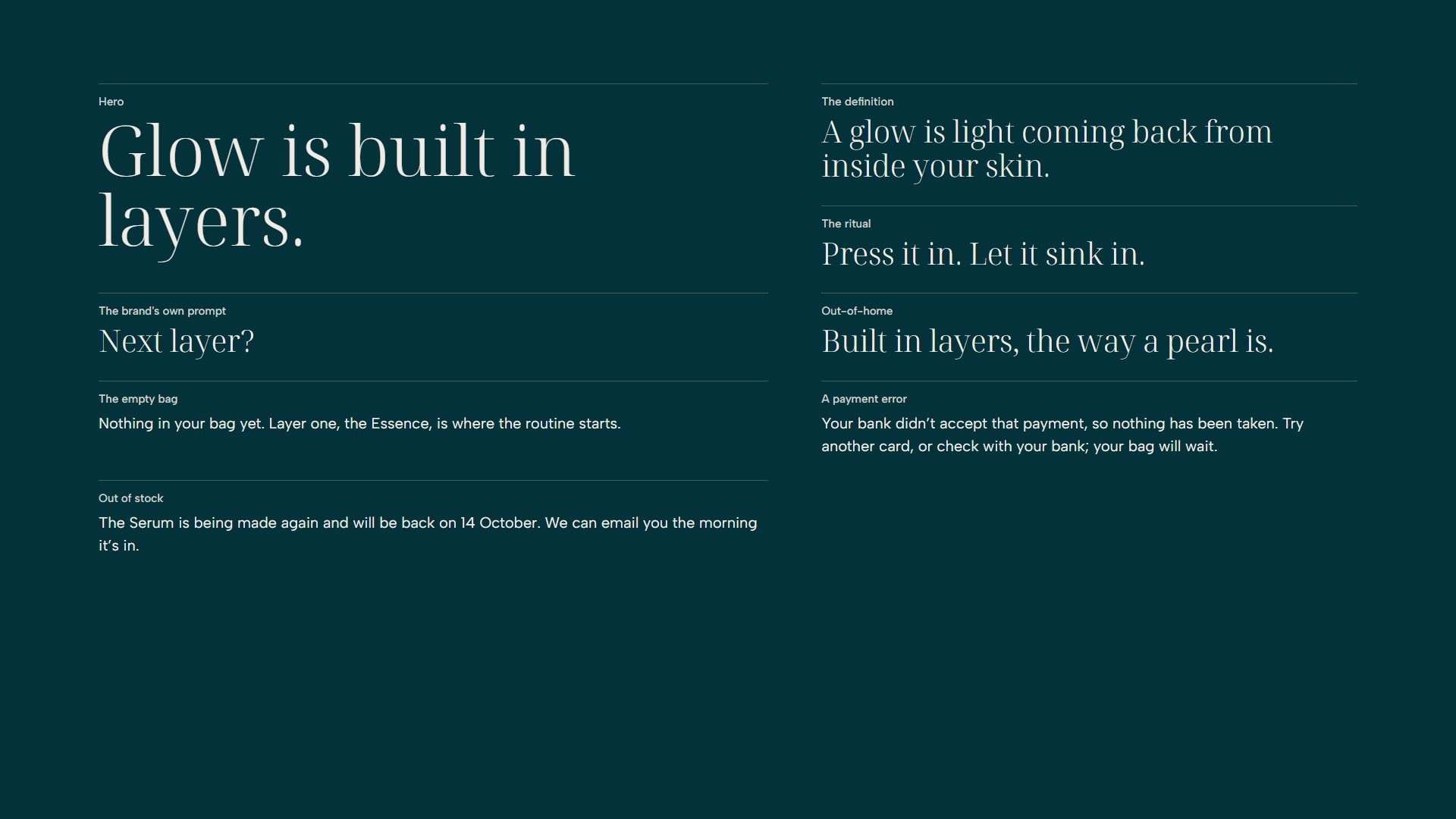
06
Lustre light.
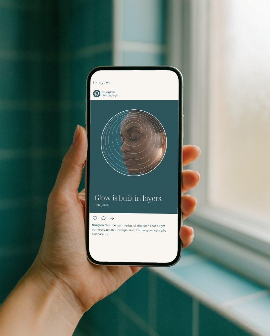
Skin lit from the side and behind, so light comes back through it: the warm edge of an ear, the curve of a cheek, a low satin sheen and never gloss. Textures are layers seen close: nacre, an essence poured thin, cream drawn out in sweeps.
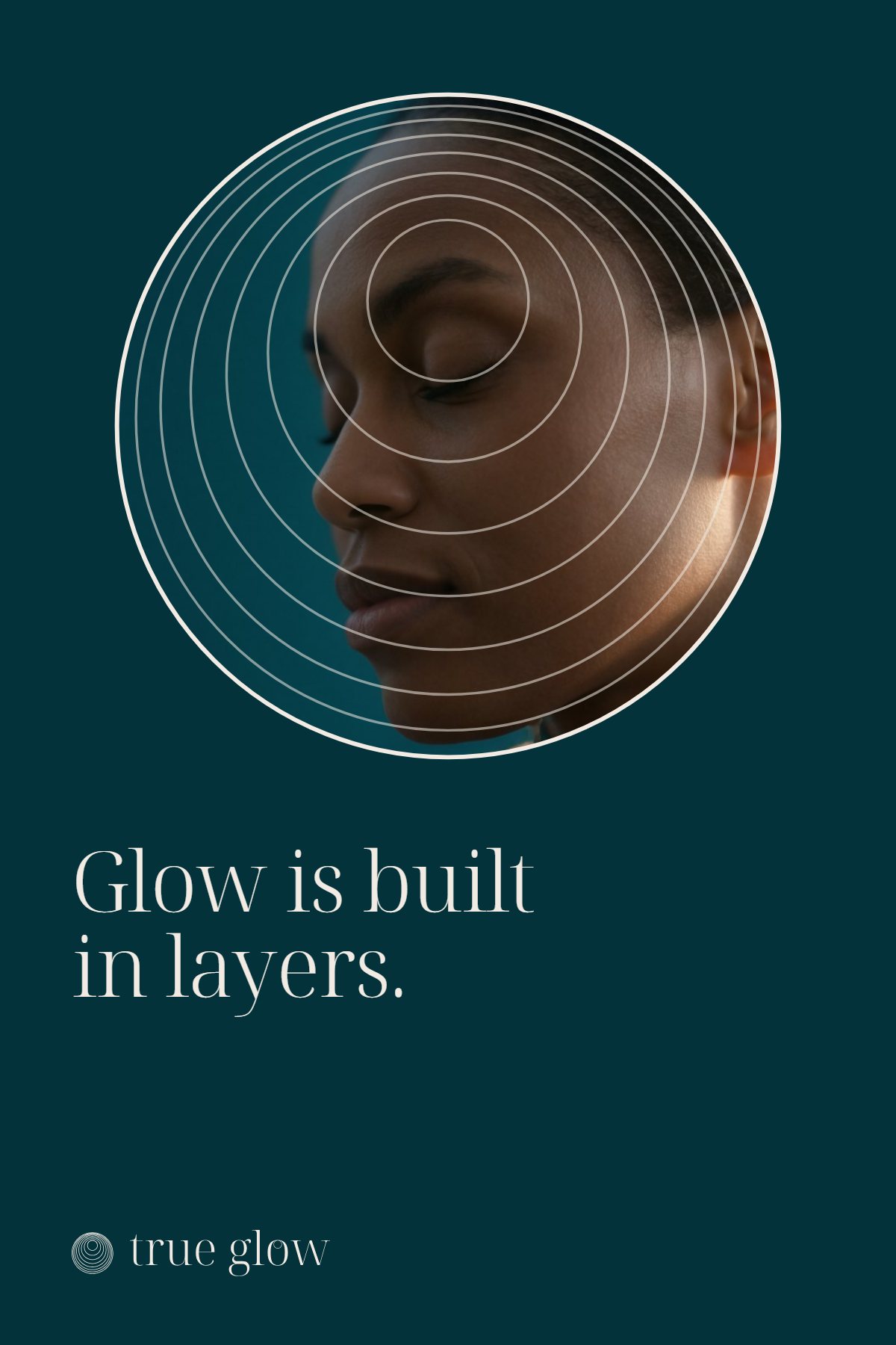
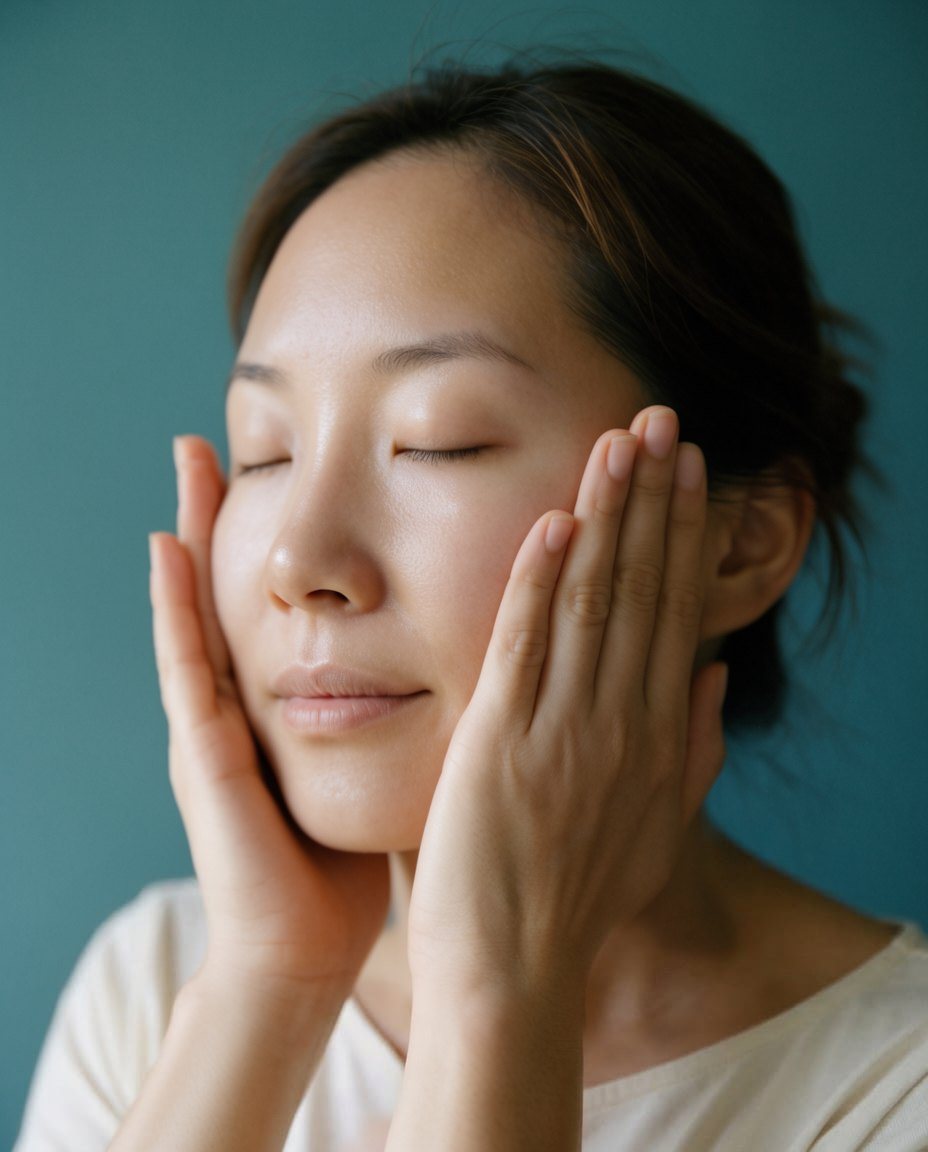


07
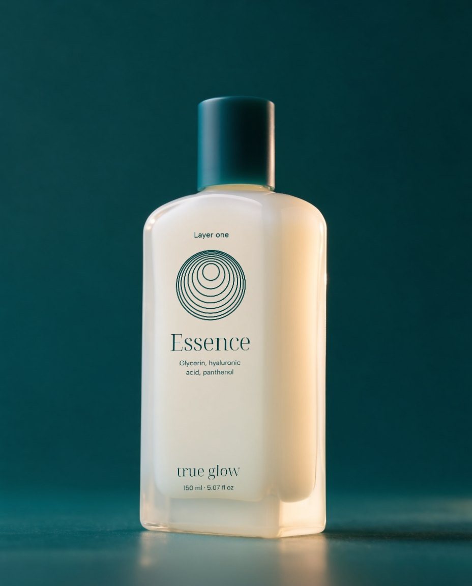
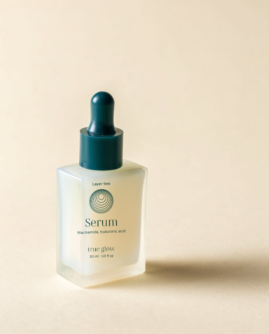
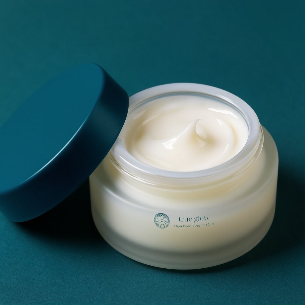
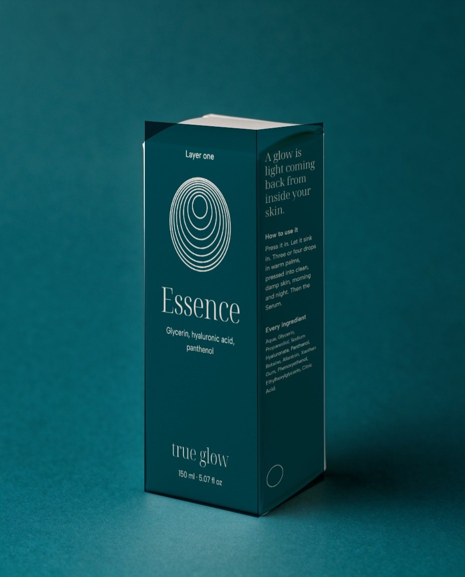
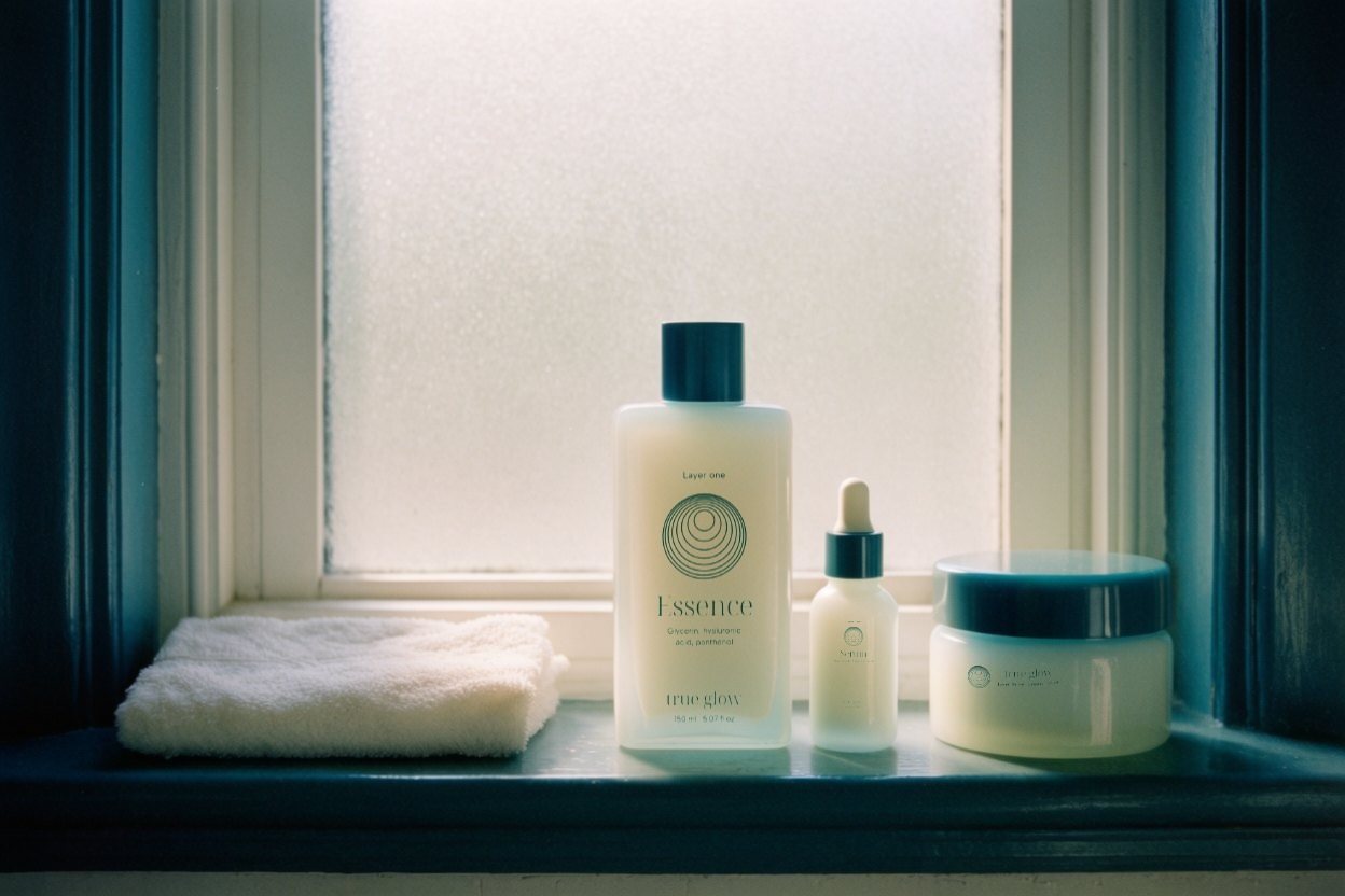
Glass that glows from within.
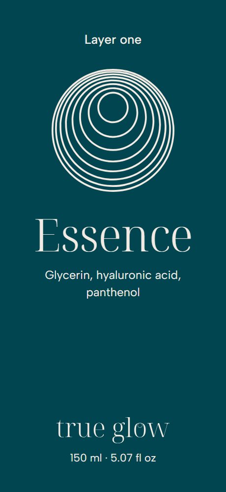
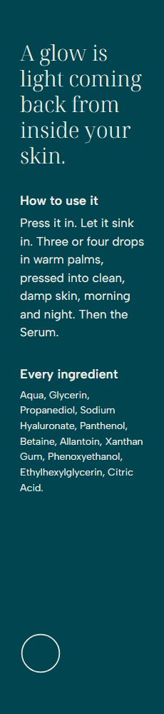
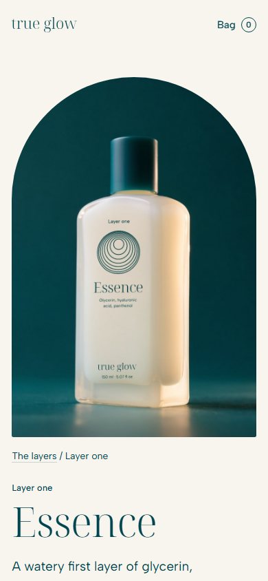
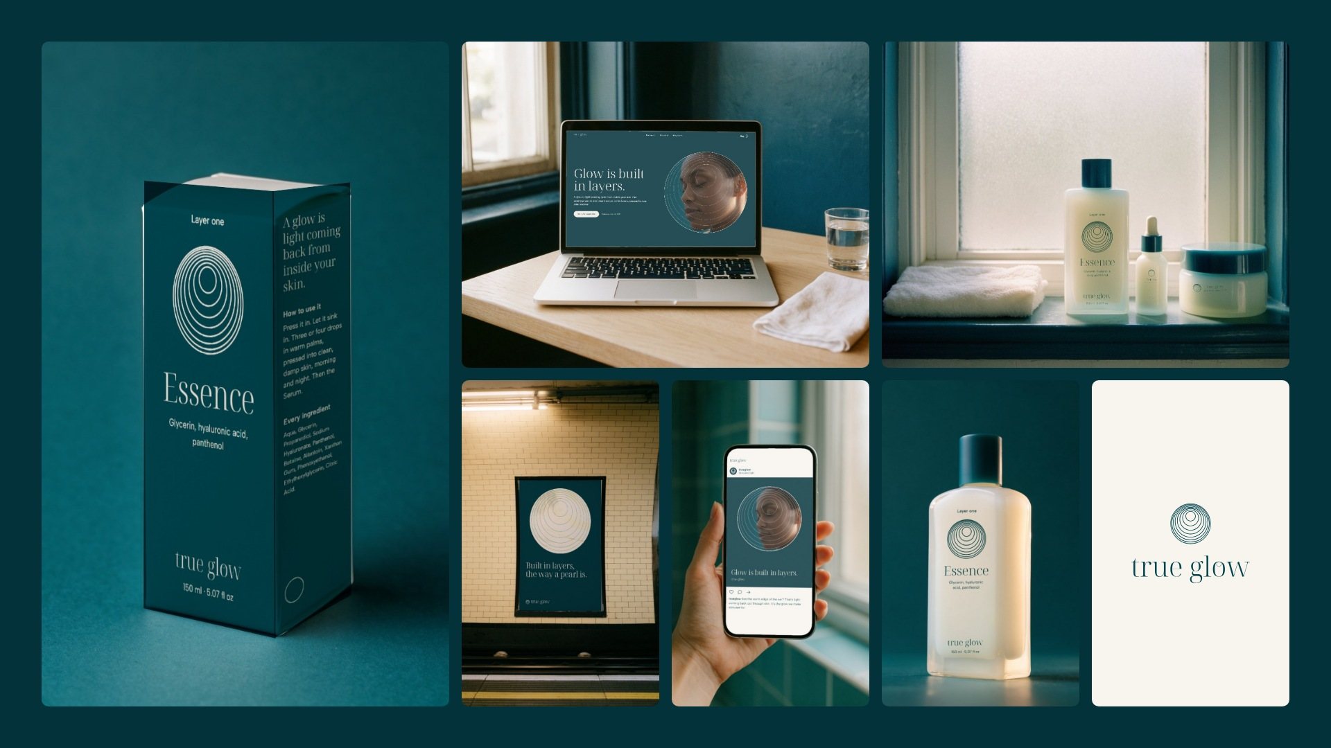
Opal glass scatters light inside itself and glows from within, the way skin does. Sea ink carries the rings, the layer and the key ingredients in plain words; the carton is the deep sea, with the definition on its side.
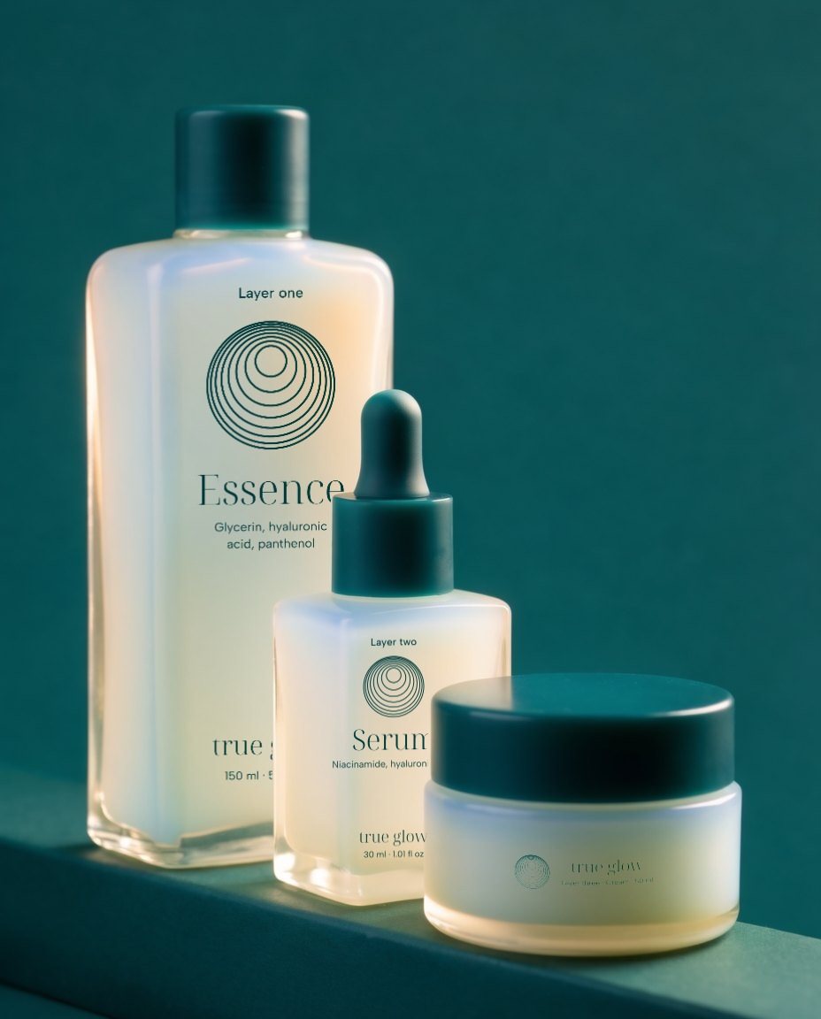
08
From a 16 px icon to a station wall.
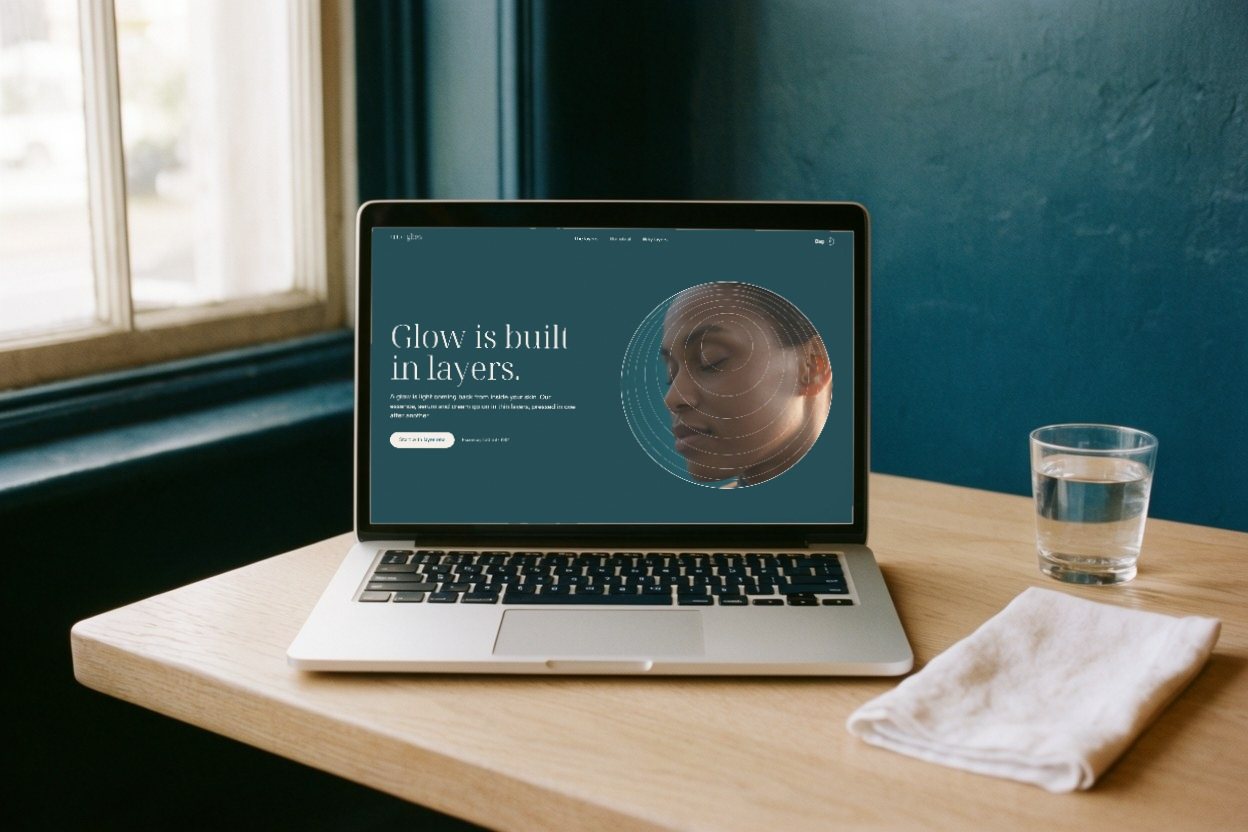
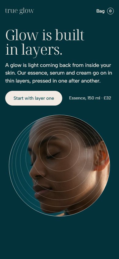
On the website the mark grows from its meeting point into a frame for skin in light, then the three layers stack the way the rings crowd. The system runs through cartons, social posts and a one-line order email, out to a poster on a station wall.

Guidelines
Two layers of guidelines.
One for people, one for agents: the rules, the masters and the tokens, from the same source.
- Concept
- A self-initiated concept by Signal Eight, made to show our capabilities.
- Made by
- Signal Eight
- Type
- Noto Serif Display and Albert Sans (SIL Open Font License)
Next case study
Three Lodgers
A home-goods brand for people who rent: shelves, lamps and hooks that press between floor and ceiling, so the walls stay as you found them. Its mark is one L turned three times round the room the lodgers share.